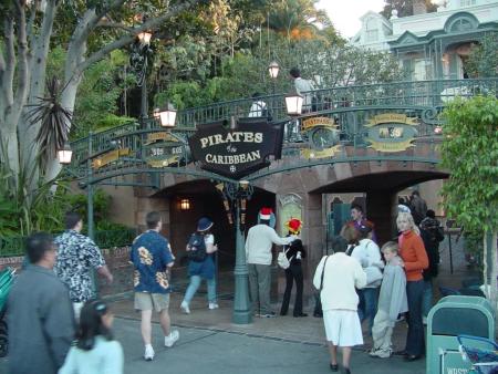
Pirates of the Caribbean: For those who visit Disney Parks often...

Sharon&Susan

Well-Known Member
In fairness to Tokyo, perhaps they thought the PIRATE! sign might drum up some interest along with the movie changes. The ride just seems perpetually unloved out there compared to the others.

I remember the original WDW Pirate sign. So much classier.

I'm not sure of the exact year but that's roughly when it happened, yes.

EDIT: It was definitely in place by 1993. I think I actually prefer the black sign over the one shown in this picture. At the very least the color of the lettering on this one seems off to me:
View attachment 655123
The nearby staircase was built the same time as the bridge, so the bridge was definitely there by the opening of the Disney Gallery in '87.
 

britain

Well-Known Member
In fairness to Tokyo, perhaps they thought the PIRATE! sign might drum up some interest along with the movie changes. The ride just seems perpetually unloved out there compared to the others.

I remember the original WDW Pirate sign. So much classier.

I'm not sure of the exact year but that's roughly when it happened, yes.

EDIT: It was definitely in place by 1993. I think I actually prefer the black sign over the one shown in this picture. At the very least the color of the lettering on this one seems off to me:
View attachment 655123

Thanks for that photo, yes, “rusted metal” turquoise letters. I wasn’t crazy!

My understanding was that the bridge was added in anticipation of Splash Mountain traffic, so it had to be before 1989.
 

TP2000

Well-Known Member
Thanks for that photo, yes, “rusted metal” turquoise letters. I wasn’t crazy!

My understanding was that the bridge was added in anticipation of Splash Mountain traffic, so it had to be before 1989.

To be honest, I thought you were crazy.

I figured you were confusing the circa-1967 Attraction Poster that was posted at the doors that had turquoise lettering as your hazy memory.

9e4cf81d549048a2574e56b3a11fdf7d4ed06d53.jpg


But it turns out there were actual rusted metal turquoise letters, in addition to the entry poster, on that 1987-built bridge during the late 1980's and through the 1990's!

tumblr_p5t6b1G4rH1wb7bfio1_640.jpg


So, I guess that proves that you aren't crazy. And I'm not as smart as I think I am. 🤔

I think we both owe @PiratesMansion a drink!
 

CaptinEO

Well-Known Member
Surely I can't be the only one who remembers when they installed that Fastpass marquee in front of the bridge back in 2001 or so? They've removed the Fastpass clocks and signage and digital readouts, but the structure and main sign is all still there.

The vines have also grown in over much of it, but when I see it I just think "Cheesy Pressler/Harriss Era Fastpass Crap". Or is that just me? It's probably just me. 🤣

0950-A.jpg
Funny story about the fastpass for Pirates. Fastpass was added to Pirates, Autopia, and Small World in 2001.

They realized those rides never needed fastpass and how fastpass ruined the standby for these high capacity rides and removed it shortly after.

In 2018/2019 the company added fastpass to It's a Small World and once again were adding fastpass to Pirates of the Caribbean.

They built the distribution machines there again as well as the scanner checkpoints, Despite all this, Pirates' fastpass 2nd attempt got axed before it even started operating thankfully.

It's like the company never learns its lessons.
 

D.Silentu

Well-Known Member
At some point in the 2000's they changed the poster on the middle pillar of the bridge to a scroll design with a dagger protruding from it as if it were pinning up the sign. Disappointingly, people pried the prop dagger loose and they stopped replacing it at some point. It is missed.
 

Stevek

Well-Known Member
If your goal is to evoke Classic Disneyland, I vote for the original 1967 sign that is still on the balcony.

The black sign to me just says "Disney's Fastpass, Presented by Cynthia Harriss!" But I'm obviously dating myself. :cool:

The original 1967 sign is Disneyland USA. The black sign is 21st century Pirates BrandingTM.

55d4ae52eff38c4e5eb92b9e88afda78c394ea85.jpg
This is the correct answer
 

mickEblu

Well-Known Member
I really love the bridge and the courtyard part of the queue.

I think the old exterior looks nice and understated but I prefer the courtyard and bridge. Half the reason the old exterior sans bridge looks great is because their are usually only two people standing there which is inviting. Not sure if it would look as great with 1,000 people standing there.
 

Register on WDWMAGIC. This sidebar will go away, and you'll see fewer ads.

Back
Top Bottom