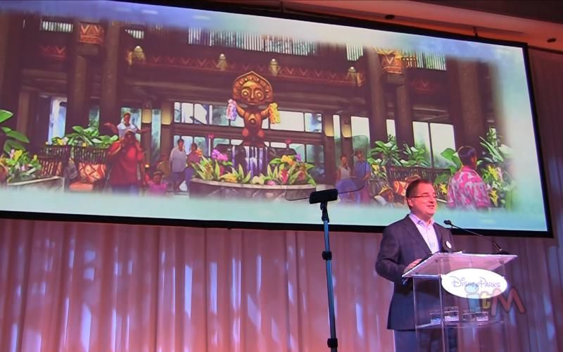
PHOTOS - Disney reveals new lobby design and Trader Sam's lounge for the Polynesian

note2001

Well-Known Member
Imagine someone who stayed at the Polynesian in 1983 and whose parents paid a reasonable price of $90 per night to stay at what they remember as a glorious resort with Macaws and amazon parrots perched atop a grand water feature in the lobby with flowing falls and vegetation all around with knowledgeable and friendly Cast Members to help make your vacation magical!

So that person decides to finally go back to WDW and experience it all once again with their children. They are probly imagining it being even better because hey, its 2014 and ITS DISNEY, it could have only gotten better with time!!! $600 a night later...

This is the same feeling I have for Fort Wilderness. So many great elements have been washed away and they don't even pay homage to them anymore (train, tram, the traveling fruit vendor cart, peaceful streets without flocks of golf carts, a full service deli, petting zoo... and even River Country. The list goes on and on.)

With more guests than ever before Disney feels it's better to pave over the memories and make more room to stand, and park golf carts. Gone are the years where Disney created magical events for the sake of them being there. Now, if there's anything magical, you can bet there's a premium being charged to experience it.
 
Last edited:

networkpro

Well-Known Member
In the Parks
Yes
How cynical! I remember the bad old days at the Poly before the landscaping had a chance to fill in during the 70's. How dare they do something to change what you remembered at a certain point in time.

Imagine someone who stayed at the Poly before 1978 when there were quite a fewer longhouses and you could walk up and eat any time you wanted! That would be me for one. With the addition of more longhouses and now DVC there needed to be more space in the atrium just for the scooters and double wide strollers.

If you want to see what it looks like, you can locate "The Tim Tracker" vlog on youtube. He did a walkthrough last night of the new space.
 

Clamman73

Well-Known Member
Fixed

image.jpg
 

Bocabear

Well-Known Member
I like it!

Now, look at it from this perspective:
Imagine if it was always open like this, and one day WDW decided to cram a massive two story fountain in the middle of it...
What would we think?
Well ok as long as we are playing that game I guess you could say, what if it were a Motel 6 and then Disney built this...and we would all say wow....Point is, it is diminished. If I had never known the old lobby, yes of course most of us would not have anything to say...but we do. This lobby looks nice. but it is no rave...it is no immersive experience... it is a nice looking hotel lobby...meh
 

ford91exploder

Resident Curmudgeon
This is pretty accurate.

Yes read the article on this, Still does not excuse the decision to destroy an iconic feature and replace with a birdbath while other hotels with far lower rates have much larger features than the original in the same market,

This abomination was all bound up in Disney wanting more RETAIL space, To H--- with the guest experience.
 

BoarderPhreak

Well-Known Member
It definitely feels more open and airy, especially from the second floor looking down. The new front desk is nice also.

But that's where my good feelings end. Now the lobby looks rather plain and boring (though looking up at the new lights is nice). The benches are weird looking. Most of the upholstery on the furniture looks somewhat disjointed - only some of it is reminiscent of Polynesian colors/patterns. It just seems to lack the coordination that was previously there. I do like the furniture itself and floor lamps though.

Finally, the planters surrounding the columns and the one in the middle don't't seem very well thought out and harsh - edgy and squared. IMO, it would've looked much better to have "natural" lava formations, perhaps with mini water features (waterfalls, hello!?) that drain around the perimeter of the features, sort of "infinity pool style." This would add much nicer, more lush vegetation and a relaxing sound to the lobby. Disney could have ditched the central feature yet still maintained the original intent.

It looks clean, updated - modern. No doubt. But it's lacking that "magic." And not just because I'm pining for the old days.
 

worldfanatic

Well-Known Member
They could have "plussed" it a bit more, but I like that the new lobby's more open. The fountain was nice to look at, but it took up way too much space, forcing guests squeeze into the small areas surrounding it.
I love Disney lobbies, and spend a ton of time reading the paper and people watching in them.
The Poly's lobby never seemed like a nice place to relax before, this one does.
And if I'm craving extra theming, Trader Sam's will be steps away.
 

NearTheEars

Well-Known Member
I cannot comment on the previous lobby as I had never seen it. Its just not in our budget to ever spend more than $150 a night on a room. But going in blind to the past, it looks open, and spacious and bright. I don't see cheap. If this were a new hotel i don't think many would be calling this generic.

I will say though, going from a huge fountain that took up much of the space (as described) to that small pile of rocks may have been too big of a change, and I certainly understand how many are underwhelmed in that specific aspect.
 

Kman101

Well-Known Member
It doesn't matter the reason, doesn't matter the 'personal/nostalgia' connection to the fountain, just comparing the two, it's an obvious downgrade from a massive lobby fountain to what others said, a pile of rubble. It screams cheap. The rest of the lobby looks fine. I don't hate it, and people shouldn't be jumped on for liking what they like, but you also have to admit that it was a massive downgrade (in terms of the fountain).
 

Register on WDWMAGIC. This sidebar will go away, and you'll see fewer ads.

Back
Top Bottom