Brian
Well-Known Member
Considering that last time they let the blue roofs fade to virtually grey, I wouldn't put it past them.Not until the 100th.
Considering that last time they let the blue roofs fade to virtually grey, I wouldn't put it past them.Not until the 100th.
Really? This is so disappointing. I remember hearing a while back that TDO were unhappy with the way the pink turned out, had my fingers crossed the color would be painted over at some point after the 50th decorations had been taken down.Not until the 100th.
Yes. it's this -Does the Castle have it‘s own background music? If so, has it been changed to go with this redecoration?
They were unhappier with the cost of repainting.Really? This is so disappointing. I remember hearing a while back that TDO were unhappy with the way the pink turned out, had my fingers crossed the color would be painted over at some point after the 50th decorations had been taken down.
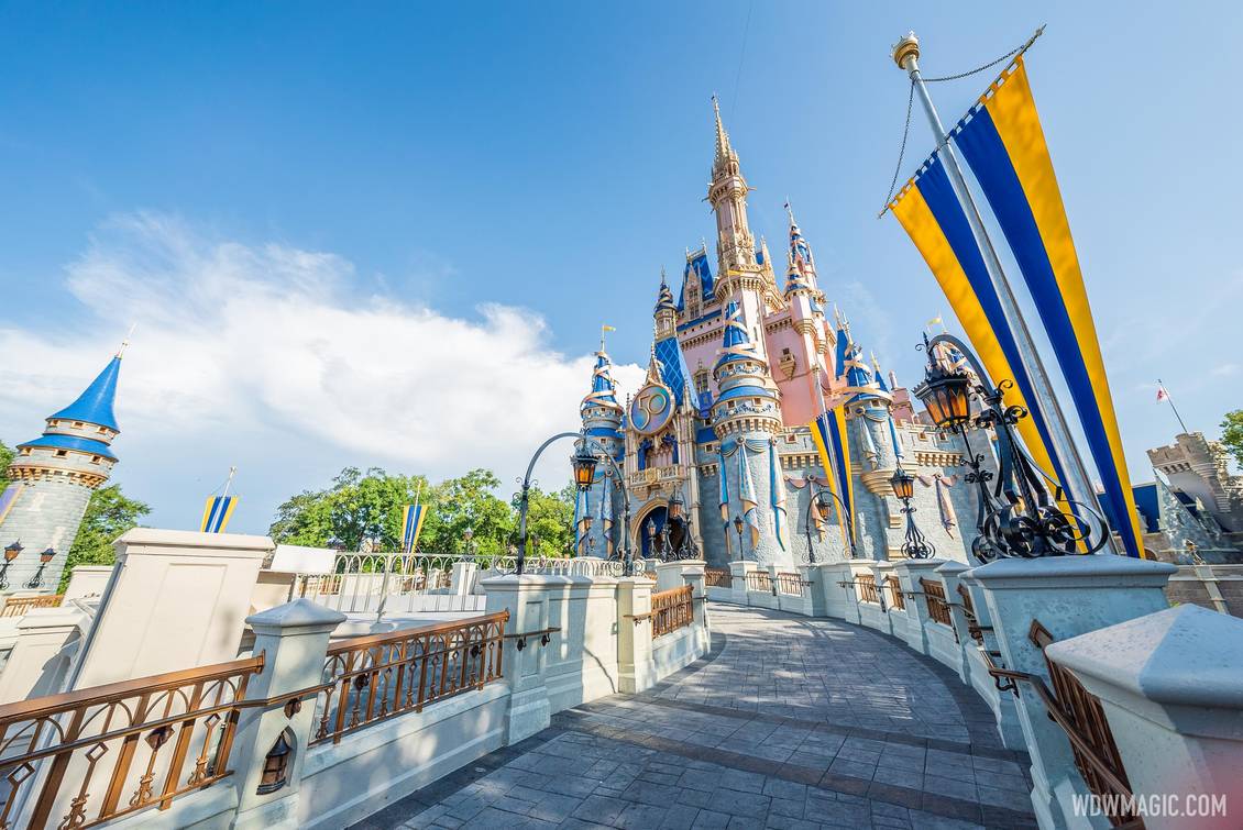
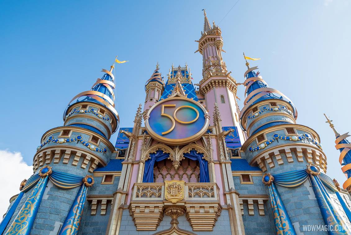
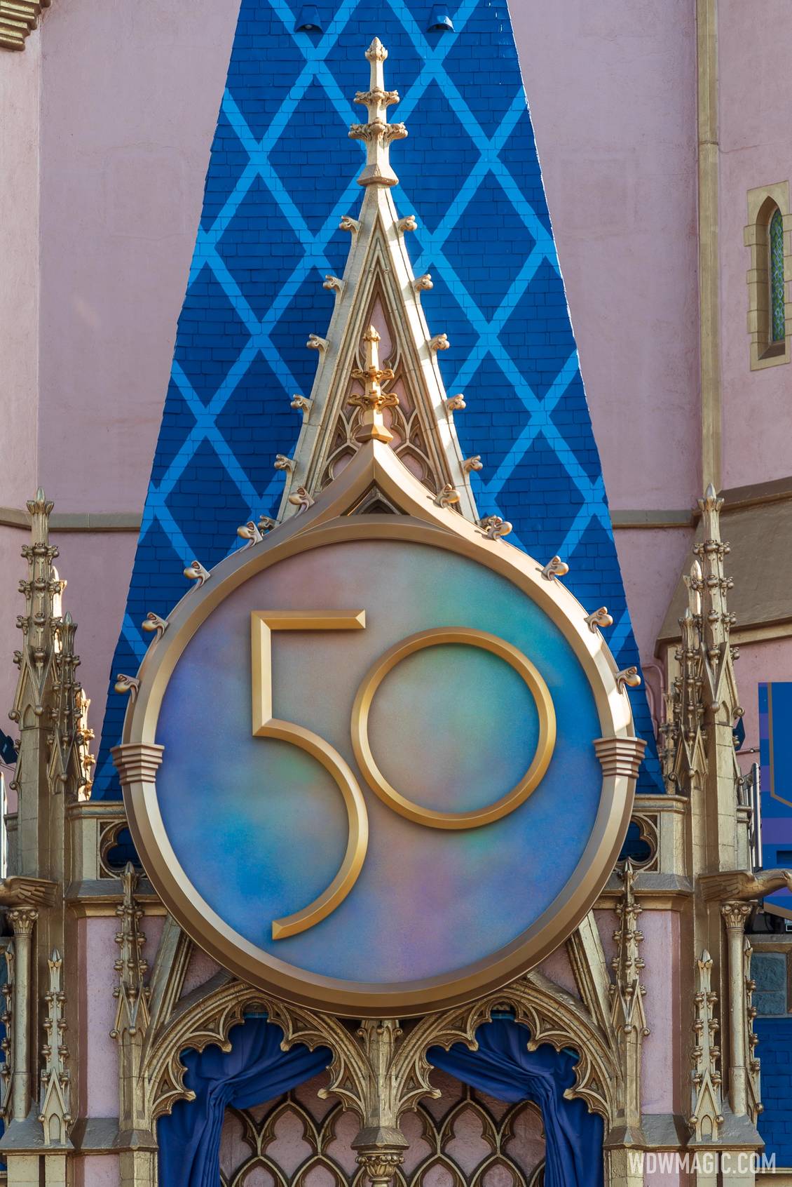
The pink looks much better in these photos. I'm not sure if it's just the light they were taken in or if the paint has faded a little.The 50th Anniversary crest has just been put up today making the Cinderella Castle enhancements officially complete.


The pink looks much better in these photos. I'm not sure if it's just the light they were taken in or if the paint has faded a little.
Yes, changing the blue certainly helped.I think part of it is that the turrets are no longer that almost purple color. That definitely helps.
Still don't think the castle looks anywhere near as good as it did with the original paint scheme, but it looks a lot better than it did when they first painted it in this scheme.
Still looks like a plastic castle in woody's toyset but whatever. Let them have their momentI think part of it is that the turrets are no longer that almost purple color. That definitely helps.
Still don't think the castle looks anywhere near as good as it did with the original paint scheme, but it looks a lot better than it did when they first painted it in this scheme.
agree unfortunately. At least its not hideous or gaudy, its nice I guess. I would have preferred a return to the original castle but thats not synergy enough for chapek and his minions in charge. Everything has to be instagrammable is the mandate and the kingdoms cant have their own identity anymore, they all have to be of the same target like branding.Still looks like a plastic castle in woody's toyset but whatever. Let them have their moment
They put it on crooked.
If they all cater to the same base customer Chappie can pare down the merch sku's and save big bucks on manufacturing bulk quantities. The base all want the same stuff, synergy at it's finest....agree unfortunately. At least its not hideous or gaudy. I would have preferred a return to the original castle but thats not synergy enough for chapek and his minions in charge. The kingdoms cant have their own identity anymore they all have to be of the same target like branding.
That picture is from the center though and there are other pictures you can tell that decor piece is tilted to the leftI think that's just the angle the photo was taken. If you're not dead in the center, its always gonna appear to be a bit off
If so, I’m sure they will fix it.That picture is from the center though and there are other pictures you can tell that decor piece is tilted to the left
I am sure they will too I just think it is funnyIf so, I’m sure they will fix it.
It was dark outside.I am sure they will too I just think it is funny

And you can still see the stick thing on the top is tilted leftAnother angle

Register on WDWMAGIC. This sidebar will go away, and you'll see fewer ads.
