News PHOTOS - Cinderella Castle at the Magic Kingdom to receive enhancements this summer

cookiee_munster

Well-Known Member
roof.jpg


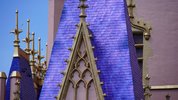
This image of the roof (taken from bioreconstruct over on twitter) does make me wonder whether they we're trying to do more than one flat colour originally and it just didn't work out? or it was a bad batch of paint?

either way, the whole thing looks like it's ran, or it's been really badly affected by the rain...

The blue is way nicer than that weird purple colour, i just wish it had a more matte appearence and wasn't so shiny/plastic looking.
 

Bocabear

Well-Known Member
View attachment 543553

This image of the roof (taken from bioreconstruct over on twitter) does make me wonder whether they we're trying to do more than one flat colour originally and it just didn't work out? or it was a bad batch of paint?

either way, the whole thing looks like it's ran, or it's been really badly affected by the rain...

The blue is way nicer than that weird purple colour, i just wish it had a more matte appearence and wasn't so shiny/plastic looking.
I am so glad to see the purple roofs going away...Now they need to address the Golden Girls Mauve color on the castle... Nothing would have been more elegant for the 50th than the castle in it's original colors then accented with gold leaf... The Blue , pale gray and Gold would have looked smart and regal...and would have celebrated the unique (when built) Castle design for this park... Instead of muddying the parks icon up with Disneyland's Paint scheme.
 

cookiee_munster

Well-Known Member
I am so glad to see the purple roofs going away...Now they need to address the Golden Girls Mauve color on the castle... Nothing would have been more elegant for the 50th than the castle in it's original colors then accented with gold leaf... The Blue , pale gray and Gold would have looked smart and regal...and would have celebrated the unique (when built) Castle design for this park... Instead of muddying the parks icon up with Disneyland's Paint scheme.
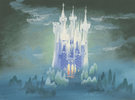
ive been following that zach imagineer on instagram and he talked about how they used Mary Blairs colour work she did for Cinderella for the current colours on the castle. Nowhere have i seen Mary Blair use any of these colours for her castle concepts... its mostly blues, greys & whites (very much like the parks castle when it opened) i expressed this to him. still no answer... :p

EDIT - attached one of Marys concepts for the castle.
 

Attachments

  • cinderella.jpg
    cinderella.jpg
    165.8 KB · Views: 61
Last edited:

JoeCamel

Well-Known Member
View attachment 543553

This image of the roof (taken from bioreconstruct over on twitter) does make me wonder whether they we're trying to do more than one flat colour originally and it just didn't work out? or it was a bad batch of paint?

either way, the whole thing looks like it's ran, or it's been really badly affected by the rain...

The blue is way nicer than that weird purple colour, i just wish it had a more matte appearence and wasn't so shiny/plastic looking.
They put a chemical buffer on the purple to help the surface bond to the new paint so it looks like this. It was a better paint job when applied, wrong colors but the craftsmanship was quality.
 

Supreme Leader

Well-Known Member
ive been following that zach imagineer on instagram and he talked about how they used Mary Blairs colour work she did for Cinderella for the current colours on the castle. Nowhere have i seen Mary Blair use any of these colours for her castle concepts... its mostly blues, greys & whites (very much like the parks castle when it opened) i expressed this to him. still no answer... :p

EDIT - attached one of Marys concepts for the castle.
1617121252932.png
 

Bocabear

Well-Known Member
ive been following that zach imagineer on instagram and he talked about how they used Mary Blairs colour work she did for Cinderella for the current colours on the castle. Nowhere have i seen Mary Blair use any of these colours for her castle concepts... its mostly blues, greys & whites (very much like the parks castle when it opened) i expressed this to him. still no answer... :p

EDIT - attached one of Marys concepts for the castle.
Yeah...because he know that was completely wrong. And aside from Mary Blair they need to look more at John Hench's drawings and Herbie Rhyman paintings...those should be the inspirations they look at. If Mary did work on Cinderella's castle it was most likely for the Disney Little Golden Book or unused storyboards from the film... not the actually produced structure.
And Even Mary wouldn't have made that decision with the suntan pink-ish mauve and purple roofs...
No never.
 

cookiee_munster

Well-Known Member
Ok, so there's some pink there. but it's nothing like the orangey/tanned pink they went with.
And Even Mary wouldn't have made that decision with the suntan pink-ish mauve and purple roofs...
No never.
Totally agree, Mary was an absolute genious with colour. I really think if she saw the colours they used for the castle makeover she'd hate it. or just laugh at its absurdity.
 

Dan Deesnee

Well-Known Member
Have they revealed an official answer as to why they repainted to a different color?

Not complaining, the blue is much better. To quote my 8 year old last year "Is that Rapunzel's castle now?"
 

aladdin2007

Well-Known Member
Yeah...because he know that was completely wrong. And aside from Mary Blair they need to look more at John Hench's drawings and Herbie Rhyman paintings...those should be the inspirations they look at. If Mary did work on Cinderella's castle it was most likely for the Disney Little Golden Book or unused storyboards from the film... not the actually produced structure.
And Even Mary wouldn't have made that decision with the suntan pink-ish mauve and purple roofs...
No never.

This, and he's about as useful as a ....oh nevermind...best to just talk about the castle I guess in all its yuckish mauve glory. Happy 50th.
 

markham

Active Member
When the new castle color scheme debuted, I kept thinking that the pink color was a darker under coat and that they would be coming in and making lighter/less saturated gradations to the structure to emphasize the architecture. Much like the adjacent Bibbidi Bobbidi Boutique or the clone at Tokyo Disneyland. Not just flat color but adding some dimension and lightening up the whole structure. I truly didn’t think it was possible they were leaving it like that haha. Shows what I know! 😂

AADFA373-6798-4286-A644-7103EBE59D34.jpeg

0BD0DCAD-55D5-48EC-BD87-4595438DEA07.jpeg
 

Bocabear

Well-Known Member
Honestly it is ok to say you burned the toast...and not force everyone at the table to eat it because you are too embarrassed to admit it...They all know you burned the toast... Just grab some more bread and do it the right way before breakfast is ruined...
See? It's not so hard...they already repainted the roofs... Now just admit the huge OOOPS and repaint the Mauve back to the pale gray... Leave the gold... it is not optimal, but certainly makes sense for a 50th Anniversary...and will coordinate well with the rest of the decor.
If they MUST use Rose Gold, do some ornamentation for the lamp posts on Main Street... Or something with banners in the forecourt....
but PLEASE I beg you.... Don't make us eat the burned toast.... lol
 

Register on WDWMAGIC. This sidebar will go away, and you'll see fewer ads.

Back
Top Bottom