
-
Welcome to the WDWMAGIC.COM Forums!
Please take a look around, and feel free to sign up and join the community.
You are using an out of date browser. It may not display this or other websites correctly.
You should upgrade or use an alternative browser.
You should upgrade or use an alternative browser.
News PHOTOS - Cinderella Castle at the Magic Kingdom to receive enhancements this summer
- Thread starter wdwmagic
- Start date
Kevin_W
Well-Known Member
I must digress my comments of HIDEOUS. After looking at different angle in different light, it does not look bad...just different than hat we are use to. I think for the most part, it will 'grow' on guests!
I tend to agree. I prefer the white color, but I'm not sure how much of that is that I prefer white and how much is because that's what color it's *nearly) always been.
gmajew
Premium Member
I have seen some pictures that I say it looks good and others that I just go no no please....
Bottom line the blue is really to much but it will fade and I am assuming that is part of the plan.... Does anyone have a picture of the blue the last time it was fresh?
Here are the turrets when they were brand newI have seen some pictures that I say it looks good and others that I just go no no please....
Bottom line the blue is really to much but it will fade and I am assuming that is part of the plan.... Does anyone have a picture of the blue the last time it was fresh?
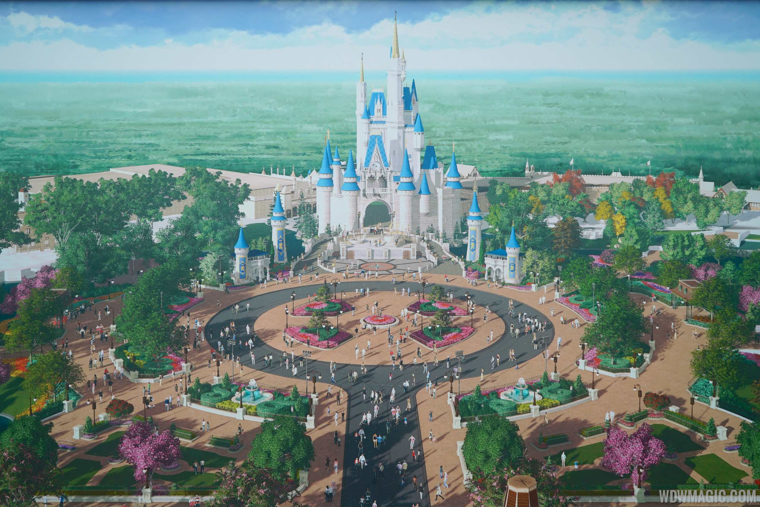
Cinderella Castle News
The Main Street U.S.A. hub redevelopment continues with work surrounding much of Cinderella Castle.
www.wdwmagic.com
gmajew
Premium Member
Ugh... Then this blue is going to stay to much....Here are the turrets when they were brand new
Cinderella Castle News
The Main Street U.S.A. hub redevelopment continues with work surrounding much of Cinderella Castle.www.wdwmagic.com
DisneyDreamer08
Well-Known Member
I think my issue is that the three colors don’t blend well together. The bright blue, pink and grey just don’t look good together. The pink and blue should have been softer to blend with the grey. And I know it could fade but who knows how long that will take.
tirian
Well-Known Member
Because it was designed to look best in its original color scheme.I tend to agree. I prefer the white color, but I'm not sure how much of that is that I prefer white and how much is because that's what color it's *nearly) always been.
")
There’s no doubt that the paint job from the ‘70s through ‘80s was too uniform and fake; the later brick details added some depth. But the overall scheme stayed consistent until the mid 2000s, when Iger decreed it should go a bit pinker to match the new WDP castle card for “Enchanted.” This latest paint job pushes the synergy even harder.
Tokyo’s latest update uses aging techniques to enhance the original scheme, and it looks better than ever before.
Otamin
Well-Known Member
It's less than ideal (and I'd rather have the original colours), but darker spires would've helped tremendously:

kevlightyear
Well-Known Member
It's less than ideal (and I'd rather have the original colours), but darker spires would've helped tremendously:
Yes!
MagicWDI
Well-Known Member
This looks much more like the concept and much better in my opinion. Wow, what a difference! It's amazing how a shade of blue can really make this much of a difference.It's less than ideal (and I'd rather have the original colours), but darker spires would've helped tremendously:
SpectroMan93
Well-Known Member
It's less than ideal (and I'd rather have the original colours), but darker spires would've helped tremendously:
I do like this a lot. And it’s much closer to the concept art and feels more dramatic. I wonder if the choice of a lighter blue on the turrets had something to do with potential difficulties having to use projections on a darker color
Notes from Neverland
Well-Known Member
I'd still prefer each castle around the world to have its own unique look and identity. Why have similar color schemes?
JoeCamel
Well-Known Member
They have something in the blue paint that really changes with the UV from sunlight. LIke DuPont Imron paint. Not a good effect IMO and should have been left out.This looks much more like the concept and much better in my opinion. Wow, what a difference! It's amazing how a shade of blue can really make this much of a difference.
tirian
Well-Known Member
That looks better! Lighten the top of the main tower as it ascends upwards, and this would look pretty good as a temporary paint job for a 50th anniversary celebration.It's less than ideal (and I'd rather have the original colours), but darker spires would've helped tremendously:
"Here is a sneak peek at the regal new look, which you might see our painters applying the final coats of paint and adding the finishing touches to if you’re planning to visit Magic Kingdom Park over the next several weeks:"
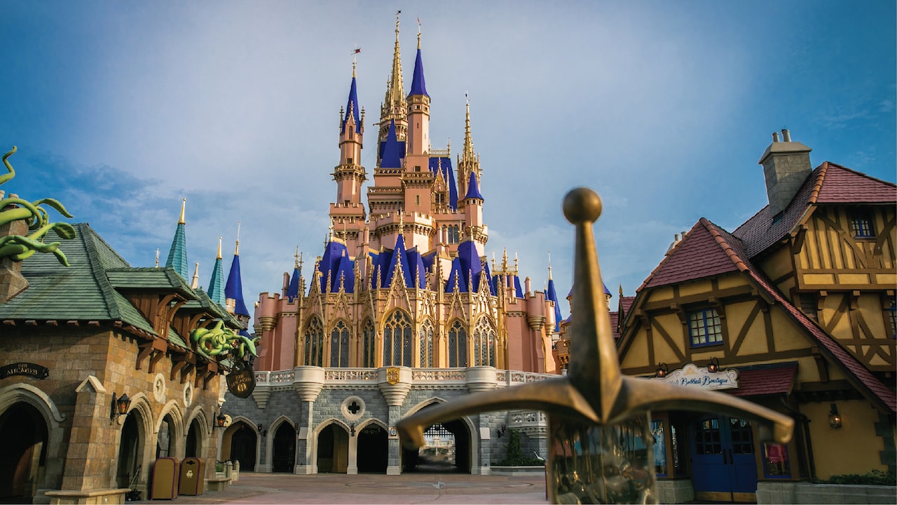
Cinderella Castle is Ready to Welcome You Back to Magic Kingdom Park
Just as we’ve missed you, I know many of you have missed visiting our parks and on your next visit there will be a lot of new things to notice.
disneyparks.disney.go.com
Giss Neric
Well-Known Member
Based on opening reports/castmember preview vlogs from different YouTubers, big and small, they all like the new castle. I haven't heard anyone dislike it and I don't think they are kissing Disney's behind.
MerlinTheGoat
Well-Known Member
- Disney social media/youtube vloggers
- Not kissing Disney's behind
Pick one.
- Not kissing Disney's behind
Pick one.
JoeCamel
Well-Known Member
They haveAre they going to paint the other blue roofs surrounding the castle too?
SpectroBro
Well-Known Member
- In the Parks
- Yes
The fantasyland rooftops were still the old shade of blue as of 7/7, and they look bad. They realllly need a coat of paint that matches now.Are they going to paint the other blue roofs surrounding the castle too?
Register on WDWMAGIC. This sidebar will go away, and you'll see fewer ads.