The Mine Train originally had some other scenes in it, as I've heard on this forum. But which scenes have been cut during the process? Not another mine scene I suppose?
-
Welcome to the WDWMAGIC.COM Forums!
Please take a look around, and feel free to sign up and join the community.
You are using an out of date browser. It may not display this or other websites correctly.
You should upgrade or use an alternative browser.
You should upgrade or use an alternative browser.
MK Original Seven Dwarfs Mine Train
- Thread starter HunnyHunter
- Start date
MerlinTheGoat
Well-Known Member
Here's an image including the original layout of the Mine Train compared to the cut versions that followed it (final layout is on the right)-
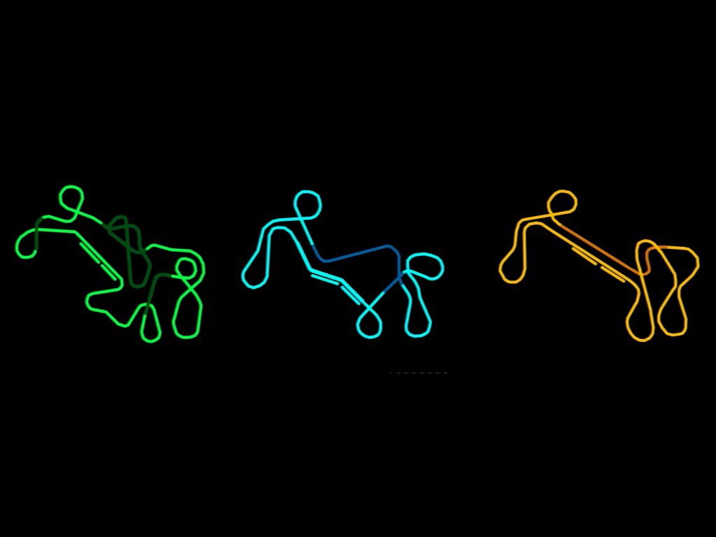
The darker green parts of the track are indoors, which have been stated (either by Lee or Martin, I forgot who first posted this) to contain extra show scenes. I'm assuming more mine scenes of some sort. Or perhaps something different, I guess extra scenes with the witch were possible too (one idea for this could be a subterranean lake with the witch in her boat like from the movie). Apparently the trains would again slow down in these scenes similar to the main big scene. You can also see that the main mine scene was going to be longer and the track was going to weave in and out of it.
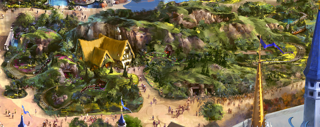
The early concept art of New Fantasyland also showed a small outside scene of a fallen tree with the Seven Dwarfs marching "home from work" along it. My guess is that the first track layout in the image above was to include this scene, it's far more similar to the original overhead concept art of the ride than the final budget cut version we received.

Last edited:
Mike S
Well-Known Member
Dang budget cuts. I remember seeing more close up concept art of the Dwarfs marching on the log but I can't find it anywhere.Here's an image including the original layout of the Mine Train compared to the cut versions that followed it (final layout is on the right)-

The darker green parts of the track are indoors, which have been stated (either by Lee or Martin, I forgot who first posted this) to contain extra show scenes. I'm assuming more mine scenes of some sort. Or perhaps something different, I guess extra scenes with the witch were possible too (one idea for this could be a subterranean lake with the witch in her boat like from the movie). Apparently the trains would again slow down in these scenes similar to the main big scene. You can also see that the main mine scene was going to be longer and the track was going to weave in and out of it.
The early concept art of New Fantasyland also showed a small outside scene of a fallen tree with the Seven Dwarfs marching "home from work" along it. My guess is that the first track layout in the image above was to include this scene, it's far more similar to the original overhead concept art of the ride than the final budget cut version we received.

Really, did you see those on the internet or at some convention or something? I am VERY curious to see more concept art for this ride!I remember seeing more close up concept art of the Dwarfs marching on a log but I can't find it anywhere.
Mike S
Well-Known Member
It was on the Internet but no matter what I search I can't find it. I know I've seen it though. Maybe it was in a video or something.Really, did you see those on the internet or at some convention or something? I am VERY curious to see more concept art for this ride!
jdmdisney99
Well-Known Member
Of course, there's always that "what could have been". I think a few more show scenes would have gone over well.
DinoInstitute
Well-Known Member
Completely agree. There's also the possibility that in maybe 15-20 years we will get a big refurbishment that extends the track and indoor scene, but who knows.Of course, there's always that "what could have been". I think a few more show scenes would have gone over well.
Even so, its still an amazing attraction, and well themed!
dstrawn9889
Well-Known Member
??? come on people, roller-coasters are gravity driven. you cannot 'extend' a coaster. sure, ok, when it is propelled like an omni indoors, possibly, but i ask you, when has ANY in place ride been extended or added to? i mean changing show scenes, yes, adding track? NYET.Completely agree. There's also the possibility that in maybe 15-20 years we will get a big refurbishment that extends the track and indoor scene, but who knows.
Even so, its still an amazing attraction, and well themed!
lazyboy97o
Well-Known Member
It is not too common, but roller coasters have been modified and extended. Steel Phantom at Kennywood was extended in late 2000-early 2001 when it became Phantom's Revenge.??? come on people, roller-coasters are gravity driven. you cannot 'extend' a coaster. sure, ok, when it is propelled like an omni indoors, possibly, but i ask you, when has ANY in place ride been extended or added to? i mean changing show scenes, yes, adding track? NYET.
jdmdisney99
Well-Known Member
??? come on people, roller-coasters are gravity driven. you cannot 'extend' a coaster. sure, ok, when it is propelled like an omni indoors, possibly, but i ask you, when has ANY in place ride been extended or added to? i mean changing show scenes, yes, adding track? NYET.
bhg469
Well-Known Member
Yup, Fantasy land got the mine train but we got the shaft.Here's an image including the original layout of the Mine Train compared to the cut versions that followed it (final layout is on the right)-

The darker green parts of the track are indoors, which have been stated (either by Lee or Martin, I forgot who first posted this) to contain extra show scenes. I'm assuming more mine scenes of some sort. Or perhaps something different, I guess extra scenes with the witch were possible too (one idea for this could be a subterranean lake with the witch in her boat like from the movie). Apparently the trains would again slow down in these scenes similar to the main big scene. You can also see that the main mine scene was going to be longer and the track was going to weave in and out of it.
The early concept art of New Fantasyland also showed a small outside scene of a fallen tree with the Seven Dwarfs marching "home from work" along it. My guess is that the first track layout in the image above was to include this scene, it's far more similar to the original overhead concept art of the ride than the final budget cut version we received.

All joking aside, a dark ride with elevation changes that would weave in and out of the mine would have been a huge hit too. That was never on the table but IMO, a longer ride without coaster section would have left less room for criticism.
Goofyernmost
Well-Known Member
Just for the sake of argument there is a huge difference between concept art and what was intended to be built. We are constantly shown those concept ideas and have them presented as this is what they were going to build and this is what we got. That is absolutely false. They never had any intention of building the bigger one, but, it was looked at as something to think about. They didn't spend anytime thinking about it and the design that they chose was the one we are riding. It wasn't a budget cut it was a what can we build for this much budget.
To put it in people perspective, it's like going to a grocery store with the ability to buy everything in the store, but only buying what you need.
To put it in people perspective, it's like going to a grocery store with the ability to buy everything in the store, but only buying what you need.
MerlinTheGoat
Well-Known Member
I believe @Lee and @marni1971 have both mentioned the green and blue layouts above were legit and at one point budgeted to be built. So it's kind of asinine to say they weren't thinking about design at that point.
I recently read some people claiming that the Mine Train was shortened because of the Shanghai version. I'm unsure whether this had any legitimacy, but it depends on which version was the "original" and which is the "clone" (design wise that is). If the claim is correct, it still can't have been a space issue at Shanghai that caused this alteration. All three of the proposed layouts were designed to fit within the same footprint. They just removed some of the additional turns, intersections and interior scenes. The question is not whether the budget was slashed, it was. The question is which version took precedence over the other and caused the budget cut to occur, those alterations would have carried over to the clone. Shanghai hasn't opened yet, but it's still possible it was the first version designed.
The green track layout is actually very similar in complexity to what can be seen from the track in the concept art. But besides that, the outside scenery is actually disappointing. Even within a smaller track layout, they could have added some better theming to the outside. It definitely feels like they simply ran out of money in some of these parts, or that the outside was designed by different people entirely. The interior queue and the Mine scene are great, but a lot of the outside scenery i'd say is plain and bland. It actually clashes with the quality of the interior as well as the rest of New Fantasyland's facades. And the night time lighting i'd even describe as outright incompetent...
lazyboy97o
Well-Known Member
No, we are not constantly shown concept art. Just because everything is called 'concept art' doesn't mean that is the phase during which the art was created. Lots of promotional materials are made on top of developed designs.Just for the sake of argument there is a huge difference between concept art and what was intended to be built. We are constantly shown those concept ideas and have them presented as this is what they were going to build and this is what we got. That is absolutely false. They never had any intention of building the bigger one, but, it was looked at as something to think about. They didn't spend anytime thinking about it and the design that they chose was the one we are riding. It wasn't a budget cut it was a what can we build for this much budget.
To put it in people perspective, it's like going to a grocery store with the ability to buy everything in the store, but only buying what you need.
Lee
Adventurer
The longer layouts above were not derived from any concept art. They come from design schematics for the attraction at earlier stages in its development. They were indeed "the plan" at least for a while.I believe @Lee and @marni1971 have both mentioned the green and blue layouts above were legit and at one point budgeted to be built. So it's kind of asinine to say they weren't thinking about design at that point.
I recently read some people claiming that the Mine Train was shortened because of the Shanghai version. I'm unsure whether this had any legitimacy, but it depends on which version was the "original" and which is the "clone" (design wise that is). If the claim is correct, it still can't have been a space issue at Shanghai that caused this alteration. All three of the proposed layouts were designed to fit within the same footprint. They just removed some of the additional turns, intersections and interior scenes. The question is not whether the budget was slashed, it was. The question is which version took precedence over the other and caused the budget cut to occur, those alterations would have carried over to the clone. Shanghai hasn't opened yet, but it's still possible it was the first version designed.
The green track layout is actually very similar in complexity to what can be seen from the track in the concept art. But besides that, the outside scenery is actually disappointing. Even within a smaller track layout, they could have added some better theming to the outside. It definitely feels like they simply ran out of money in some of these parts, or that the outside was designed by different people entirely. The interior queue and the Mine scene are great, but a lot of the outside scenery i'd say is plain and bland. It actually clashes with the quality of the interior as well as the rest of New Fantasyland's facades. And the night time lighting i'd even describe as outright incompetent...
As for the Shanghai question, I've heard slightly conflicting stories.
It appears that a mine train was always on the menu for Shanghai, most likely in one of the earlier layouts/designs.
After it was decided to revive the concept for MK, it went through the revisions that gave us the current design, which was then cloned for Shanghai. I would very much like to see the initial designs for Shanghai to be sure of that timeline, but alas....
Lee
Adventurer
This?Dang budget cuts. I remember seeing more close up concept art of the Dwarfs marching on the log but I can't find it anywhere.
Mike S
Well-Known Member
It was more of a close up like this and showed them going under the log with the dwarfs on top.
Maybe I imagined it.........
Goofyernmost
Well-Known Member
And your point would be? You're saying than many ideas are reviewed before the actual decision is made? So am I! Just because that picture has shown up on the internet does not in any way mean that it was ever seriously considered. In fact, the only thing that was positively, totally and completely considered is what we have. Nothing more, nothing less.No, we are not constantly shown concept art. Just because everything is called 'concept art' doesn't mean that is the phase during which the art was created. Lots of promotional materials are made on top of developed designs.
When I was in 8th grade I used to play baseball. In one game I found myself in the position to hit the winning run. I stood at the plate and envisioned the ball taking flight and clearing the left field fence bringing home the winning run plus one. I concentrated and zoned out of reality and when the pitch was thrown it was like it was in slow motion. I took a mighty swing and missed the damn thing completely for strike three and the loss. I did everything I could except actually hit the ball to make myself a hero. Not only did I miss the ball but it was in the catchers mitt before I even swung at it. The moral of the story is many attempts are made to hit that home run, but, in the end only one makes it. That drawing be it called concept art or a developable design took a swing and a miss. End of story!
Register on WDWMAGIC. This sidebar will go away, and you'll see fewer ads.
