Original Alice in Wonderland Ride

Clover Bailey

Well-Known Member
In the late seventies, all the plywood flats in the Fantasyland dark rides were repainted with additional detailing and shading in an attempt to make them look a little less "crude"; this can also be observed in Mr. Toad and Snow White on the same 1980 Fantasyland souvenir film. In the case of the swing-down Cheshire Cat, however, the repainting only resulted in the flat looking more generic, as originally it appeared more or less like a silhouette, with very pronounced eyes and teeth against a dark head and body.

This very mild overhaul of the dark ride interiors kind of coincided with the new designs applied to Fantasyland's tournament tent facades around the same time. I don't know if many people are very aware of this, but the original, pre-redesign Fantasyland actually spent its last five or six years with a less tacky, less garish appearance overall, with slightly more muted colors adorning the facade canopies and realistic heraldic symbols replacing many of the original stripes and geometric patterns.
Wow, it's so bizarre seeing a picture of old Fantasyland with it's medieval fair style while also being able to see Space Mountain in the background. Feels like they're from different eras, you know?

Also, was the giant cutout of the Mad Hatter pouring tea for the March Hare part of the late 70s repaint, or was that installed much earlier?
 

Okee68

Well-Known Member
Wow, it's so bizarre seeing a picture of old Fantasyland with it's medieval fair style while also being able to see Space Mountain in the background. Feels like they're from different eras, you know?

Also, was the giant cutout of the Mad Hatter pouring tea for the March Hare part of the late 70s repaint, or was that installed much earlier?
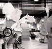
The original pop-up versions of the Hatter and Hare were replaced in 1961 to my knowledge, which was around the time the other three Fantasyland dark rides received light overhauls featuring improved effects and more scene details: Snow White in '59, Peter Pan in '60, and Toad in '61. This photo of the huge flats being assembled also shows an upended Toad car in the foreground with no safety bar or reflective headlight covers, and seeing as the motorcars received both of those things in 1961, then this picture must be dated to 1961 at the very latest. Therefore the latter versions of the Hatter and Hare flats were in fact installed in 1961, if not a little before.
 

Attachments

  • Mad Hatter and March Hare flats prior to being painted, 1961.jpg
    Mad Hatter and March Hare flats prior to being painted, 1961.jpg
    84.9 KB · Views: 145
Last edited:

Clover Bailey

Well-Known Member
Note also the cursedly happy caterpillar; the only thing he's missing is a double thumbs-up. There was actually another variant of this advertisement featuring on-model character designs, although I can't find it at the moment.

This just occurred to me, but how likely would you lads say it was that the first of the two Cheshire Cat flats was tilted forward slightly? Since it was situated above riders as opposed to being at eye level, I think it probably would have looked overly flat if it had been positioned totally upright. This is something I've noticed in the VR re-creation, where the Cheshire Cat definitely isn't set up at any sort of angle and looks very obviously like a wooden cutout as a result. Having him angled downward a little bit probably would have solved this, and I think this was likely the case in real life, as I have yet to see an actual photo in which the Cheshire Cat looks distinctly larger on bottom and smaller on top like he does in the VR version.

Is it possible that both of them were tilted? In the other known photo of the repainted Cheshire Cat, it's at a different angle but it doesn't look any flatter. If anything, I'd say this one in particular looks like it's leaning.

cheshire2.png
 

Animaniac93-98

Well-Known Member
In the late seventies, all the plywood flats in the Fantasyland dark rides were repainted with additional detailing and shading in an attempt to make them look a little less "crude"; this can also be observed in Mr. Toad and Snow White on the same 1980 Fantasyland souvenir film. In the case of the swing-down Cheshire Cat, however, the repainting only resulted in the flat looking more generic, as originally it appeared more or less like a silhouette, with very pronounced eyes and teeth against a dark head and body.

This very mild overhaul of the dark ride interiors kind of coincided with the new designs applied to Fantasyland's tournament tent facades around the same time. I don't know if many people are very aware of this, but the original, pre-redesign Fantasyland actually spent its last five or six years with a less tacky, less garish appearance overall, with slightly more muted colors adorning the facade canopies and realistic heraldic symbols replacing many of the original stripes and geometric patterns.

Likely influenced by the designs for WDW's Fantasyland. The Carousel canopy in particular:

1611110114123.png
 

Okee68

Well-Known Member
Is it possible that both of them were tilted? In the other known photo of the repainted Cheshire Cat, it's at a different angle but it doesn't look any flatter. If anything, I'd say this one in particular looks like it's leaning.

View attachment 525293
I have doubts that the smaller Cheshire Cat was ever tilted at an angle, as it was directly in front of guests' faces like most of the other flat characters and presumably didn't require any perspective trickery to prevent it from looking two-dimensional.
 

Clover Bailey

Well-Known Member
I have doubts that the smaller Cheshire Cat was ever tilted at an angle, as it was directly in front of guests' faces like most of the other flat characters and presumably didn't require any perspective trickery to prevent it from looking two-dimensional.
Oh no, I'm talking about the repaint of the large Cheshire Cat on top of the footstool
 

Okee68

Well-Known Member
Oh no, I'm talking about the repaint of the large Cheshire Cat on top of the footstool
If my theory of the flat having been tilted forward slightly is true, then I don't see why it would have been angled any differently after the repaint. I'm sure the prop was positioned the exact same way throughout its entire quarter-century existence.
 

Clover Bailey

Well-Known Member
So I mentioned a few days ago that I was interested in making some small replicas of props from the original Alice, and I'm thinking that I will probably do a miniature recreation of the Oversized Room.

I did a practice drawing of one of the Cheshire Cat flats, it's a bit rough but came out pretty good I think:
IMG_20210120_011020.jpg
 

Clover Bailey

Well-Known Member
So I have a few questions about the Oversized Room if I am to make a miniature replica of it:

1. Was the footstool you passed under a full circle, or like a weird semi-oval? It never seemed like the room could fit a prop that big if it was a full build.
2. 2nd Cheshire Cat would quickly swing down from the right, if I am correct?
3. Was there much space between the footstool and the doorknob? Most photos look like the footstool is near the back of the room, right before the keyhole door.
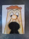
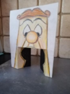
4. What exactly was the Doorknob? Was it a crash door, or a giant keyhole that you would pass through? I've also read somewhere that it was designed to look like the Doorknob with his mouth gruesomely stretched open, is this accurate?
 

Okee68

Well-Known Member
So I have a few questions about the Oversized Room if I am to make a miniature replica of it:

1. Was the footstool you passed under a full circle, or like a weird semi-oval? It never seemed like the room could fit a prop that big if it was a full build.
2. 2nd Cheshire Cat would quickly swing down from the right, if I am correct?
3. Was there much space between the footstool and the doorknob? Most photos look like the footstool is near the back of the room, right before the keyhole door.
4. What exactly was the Doorknob? Was it a crash door, or a giant keyhole that you would pass through? I've also read somewhere that it was designed to look like the Doorknob with his mouth gruesomely stretched open, is this accurate?
1. The footstool seems to have been a full circle, as it was situated in the center of the room and had just barely enough space to not cut into the walls. Also note that there was a black wall somewhere between the first Cheshire Cat and the doorknob, presumably built on top of the stool, which hid the upper half of the doorknob from sight until the footstool had been passed under.
2. Correct, and in the same fashion as an antique traffic signal.
3. Don Carson's virtual ride-through is accurate in that regard.
4. The doorknob's brass plate spanned the entirety of the Oversized Room's back wall, and therefore wasn't attached to any larger door. His keyhole mouth was painted within a set of rectangular crash doors just like what you see in the virtual replica, with almost the entire bottom half of the brass plate opening up similar to how the wall around the front door to the Dwarfs' cottage or Winky's Pub would crudely break away in the WDW versions of Snow White and Mr. Toad. You can actually faintly make out the division between the doors and the wall above them in this photo, right at the top of the black keyhole:
OG Alice.jpg

Also, the Alice article from Persistence of Vision (https://web.archive.org/web/20001217220700/http://www2.aros.net/~pov/issue03/rabbithole.html) notes that the doorknob "looked down" at riders, implying that he had eyes instead of just lifeless screws as he does in the virtual version.
 

Clover Bailey

Well-Known Member
1. The footstool seems to have been a full circle, as it was situated in the center of the room and had just barely enough space to not cut into the walls. Also note that there was a black wall somewhere between the first Cheshire Cat and the doorknob, presumably built on top of the stool, which hid the upper half of the doorknob from sight until the footstool had been passed under.
2. Correct, and in the same fashion as an antique traffic signal.
3. Don Carson's virtual ride-through is accurate in that regard.
4. The doorknob's brass plate spanned the entirety of the Oversized Room's back wall, and therefore wasn't attached to any larger door. His keyhole mouth was painted within a set of rectangular crash doors just like what you see in the virtual replica, with almost the entire bottom half of the brass plate opening up similar to how the wall around the front door to the Dwarfs' cottage or Winky's Pub would crudely break away in the WDW versions of Snow White and Mr. Toad. You can actually faintly make out the division between the doors and the wall above them in this photo, right at the top of the black keyhole:
View attachment 525698
Also, the Alice article from Persistence of Vision (https://web.archive.org/web/20001217220700/http://www2.aros.net/~pov/issue03/rabbithole.html) notes that the doorknob "looked down" at riders, implying that he had eyes instead of just lifeless screws as he does in the virtual version.
Thanks for the info. I was pretty confused in the virtual ride through why the Doorknob looked like that, so I was wondering "wait, in the original ride did the Doorknob literally have those uncanny dead eyed screws?".. though judging by the original Fantasyland dark rides I would not be surprised at all if that were the case.
 

Clover Bailey

Well-Known Member
1. The footstool seems to have been a full circle, as it was situated in the center of the room and had just barely enough space to not cut into the walls. Also note that there was a black wall somewhere between the first Cheshire Cat and the doorknob, presumably built on top of the stool, which hid the upper half of the doorknob from sight until the footstool had been passed under.
2. Correct, and in the same fashion as an antique traffic signal.
3. Don Carson's virtual ride-through is accurate in that regard.
4. The doorknob's brass plate spanned the entirety of the Oversized Room's back wall, and therefore wasn't attached to any larger door. His keyhole mouth was painted within a set of rectangular crash doors just like what you see in the virtual replica, with almost the entire bottom half of the brass plate opening up similar to how the wall around the front door to the Dwarfs' cottage or Winky's Pub would crudely break away in the WDW versions of Snow White and Mr. Toad. You can actually faintly make out the division between the doors and the wall above them in this photo, right at the top of the black keyhole:
View attachment 525698
Also, the Alice article from Persistence of Vision (https://web.archive.org/web/20001217220700/http://www2.aros.net/~pov/issue03/rabbithole.html) notes that the doorknob "looked down" at riders, implying that he had eyes instead of just lifeless screws as he does in the virtual version.

And the Doorknob is yellow/gold? Just making sure because the photo makes it look blue.
 

Clover Bailey

Well-Known Member
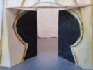
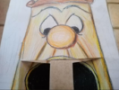
So I put together a paper cutout of the Doorknob crash door scene. Because there's no known photos of the full prop I mainly went off of the character's design in the film. I'd love some feedback, especially from those who got the chance to ride it!
 

Attachments

  • Doorknob1.PNG
    Doorknob1.PNG
    274.9 KB · Views: 153
  • Capture.PNG
    Capture.PNG
    280.2 KB · Views: 135
  • Capture2.PNG
    Capture2.PNG
    466.2 KB · Views: 126
  • Capture3.PNG
    Capture3.PNG
    542 KB · Views: 160

Register on WDWMAGIC. This sidebar will go away, and you'll see fewer ads.

Back
Top Bottom