One Sentence Competition: The Prism of SYWTBAI - Game End

AceAstro

Well-Known Member
Tomorrowland DAYTONA Speedway

1714015186137.png


In a constant effort to update and adapt Tomorrowland, the Tomorrowland Speedway receives a new update, and sponsorship with Daytona. Of course, the Speedway previously has had a sponsorship with the Indy 500 (and a complete layover), so why not do the Daytona 500, which is only a hour drive away. While the ride remains untouched, the entire façade and queue of the attraction gets re-worked, including the Daytona tunnels (a tunnel for standby and a tunnel for lightning lane) as well as the rest of the queue turning into a more history/ quick timeline of the Daytona 500, instead of a standard, non-themed switchback queue.

Bonus:
Throughout the queue we bring back this absolute earworm of a song from the game to just jam out to in the queue line


Outbound

Well-Known Member
THE CAROUSEL OF PROGRESS PRESENTS
A "FUTURAMA"


1714015070579.png


Walt Disney's Carousel of Progress has long deserved an upgrade, especially in how the attraction presents itself to everyday guest -- so, rather than an empty and underwheming revolving door outside, the theater is instead anchored to an abstract & radical Bahaus-esque facade, bearing signs for a WORLD's FAIR & NEW AMERICANA. -

Stepping into the past, the short queue / walkthrough loosely adapts another (older) famed vision of the future -- the 1939 "Futurama" exhibit by General Motors, that imagined a future 20 years forward (to the far-off 1960s) where hyper-urbanization, interstate highways, and mass suburbanization became reality -- to us a fact of life, to the people exploring this exhibit for the first time, as radical as any Space Mountain in Tomorrowland.

Walking overhead animated miniature of cars, boats, and trains navigating this brave new world excitedly, this brief edutaintment provides context and some audio-description into the world & perspective of Walt Disney circa 1964 & the Carousel of Progress, which draws upon the same recurring waves of time and curiosity wondering how tomorrow can become a better place.

MUSIC


In the background, Moonlight Serenade, a popular song from this period, plays optimistically.​
 
Last edited:

Architectural Guinea Pig

Well-Known Member
Original Poster
In the Parks
No
1714027323250.png

Big Thunder Mountain Queue Revitalization - @Lord Fozzinator
I love this idea! The idea of a rainbow cavern, nostalgic towards the original attraction in Disneyland, gives off this excellent vibe and setting before guests head on the actual ride itself. It’s not just cool- it’s cooler than the hot Magic Kingdom heat, which just sounds so awesome because not only can people get to explore “caves” but they also get some nice AC. The only thing that feels off is how realistic your pitch is sizing because I find it hard to be able to fit such a unique addition literally inside the mountain (35%). Is there realistically enough space?

+0.5 Bonus - Where’s the actual western music?


Jungle Cruise Queue Revamp - @Brer Panther
Nice and simple pitch! I understand your frustrations with the current queue layout, and Jungle Cruise’s queue honestly needs to be better. Even a simple rearrangement of the queue layout as said would make it feel so much shorter and make everyone less impatient. I also seriously need some chairs - maybe some scattered boxes perhaps.


Cannibal - @Disney-Universal Fanboy
Wow you took this prompt and made magic with it! I love how you thought outside of the Disney/Universal bubble (as a Disney Universal Fanboy nonetheless) with the great Cannibal Coaster. There’s a great story being created for this queue that sets up the coaster (I don’t know what it’s like, so creating a background with a cool story is nice). How exactly do guests “defeat” the fireballs in a race? It would have been nice to also explain the tower too in the story but great work overall, especially regarding your ability to think outside the box!

+1 - Zipp-a-dee


REVAMPED QUEUE Magic Carpets of Alladin - @imagineer97
I think so far, this pitch has surprised me the most (also want to add that your pitch ideas are incredibly, consistently awesome). I mean CMON this has such a beautiful Dumbo energy- a wildly fun queue that is fitted in with detail, love, and dedication that people go on the ride for the queue over the experience itself. I love your realism in comparing elements with actual existing items at the Disney Parks, like the Emporium Windows. The only problem I have with this is WHY IS IT ENCLOSED? While I appreciate the screens and such, I just feel like the ride needs to be that kinetic element Adventureland/Animation Studios (or whatever, not sure which carpets you’re going for)…

+1 Bonus - never watched that movie before


Batman the Ride - @Disney Warrior
Just like Cannibal’s new queue by Fanboy, I always love the incorporation of a great queue for an otherwise barebones rollercoaster. It adds the feeling of making it a “sensation coaster”, where you start with a story and then soar in the feeling of flying… like Batman (or whatever). The idea of going through Wayne Manor and then into the Batcave sounds so fun that it again makes going on the ride so very worth it. A perfect beginning and end! And the Joker laugh addition… OMG

+1 Bonus - Beautiful score.

I'm SO sorry if I haven't gotten to your reviews yet tonight. I had a long day and it's super late so I don't have the capacity to write more reviews. I'll try to finish them tomorrow morning and have the results by noon. The prompt will be released at midnight WDW time the same day!
 
Cannibal - @Disney-Universal Fanboy
Wow you took this prompt and made magic with it! I love how you thought outside of the Disney/Universal bubble (as a Disney Universal Fanboy nonetheless) with the great Cannibal Coaster. There’s a great story being created for this queue that sets up the coaster (I don’t know what it’s like, so creating a background with a cool story is nice). How exactly do guests “defeat” the fireballs in a race? It would have been nice to also explain the tower too in the story but great work overall, especially regarding your ability to think outside the box!

+1 - Zipp-a-dee
You said just the queue but here’s how it would work: The tower was created by the tribe seen in the queue and the fireballs awakened from the queue and haunt the coaster until someone beats them in a race. We defeat them at the end where the final cave is replaced with a waterfal above us and the fireballs get put out by it. I would also put some temple ruins in the coaster section. Also visit Lagoon when you have some time @Architectural Guinea Pig it has 11 roller coasters including this one.
 

Disgruntled Walt

Well-Known Member
In the Parks
No
The only problem I have with this is WHY IS IT ENCLOSED?
At the end of the day, it's a carnival ride in a highly themed environment. It's always bugged me that in Adventureland, you're in this immersive place and then there's suddenly a carnival ride in front of you. I wanted to hide it from view, but I get the kinetic energy aspect as well.
 

Architectural Guinea Pig

Well-Known Member
Original Poster
In the Parks
No
Please be patient...they'll be coming
They will! The prompt is set to be released at midnight today along with the reviews (I already decided on a winner and they have already made their decision).
1714191086457.png


It’s a small world - @WaltWiz1901
This is a very interesting pitch that you shared in the competition World in MK probably has the ugliest facade in fantasyland, in terms of the fantasy tent exterior that is so dated- it’s awfully weird that Disney did a New Fantasyland refurbish without touching those ugly tents! The Blair-esque clock tower design being able to see the light as you described sounds interesting, but it kind of ruins the view from the Pinnochio restaurant. At least there’s some kind of fixing to the exterior/queue!

+1 Bonus 1 hour straight of music :eek:


Queue Revamp (Eagle Flyer) - @Miru

Great pitch- but some images to show what eagle flyer even is would be a nice addition, because I literally don’t know what it looks like before I had some good old research (yet I still can’t find it on the internet, is the name correct?) Anyways, revamping the queue to making it a colonial house is a nice and simple touch with a good bit of partriotics. I can hear those gun (coaster sounds) and eagle screeches from far away… Overall your pitch sounds very worthy to the surrounding theming an I like it.


Pirates of the Carribean - @montydysquith-navarro
WOW! My initial reaction was just plain dumbfounding on how you chose the perfect ride that clearly needed a queue, and then gone forth with such an immaculate and realistic pitch for it. I waited more an hour once in POTC in the baking hot summer sun, and it was one of my least favorite experiences for a park that usually wins in terms of shade. Not only did you smartly move 21 royal, the idea of going up the stairs into the ransacked rooms creates such an element of background storytelling and scene-setting that the ride mostly lacks before guests actually go onto the ride. Every detail you put in your pitch is superbly realistic, and I am so ready to partake on another swashbuckling adventure.

+1 Bonus - Yo HO HO


Triceratops Spin - @Disney Dad 3000

Ooh this is an interesting one. Triceratops Spin is for sure that one ride that nobody goes to, just because how lackluster both the queue and the experience is. Your redirected to a more forest-oriented setting contains lush foliage that the area seriously needs, which is a great move and decision to make. If all the such theming and rockwork is plussed though, will the actual ride receive major changes? It would be funny to see an ugly dino carnival spinner in the middle of nowhere :D

+1 Bonus - Yikes


Flynn’s Arcade - @Solaris Knight

Hmmm… tron already in my opinion has a really cool queue. How far away is Flynn’s Arcade from the actual ride itself? I keep feeling it’s tucked in Tomorrowland, which would make it hard for a queue to stretch all the way to the existing one. Nice and simple write up (loving the play games while you wait experience), nice work!

+1 Bonus I like me a good 80’s tune
 
Last edited:

Architectural Guinea Pig

Well-Known Member
Original Poster
In the Parks
No
Last time it was WDW time, so unless the Guinea Pig is feeling tricksy, I'll bet it's the same.
Spoiler alert its CA time because I'm a procrastinatory host like that haha lol lmao 😭

1714190843273.png

Rock’n Rollercoaster - @OSUPhantom
A surprise to be sure- but a welcome one! Rock’n roller coaster is one of those must-dos at the parks that need a queue redo. I love your idea of painting the story towards a Hollywood Museum of Rock, which will probably allow the ride to finally be integrated well and properly into the park in a subtle manner. Basically, if Mother Q and Father Hard Rock Cafe had a kid- chemistry!

+1 Bonus - Serious GOTG vibes (I loved listening to this while I was typing reviews)


Peter Pan’s Flight - @Evilgidgit
Before I even looked at your prompt, I was shocked by how beautiful the concept art you shared with us was. It perfectly emanates the Fantasyland feel and it should have gone to MK along with New Fantasyland. I’m a bit surprised that the ride is getting another queue revamp as you described in your pitch as the current queue is already very on point with theming and cute. But the idea of a Georgian London labyrinth is A+, because it sets up a dark yet warm setting before hopping aboard the ride. The facade upgrades are also great, finally giving the land status to equal Disneyland. Paired with Waltwiz’s Small World update, this is the Fantasyland I want and need!

+1 Bonus - Starry


Space Mt Revamp - @Rock Wren
An innovative new queue packed with learning opportunities and optimistic “gazing” into the future? Sign me up! With Tron entering the competition, Space Mountain receiving a way to be able to be on par with it and keep up with wait times is perfect, and the queue you pitch is something to behold. The little detail of dynamic screens that feature information about the telescope is such a nice touch, and I would pause, and let other people walk in front of me, to read what they say. I loved your pitch from front to back, nice job!

+1 Bonus - SO CULTURED WITH THE SINFONIE ORCHESTRA CLASSICAL MUSIC


Soarin’ Historic Airport Queue at Epcot - @ThemeParkPriest
Your pitch is great - a true understanding of how Epcot was more about celebrating innovation that would lead to the future, as shown with the Pan Am airport. What makes me nervous about it though is that Soarin’ is literally in the LAND pavilion, and having an industrial airport theme with nods to airplanes, some of the very villains of carbon emissions, would not paint a good message for both Soarin’ and the Land pavilion. But there’s no denying that the architecture of the airport fits that retro-futuristic Epcot feel, and I still adore it!

+1 Bonus - Flying Higher


Haunted Mansion (Extra Extra Dead!) - @Tony the Tigger
WOAH - I thought Haunted Mansion’s queue was already good, but I was surprised that you made it even better! My favorite part about your pitch is the idea of the Doom Buggy’s clear top- it sounds like a ghostly “shield” of a sort, and the idea of it doubling as a screen for special effects is just so Disney and so… innovative that it feels incredibly magical, kicking up Haunted Mansion as the best version of the rides in all the parts and keeping its place there. Overall while the actual changes the to the queue weren’t much, your ideas for the ride were so great- :D

+1 Bonus - Scawy


Daytona Speedway - @AceAstro
New sponsor! Again! Why is the speedway still a thing??? Anyways, Daytona Speedway is a perfect way for the corporate and capitalist House of Mouse to get money, and whether this was your intention, I don’t know, but the idea of letting people know all about Daytona, Daytona everything just seems like such an Iger/Eisner/Chapek move that I’m surprised that haven’t done anything yet. The Daytona tunnels sound really fun though, and so do all the signs that talk about the company and all its success/vroom vroom competitions.

+1 Bonus - WTH-


Carousel of Progress Present a “Futurama” - @Outbound
Oh my gawds your pitch is delicious, which sounds super wrong coming from the Guinea Pig but everything that you’ve done here is so powerful, so charmant Disney Imagineering- The tone of your pitch is historical, beautiful, and most importantly optimistic. With how detailed and must-do CoP already is, having this bonus queue is a double punch in the feels. This “Futurama” tone hoping for a future in the 1960s is both ironic and poetic, and with the Bahaus-esque facade paired with the little miniature animated cars and such, the nostalgic tone of your prompt has me deciding how much money I’m going to invest into this to make it a reality.

+1 Bonus - In Tears.


BONUS REVIEWS (PROMPT 1)

Tinseltown Social-ville - @Tony the Tigger

I loved the charming and nostalgic name to your land- until I read your pitch! Are we back into the 2024 Superstar Limo or something? Tiktok ticks me off, seriously? Bad jokes aside, this pitch is bad. Jokes aside, this seems a bit too realistic as something Disney would actually do to milk out the money from guests in the parks. Is there a paywall behind the gold carts and the dark ride?

Hercules Land - @ThemeParkPriest
Hercules! What an adventure for Adventure World. The fantastical theming of your land is perfect for the families, with a delightful assortment of rides. Overall, a great replacement! Hercules is in dire need of a good land, and you just made it.​
 
Last edited:

Architectural Guinea Pig

Well-Known Member
Original Poster
In the Parks
No
IMG_3544.jpeg


IMG_3545.jpeg


Magic Carpets of Alladin by @imagineer97

Honorable Mention goes to someone whose project excelled in one field, but did not quite make the cut for a medal for whatever reason. I loved the queue a lot, but what detracted from the pitch was the enclosed ride (even if it wasn't part of the prompt)


IMG_3546.jpeg


BATMAN the ride by @Disney Warrior


This prompt not only headed out of the realm of Disney/Universal, it had a cohesive and realistic queue that seems like a joy to walk through.

IMG_3547.jpeg


"Futurama" by @Outbound

Another 2nd place in the bag! Outbound's creativity and originality shined when it came to this nostalgic queue for a nostalgic attraction.


IMG_3549.jpeg

POTC Revamp by @montydysquith-navarro

A perfect fix to a perfect ride that needed a better queue. Beautiful theming, air conditioning, a set story leading to the ride- what more could you want?


as the winner of SPECTRUM 2 @montydysquith-navarro chose the prompt for the next spectrum. Again, thank you everyone for participating!

 
Last edited:

Architectural Guinea Pig

Well-Known Member
Original Poster
In the Parks
No

IMG_3551.png
Animatronic Advances

Welcome back to the third spectrum of the One Sentence Competition: Prisms of Light!

-The Set Up-
The worthy 1st placer @montydysquith-navarro , upon careful consideration, shined his beam of light on the next prism. Well that's weird- the light is landing on existing rides. The light whispers...

Ani...
Anime?
Anima...
Animation?
Animatron...
Animatronic!

Huh.

What Is Disney Audio-Animatronics Technology?
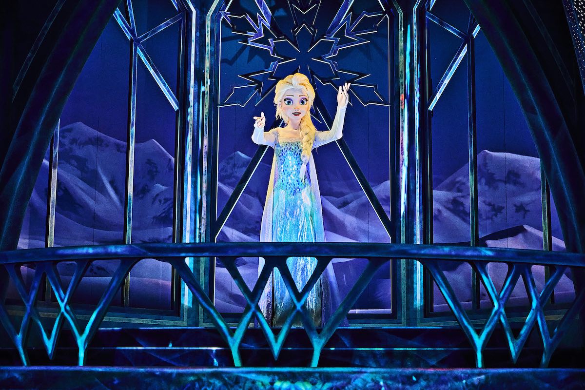
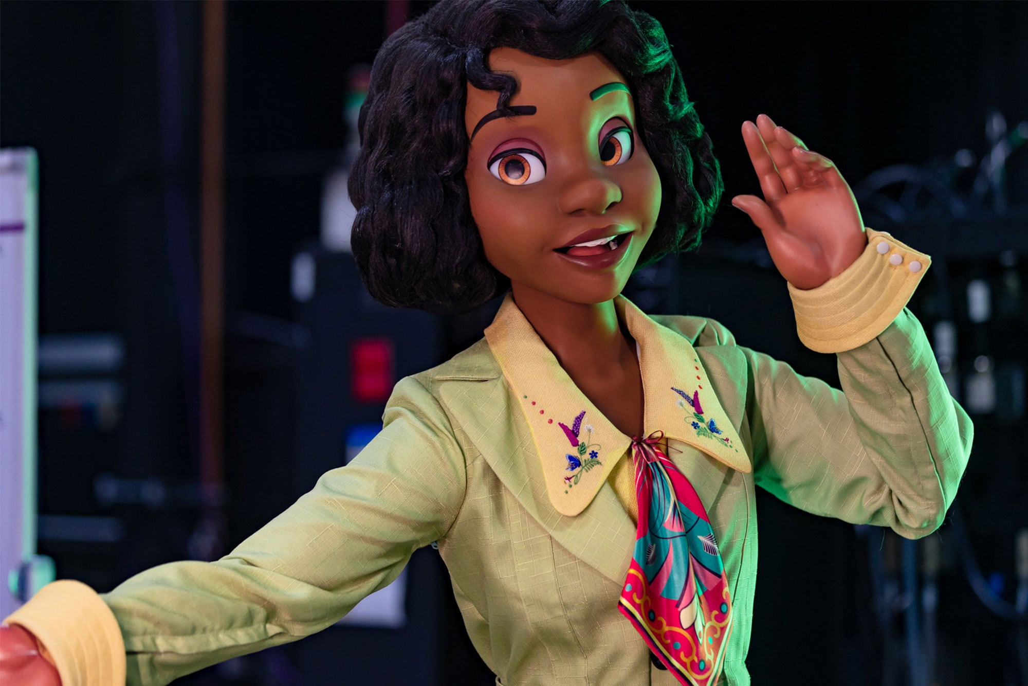
Disney announces opening for Tiana's Bayou Adventure at Walt Disney World  and a first look at new animatronics


Powerful animatronics exist on Disney's latest and greatest new rides, but not in the old ones. It seems like the light wants you to update these old rides by giving them something new... like the Hatbox Ghost (but don't do that, MK already did that badly)!

-Challenge-
Design a new A-1000 animatronic for ANY existing Disney/Universal ride of your choice.

-Rules-
  • Any ride around the world is allowed- but it should take up about the same space as before.​
  • You may use between 1 to 3 sentences and up to 1 image.
  • No AI generated artwork, writing, or assistance in the brainstorming process is allowed​

-Deadline-
This project is due on Monday, April 29th at 11:59 PM WDW Time
(8:59 PM Disneyland Time)

-Tips-
K.I.S.S. – Keep it simple, silly. Try not to complicate or overthink things too much. It’s a simple, casual competition – there are no eliminations. Propose as you please, let your imagination soar!

-Judging Criteria-
Is it creative?
Is it (generally) realistic?
Does it fit thematically/visually?


BONUS: Font Fanatics
Everyone loves a good font. Fancy up your text by changing the font in line with your ride's theming (or your preference). Good luck!

 
Last edited:

IncrediCoaster!

IMG_0407.jpeg

Not gonna lie, Pixar Pier is one of my favorite lands in Disneyland even if it ruins the California them, and the IncrediCoaster was a great retheme that brought story to the coaster, but we got FIGURINES instead of ANIMATRONICS. To fix this, I will only bring sight movement to the figurines, like Dashs legs moving in the first tunnel, Elastigirl stretching and Mr. Incredible moving his arm with the cookie in it in the second tunnel, and having Edna cuddle Jack-Jack in the final scene. Nothing could really be done with the first scene on the ride and the last tunnel is too chaotic to put something in.

Bonus: The title is supposed to feel “Metro” so I used the font “Verada.”
 
Last edited:

Brer Panther

Well-Known Member
-Challenge-
Design a new A-1000 animatronic for ANY existing Disney/Universal ride of your choice.
The Cat in the Hat
1714140415800.png
Let's be honest, the Cat in the Hat animatronics in the Universal dark ride based on the story are kind of creepy-looking. Some updated animatronics - for the Cat, at least - would do wonders. But since we're only allowed to put in ONE, let's take the animatronic of the Cat balancing (as shown in the photo) and make it one of them fancy new A-1000 animatronics - he now moves his mouth, blinks, and struggles to keep his balance as he holds up the fish, the books, the cup, the cake, the rake, the toy ship, etc.
 

Disgruntled Walt

Well-Known Member
In the Parks
No
Big Thunder Mountain Railroad
1714139559473.png

Big Thunder Mountain finally gets its own star of the show: the Mountain Man narrator has been added to the first lift-hill (in all BTMs worldwide)! As you climb through the cavern, the enigmatic Mountain Man climbs in a mine cart parallel to your own and warns you against greedily stealing the mountain's gold, for Big Thunder is cursed! He cackles and then mysteriously vanishes into the darkness of the cavern...(the animatronic and the cart it's on reset for the next train)

BONUS: This is the most Western-looking font I could find.
 

Register on WDWMAGIC. This sidebar will go away, and you'll see fewer ads.

Back
Top Bottom