Next Gen Busses

Cmdr_Crimson

Well-Known Member
Can we just be greatful they didn't use the new designs on the busses and just used them on the Gondolas...
tumblr_inline_morjlcSnP41qz4rgp.jpg


Frankly riding on a bus with a creepy Goofy head just doesn't feel right..
26ee861fa3814dc7a51797daf67d0eff.jpg
 

Missing20K

Well-Known Member
Um...I do have a more informed opinion. Over 20 years of training and experience in designing everything from small marketing materials to 8-foot tall 3-dimensional, interior lit letters and banners that cover the entire sides of buildings - and that includes vehicle graphics and wraps. Forgive me if I chose to use a visual example.

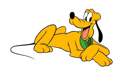
At a quick glance, the Pluto bus WILL look like a school bus to anyone who is or has a child (Edit: in the US) - which is one of Disney's big target demographics. The green stripe actually contributes to this problem because often, schools will use that area of the bus for a different color stripe to help the name of the school stand out. And where vehicles are very often moving, a quick look is all many people will get. Disney is an entertainment company, and Walt Disney World a vacation destination - with the aim of helping us to escape reality for the time we are there. A bus that brings to mind a school bus breaks that illusion - even if for only for a moment. The last thing a mother on vacation with her kids wants to think about is having to go home and get the kids ready for school. It's along the same reasoning as to why people avoid using large quantities of yellow and red in their marketing - because it almost immediately brings to mind McDonald's. Brand recognition can work both for and against you - in the case of the Pluto bus, it works against Disney.

Further, the fact that the white stripe that is above the green doesn't follow through across at least a couple of portions of the bus looks unfinished and unprofessional.

While we can tell that these buses belong to Disney, the lack of text and visual carry-through could make some guests think that these are "special" buses - similar to the Minnie Vans - rather than regular Disney on-property transport. People who are on vacation - especially in a place as busy and distracting as Disney World - don't tend to be good at reading or looking for signage. I think chances are very slim that many will think to look at the front of the buses to determine whether they are regular Disney transportation or not.

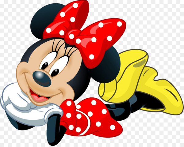
Another issue is that it's not a good idea to have a fleet of vehicles without some sort of prominent visual element that carries through. One of the biggest tenets in outdoor/vehicle advertising is that the message needs to be understood quickly and without much thought. If you look at the picture quoted below, the only two buses that are instantly recognizable as Disney buses are Donald and Micky. The rest could literally be buses from any other company. If you take the time to look closely - which most people don't - you can spot a smidge of Pluto and part of Goofy's hat, but that's pretty much it.


Without any common elements, the wraps make it look like they ordered some buses, then realized that they needed to put graphics on them, but couldn't settle on a design - or even worse, had a different person design each wrap. They look like an afterthought. In contrast to these buses, the Skyliner cars may be of varying colors and have different characters, but they all have the same white stripe and logo on them, plus all the characters were designed to look as if they're RIDING the Skyliner, rather than just being slapped onto them. The Skyliner proves that Disney is perfectly capable of having elements follow through differing designs and color schemes. These buses fail in that regard.

In order to achieve what they did with the Skyliner, they should have either used a logo that carried through or used one main color for the buses themselves, and then used the stripes to reflect each character's color, rather than the entire bus. The way they are, the fleet looks like a disjointed mess, and certainly doesn't reflect the world class reputation of Disney that they themselves seem to want so much to bank on these days.
giphy.gif
 

Tony the Tigger

Well-Known Member
The green stripe actually contributes to this problem because often, schools will use that area of the bus for a different color stripe to help the name of the school stand out. And where vehicles are very often moving, a quick look is all many people will get.

Thanks for your thoughtful reply!

Re: the green stripe: once they boxed themselves in to making the bottom part of the bus match the character’s colors, there weren’t many options with Pluto. His collar is green, his secondary features are black. To me, within those guidelines, the green stripe represents his collar.

I look at that bus and see a big, fun Pluto head, not a school bus. Other opinions may differ.

The white stripes stop at the doors, not randomly. I’m fine with that.

And you’re right that they’re often moving and seen quickly, IMO one large image makes more of an impact than a “scene.”

similar to the Minnie Vans

They are. My first thought when I saw the Minnie one was that it matches the Minnie Van, and folks who can’t/won’t pay for the Minnie Van can say, “Hey, we rode the Minnie bus!”

I think chances are very slim that many will think to look at the front of the buses to determine whether they are regular Disney transportation or not.

Here I have to disagree. These buses will be at all the bus stops where other buses are/have been. And the first thing everybody does is read the words that tell you where it’s heading. If you’re a repeat guest, you’ll “get it” on day one. If you’re a new one, you’ll have no preconceived notions.

plus all the characters were designed to look as if they're RIDING the Skyliner,

But there are already other buses with characters like that - so here is a case where it actually might get confusing!
 
Last edited:

ImperfectPixie

Well-Known Member
Thanks for your thoughtful reply!

Re: the green stripe: once they boxed themselves in to making the bottom part of the bus match the character’s colors, there weren’t many options with Pluto. His collar is green, his secondary features are black. To me, within those guidelines, the green stripe represents his collar.

I look at that bus and see a big, fun Pluto head, not a school bus. Other opinions may differ.

The white stripes stop at the doors, not randomly. I’m fine with that.

And you’re right that they’re often moving and seen quickly, IMO one large image makes more of an impact than a “scene.”


They are. My first thought when I saw the Minnie one was that it matches the Minnie Van, and folks who can’t/won’t pay for the Minnie Van can say, “Hey, we rode the Minnie bus!”


Here I have to disagree. These buses will be at all the bus stops where other buses are/have been. And the first thing everybody does is read the words that tell you where it’s heading. If you’re a repeat guest, you’ll “get it” on day one. If you’re a new one, you’ll have no preconceived notions.


But there are already other buses with characters like that - so here is a case where it actually might get confusing!
Nitpicking, but the white stripe doesn't carry around the front of the bus either. And what's odd is that on the Daisy bus, the smaller stripe (can't remember the color, but it's basically in the same spot as the white on Goofy) seems to continue all the way around. I have far less confidence in guests reading signage, lol...if you've ever seen an average human try to navigate a hospital that has decent signage, you'd see what I'm talking about. You can have arrows and icons, and even color-code overhead signage with stripes on the floor and people will still have no idea where they need to go.
 

Missing20K

Well-Known Member
The more I see them, the more I'm confused as to why they felt the need to crop the head artwork at the top and bottom.

Sorry for those that like them, you're more than welcome to, but for me, these look like they were done by a first year graphic design student. And I would venture that most graphic design profs would tear this apart during a crit.
 

FigmentFan82

Well-Known Member
The more I see them, the more I'm confused as to why they felt the need to crop the head artwork at the top and bottom.

Sorry for those that like them, you're more than welcome to, but for me, these look like they were done by a first year graphic design student. And I would venture that most graphic design profs would tear this apart during a crit.
Well it's certainly nothing new for them...
https://www.travelingmom.com/wp-content/uploads/2017/05/Complete-Guide-to-Disney-Transportation-Shuttle-Bus.jpg
 

Cmdr_Crimson

Well-Known Member
The more I see them, the more I'm confused as to why they felt the need to crop the head artwork at the top and bottom.

Sorry for those that like them, you're more than welcome to, but for me, these look like they were done by a first year graphic design student. And I would venture that most graphic design profs would tear this apart during a crit.

Would have been better having them laying down...
th
550e9a4b33396f2de8b497a77217ad94.jpg

th
140722985_1924633_dog.jpg

daisy_duck_laying_down_poster-r095c0be54c2b401db84055878d440626_fe74b_8byvr_540.jpg
5747117591101440.jpg
 

Janir

Well-Known Member
Nitpicking, but the white stripe doesn't carry around the front of the bus either. And what's odd is that on the Daisy bus, the smaller stripe (can't remember the color, but it's basically in the same spot as the white on Goofy) seems to continue all the way around. I have far less confidence in guests reading signage, lol...if you've ever seen an average human try to navigate a hospital that has decent signage, you'd see what I'm talking about. You can have arrows and icons, and even color-code overhead signage with stripes on the floor and people will still have no idea where they need to go.
If the guest don't read the signage on the bus, then they'll miss the bus, and that will just make more room for the rest of us trying to catch that bus to go back to our resorts after fireworks.
 

Goofyernmost

Well-Known Member
That is completely untrue. The stripes are either solid-color vinyl or printed, and the faces are definitely printed. Repairing the wraps is as easy as selecting the proper color or printing the graphics you need to replace. The most difficult part would be repairing any body damage, which they'd have to do regardless of what graphics are present.
Easy huh? There is a lot more to it then that. They haven't even been able to keep the Monorails looking like new and they don't usually run into anything or be run into. Yes, the are wrap graphics, but, if a minor accident happens they aren't going to wait for a matching section to be made up, shipped and applied. They have a choice of either leaving that damage there and operating the bus until a new one arrives or matching paint and touching it up. Obviously, if there is major damage and they have to replace an entire panel or two, then that wouldn't work. Either way, it is major expense and man power to put them back to being presentable again. The Gondola are not liable to hit anything except the occasional drunken bird.
 

Tony the Tigger

Well-Known Member
You can have arrows and icons, and even color-code overhead signage with stripes on the floor and people will still have no idea where they need to go.

Generally speaking, I don't disagree with that. But in the specific context of people waiting at the Epcot bus stop for the bus to the All Stars in the specific section where that bus will come, they're not going to get on the wrong bus because Pluto is on it LOL.
 

ImperfectPixie

Well-Known Member
Generally speaking, I don't disagree with that. But in the specific context of people waiting at the Epcot bus stop for the bus to the All Stars in the specific section where that bus will come, they're not going to get on the wrong bus because Pluto is on it LOL.
Maybe not...but I've seen plenty wandering around wondering where they needed to go to find the bus they wanted. I think the lack of consistency is going to make it worse.
 

Janir

Well-Known Member
Easy huh? There is a lot more to it then that. They haven't even been able to keep the Monorails looking like new and they don't usually run into anything or be run into. Yes, the are wrap graphics, but, if a minor accident happens they aren't going to wait for a matching section to be made up, shipped and applied. They have a choice of either leaving that damage there and operating the bus until a new one arrives or matching paint and touching it up. Obviously, if there is major damage and they have to replace an entire panel or two, then that wouldn't work. Either way, it is major expense and man power to put them back to being presentable again. The Gondola are not liable to hit anything except the occasional drunken bird.
Wraps, even at that size are fairly cheap and easy to put on and replace as needed. There's a reason most racing teams ( car and motorcycle) use them, it's easy to keep in stock, relatively easy and quicker to apply than a custom paint job. And they are rather durable to small road debris. More so than paint generally is.
 

Register on WDWMAGIC. This sidebar will go away, and you'll see fewer ads.

Back
Top Bottom