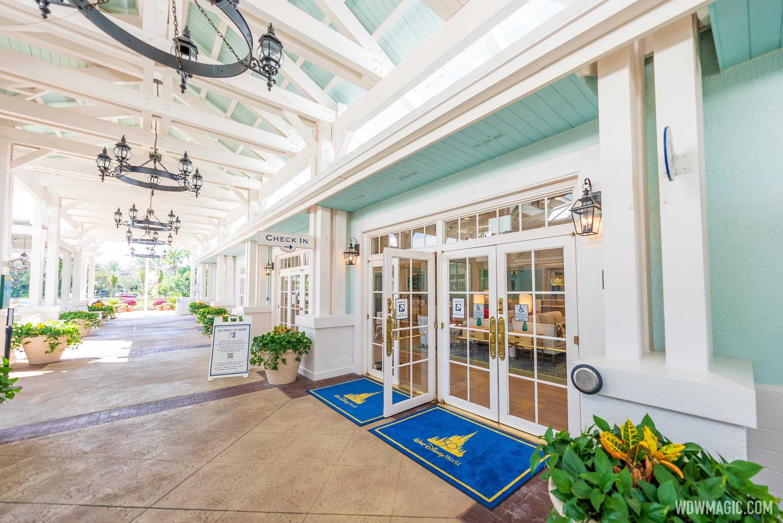
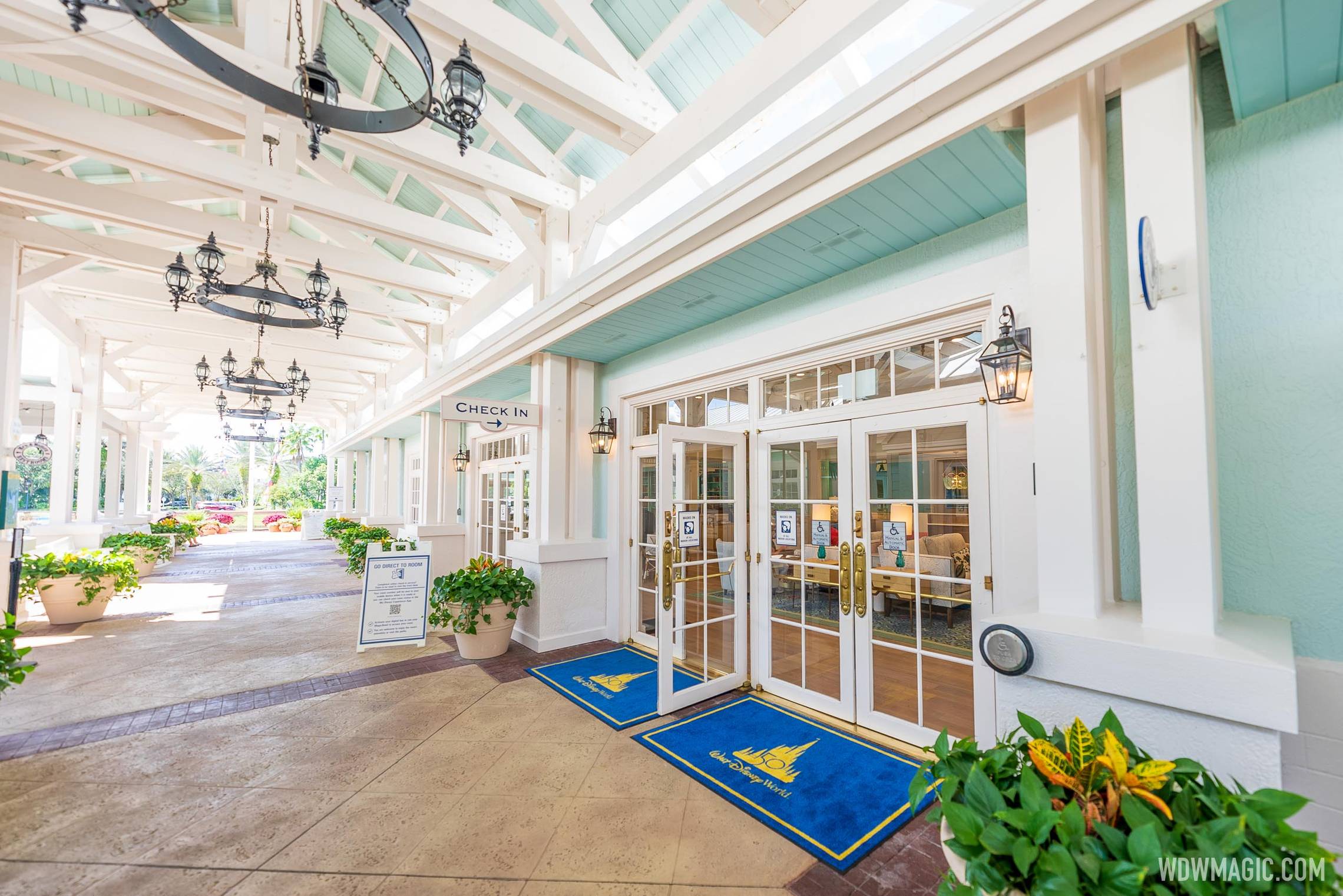
News New lobby layouts coming to Disney's Old Key West and Disney's Saratoga Springs Resort

castlecake2.0

Well-Known Member
What is this obsession with "story" that everyone has all of a sudden? It's a resort. It's meant to convey a sense of place, not a narrative "story."
I guess that’s what I mean by story. I don’t need a 200 page book making up a fake history of the resort, but I feel imagineering should have some sort of underlying story that guides their design other than “this looks nice”. The old OKW lobby had a whole backstory that guided its design, which looks to have been totally ignored for this new lobby. Disney is a storytelling company, shouldn’t we expect a bit of that in its venues? As I’ve said I’m mostly happy with all the latest renovations, and (other than contempo) very happy with all the sleek room updates. I just think they went a little too far with these lobby re dos.
 

CaptainAmerica

Premium Member
I agree with this -- I just think their resort remodels have mostly removed the sense of place in favor of generic mid-high end chain hotel.
My problem with the old way in which they created that sense of place is that it was often cartoonish-and-kitsch-bordering-on-self-parody. I'll pick on the old Yacht Club rooms because I think it's one of the most extreme examples.

1634224208977.png


That doesn't convey "you're in a luxury oceanside retreat on Cape Cod or Martha's Vineyard." Ironically, going "more generic" in this instance actually improves the sense of place you're looking for, IMO.
 

Disney Analyst

Well-Known Member
My problem with the old way in which they created that sense of place is that it was often cartoonish-and-kitsch-bordering-on-self-parody. I'll pick on the old Yacht Club rooms because I think it's one of the most extreme examples.

View attachment 593448

That doesn't convey "you're in a luxury oceanside retreat on Cape Cod or Martha's Vineyard." Ironically, going "more generic" in this instance actually improves the sense of place you're looking for, IMO.

You said this very well. This has often been my issue with the old Disney hotel designs. I much prefer the renovated products they’ve been putting out.
 

UNCgolf

Well-Known Member
My problem with the old way in which they created that sense of place is that it was often cartoonish-and-kitsch-bordering-on-self-parody. I'll pick on the old Yacht Club rooms because I think it's one of the most extreme examples.

View attachment 593448

That doesn't convey "you're in a luxury oceanside retreat on Cape Cod or Martha's Vineyard." Ironically, going "more generic" in this instance actually improves the sense of place you're looking for, IMO.

Yes, those rooms were terrible -- no argument there. They looked like a kid's room in a weekly rental beach house.

I'd prefer the rooms do more to maintain a sense of place than what we've seen in the recent refurbs, which have tended to lean too heavily towards random Hilton/Marriott for my tastes. The Contemporary admittedly doesn't have that problem, but they went too far in the other direction towards cartoony!

The lobby/grounds/restaurants/common areas are more important than the rooms themselves for that sense of place, though, which is one of the reasons I like Port Orleans Riverside so much.
 

castlecake2.0

Well-Known Member
My problem with the old way in which they created that sense of place is that it was often cartoonish-and-kitsch-bordering-on-self-parody. I'll pick on the old Yacht Club rooms because I think it's one of the most extreme examples.

View attachment 593448

That doesn't convey "you're in a luxury oceanside retreat on Cape Cod or Martha's Vineyard." Ironically, going "more generic" in this instance actually improves the sense of place you're looking for, IMO.
Totally agree with this, I love all the new room designs, clean and sleek and updated. I just prefer the lobbies didn’t go as far. I think whats bothering me is all the final touches look like they’re from HomeGoods. For OKW for example I love all the new colors and the furniture, im just turned off by some of the paintings on the wall, all the little candleholders/vases etc they sprinkled around, and the light fixtures. Replace those with something that has a bit more substance and I would love it 100%, right now I love it like 90%.
 

aladdin2007

Well-Known Member
some Disney touches would have been nice, its getting to where you would never know you were staying on Disney property anymore. Thats my problem with these. It seems like they are doing everything they can to make sure there is no Disney theme/feeling. You use to walk in and while maybe mickey was not waving in a big portrait on the wall, you always knew you were at Disney, it just had that feeling. Not anymore, they are all matching up to a standard hotel chain bland office space look. Contemporary did it right, until you go upstairs and to the kindergarten rooms.
 

Bocabear

Well-Known Member
Seems like TDO has outsourced all interior and hotel projects to the Marriott company. Charmless generic modern any hotel usa...
Such a shame... Let's hope they don't get to any more in the near future...or until they have some new management that will realize that people are spending the crazy money to stay there for these details...not in spite of"...
 

Casper Gutman

Well-Known Member
My problem with the old way in which they created that sense of place is that it was often cartoonish-and-kitsch-bordering-on-self-parody. I'll pick on the old Yacht Club rooms because I think it's one of the most extreme examples.

View attachment 593448

That doesn't convey "you're in a luxury oceanside retreat on Cape Cod or Martha's Vineyard." Ironically, going "more generic" in this instance actually improves the sense of place you're looking for, IMO.
Disney isn’t supposed to be real. It’s supposed to be hyper real, a copy of a place that never existed but is more like the source then the source is itself - more Key West then Key West, more Caribbean then the Caribbean.
 

Familydvc4

New Member
I like the new remodel yes open airy really beautiful. The only thing I miss is the original was the theme of a train station. But they did a great job on the refurbishment
 

Register on WDWMAGIC. This sidebar will go away, and you'll see fewer ads.

Back
Top Bottom