
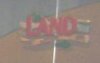
Yesterday someone posted two new photos inside the soarin' queue in another thread. I noticed there was a sign on the right side of the picture. I tried to zoom in and lighten the picture up a bit and found what appears to be the lands new logo. What do you think?

") I can't wait to visit again!!
I can't wait to visit again!!