New Enhancements, Dining Options Coming to Disney’s BoardWalk

Nunu

Wanderluster
Premium Member
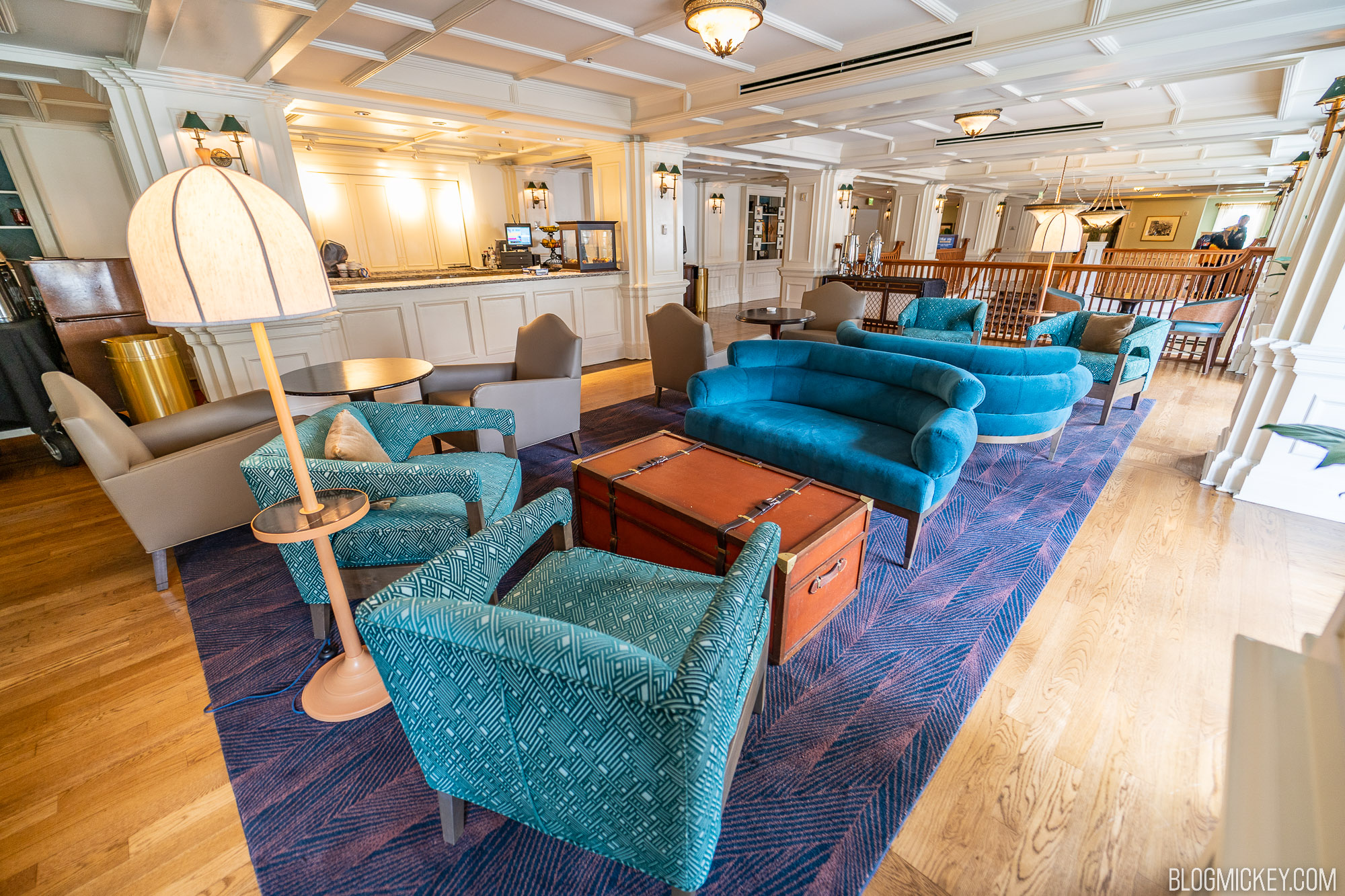
Belle Vue needed a refresh. That being said, the new furniture looks generic to me, specially the beige leatherette chairs. Don't particularly like the color palette either. Glad to see the (tired looking) wicker elements gone. I also like the new outdoor/balcony furniture, an improvement, imo.
 
Last edited:

dreday3

Well-Known Member
I went to the lounge yesterday, the changeover is not complete, still some furniture pieces missing and new bar stools coming. The furniture does have a 1930s feel to me, just a little more upscale than the previous arrangement. and being a deluxe resort that makes sense. Patio furniture received small refresh. Radio show is the same. Props on the shelves are the same. Good balance of making the space feel refreshed without losing its charm.

Furniture definitely has a 20s/30s art-deco style, just slightly more upscale. Especially that gorgeous blue couch!

The old furniture reminded me of a grandpa's den from the 70's. (just my opinion, of course :) )
 
Last edited:

UNCgolf

Well-Known Member
I'm not familiar with what this looked like before, but aside from the four gray chairs, everything else looks to have a fairly art deco silhouette, which would be appropriate for the 30s. The color scheme and prints used wouldn't be out of place either. Is the space supposed to be art deco or something else?

The old space wasn't really Art Deco (and I don't think the Boardwalk Inn has ever really tried to be Art Deco), although I would love for Disney to actually build an Art Deco resort.

Regardless, I disagree that this feels much like Art Deco. While the furniture itself has vaguely Art Deco stylings (absent the gray chairs, as you mentioned), nothing else about the space is really Art Deco in nature. With that said, I don't think it's intended to be an Art Deco space anyways.

The problem is that it could now easily pass as a random seating area in a modern hotel, which is what Disney is doing nearly everywhere. The original space felt like something you might walk into in a 1930s/1940s hotel. That feeling of authenticity is the one of the most important things in theming, regardless of actual accuracy (i.e. a space could use materials/designs that wouldn't have existed at the time as long as it evokes the proper feeling). This new space has lost that feeling, at least for me.

I realize this is a small location in a resort, and it's not even close to being a mistake/issue on the level of something like the Harmonious infrastructure. It was just one of those small spots at Disney we really loved.
 
Last edited:

pixargal

Well-Known Member
The old space wasn't really Art Deco (and I don't think the Boardwalk Inn has ever really tried to be Art Deco), although I would love for Disney to actually build an Art Deco resort.

Regardless, I disagree that this feels Art Deco much at all. The couch has a vaguely Art Deco styling, and I suppose I can agree the green chairs have a vague nod towards it as well. I don't think the prints look especially Art Deco, but I also don't think it's intended to be an Art Deco space anyways.

The problem is that it now looks like a random seating area in a modern hotel, which is what Disney is doing nearly everywhere. The original space felt like something you might walk into in a 1930s/1940s hotel. That feeling of authenticity is the one of the most important things in theming, regardless of actual accuracy (i.e. a space could use materials/designs that wouldn't have existed at the time as long as it evokes the proper feeling). This new space has lost that feeling, at least for me.

I realize this is a small location in a resort, and it's not even close to being a mistake/issue on the level of something like the Harmonious infrastructure. It was just one of those small spots at Disney we really loved.
This is one of my favorite small spaces as well. I think it would help if they add more greenery and accent pieces. The space looks unfinished and visually uninteresting.
 

Bocabear

Well-Known Member
Is the bar gone? Looks like it has been cleared out. This look like the same design team that did the Blooming Rose lounge or whatever it is called... Generic, Any-Hotel-USA...
Yes, the lounge needed an update and refresh, but it cannot be that hard to do that while still maintaining the feel of the resort's theme.
I know it is set in the 30s-40s....But the heart of the Jersey Shore in that era was not Art deco sleek... It should have still felt nostalgic...This looks like Jonathan Adler moderne furniture. And what's with the lamp-table standing out from the furniture in the walkway?
I love the color palette and that it looks fresher... but this could have been done in a way that fits the resort story line and theming
 
Last edited:

eddie104

Well-Known Member
I think this refresh could have turned out way worse than it did. But I think they didn’t go all in like other previous refurbishments and actually tried to keep some charm and thematic consistency with the pieces.

The reason places looks so different after these projects is because they have stayed relatively the same for 20 plus years and we get accustomed to them being that way.
 

James Alucobond

Well-Known Member
The old space wasn't really Art Deco (and I don't think the Boardwalk Inn has ever really tried to be Art Deco), although I would love for Disney to actually build an Art Deco resort.

Regardless, I disagree that this feels much like Art Deco. While the furniture itself has vaguely Art Deco stylings (absent the gray chairs, as you mentioned), nothing else about the space is really Art Deco in nature. With that said, I don't think it's intended to be an Art Deco space anyways.

The problem is that it could now easily pass as a random seating area in a modern hotel, which is what Disney is doing nearly everywhere. The original space felt like something you might walk into in a 1930s/1940s hotel. That feeling of authenticity is the one of the most important things in theming, regardless of actual accuracy (i.e. a space could use materials/designs that wouldn't have existed at the time as long as it evokes the proper feeling). This new space has lost that feeling, at least for me.

I realize this is a small location in a resort, and it's not even close to being a mistake/issue on the level of something like the Harmonious infrastructure. It was just one of those small spots at Disney we really loved.
Gotcha. Just wasn’t sure what the intended vibe was. I do feel like they struggle to source anything that feels authentic, even when it’s done fairly competently like in the Contemporary lobby or the Grand Floridian rooms. I can’t quite decide if it’s because the individual pieces aren’t convincing or if it’s because they mix and match everything with a kind of modern eclecticism that isn’t period-appropriate.
 

UNCgolf

Well-Known Member
Gotcha. Just wasn’t sure what the intended vibe was. I do feel like they struggle to source anything that feels authentic, even when it’s done fairly competently like in the Contemporary lobby or the Grand Floridian rooms. I can’t quite decide if it’s because the individual pieces aren’t convincing or if it’s because they mix and match everything with a kind of modern eclecticism that isn’t period-appropriate.

I think this may be the biggest issue. As you mentioned, some of the furniture is vaguely Art Deco and period-appropriate, but the gray chairs really aren't, and the trunks that are leftovers from the previous space just don't go well with the new furniture/color scheme.

They'll pull together some items and designs that fit the era/theme, but then don't follow through and complete the theme via the overall design to create that authentic feeling. Even if you have a bunch of original 1930s Art Deco furniture and furnishings (since we're on the Art Deco kick), it's still not going to feel like an Art Deco space if they're dropped into a modern glass atrium.
 
Last edited:

DCBaker

Premium Member
Disney has shared a concept art photo for the new Cake Bake Shop -

IMG_E8AF75572710-1.jpeg
 

Register on WDWMAGIC. This sidebar will go away, and you'll see fewer ads.

Back
Top Bottom