News New Crêperie restaurant coming to Epcot's France Pavilion as part of Ratatouille expansion

Tony the Tigger

Well-Known Member
Outrage might be an exaggeration but I think what some of us are attempting to point out is that the small details that seem inconsequential add up to a lesser experience.

...for a small minority of guests.

The Eiffel Tower may not be to scale, either.

The good news is, you all have time to make a call and correct them since all they've done is draw it so far.

With all that said: it couldn't take much more effort for them to be "accurate" than it did to be "inaccurate."
 
Last edited:

Tony the Tigger

Well-Known Member
So? Then why bother with so many details? What elements should be used appropriately and which ones should not? Should Cinderella Castle get a standing seam metal roof?


Who said anything about scale?

Here we go again.

We can all find anything to pick on.

It's a representation. It's not real. It's not meant to be real. The castle isn't real, either. (Psst...neither is Main Street. Do you know in the real world there is no forced perspective when they build buildings in a downtown area? They also don't put fake messages in windows or fake American flags to disguise lightning rods.)

Movies aren't real, either. There is a thing called "artistic license."

It's great to have reasonable standards. Not to be crazy.

Do we know for a fact that this will be built to the exact specs of an artist's rendering? Maybe the artist just threw some doodads in there, knowing people who actually build things will put them as they really belong. I doubt the artist is also an architect specializing in French architecture, nor is an artist's rendering required in any way to be a map from which the construction will be exactly copied.

Settle down. It's a theme park. It's not real.

And when you own your own, you can make miraculous technical marvels in it, and see if you get more traffic.
 
Last edited:

lazyboy97o

Well-Known Member
It's a representation. It's not real. It's not meant to be real. The castle isn't real, either. (Psst...neither is Main Street. Do you know in the real world there is no forced perspective when they build buildings in a downtown area? They also don't put fake messages in windows or fake American flags to disguise lightning rods.)
Nothing you listed is just some theme park / Disney thing. They are all examples of creating an image that is to be read as real, not fake. Sleeping Beauty Castle was patterned after a real castle. Cinderella Castle was patterned after real castles and composed in an eclectic manner similar to Sleeping Beauty Castle’s model, Neuschwanstein. Forced perspective is not some cutesy thing where stuff is just small, it is a specific means of designing with the purpose to create the illusion of real, livable space with smaller space. Real architecture employing understandings of perspective is literally ancient, as in the ancient Greeks were using it 2,500 years ago. The Windows being decorated to reflect the businesses within is also not some Disney thing; it comes from real life practices and was initiated to make Main Street, USA look more like a real, lived in place which would have inhabitants noting their businesses on the windows. Even the lightning rod flag poles are about minimizing a visual intrusion.

Movies aren't real, either. There is a thing called "artistic license."
Set and costume designers win awards for doing the opposite of what you espouse.

It's great to have reasonable standards. Not to be crazy.
Your definition of unreasonable is making sure a gutter is at the bottom of a roof, where the water flows, and not at the top. That a group of windows be the same size and evenly spaced. During all of the work required to make a two story building look like a three story building seems like it would fall under your definition of unreasonable.

Do we know for a fact that this will be built to the exact specs of an artist's rendering? Maybe the artist just threw some doodads in there, knowing people who actually build things will put them as they really belong. I doubt the artist is also an architect specializing in French architecture, nor is an artist's rendering required in any way to be a map from which the construction will be exactly copied.
This art wasn’t rushed to meet a publication deadline and designing the parks is kind of Walt Disney Imagineering’s job. This is not the only recent example of such architectural nonsense. The issues with this drawing aren’t super obscure nuances of French architecture, they’re rather basic elements. It also would not be hard to find someone in all of Southern California familiar enough with French architecture to give the design a quick once over.
 

RandySavage

Well-Known Member
Very good concept designers usually have a solid understanding of traditional architecture, do research and work from reference photos. It's the job of Imagineering to create the highest level of compelling stagecraft, like a tentpole film's art department.

I really dislike Frozen in Norway, but I'm not going say the rendering or execution of the meet & greet was below the place-making standards of Disney:
357981


Whereas, I welcome the idea of this new Creperie, I'm just picking on the rendering (and design if that's final), because regardless of one's familiarity with traditional architecture in France, many can sense something is off.

Some France production renderings by the old masters:
357982


357983


357984


and
357985


It's not a big deal. But it's fun to disect the good, the bad & the ugly.
 
Last edited:

MisterPenguin

President of Animal Kingdom
Premium Member
Very good concept designers usually have a solid understanding of traditional architecture, do research and work from reference photos. It's the job of Imagineering to create the highest level of compelling stagecraft, like a tentpole film's art department.

I really dislike Frozen in Norway, but I'm not going say the rendering or execution of the meet & greet was below the place-making standards of Disney:
View attachment 357981

Whereas, I welcome the idea of this new Creperie, I'm just picking on the rendering (and design if that's final), because regardless of one's familiarity with traditional architecture in France, many can sense something is off.

Some France production renderings by the old masters:
View attachment 357982

View attachment 357983

View attachment 357984

And by the intern:
View attachment 357985


It's not a big deal. But it's fun to disect the good, the bad & the ugly.

Does this look like the work of an intern to you?!

357986


Oh wait. It does.

It rivals the light-source disasters of the art for Pandora and TSL.
 

FerretAfros

Well-Known Member
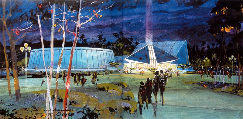
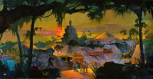
Throughout Disney's theme park history, there has been a rich and storied tradition of skilled visual artists developing whimsical concept art. The images have been evocative of the atmosphere that the designers intend to create, even if the designs themselves still haven't been decided upon. They feature happy families, dramatic lighting, and birds taking flight, but are fairly light on the details of the buildings and spaces themselves. They're basically doodles of one person's interpretation of what could be; more than anything, they focus on a mood or feeling that the designers are working from.

These early EPCOT Center and Indiana Jones Adventure images are excellent examples of capturing the spirit of a project, even if the final form turns out very different:
scienceandinventionlg__medium__158.jpg


tumblr_mqtccxfm3v1rv39g6o3_500.jpg


But that's not what this is.

Based on the level of detail and precision on the building itself, it appears that this rendering was pulled from the CAD files that the builders are working from, with placemaking added around the edges to make it more presentable to the general public. The haphazard adornment on the building isn't some pie-in-the-sky doodle from a well-intentioned painter, it's the design of an architect who really should know better.

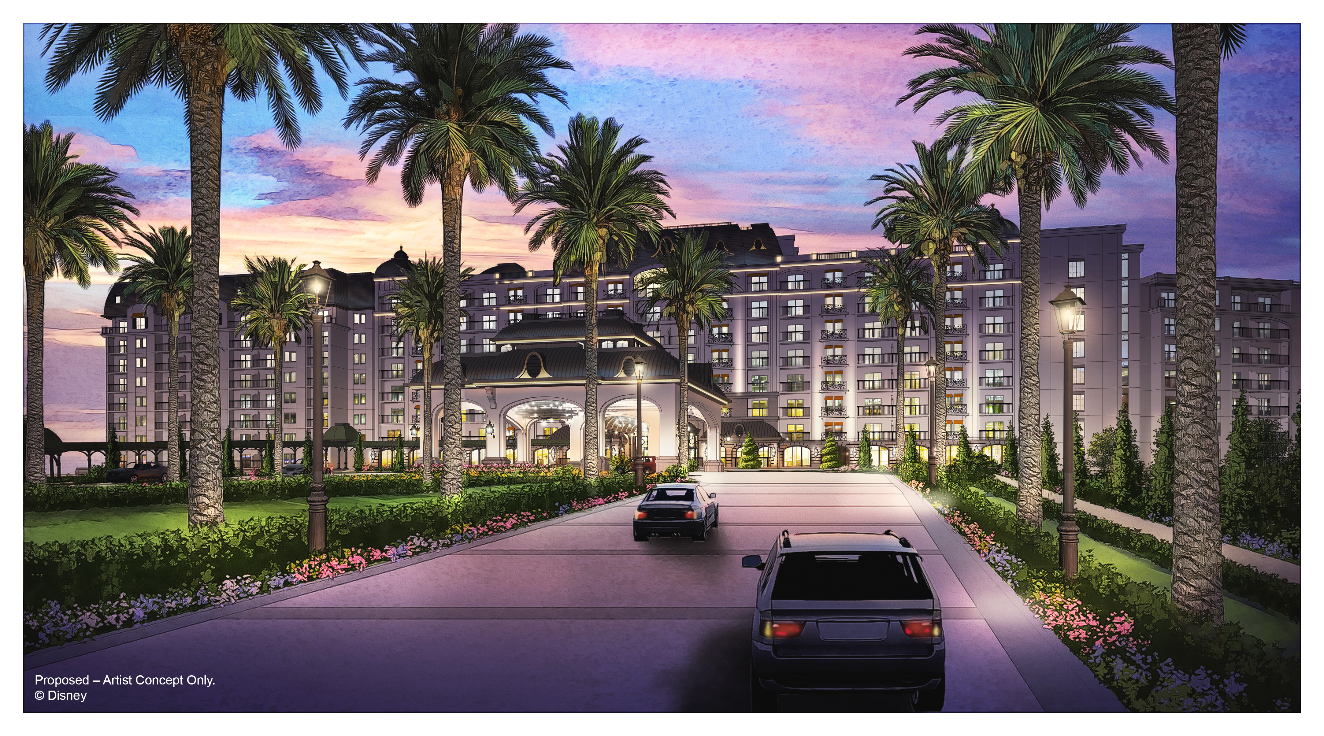
In a lot of ways, this raises the same red flags that we saw with the initial Riviera concept art, which was also clearly pulled from a CAD file and gussied up for public consumption, architectural non sequiturs and all.
Disney-Riviera-Resort_Full_30590.jpg


But what's the point? This isn't something that was created to inspire the project's designers, but rather is a piece of marketing art. It's intended to inspire the general public. But nobody is going to book a trip to Epcot because of a relocated crepe stand. Disney adds new things to its parks all the time without releasing marketing images, so why this? There still hasn't been any artwork for the new steakhouse in the Japan pavilion, even though that actually has the potential to pull in additional guests. Especially when the design is so flawed and lackluster, it's curious why they would want to hype up this project that ultimately amounts to very little in the grand scheme of the park.

They would have been better off with a typical paragraph of flowery language about how "magical" the new building would be, without revealing the actual design intent. At least that way, there's the potential that any disappointment in its design might be overshadowed by the infatuation with the new courtyard as a whole.
 
Last edited:

Missing20K

Well-Known Member
...for a small minority of guests.

The Eiffel Tower may not be to scale, either.

The good news is, you all have time to make a call and correct them since all they've done is draw it so far.

With all that said: it couldn't take much more effort for them to be "accurate" than it did to be "inaccurate."
I'm sure you've heard that "the devil is in the details" no?

WS Eiffel Tower still looks like the Eiffel Tower. Because of the attention to detail. If it wasn't to scale, one would notice immediately.

I've tried calling, they don't answer anymore.

EXACTLY!!!!!
,
Yes, I've looked out of my window in Paris at the Eiffel tower and marveled at the view", I did not look at my hotel and say "boy that window at the top is out of place" big difference. I've never looked at the view and based it on the window or the building. I looked at the view and marveled at the nature. again big difference. The window in my room had no bearing whatsoever imo to the view that I was seeing. now maybe the inability to see a view would matter but again that's totally different.


Again it maybe just me, when I walked in a pasterrie, my thoughts were not on what the building looked like,, unless it was a complete dive but rather if the pastries were good.

so again, the drawings look cute to me, I'll wait until the actual shop opens but I highly doubt if I walk up to it and say "that building is not what a french building is like".

I did take in consideration those with technical knowledge, that's exactly why I asked @lazyboy97o what those terms where and was he in the industry. I simply marveled that he got all those short comings from an artist rendition.
I was pointing out that there is a communication between the interior and exterior of a structure, often through the windows. That windows are a greater component of a building than merely the function. That windows might actually be design elements, their placement, style, size, etc., either enhance or detract from the overall design of a building.

The placement of windows on a facade should take into consideration many aspects, including the view you experienced. The placement of the window for you to see the view, the selection of material so that you aren't distracted by the frame, muntins, or hardware, and determining the appropriate size in which to frame the view. These are all design decisions that you may not notice individually, or even collectively, but add up to the wonderful experience of viewing the Eiffel Tower you described.

A dingy, run-down patisserie would catch your attention. A really well-designed creperie could do the same, no?

Sure you asked about the definition of the terms, but you haven't altered your opinion based on those with technical knowledge pointing out shortcomings. You've willfully ignored the criticisms, because they don't fit your narrative of this concept being "good enough".
 
Last edited:

MrMcDuck

Well-Known Member
Hopefully the actual building looks nothing like this released art, but I'm not holding my breath.

This is far below Disney standards. Even worse is that it's in Epcot where the standard should be the highest in terms of getting the architecture right. (I don't really understand why there is such a debate over this. There are things here that one can actually label as wrong.)
 

eliza61nyc

Well-Known Member
It really is on you to leave the thread. People are allowed to discuss the look of a new building in a thread about that new building. There is literally nothing else on topic to discuss. We can’t review the crepes yet. What should we discuss? The Hagrid coaster? The view of GotG from the France pavilion?

But you are not discussing the look of the building, it hasn't been built yet. you are discussing a drawing.
 

Register on WDWMAGIC. This sidebar will go away, and you'll see fewer ads.

Back
Top Bottom