Mermaid Duplicate Animatronics Photo

Rasvar

Well-Known Member
I just read through this and wow. It is a nice upscale dark ride. I was on it at DCA. I enjoyed it. I did not really see anything wrong with it. It far surpasses the quality of any of the existing dark rides in Fantasyland in both artistic style and length. You can nitpick away on if it is a technical dark ride or not but it really is just another dark ride style attraction. It is bright, colorful and kinetic. Kids are going to love it and adults won't feel like they are trapped in a bad dream. It is a nice and fitting addition to the Magic Kingdom. It actually worked better for me than the Nemo overlay on the submarine ride. I rode the Mermaid ride twice. I never noticed the duplicates. I probably will now but it never distracted from the ride for me. (The Dole Whip hair...that was a different story)
 

Pixiedustmaker

Well-Known Member
Original Poster
I have a question, you talk about Mermaid not being a "dark ride" because they use white fluorescent lighting in some of the scenes, but how would painting everything in black light paint an lighting it up in black light make it look better?

Well, I sure hope it isn't the fluorescent lights used as work lights in most of the rides, as opposed to show lights which are often incadescent, LEDs more frequently now. The old style fluorescent tube lights make everything look sickly.

The "background" of the Under the Sea area is mostly black, with a little green. I like to call it the "Twilight Zone" background, I would have gone with something much different, no comment on what it would have been. ;-)
 

Pixiedustmaker

Well-Known Member
Original Poster
. . . it's an animated movie, it's supposed to look fake and plastic. It's like the same could be said for multiple dark rides inspired off of animated films, but it's not like anyone is like "Oh crap" when they see fluorescent lighting shine off of Pooh's stomach.
Unfortunately, it is what it is . . .

The lighting in Mermaid uses spotlights mounted in the ceiling, this is what produces that shinny effect, not lower level diffuse lighting, which is what is needed, IMHO. You won't see much (if any) glare off of Ursula as the lighting is much better, and more diffuse, not being lit by lights that are 25 feet up in the air. PLUS Ursula's skin is much less reflective. They could change this with Ariel by using a variety of compounds, some of them with obscure industrial uses.

Spot lights up in the air are good for Sears, but for a ride, I think the lightning needs to be hidden, and it needs to be more diffuse. Plus, the Ariel animatronics, while good, have a somewhat reflective skin.

The "Kiss the Girl" scene had bright spots on it, and then they changed it to have light with a bluish tint that was filtered through a "leaf" type pattern.

I have done some theatrical lighting work, so maybe I just notice all the mistakes, but the lighting looks like it was done by rookies who were setting up a low quality museum display. The first rule is that the audience doesn't see the light source, makes sense . . . they seem to have forgotten this. And the, laughably, the bright shadows cast on Ariel's face made her look creepy (again, maybe I'm one of the few that would get this) . . .

You also don't need to shine a super bright light on a figure, especially on Mermaid as Ariel is so close to the Omnimovers and you're bound to see her anyway. This is museum display lighting, where you want to momentarily highlight an artifact during, say, a presentation. A little nice, barely noticeable, highlight on Ariel would be fine, but they have screams amateur to my eyes.
 

Pixiedustmaker

Well-Known Member
Original Poster
but it's not like anyone is like "Oh crap" when they see fluorescent lighting shine off of Pooh's stomach.

I would. Though the lighting done in Tokyo's Pooh is very well done, it is appropriately bright as some areas are daytime (actually the sunlight looks yellowish-orange like at sunrise). Pooh looks pretty good, despite a small amount of reflectivity. On Mermaid, the reflectivity is enhanced as the background is much more dark that the foreground.

Anyway, I think Tokyo's Pooh is kind of why I complain, Magic Kingdom didn't get the best Pooh, didn't get the best Pirates . . . I just wish TDO put more money in rides to get the job done right!

Remember, it was Michael Eisner who said that guests wouldn't ever look behind them on a Disney ride and if you did then you'd see all of the fake stuff. Well, guests do see everything as you've got millions that will see an attraction over the years, might as well make sure every detail is spot on.

BTW, Mermaid "Under the Sea" scene is lit very similarly to the Heffalumps and Woozles scene, you've got a black background, and foreground character lit up, only in Mermaid's Under the Sea the foreground characters are atrociously lit up with regular stage lighting, that is also turned up too bright.

There's nobody sitting fifty rows back, so this level of brightness isn't needed, IMHO.
 

KingMickey

Active Member
In the Parks
Yes
They have since lowered the lighting in the Under the Sea scene since its' opening day and I believe they have done lighting upgrades. I don't see how this scene is anything like Heffalumps and Woozles, an entirely black-lit scene. It is supposed to be colorful and fun. The scene has a very similar lighting and design tecture to Tokyo DisneySea's Mermaid Lagoon, which is fantastic, albet larger and more immersive. I'd rather have that than something that looks like a black-lit puppet show from VotLM.

I agree that you don't have to shine a bright line on a figure, but to disparage overhead spotlight lighting in an attraction is a bit etreme. SO many rides have lights mounted to the ceiling. It's not that big of a deal, it's a nice C Ticket dark ride, that at least tries to make the lighting levels not so glaring. When you look at PotC and you're sailing right by the beach just after the Davy Jones/Blackbeard waterfall, there's a big a** blue spotlight directly to the right in the middle of a cavern wall, literally shining right above the guest. It's not like Mermaid has made this mistake, which not only is a awful lighting decision, but also COMPLETELY breaks any immersive theming. While, sure, lighting and attraction enhancements could always be added and they will, let's not pretend that Mermaid is the absolute bottom of the barrel.
 

RSoxNo1

Well-Known Member
The lighting in Mermaid uses spotlights mounted in the ceiling, this is what produces that shinny effect, not lower level diffuse lighting, which is what is needed, IMHO. You won't see much (if any) glare off of Ursula as the lighting is much better, and more diffuse, not being lit by lights that are 25 feet up in the air. PLUS Ursula's skin is much less reflective. They could change this with Ariel by using a variety of compounds, some of them with obscure industrial uses.

Spot lights up in the air are good for Sears, but for a ride, I think the lightning needs to be hidden, and it needs to be more diffuse. Plus, the Ariel animatronics, while good, have a somewhat reflective skin.

The "Kiss the Girl" scene had bright spots on it, and then they changed it to have light with a bluish tint that was filtered through a "leaf" type pattern.

I have done some theatrical lighting work, so maybe I just notice all the mistakes, but the lighting looks like it was done by rookies who were setting up a low quality museum display. The first rule is that the audience doesn't see the light source, makes sense . . . they seem to have forgotten this. And the, laughably, the bright shadows cast on Ariel's face made her look creepy (again, maybe I'm one of the few that would get this) . . .

You also don't need to shine a super bright light on a figure, especially on Mermaid as Ariel is so close to the Omnimovers and you're bound to see her anyway. This is museum display lighting, where you want to momentarily highlight an artifact during, say, a presentation. A little nice, barely noticeable, highlight on Ariel would be fine, but they have screams amateur to my eyes.
The lighting on Mermaid has definitely received from criticism in DCA. I'm curious if the lighting will be better in Florida.
 

voodoo321

Well-Known Member
The lighting in Mermaid uses spotlights mounted in the ceiling, this is what produces that shinny effect, not lower level diffuse lighting, which is what is needed, IMHO. You won't see much (if any) glare off of Ursula as the lighting is much better, and more diffuse, not being lit by lights that are 25 feet up in the air. PLUS Ursula's skin is much less reflective. They could change this with Ariel by using a variety of compounds, some of them with obscure industrial uses.

Spot lights up in the air are good for Sears, but for a ride, I think the lightning needs to be hidden, and it needs to be more diffuse. Plus, the Ariel animatronics, while good, have a somewhat reflective skin.

The "Kiss the Girl" scene had bright spots on it, and then they changed it to have light with a bluish tint that was filtered through a "leaf" type pattern.

I have done some theatrical lighting work, so maybe I just notice all the mistakes, but the lighting looks like it was done by rookies who were setting up a low quality museum display. The first rule is that the audience doesn't see the light source, makes sense . . . they seem to have forgotten this. And the, laughably, the bright shadows cast on Ariel's face made her look creepy (again, maybe I'm one of the few that would get this) . . .

You also don't need to shine a super bright light on a figure, especially on Mermaid as Ariel is so close to the Omnimovers and you're bound to see her anyway. This is museum display lighting, where you want to momentarily highlight an artifact during, say, a presentation. A little nice, barely noticeable, highlight on Ariel would be fine, but they have screams amateur to my eyes.
Amen brother. I tried to convey this when speaking of the queue in TSMM. My feeling was of being in a furniture showroom because of the lighting. Nobody seemed to understand what I was talking about. I went out and rode Mermaid and had the exact same feeling, especially during the "under the sea" part. The ride is just poorly executed on many levels, not just the lighting. No fun at all. Laughable, in a bad way. It's like a bad, or very average, movie you watch and wonder how it ever got produced in such a way, with so much money and supposed talent involved. My 10 and 7 yr old daughters did not have the least bit of enthusiasm for it, even though it's one of their favorite movies. It's a shame really. I think it is a failure of monumental proportions and here is why..... It has and will be ill received, inso may be the death of the "live" ride. The beancounters may surely see it that way instead of being aware that it was just a poorly executed show. Dare I say more screens in our future?
 

Pixiedustmaker

Well-Known Member
Original Poster
Amen brother. I tried to convey this when speaking of the queue in TSMM. My feeling was of being in a furniture showroom because of the lighting. Nobody seemed to understand what I was talking about. I went out and rode Mermaid and had the exact same feeling, especially during the "under the sea" part. The ride is just poorly executed on many levels, not just the lighting. No fun at all. Laughable, in a bad way. It's like a bad, or very average, movie you watch and wonder how it ever got produced in such a way, with so much money and supposed talent involved. My 10 and 7 yr old daughters did not have the least bit of enthusiasm for it, even though it's one of their favorite movies. It's a shame really. I think it is a failure of monumental proportions and here is why..... It has and will be ill received, inso may be the death of the "live" ride. The beancounters may surely see it that way instead of being aware that it was just a poorly executed show. Dare I say more screens in our future?

Thanks for having the bravery to say what you felt on the ride! My impressions were very similar. The five year old in our party, who is a rabid Mermaid fan, basically didn't care for the ride, which really shocked me. Though maybe it shouldn't have as I didn't have "fun" like you said, more like the ride was sort of just a way to check off the box that reads "saw Ariel's ride".

Though I like Scuttle from the film, the sunset effect on this animatronic was just too bright, and how they worked the character in was a little obnoxious. But the worst offender was the "Under the Sea" scene with the really bright lights, and the finale which feels like it is in a furniture show room, like you said, great analogy IMO.

I got the impression that the folks who worked on the project hadn't really seen the film in a while, and sort watched it a couple times and duplicated some of the iconic scenes, without letting the ride tells its own story, they just tried to get brownie points for a couple of scenes, sort of "You love Ariel, right? Well, here she is! You remember this, right?" Not a very creative way to do a ride, I felt like I was watching a mediocre Little Mermaid Parade at a lot of points, as the background in the "Under the Sea" scene is black, with a weird band of greenish haze.

The ride just doesn't have the magic, and like you said, I thought that some parts were . . . laughable. I mean, a paper cut out Ursula "exploding" in the sea? A screen showing Ariel getting her voice back? Stuff like this shouldn't be in any Disney ride, IMHO.

Really interesting point you made about the future of such Fantasyland rides, knowing how the bean counters look at things, they might well conclude that the millions of dollars was wasted and that next time they'll go with even more screens.

I think that Mermaid is a disappointment for DCA, why else would they spend millions of dollars to re-do the screens and "fix" Ariel's hair? Maybe somebody should have told them that these specific complaints are just the tip of the iceberg and that the screens don't work at all, and that Ariel doesn't look good in the "under the sea" scene because the whole scene really doesn't work.

If they are going to use a showroom this big, and show off every corner and the walls and ceiling, then it needs to be decorated better and look more like the bottom of the ocean, IMHO.

Mermaid is often, perhaps even usually, a walk-on in DCA, I think that MK's Mermaid might have the same reception as once you've ridden the ride, you've seen everything in the "furniture display room", and there is no need to experience it again, especially since you don't feel transported to another place, like how classic dark rides like Peter Pan and others can make you feel.
 

RSoxNo1

Well-Known Member
One thing I've heard from Imagineers on the record is that it's much harder to produce a daylight scene in an attraction that a nighttime scene. While "under the sea", I would consider some of the scenes with lighting issues on Mermaid to be "daylight" scenes.
 

Pixiedustmaker

Well-Known Member
Original Poster
One thing I've heard from Imagineers on the record is that it's much harder to produce a daylight scene in an attraction that a nighttime scene. While "under the sea", I would consider some of the scenes with lighting issues on Mermaid to be "daylight" scenes.

I would agree and say that with classic dark rides, it is easier to hide stuff that you don't want guests to see, just paint it black. But the folks who did Pooh in Tokyo did a good job with daylight scenes, they had to make sure everything looked spot on, but they did it:

pooh_vehicle.jpg


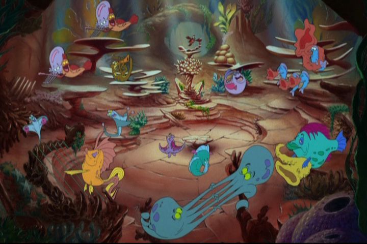
The "Under the Sea" scene was tricky to do, but they decided against using a lot blues and greens, over the use of red, yellows, and pure white, which create a sort of "festival" atmosphere, but you don't feel like you are under the ocean. In animated film Ariel was often "lit up" normally under the ocean, but you had these great blues and green in the background which dominated the big picture, and set the tone. Visually you could take a careful picture of Ariel with the black background in the ride and convince somebody that it is a picture of a parade float at night.

I'm a big proponent of mixing incandescent/gels with the narrow spectrum blue/green LEDs to create subtle lighting effects, which I think could have been used to provide a nicer background, and decrease the need for such bright spots on the main characters, without washing out the colors of the foreground. For example:

web-thumb-475x317-29244.jpg


The bluish background provides (intimates) a atmosphere, a subtle effect which I think goes back to famous paintings like Velazquez's Las Meninas where you have subtle shading and haze to create a space. Compared to what we have here in Mermaid,

dsc09378.jpg


Sort of visual clutter (as well as sea plants not found any where else in the ride). This is the "Mardi Gras" Ariel, as opposed to the film which had a decided more aquatic feel, but more importantly atmosphere, the sense of space, achieved via subtle colors, instead of a mostly pure black,

541728_1284687405565_full.jpg


The concept art revealed a beatiful blue/green background with out a lot of the "jazz lights" we have in the real ride,

http://www./wp-content/uploads/2011/02/9_10_WDI_900356114296.jpg

All goes back to paintings, such as Las Meninas below, where a sense of space, and three dimensions was constructed by using artistic techniques, the Ariel we have is almost two dimensional as the black background and flat plants intimate a two dimensional world,

velazquez_lasmeninas_large.jpg
 

JustInTime

Well-Known Member
I would agree and say that with classic dark rides, it is easier to hide stuff that you don't want guests to see, just paint it black. But the folks who did Pooh in Tokyo did a good job with daylight scenes, they had to make sure everything looked spot on, but they did it:

pooh_vehicle.jpg


The "Under the Sea" scene was tricky to do, but they decided against using a lot blues and greens, over the use of red, yellows, and pure white, which create a sort of "festival" atmosphere, but you don't feel like you are under the ocean. In animated film Ariel was often "lit up" normally under the ocean, but you had these great blues and green in the background which dominated the big picture, and set the tone. Visually you could take a careful picture of Ariel with the black background in the ride and convince somebody that it is a picture of a parade float at night.

I'm a big proponent of mixing incandescent/gels with the narrow spectrum blue/green LEDs to create subtle lighting effects, which I think could have been used to provide a nicer background, and decrease the need for such bright spots on the main characters, without washing out the colors of the foreground. For example:

web-thumb-475x317-29244.jpg


The bluish background provides (intimates) a atmosphere, a subtle effect which I think goes back to famous paintings like Velazquez's Las Meninas where you have subtle shading and haze to create a space. Compared to what we have here in Mermaid,

dsc09378.jpg


Sort of visual clutter (as well as sea plants not found any where else in the ride). This is the "Mardi Gras" Ariel, as opposed to the film which had a decided more aquatic feel, but more importantly atmosphere, the sense of space, achieved via subtle colors, instead of a mostly pure black,

541728_1284687405565_full.jpg


The concept art revealed a beatiful blue/green background with out a lot of the "jazz lights" we have in the real ride,

http://www./wp-content/uploads/2011/02/9_10_WDI_900356114296.jpg

All goes back to paintings, such as Las Meninas below, where a sense of space, and three dimensions was constructed by using artistic techniques, the Ariel we have is almost two dimensional as the black background and flat plants intimate a two dimensional world,

velazquez_lasmeninas_large.jpg


I thought that Pooh pic WAS outside. Wow.
 

cheezbat

Well-Known Member
Oh, well that's good. You're not expecting an E. It's just that a lot of people are expecting a lot from Mermaid.

And they shouldn't. Sad thing is, this ride was touted as the "E-ticket" for the fantasyland expansion. It's not even on the same level as Haunted Mansion.
My girlfriend went with me to California a few weeks back and came off the ride with a "that's it?" comment. She's a big mermaid fan and was very underwhelmed. She knew well in advance what the ride was...but she thought it was too mashed together and too short. (she also got very upset with the way they 'kill' Ursula.)
 

space42

Well-Known Member
And they shouldn't. Sad thing is, this ride was touted as the "E-ticket" for the fantasyland expansion. It's not even on the same level as Haunted Mansion.
My girlfriend went with me to California a few weeks back and came off the ride with a "that's it?" comment. She's a big mermaid fan and was very underwhelmed. She knew well in advance what the ride was...but she thought it was too mashed together and too short. (she also got very upset with the way they 'kill' Ursula.)


There is no good reason that this attraction shouldn't be an E-Ticket as detailed and elaborate as other family friendly E-Tickets: Mansion, Pirates, Jungle, Tokyo Pooh, Original Journey into Imagination, etc.
 

Californian Elitist

Well-Known Member
And they shouldn't. Sad thing is, this ride was touted as the "E-ticket" for the fantasyland expansion. It's not even on the same level as Haunted Mansion.
My girlfriend went with me to California a few weeks back and came off the ride with a "that's it?" comment. She's a big mermaid fan and was very underwhelmed. She knew well in advance what the ride was...but she thought it was too mashed together and too short. (she also got very upset with the way they 'kill' Ursula.

Yeah, I'd take any of the Fantasyland dark rides over Mermaid. Monsters Inc too. I do like the ride. But why it's being declared an E is beyond me. It's definitely no E. I enjoy Mermaid because I take it for what it is; a nice, family "movie ride". Still, I'd take all the other dark rides, including Roger too.
 

Register on WDWMAGIC. This sidebar will go away, and you'll see fewer ads.

Back
Top Bottom