ImperfectPixie
Well-Known Member
Surprised it's not $50 for the 50th
That's a blatant ripoff.
Surprised it's not $50 for the 50th
Surprised it's not $50 for the 50th
$40 for some M&Ms might be the biggest rip-off anywhere at Disney.
I don't think it can touch the $25/night fee for parking our cars outside our overpriced hotel rooms.$40 for some M&Ms might be the biggest rip-off anywhere at Disney.
Something like that. I believe it's supposed to be a mix of popcorn and m&m's.Is it supposed to be like a trail-mix? It looks like a scoop that you use to scoop from the tube of mix into baggies.
Here's video of the new addition -
That may be the intention, but that ain’t popcorn as I know it.Something like that. I believe it's supposed to be a mix of popcorn and m&m's.
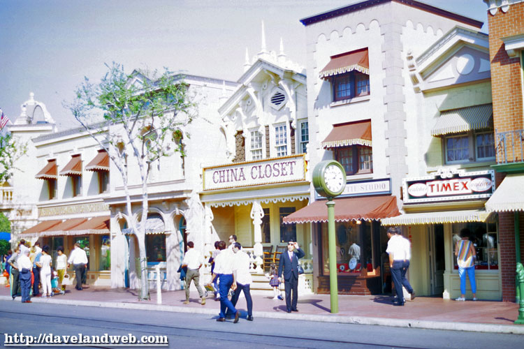
Even classic Main Street had anachronistic signage that very conspicuously broke theme (Hallmark and Timex, for example), but I agree that the M&M sculpture does not look good.So according to other sites, Disney added some sort of sculpted M&M sign thing to the front of the confectionary and it just seems… inexplicable. Not only does it seem to break theme, but what exactly the other substance with the M&Ms is meant to be is unclear. Is it just me, or is it really awful?
True, of course, but it generally tried to conform broadly to an appropriate thematic form, even if it was anachronistic. This isn’t even clearly signage for the confectionary, it’s some sort of… thing advertising M&Ms.Even classic Main Street had anachronistic signage that very conspicuously broke theme (Hallmark and Timex, for example), but I agree that the M&M sculpture does not look good.
Those round things next to the M&Ms look weird. They don’t resemble popcorn if that’s what they’re supposed to be. I have no issue with the concept or even the inclusion of M&Ms, but the execution isn’t great.It looks fine
I disagree. These signs break theme quite egregiously:True, of course, but it generally tried to conform broadly to an appropriate thematic form, even if it was anachronistic.


The logo does. The signs themselves are consistent with the other, non-branded signs.I disagree. These signs break theme quite egregiously:


Yeah...as much as I understand how difficult it can be to try to create something that looks organic like popcorn or clumps of oats in trail mix...that just looks so bad. You can't just re-use the same shape over and over like that.Those round things next to the M&Ms look weird. They don’t resemble popcorn if that’s what they’re supposed to be. I have no issue with the concept or even the inclusion of M&Ms, but the execution isn’t great.
And the people talking in the upstairs windows!Still waiting for the party line phone to return
Register on WDWMAGIC. This sidebar will go away, and you'll see fewer ads.
