News Kona Cafe at Disney's Polynesian Village Resort closing for refurbishment this summer

Sir_Cliff

Well-Known Member
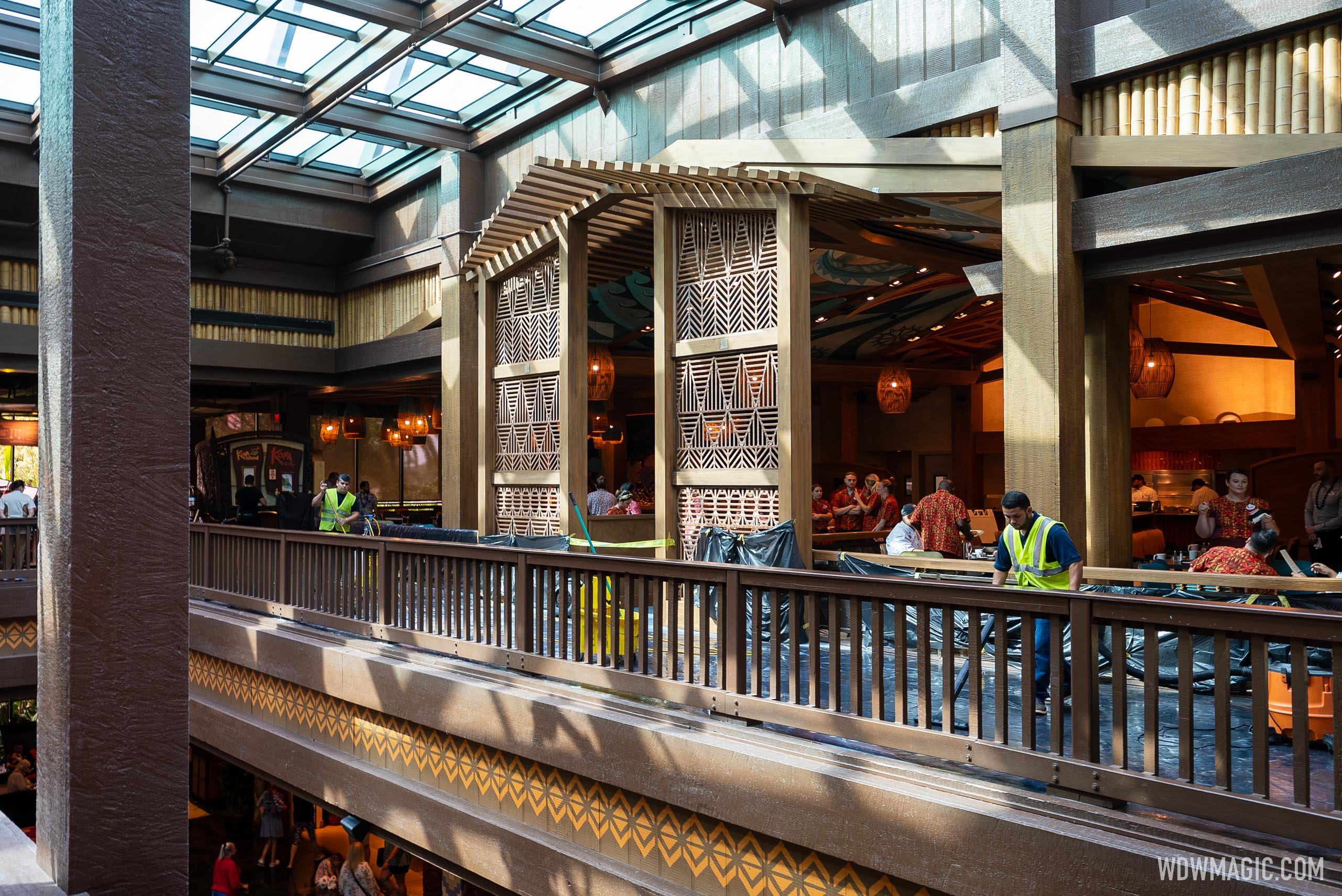
Looks pretty good. I have to agree, though, that I’m not sure that a hotel with a kitschy 50’s tiki motif (it was never actually trying to be accurately Polynesian at all) is supposed to avoid being “garish.” That seems like the whole point! I mean, if Uni decided to makeover Cabana Bay in a subdued, tasteful style, it would be pretty clear they’d lost sight of the theme.
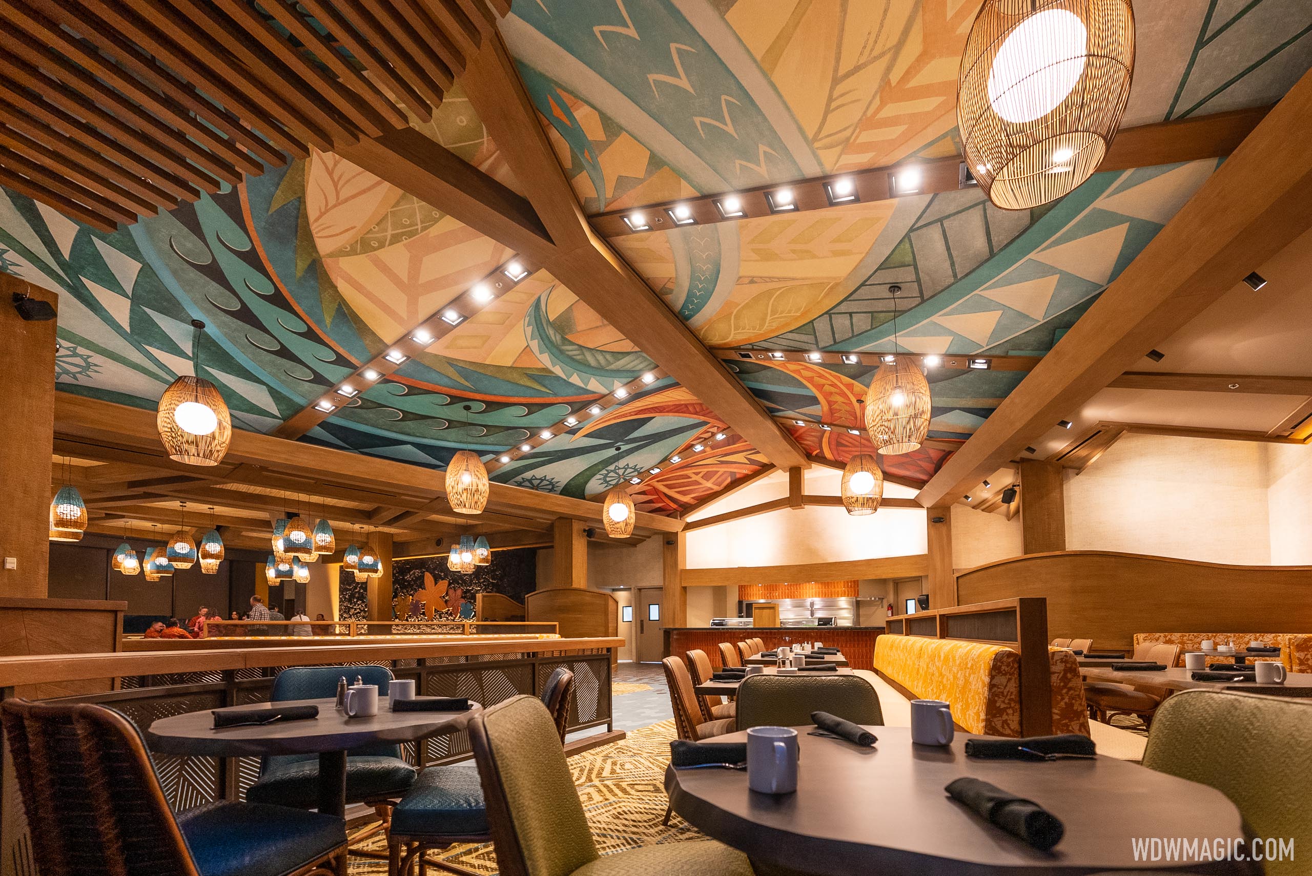
I think this one actually looks more in tune with the retro Polynesian theme of the hotel than the old Kona Cafe, which kind of had a late-1990s/early-2000s vibe. Gave me a hint of the Wolfgang Puck's vibe! Overall, I'm impressed with this refresh which seems a clear improvement that actually enhances the theme of the resort.
 

Epcot82Guy

Well-Known Member
I think this looks perfectly fine. It's a much more subtle version, which works well. The tables are a little plain, which could easily be fixed by a simple candle holder or flower vase or anything. (And those may very well be on their way.). If you added that little pop of color at the eye-mid level (i.e. table top), I think it's a nice way to update the space into something new.

Now the $5 per plate upcharge that will likely accompany this may be a different conversation... ;)
 

DC0703

Well-Known Member
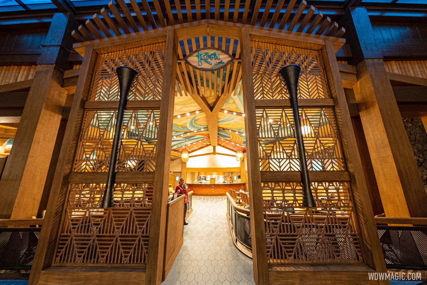
I like this new look a lot, especially the more tropical looking light fixtures and the new wooden entry way. Definitely fits the island aesthetic more than the older version. I'd say they nailed this one.
 
Last edited:

aladdin2007

Well-Known Member
I like this new look a lot, especially the more tropical looking light fixtures and the new wooden entry way. Definitely fits the island aesthetic more than the older version. I'd say the nailed this one.
agree, color me surprised and impressed! Maybe they are starting to get the message that the generic wave they have been on is turning people off. Can't wait to check it out in person.
 

Skywise

Well-Known Member
ehh... it's a bit of a wash for me. It feels more like a late 60s/70's coffeeshop (which might've been the intent) Not that I was in love with the previous design but there were elements I liked (the color scheme, the OA carvings) and none of the new things really wows me.

It's kind of like how I felt about 1900 Park Faire - you see all the decorations in the pictures and you think you're going to sit in this Victorianesque park-like restaurant with carousels and such and you're just in a typical cafe layout with a few totem decorations mounted on the middle. Themed-light.

(Contrast that with Jock Linsday's bar, rainforest cafe, etc)
 

Clamman73

Well-Known Member
RIP these twirling fans things..almost as devastating as losing the waterfall.
Screen Shot 2022-10-30 at 3.01.27 PM.png
 

ToTBellHop

Well-Known Member

Register on WDWMAGIC. This sidebar will go away, and you'll see fewer ads.

Back
Top Bottom