Disstevefan1
Well-Known Member
Hindsight was not needed to know Moana should not be in EPCOT.Hindsight is always 20/20. Like when they opened the Fantasyland expansion right before the release/success of Frozen...
Hindsight was not needed to know Moana should not be in EPCOT.Hindsight is always 20/20. Like when they opened the Fantasyland expansion right before the release/success of Frozen...
Hindsight was not needed to know Moana should not be in EPCOT.
That's good, because Moana isn't in Epcot.Hindsight was not needed to know Moana should not be in EPCOT.
RIP edutainmentAs long as it has a high edutainment level, then I have no issue with it being where it is. If it's purely for aesthetics and for people to just go to cool off and get wet, then it's a total waste of space.
“Journey of Water Inspired by Moana”, the attraction’s official name, has Moana’s logo literally written in stone and a Ti Fiti monument (a major character in the Moana movie)That's good, because Moana isn't in Epcot.
Journey of Water is, or rather will be.
There are some nods to the film Moana in the rockwork.
As they won’t open it for a couple of years to coincide with the opening of EPIC Universe, we got a while to go yetOh god, just open so we can end this thread.
No.Moana or no Moana, wasn't a walkthrough journey of water attraction already planned?
im pretty sure there was a giant water walkthrough already planned. regardless, any more recent pics of site?
I think at most it was maybe vaguely alluded to that they'd been wanting to do something similar for a while that explored these themes, but that doesn't mean this was where it was meant to go or that it was a solid enough idea to have been fully envisioned as a walkthrough attraction.im pretty sure there was a giant water walkthrough already planned. regardless, any more recent pics of site?


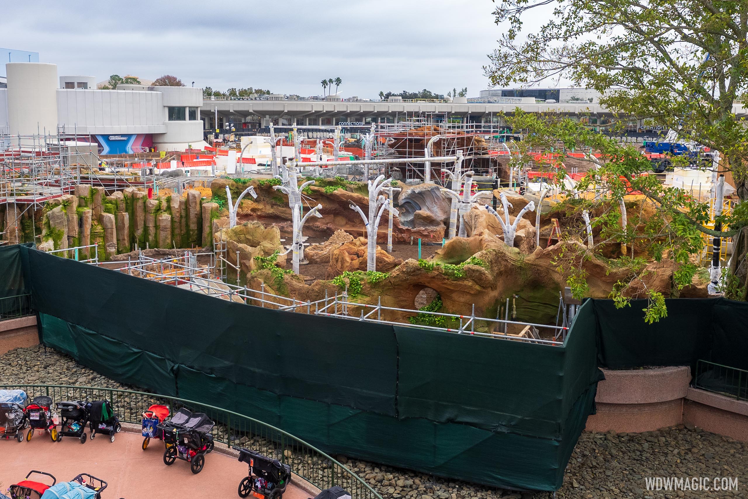
Looks like theyre paving the pathways. Will this really not open till 2023?Construction update from 'Journey of Water Inspired by Moana' at EPCOT

Construction update from 'Journey of Water Inspired by Moana' at EPCOT
See the latest progress on the Moana themed gardens coming to EPCOT in 2023.www.wdwmagic.com

Looks like theyre paving the pathways. Will this really not open till 2023?
There's only about a month left in 2022. It's going to take them a month to take down all the scaffoldingLooks like theyre paving the pathways. Will this really not open till 2023?
I figure I would stop by and check in on the (progress?) of Moana's Journey ofConstruction update from 'Journey of Water Inspired by Moana' at EPCOT

Construction update from 'Journey of Water Inspired by Moana' at EPCOT
See the latest progress on the Moana themed gardens coming to EPCOT in 2023.www.wdwmagic.com

Register on WDWMAGIC. This sidebar will go away, and you'll see fewer ads.
