Jimmy Fallon Ride

Tom Morrow

Well-Known Member
It would look a lot more realistic it they had gone ahead and built the other 65 floors too. That's what Disney would have done.
Disney would have covered the entire show building and don't act like they wouldn't have.

The excuse here will be "it's a studio facade", except it isn't because the storyline is you're going into the real thing.
 
Last edited:

JT3000

Well-Known Member
Disney would have covered the entire show building and don't act like they wouldn't have.

The excuse here will be "it's a studio facade", except it isn't because the storyline is you're going into the real thing.

Where do you guys pick up those special glasses that keep you from seeing exposed or under-themed show buildings at Disney? I want some. They would make the experience so much more immersive. I was at Epcot and MK just last week and lost count of how many I noticed. And those are parks that can never use the "studio facade" excuse.

The Fallon building doesn't look perfect, but it seems corners are always cut somewhere, even on much larger attractions. What are you gonna do? Considering the exterior is still an improvement over what was there previously, I'm a lot more concerned with what's inside.
 
Last edited:

Disneyhead'71

Well-Known Member
Original Poster
Disney would have covered the entire show building and don't act like they wouldn't have.

The excuse here will be "it's a studio facade", except it isn't because the storyline is you're going into the real thing.
I think it depends which park. At the MK they definitely would have gone further with the facade. But at DHS, particularly the DHS of the 2000s up until now, I could see them doing about what Uni is doing.

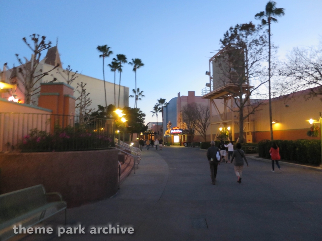
The Music Plaza side doesn't really bother me, as I think something is coming to the big gray wall. But I do wish the would do something about the yellow behind the Firehouse facade. I'd, at least, go with more gray.
 

Tom Morrow

Well-Known Member
Where do you guys pick up those special glasses that keep you from seeing exposed or under-themed show buildings at Disney? I want some. They would make the experience so much more immersive. I was at Epcot and MK just last week and lost count of how many I noticed. And those are parks that can never use the "studio facade" excuse.

The Fallon building doesn't look perfect, but it seems corners are always cut somewhere, even on much larger attractions. What are you gonna do? Considering the exterior is still an improvement over what was there previously, I'm a lot more concerned with what's inside.
Show me anything in Epcot or MK where it's as blatantly obvious as this, where you don't have to find some weird angle to see it and instead it's displayed prominently to you.

Agreed that it's an improvement over what was there before. I suppose it does match the facades on the Mummy building.
 

JT3000

Well-Known Member
Show me anything in Epcot or MK where it's as blatantly obvious as this, where you don't have to find some weird angle to see it and instead it's displayed prominently to you.

I will remember to take photos the next time I'm there. And they'll all be from guest areas, so no weird angles.
 

JoeCamel

Well-Known Member
Show me anything in Epcot or MK where it's as blatantly obvious as this, where you don't have to find some weird angle to see it and instead it's displayed prominently to you.

Agreed that it's an improvement over what was there before. I suppose it does match the facades on the Mummy building.

Off the top of my head the IASW building is pretty visible from Mansion or the riverboat along with several others around the MK. They can paint them "go away green" but they are still there. Doubt you win this one.
 
Last edited:

Tom Morrow

Well-Known Member
Again, find me examples that aren't completely obvious. Seeing the IASW building if you look through the trees, or seeing the Soarin' building in the distance but not up close doesn't count because you have to make a conscious effort to look for them to even notice. This? This is more like if Expedition Everest's flat wall (which they still bothered to paint theming onto) was facing the park prominently.

Universal's strong points are excitement, flashiness, and ride upkeep, not immersion. This could be a more constructive discussion if you guys wouldn't knee-jerk defend every aspect about Universal.
 

JT3000

Well-Known Member
Again, find me examples that aren't completely obvious. Seeing the IASW building if you look through the trees, or seeing the Soarin' building in the distance but not up close doesn't count because you have to make a conscious effort to look for them to even notice. This? This is more like if Expedition Everest's flat wall (which they still bothered to paint theming onto) was facing the park prominently.

Universal's strong points are excitement, flashiness, and ride upkeep, not immersion. This could be a more constructive discussion if you guys wouldn't knee-jerk defend every aspect about Universal.

I'm afraid a constructive discussion is going to be impossible if you're going to pretend a monstrosity such as this "doesn't count." That is Extreme Bias 101. And yes, I notice it several times on every visit. Those magical glasses haven't come in the mail yet.

epcot-canada-pink-sky-1-9.jpg


Of course, if we were being constructive, we would at least wait until we're absolutely sure they're finished with the exterior before judging it.
 
Last edited:

Tom Morrow

Well-Known Member
I love how the only example you provided was one of two things I said not to use. Yep, zooming in on something backstage with a DSLR from across the lagoon = totally the same as placing it front and center in the main plaza of your park and not theming all of it. Even if the Soarin' building WAS IN the guest areas, you can bet that Disney would theme every part of it that faces the park areas, not just the part closest to the attraction entrance so it looks good for Instagram photos. You know, like they did for Soarin' in DCA.

It is very rare to get a glance at any backstage area at Disney that you aren't supposed to see. Even at every service access gate, they have taken steps to ensure that if you walk all the way to the gate, everything is still themed to that point. Now look at Universal's access gates, if you walk up to them, like the one next to Mummy, you see backstage, you see everything you're not supposed to see. Even at the entrance gates of IOA, look to the left of the lighthouse - there's a service access gate with a clear view of a security booth. If you walk closer to it, you see everything you shouldn't sere. Right at the entrance. Universal is filled with instances like this because, excluding Diagon, everything only looks "good enough" but is not totally immersive. They do not take sightlines into consideration.

Again, I fully support praising Universal for their strengths... but immersion is not one of their strengths unless JK Rolling is calling the shots. Focus on their strengths instead of insinuating that everything they do is somehow better than what Disney does.

This forum makes people SO jaded against WDW that they'll scream at it for minor flaws but gloss over major, glaring flaws elsewhere. I was the same way until I stepped away from this forum and the parks for about a year.
 
Last edited:

JT3000

Well-Known Member
I love how the only example you provided was one of two things I said not to use.

Translation: "I hate that you used one of the things I knew would blow a giant hole in my argument, even after I told you not to."

It is very rare to get a glance at any backstage area at Disney that you aren't supposed to see.

And I'll happily provide the evidence that this isn't true, since we're pushing the issue. But I have a feeling you'll just tell me that since it's exposed we're supposed to see it.
 
Last edited:

Tom Morrow

Well-Known Member
Translation: "I hate that you used one of the things I knew would blow a giant hole in my argument, even after I told you not to..
You picked the ONE thing that every jaded fanboy gets their underwear in a bunch over. PLEASE, show me something else at Epcot or really anywhere in WDW that is as blatantly crappy as this facade. Hell, the fact that the show building is exposed isn't even the big offense since all the adjacent attractions' show buildings are also fully exposed, it's that it's supposed to be a real building in New York, but not covering all of it makes it an obvious half-assed facade.

I actually give the visible Forbidden Journey show building a pass because I know they had limited space and can't really theme it as anything else or it would detract from Hogwarts Castle. Transformers doesn't bother me at all because the entire building is well themed. But there's no question that this would have looked much better as a complete facade.
 
Last edited:

TubaGeek

God bless the "Ignore" button.
Disney would have covered the entire show building and don't act like they wouldn't have.

The excuse here will be "it's a studio facade", except it isn't because the storyline is you're going into the real thing.
You just described a vast majority of DHS. Why is anyone ing and moaning about the studio parks? They have their excuse built in.
 

Disneyhead'71

Well-Known Member
Original Poster
Crappy design being used to justify crappy design. For all the talk of how Universal isn't copying Disney, Disney sure gets brought up a lot.
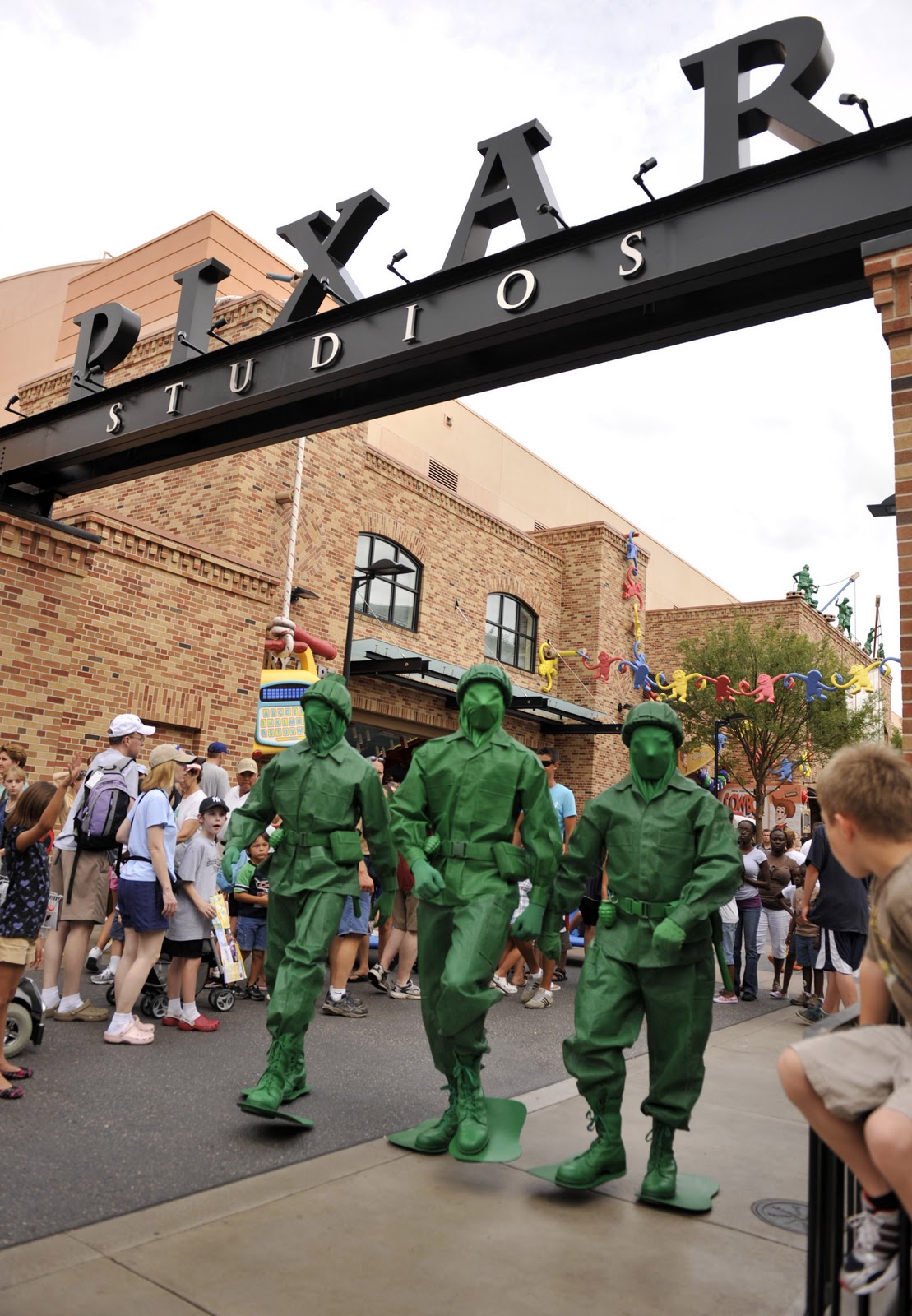
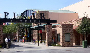
But I don't think it's crappy design. I like PIXAR Place. And I like the Fallon facade. I like how they blend the studios aesthetic and the content inspired facades. I like how the Production Central side of the building is left with more of soundstage look, while the NYC side of the building doesn't.
 

lazyboy97o

Well-Known Member
But I don't think it's crappy design. I like PIXAR Place. And I like the Fallon facade. I like how they blend the studios aesthetic and the content inspired facades. I like how the Production Central side of the building is left with more of soundstage look, while the NYC side of the building doesn't.
The studio aesthetic itself is crappy, an excuse not to do anything that has largely been abandoned even by Universal. The soundstage look doesn't face Production Central, it looms over New York.
 

Register on WDWMAGIC. This sidebar will go away, and you'll see fewer ads.

Back
Top Bottom