Imagineerland's Sydney Summer

Imagineerland

Well-Known Member
Original Poster
sydney-summer-TITLE-2-01-smal.jpg


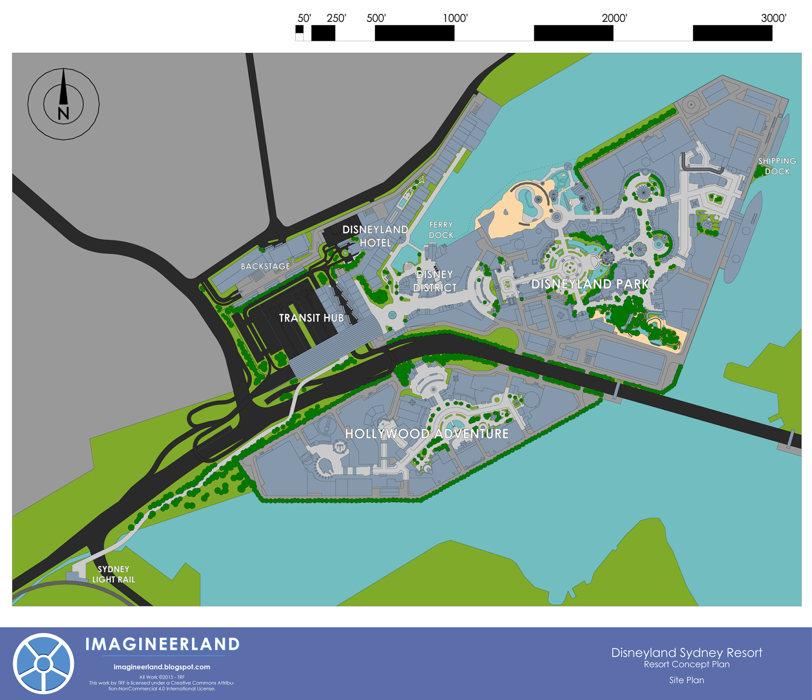
For those of you who have not already seen it, I just started a new series of posts on Imagineerland that covers the design of an original resort in Sydney. Some of you may have seen a first version of this resort, but this is a greatly refined version with many new elements.

This week I posted a introduction to the site and the concept, next week I will be posting detailed park plans of the two theme parks in the resort, and over the rest of the summer I will be posting a few attraction plans, elevations, graphics, and more text explaining the architectural and entertainment design of the resort. This will be a indepth look at the creation of a new resort.

I plan to post every other week and continue this series through the summer and fall, until the entire resort is covered in detail. I would love for you to follow along. At the end of this post, I have attached a preview of the overall site plan for the resort.

Please feel free to leave comments with thoughts and questions about the resort on the blog. I would be happy to discuss design with you all.

Thanks!

TRF of Imagineerland

imagineerland.blogspot.com

sydney%2Btotal%2Bsite%2Bplan-01.png
 

jdmdisney99

Well-Known Member
sydney-summer-TITLE-2-01-smal.jpg


For those of you who have not already seen it, I just started a new series of posts on Imagineerland that covers the design of an original resort in Sydney. Some of you may have seen a first version of this resort, but this is a greatly refined version with many new elements.

This week I posted a introduction to the site and the concept, next week I will be posting detailed park plans of the two theme parks in the resort, and over the rest of the summer I will be posting a few attraction plans, elevations, graphics, and more text explaining the architectural and entertainment design of the resort. This will be a indepth look at the creation of a new resort.

I plan to post every other week and continue this series through the summer and fall, until the entire resort is covered in detail. I would love for you to follow along. At the end of this post, I have attached a preview of the overall site plan for the resort.

Please feel free to leave comments with thoughts and questions about the resort on the blog. I would be happy to discuss design with you all.

Thanks!

TRF of Imagineerland

imagineerland.blogspot.com


sydney%2Btotal%2Bsite%2Bplan-01.png
Happy to see you further developing that idea!
 

Imagineerland

Well-Known Member
Original Poster
In next week's post, I discuss why I chose the parks I did. But the short answer is that I believe current IP popularity would drive any new resort to include film properties like Star Wars and Marvel. I also wanted to maintain the thematic integrity of the first gate as a IP free park (outside of the classic dark rides of Fantasyland), so a Hollywood Park was the logical result to hold those instantly popular properties that the resort needs. Tokyo DisneySea is a great park, and I definitely wanted to bring some of its design aesthetic and detail to this resort but I did not want to just build a copy because its uniqueness to Japan is part of what makes it special. I wanted to take the best elements and adapt them into the Disneyland Park, which you will see when i go into the detailed design philosophy of each land. Specifically, the New York Harbor area to the east is heavily reminiscent of American Waterfront, and Discoveryland has some elements from Mysterious Island and Port Discovery.
 

Imagineerland

Well-Known Member
Original Poster
I'm dying....that logo is gorgeous....that map...my God...I'm dying.

BTW nice props for Sydney 2000's logo being used:
2000_sydney_logo.jpg
Haha glad someone noticed i just took the Sydney text for the logo. I liked the font, thought why not. I would not say logo design is a strength. I'm in architecture, not graphic design haha.

Thank you for the comments. That plan is a long time in progress with alot of thought behind it. Hope you follow along over the rest of the summer!
 

Sam Magic

Well-Known Member
Haha glad someone noticed i just took the Sydney text for the logo. I liked the font, thought why not. I would not say logo design is a strength. I'm in architecture, not graphic design haha.

Thank you for the comments. That plan is a long time in progress with alot of thought behind it. Hope you follow along over the rest of the summer!
I actually have a zip of that typeface if you want me to send it to you, just PM me . I love the Olympics and Sydney is one of my favorite games.
 

Imagineerland

Well-Known Member
Original Poster

Twilight_Roxas

Well-Known Member
It looks good but 2 questions. 1.Where's Space Mountain? 2.What would the nighttime show in front of the castle use along with fireworks?
 

Imagineerland

Well-Known Member
Original Poster
No Space Mountain, I wanted to try some new things in the park and not necessarily stick to the traditional model. Instead, a Journey to the Center of the Earth coaster/dark ride becomes the feature draw of Discoveryland.

Later on in the summer's schedule is a post just about the fireworks entertainment of the parks. I will say now that it includes many of the innovations from Disney Dreams and Disneyland Forever, including projections and water. I will have diagrams and elevations of my proposal later on in the summer.
 

Vipraa

Well-Known Member
Love the detail you put into the infrastructure and little details that most people overlook. The parking garage and backstage details are pretty impressive. You definitely choose a hard location to work with being an odd shape of land and locked with city on one side and water on the other.

You will definitely need lots additional parking with only 7,800 spaces. Magic Kingdom regularly fills up most of its 11,000 spaces on busy day and Disneyland nearly fills its 19,000 spaces almost every weekend with the crush of locals. However I do feel you may be underestimating you space counts. How did you reach your numbers? You hotel lot in paticular is rather odd with 6 levels and only 300 spaces. That only 50 per level. The new DTD Orange garage has 50 cars per row.

Another thing and I know you are space limited but your Hollywood Adventure Park feels like it would have crazy crowd control dynamics or very low capacity with dead ends in 2 popular areas. The crowd crush at the inlets for the Star Wars area in particular would be rather nasty with the single narrow opening in a popular area. Just wondering how you would get around that.

Besides those minor quibbles everything you have done is very impressive and I cant wait to see more. The layouts, diagrams and elevations are very detail and professional looking. If you don't mind me asking what program do you use to create them?

All in all keep up the good work ;)
 

Imagineerland

Well-Known Member
Original Poster
I thought those numbers came out a little low too honestly so I checked them. And of course I found a mistake haha. I left out a floor, so it is actually 2290 spaces in the main deck. Still not alot. But here's some details.

Since I used 45 degree parking, the standard width of one spot is 12.7 feet, as opposed to 9 feet for 90 degree parking. However the 45 degree allowed the rows to be closer so it works out. A standard row is 437 feet, so 34 spaces a row. 10 rows a floor, 6 standard floor and the entrance floor with a little lower capacity. So 2290 spaces in that deck. The deck is 350' by 540' or 189,000 sq ft per floor including the ramp systems. For comparison the Downtown Disney decks are 790' x 350' or 276,500 sq ft not including the ramps. The hotel deck is 120' x 250', so it is an extremely small deck. Also it is 60 per floor, because the 300 number does not include the bottom floor for manager parking. So it is pretty small and seems smaller than it should be, but I think it makes sense.

And I think it is ok because the resorts location allows it to depend on public transportation, like Paris and Hong Kong. Your examples are completely true, but those are for the car dependent American society. I think the light rail, ferry, and buses would bring a good majority of the capacity to the resort. Also I was thinking about proposing that the deck here was presale only and all day-of traffic would go to the remote lot. That would organize traffic enough to work I think.

I will say though that I am no traffic planner so this is all just speculation and trail and error. But good enough for me.

The traffic flow of Hollywood Adventure is a challenge that I don't know if I completely solved, but I definitely recognize. The shape of that land causes issues because it was hard to get many parallel paths to fit and make thematic sense. I think the Pixar side is ok. The Star Wars dead end is a bit more of an issue, but I have some thoughts that I will make sure to address when I get there.

Its all made it sketchup, which I see you are familiar with. Then i export to adobe illustrator to add the text and logos. I looked at the projects in your signature, really cool. Very impressed by the animated fireworks video.

Thanks for reading and commenting!
 

Sam Magic

Well-Known Member
I think your traffic flow is a big problem. While it is true that Sydney has great public transportation, the area you are working with is rather small, near residential areas, and very far from the international airport.

Sydney's Airport is all the way in Botney Bay...how would you get guest effectively between the two areas and properly connect the resort to the Australian interstate system?
 

Imagineerland

Well-Known Member
Original Poster
I'm not sure I see much of a problem. For getting guests from the airport to the resort, I have proposed a Magic Express like Bus line, except for all guests to the resort, not just those at the hotel. According to Google Maps, the trip between airport and resort is 16 minutes via M1 to the Cross City Tunnel and then A4. For comparison, the route from the Orlando Airport to the Contemporary for example is 35 minutes. So distance and time are not an issue to what I have proposed.

Additionally, I see this as one or two day visit resort, so it is intended for locals and those doing further visiting to Sydney. So the heaviest capacity load for transportation to the resort would likely be on public transportation, i.e. the buses, ferries, and light rails, which I believe have the capacity. Disney choose this site in the past after all, so they must have believed in the transportation. It would be nice if it was on a train line (I considered saying in the proposal that a new underground station was built under the transit hub specifically for the resort) but I think its ok.

It is not perfect, but its good enough for a hypothetical resort plan.
 

Imagineerland

Well-Known Member
Original Poster
New post this week at Imagineerland!

Adventureland! Jump over to Imagineerland to read the detailed walkthrough of the land, including a brand new attraction plan for an original Pirates of the Caribbean flume attraction.

Also, two weeks ago I posted about Main Street and Fantasyland, including a new castle elevation. I didn't get around to posting here, so you may have missed it.

Thanks for reading and I would love to answer any questions about the design of the land here or on the blog. Hope you enjoy it!

TRF

A%2BELEVATION-01.png
 

Imagineerland

Well-Known Member
Original Poster
Its all drawn in Sketchup, which I know alot of people around here are familiar with. I use the pro student version and export as a vector file and then I scale it and add the text and shadows in Adobe Illustrator.

But the important part is the settings you use to export from Sketchup. You can get a plenty good image out of the free version of sketchup and add text in a free image editing program. I can get specific on those if you or anyone wants to know more.
 

Register on WDWMAGIC. This sidebar will go away, and you'll see fewer ads.

Back
Top Bottom