LittleBuford
Well-Known Member
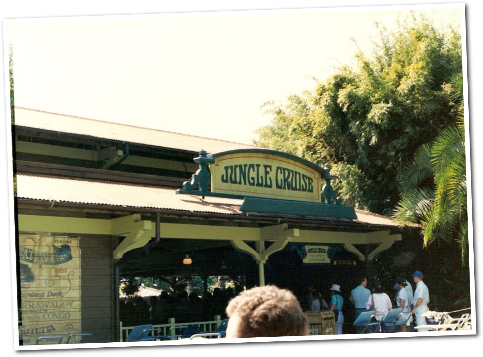
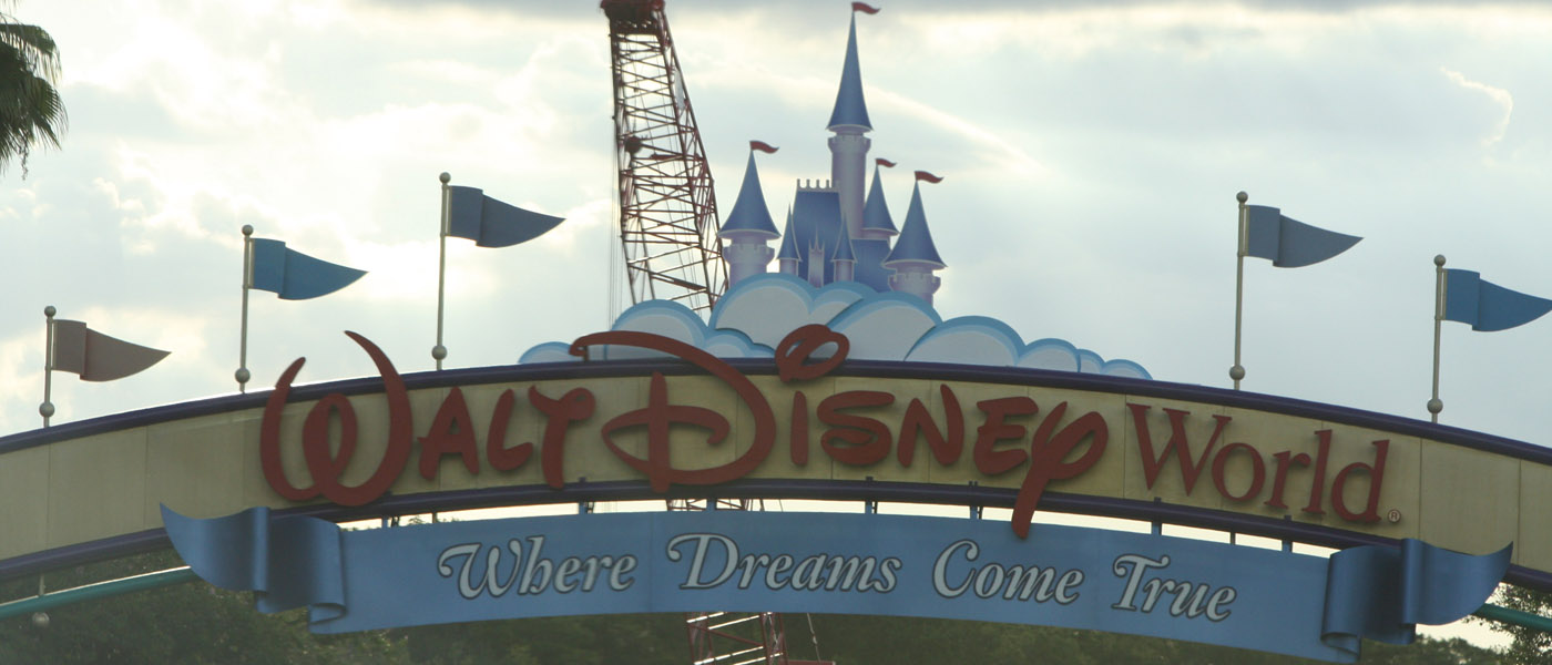
I would say that Disney’s aesthetic choices have always been responsive to the tastes of the day. Note the very ’70s font here, for example:The road signs are not attributable to cheapness. I think they’re more attributable to the fact that Disney is determined to attract folks with a lot of cash and has fixed on the stereotype that theming, bright colors, and entertainment architecture aren’t “classy.” As with the resort makeovers, it’s an absurdly misguided attempt to make WDW “fashionable.” Like so many other problems, it’s born of the fact that management has no notion of the very specific needs of the Disney brand and is instead versed only in general, one-size-fits-all “business principles.”

I don’t fault them for updating their new signs to better accord with today’s fashions. I just happen to prefer the ’90s aesthetic (and not everyone does) and to dislike the fact that the new colour scheme reminds me of British motorway signage.

