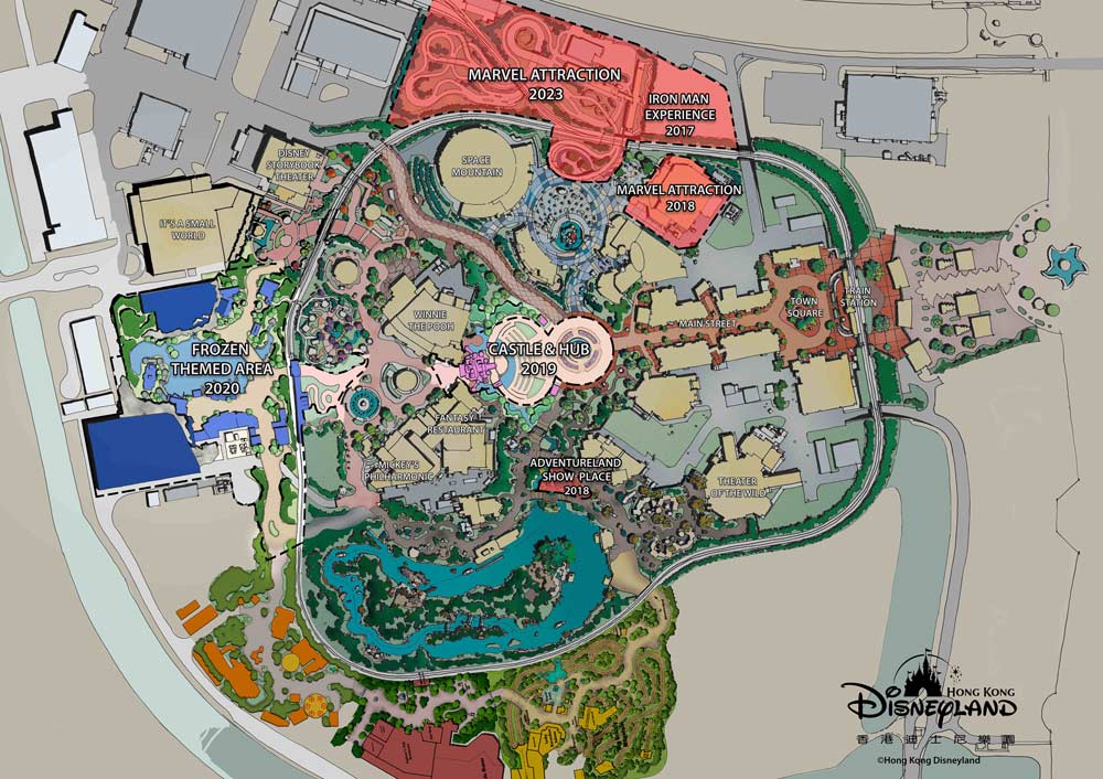
HKDL gets new castle, frozen land and marvel land.

616.1314

Well-Known Member
In the Parks
Yes

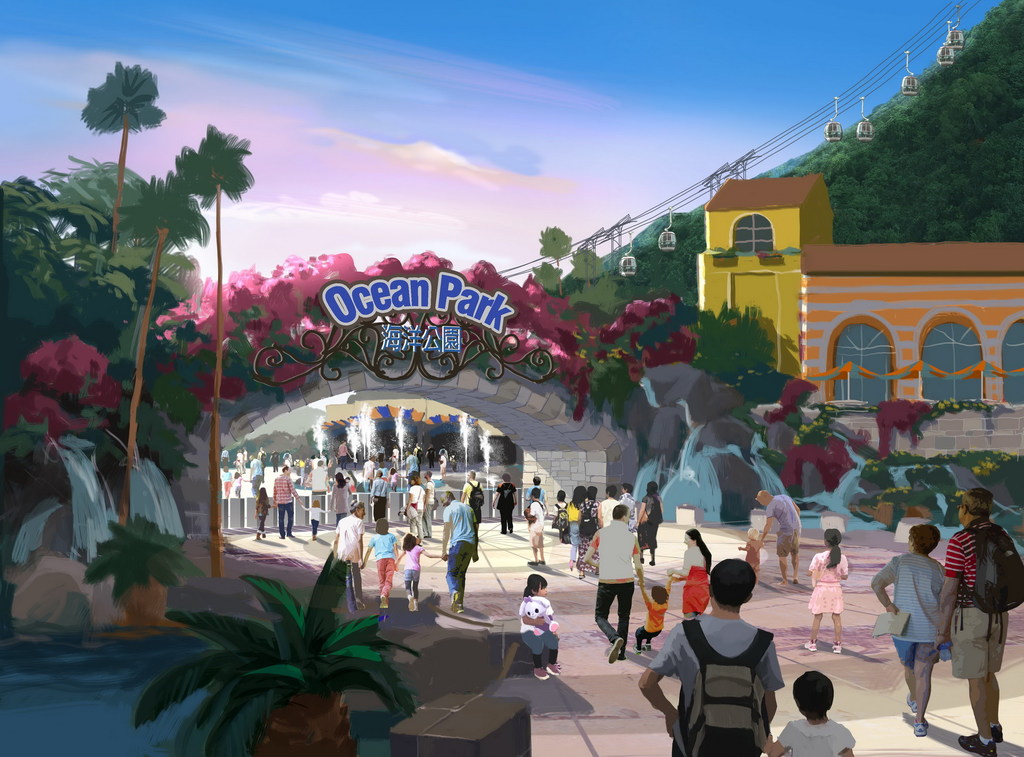
Hong Kong Ocean Park will get an HK$10.6 billion multi-year expansion plan, including Ocean Park version’s “Downtown Disney”. However, based on the concept art, none of them can be compared to the avengers' e-ticket or even Frozen Ever After.

It also said the current financial year‘s attendance may drop to 3.3 million. Anyone know how the attendance in HKDL since Oct 2019 (this financial year)?

Concept Art:
omg what a joke...
the past OP expansion was already a total disaster - not following the concept art at all
and this time, even the concept art looks tedious
it will be an insult to Disney if we continue calling OP a rival of HKDL
 

HKDLer

Well-Known Member
It also said the current financial year‘s attendance may drop to 3.3 million. Anyone know how the attendance in HKDL since Oct 2019 (this financial year)?
The next LegCo panel on economic development which will cover HKDL fiscal year 2019 operations is scheduled to be held on Feb 24, 2020.
 

HKDLer

Well-Known Member
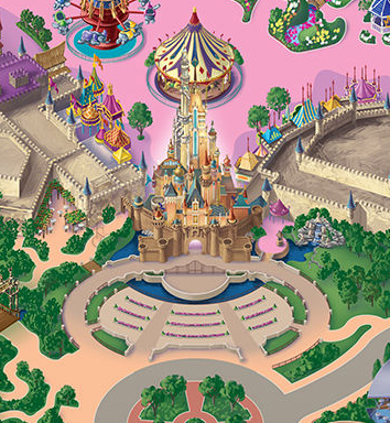
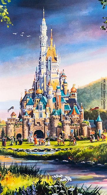
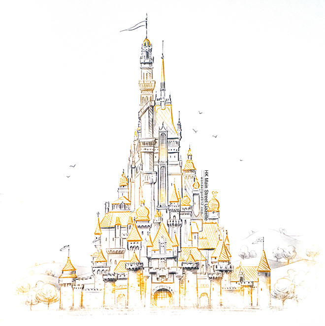
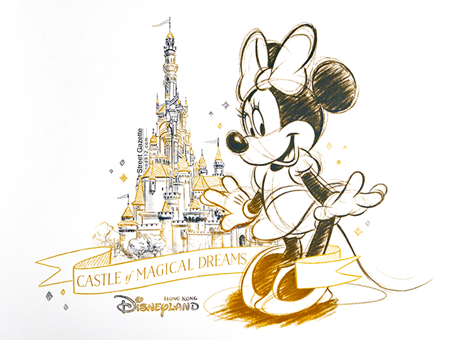
Some great updates from HKMSG:
HKMSG_HKDL_COMD_PM_1.jpeg

Park map updated with new castle and viewing area. I'm so glad that Snow White's grotto remains.

HKMSG_COMD_DA_2020_9.png

HKMSG_COMD_DA_2020_10.jpg

HKMSG_COMD_DA_2020_6.png

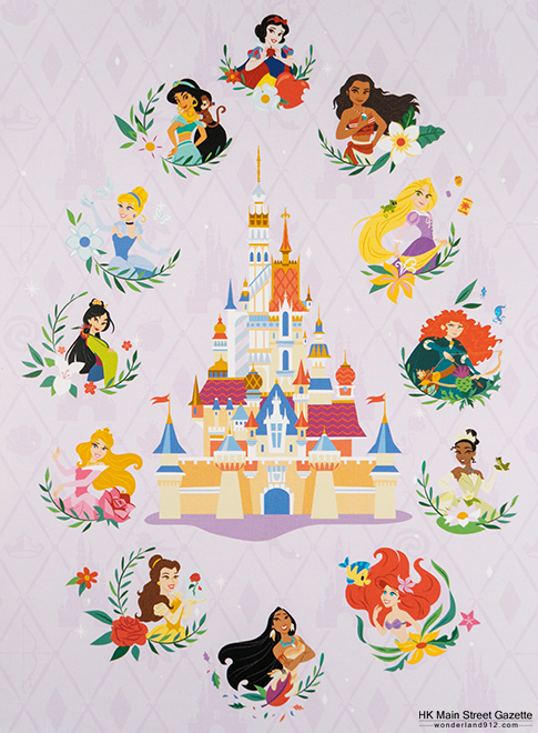
New artworks featured on cast exclusive calendar

HKMSG_COMD_DA_2020_2.png

HKMSG_COMD_DA_2020_3.png

Cast exclusive commemorative mug prints

HKMSG_COMD_DA_2020_8.png

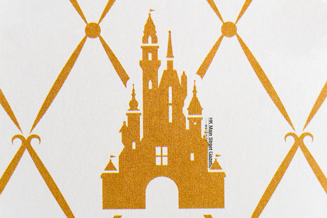
New logo?

Full link: https://hkmsg.blogspot.com/2016/11/20171122.html
 
Last edited:

616.1314

Well-Known Member
In the Parks
Yes
Some great updates from HKMSG:
HKMSG_HKDL_COMD_PM_1.jpeg

Park map updated with new castle and viewing area. I'm so glad that Snow White's grotto remains.

HKMSG_COMD_DA_2020_9.png

HKMSG_COMD_DA_2020_10.jpg

HKMSG_COMD_DA_2020_6.png

New artworks featured on cast exclusive calendar

HKMSG_COMD_DA_2020_2.png

HKMSG_COMD_DA_2020_3.png

Cast exclusive commemorative mug prints

HKMSG_COMD_DA_2020_8.png

New logo?

Full link: https://hkmsg.blogspot.com/2016/11/20171122.html
omg thats breaking news
thanks for the update!
wonder if the change in colour of the castle walls will cause major visual disturbances in F-land tho
 

yensidtlaw1969

Well-Known Member
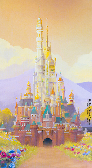
It kind of stuns me how little design relation the new construction seems to have to the existing castle.

The design appears to be well executed in the construction, but the design itself . . . woof.

There's room to "break the rules" for the sake of making something unique, but you'd think they'd make sure it's also good.
 

Stevie Amsterdam

Well-Known Member
It kind of stuns me how little design relation the new construction seems to have to the existing castle.

The design appears to be well executed in the construction, but the design itself . . . woof.

There's room to "break the rules" for the sake of making something unique, but you'd think they'd make sure it's also good.
Isn't that in the eye of the beholder? I love the new design and still see the relation to the original castle.
 

yensidtlaw1969

Well-Known Member
Isn't that in the eye of the beholder? I love the new design and still see the relation to the original castle.
The woof part? The "good" part? Sure, that's just my opinion. I have no interest in shouting down anyone who feels otherwise.

The relation between the old design and the new? That's a little more objective - the only meaningful design elements I see in the pictures above that relate to the architecture of Sleeping Beauty Castle are the mansard roofs and their shingles, the flying buttresses (which demonstrate no reasonable application of their function), and . . . the fact that the main tower has a central stained glass window, I guess? Outside of that, everything else looks just as tacked on as it actually is and creates no illusion that the building is a complete whole and was designed this way from the beginning. Which, maybe is the point? But what a weird, convoluted point for your central icon, especially since it impacts its visual appeal.

There doesn't appear to be any real architectural grounding here, unlike Paris which is highly fantastical while still appearing plausible. Castles in the real world don't look like Le Chateau, but Le Chateau balances that out wisely by appearing to be built the way real castles are built. The Mulan tower on this castle is pure ornament - what are we supposed to believe is in there? There are no windows, no doors, no balconies . . . it's a tower for the sake of putting a tower on a fake castle, not one that puts forth the idea that not only does this place look cool but things HAPPEN there. The elements appear cherry-picked from a list of what makes a cool castle but assembled with no discernible logic. It's a ransom note of architectural features put together by someone who doesn't seem to know how to spell.

For as weird as Shanghai's Castle is (and I think it is - those proportions are booonkers), it at least avoids the trap of featuring elements that don't look like they could be practical.

I'm not saying anyone can't love it - lord knows there are a good many things in this world that I love that either don't make sense or aren't objectively "good" . . . but given the generally high standard of design for Disney Castles this one seems to reject every lesson in the book in favor of something that doesn't offer as strong a notion of what a Disney Castle could be. All built on the back of what is the most iconic and charming of all Disney Castles. What a weird thing to choose to clash with.
 

Stevie Amsterdam

Well-Known Member
The woof part? The "good" part? Sure, that's just my opinion. I have no interest in shouting down anyone who feels otherwise.

The relation between the old design and the new? That's a little more objective - the only meaningful design elements I see in the pictures above that relate to the architecture of Sleeping Beauty Castle are the mansard roofs and their shingles, the flying buttresses (which demonstrate no reasonable application of their function), and . . . the fact that the main tower has a central stained glass window, I guess? Outside of that, everything else looks just as tacked on as it actually is and creates no illusion that the building is a complete whole and was designed this way from the beginning. Which, maybe is the point? But what a weird, convoluted point for your central icon, especially since it impacts its visual appeal.

There doesn't appear to be any real architectural grounding here, unlike Paris which is highly fantastical while still appearing plausible. Castles in the real world don't look like Le Chateau, but Le Chateau balances that out wisely by appearing to be built the way real castles are built. The Mulan tower on this castle is pure ornament - what are we supposed to believe is in there? There are no windows, no doors, no balconies . . . it's a tower for the sake of putting a tower on a fake castle, not one that puts forth the idea that not only does this place look cool but things HAPPEN there. The elements appear cherry-picked from a list of what makes a cool castle but assembled with no discernible logic. It's a ransom note of architectural features put together by someone who doesn't seem to know how to spell.

For as weird as Shanghai's Castle is (and I think it is - those proportions are booonkers), it at least avoids the trap of featuring elements that don't look like they could be practical.

I'm not saying anyone can't love it - lord knows there are a good many things in this world that I love that either don't make sense or aren't objectively "good" . . . but given the generally high standard of design for Disney Castles this one seems to reject every lesson in the book in favor of something that doesn't offer as strong a notion of what a Disney Castle could be. All built on the back of what is the most iconic and charming of all Disney Castles. What a weird thing to choose to clash with.
Thank you for the detailed reaction. I actually feel smarter after reading your reply and I agree on some of the things you wrote. A tower needs to have a purpose, even if it would only be a stairs or something (not every tower can be a bedroom lol).
 

yensidtlaw1969

Well-Known Member
Thank you for the detailed reaction. I actually feel smarter after reading your reply and I agree on some of the things you wrote. A tower needs to have a purpose, even if it would only be a stairs or something (not every tower can be a bedroom lol).
Well, I'm sure that's overly generous of you to say, but I appreciate it!

And to be sure, there are things about this design that I enjoy - I just came across this picture of the construction and find it quite flattering. If the whole thing were being created from scratch in line with what we see here I think it would make for a handsome departure from other Disney Castles:

Screen Shot 2020-01-22 at 4.08.05 PM.png


This picture does also remind me of another Sleeping Beauty Castle design element that's carried over into the new - the "Notre Dame" Spire from SBC is echoed by the golden spire on top of the central roof. I forgot to mention that in my earlier post!

That said, it does also highlight another strange feature of the new design - both the Spire and Flying Buttresses that are echoed in the new construction are larger than the originals they are echoing, which speaks to the idea of trying to create an impressive new addition but works against any notion of forced perspective which is traditionally used to make the castles appear even taller than they are.

I understand not wanting to feel hemmed in by the scale of the castle that already existed if its size was one of the problems that drove this project into being, but then maybe find a way to incorporate those elements that doesn't disagree with one of the historic base principles of Castle Design. Maybe put those features around back where they can't be directly compared to the original and upset the scale?
 

hkdisky

Member
if they dont use the plot on the other side of the railroad tracks, the E-ticket is going to be much smaller in scale than expected...
76AF1FD1-8B1C-4C1B-A02A-9E182FC4C894.jpeg
3D3DA51B-F656-42F4-9B95-E377DA65912E.jpeg

This should be the viewing angle from the concept art. There will be enough space for the building as shown in the concept art, but smaller in scale than I expected.
 

Register on WDWMAGIC. This sidebar will go away, and you'll see fewer ads.

Back
Top Bottom