Haunted Mansion to Return with New Enhancements and Magic :(

TP2000

Well-Known Member
Huh? In Florida the Mansion isn’t far away. You enter a side door on the lower level, not somewhere removed from the house.

A side door on the lower level? Is that what we're calling it now? That seems rather tortuous to try and excuse it like that.

It's a weirdly placed entry built into an earthen berm far from the house itself, and nowhere near the front door.

If you dare think about it, it becomes a question of "Why is there an entrance to this house built into the side lawn?" o_O
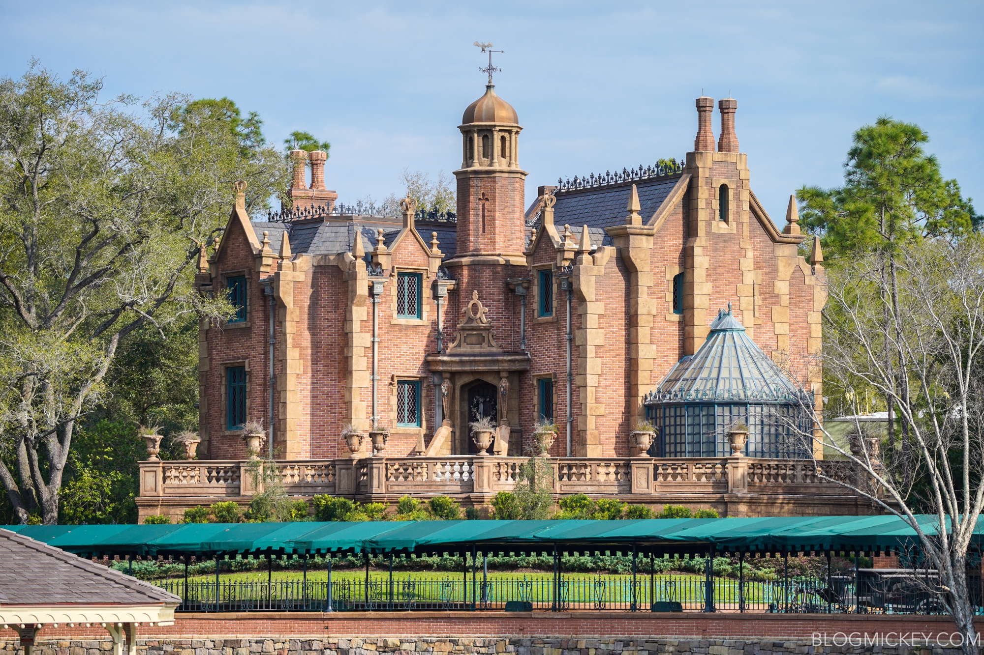
haunted-mansion-facade-1.jpg
 

Professortango1

Well-Known Member
Huh? In Florida the Mansion isn’t far away. You enter a side door on the lower level, not somewhere removed from the house.

But it is removed from the house. The house it up and to the side. This is made even worse by the weird covered walkway leading up to this underground entrance. It feels like we're walking into the carriage house, but instead its a foyer for some weird reason.
 

TP2000

Well-Known Member
Right now they're doing some select attractions and food locations for cms on the clock as a test and adjust period and mansion was one of them. I had time to kill and rode it.

Grounds and exterior haven't looked any better. Social distancing the queue could be worked out better. They didn't utilize all of their queue but we had to wait even using their extended queue that they use for holiday. They only had one stretch room going so it took a little over 30 min for the queue.

For now it's only 4 groups in the foyer. But once in the stretching room it can accommodate one more group. So that last will end up missing the spiels by the time they enter.

As I said it's test and adjust so not everything was working. Load area seems to be the most work done. It was nice but odd being so used to the old way for many decades.

Rest of the ride looks exactly the same. Some Props or lighting were not working or placed right.

I didn't notice the new doll house they mentioned in the attic. If it was there or not. I couldn't tell. Bride is still the same unfortunately.

Graveyard looked refreshed for some of the characters.

Thank you!

So it's a basic little refurbishment with a reworked loading area to accommodate more wheelchairs. Nothing earth-shattering or new. Just a basic refurbishment of the sort all attractions got regularly in the 20th century, before standards were allowed to fall.

And yet somehow TDA stretched all that minor maintenance into a major press release? Really? :rolleyes:
 

TP2000

Well-Known Member
But it is removed from the house. The house it up and to the side. This is made even worse by the weird covered walkway leading up to this underground entrance. It feels like we're walking into the carriage house, but instead its a foyer for some weird reason.

Exactly. It's one of those things that WDI is hoping you don't think about, because if you do stop for a moment to consider it you have to ask yourself "Why is an entrance to this home built out into the side lawn, and where would this even lead me if it was real?"
 

DLR>WDW

Well-Known Member
Right now they're doing some select attractions and food locations for cms on the clock as a test and adjust period and mansion was one of them. I had time to kill and rode it.

Grounds and exterior haven't looked any better. Social distancing the queue could be worked out better. They didn't utilize all of their queue but we had to wait even using their extended queue that they use for holiday. They only had one stretch room going so it took a little over 30 min for the queue.

For now it's only 4 groups in the foyer. But once in the stretching room it can accommodate one more group. So that last will end up missing the spiels by the time they enter.

As I said it's test and adjust so not everything was working. Load area seems to be the most work done. It was nice but odd being so used to the old way for many decades.

Rest of the ride looks exactly the same. Some Props or lighting were not working or placed right.

I didn't notice the new doll house they mentioned in the attic. If it was there or not. I couldn't tell. Bride is still the same unfortunately.

Graveyard looked refreshed for some of the characters.
How was the pace of the line? Excruciatingly slow?
 

yensidtlaw1969

Well-Known Member
Right now they're doing some select attractions and food locations for cms on the clock as a test and adjust period and mansion was one of them. I had time to kill and rode it.

Grounds and exterior haven't looked any better. Social distancing the queue could be worked out better. They didn't utilize all of their queue but we had to wait even using their extended queue that they use for holiday. They only had one stretch room going so it took a little over 30 min for the queue.

For now it's only 4 groups in the foyer. But once in the stretching room it can accommodate one more group. So that last will end up missing the spiels by the time they enter.

As I said it's test and adjust so not everything was working. Load area seems to be the most work done. It was nice but odd being so used to the old way for many decades.

Rest of the ride looks exactly the same. Some Props or lighting were not working or placed right.

I didn't notice the new doll house they mentioned in the attic. If it was there or not. I couldn't tell. Bride is still the same unfortunately.

Graveyard looked refreshed for some of the characters.
Thank you for the update! Disappointing to hear that Constance didn't recieve more love.

Can I ask if you got a sense of the lighting levels in the Load Area? Did it seem darker than usual? My prayer is that the walls once again seem to "disappear" . . . or at least are less visible than they've been recently.
 

Castle Cake Apologist

Well-Known Member
A side door on the lower level? Is that what we're calling it now? That seems rather tortuous to try and excuse it like that.

It's a weirdly placed entry built into an earthen berm far from the house itself, and nowhere near the front door.

If you dare think about it, it becomes a question of "Why is there an entrance to this house built into the side lawn?" o_O

haunted-mansion-facade-1.jpg

But it is removed from the house. The house it up and to the side. This is made even worse by the weird covered walkway leading up to this underground entrance. It feels like we're walking into the carriage house, but instead its a foyer for some weird reason.

Huh??

I'm sorry, but have you ever actually been to the WDW Mansion, or are you just basing this on pictures? @lazyboy97o is right, you enter the home from a side entrance on the lower level. Nothing is "built into the side lawn," and nothing gives you the impression that it is. You walk right into the same house you've been queuing in front of.

HauntedMansion-02.jpg


Regarding the canopy, that wasn't part of the original design and was added later because of the punishing Florida sun. It's popular in the Disneyland sub-forum to act like everything at MK is inferior to DL (rightfully so in some cases), but the WDW Mansion was literally built by the same team at WED, and practically at the same time.
 
Last edited:

Castle Cake Apologist

Well-Known Member
Doesn't feel like you're going in to the house. It's up on a hill and you're not. If anything, you go into a basement, or the batcave.

How does literally walking into a door in the side of the house not feel like going into the house? The WDW Mansion isn't really "up on a hill," like it may appear from front-on shots of it. It's just very tall and has a main entrance on what is technically it's 2nd floor. There is a landscaped hill built up in front of the house, but the Mansion isn't really on it or built into it. You can walk all around the front and sides of the Mansion and see that it's just very tall, but the house itself goes to the ground level on all sides. It's a three story home with an attic.
 

Animaniac93-98

Well-Known Member
It’s so bizarre how they spend money “fixing” things that are not broken while stuff that is just continues to chug along.

I think that's because newer Imagineers are eager to leave their mark on attractions and do new things. These contracted talents often forget what's been neglected because things aren't documented properly and few stay long enough to care.
 

Professortango1

Well-Known Member
How does literally walking into a door in the side of the house not feel like going into the house? The WDW Mansion isn't really "up on a hill," like it may appear from front-on shots of it. It's just very tall and has a main entrance on what is technically it's 2nd floor. There is a landscaped hill built up in front of the house, but the Mansion isn't really on it or built into it. You can walk all around the front and sides of the Mansion and see that it's just very tall, but the house itself goes to the ground level on all sides. It's a three story home with an attic.

When waiting for the WDW HM it feels like you're at the set for the Bates House. Its a smaller facade up on a hill. It feels fake. And entering it feels like we are walking into the Bates Motel and suddenly seeing an interior for the House.

When you enter, you are entering what feels like below ground since the front door is seen to be above you and to the side. Such an entrance into a property would usually be something designed for staff/shipping and receiving. If they had themed the hallway to the staff entrance with us then entering the main house in a transition room, I'd be much more accepting. But as it is, it is a design flaw.

As for the canopy, it looks bad and also blocks the full Mansion from view at many times. Could WDW not plant trees and build some themed elements to provide pockets of shade? A vine covered arbor or a gazebo. Maybe a greenhouse towards the back? Instead of putting in a weird cartoon graveyard with ghosts interacting with guests before it makes sense, they could have built a shaded and wandering path.
 

180º

Well-Known Member
When waiting for the WDW HM it feels like you're at the set for the Bates House. Its a smaller facade up on a hill. It feels fake. And entering it feels like we are walking into the Bates Motel and suddenly seeing an interior for the House.

When you enter, you are entering what feels like below ground since the front door is seen to be above you and to the side. Such an entrance into a property would usually be something designed for staff/shipping and receiving. If they had themed the hallway to the staff entrance with us then entering the main house in a transition room, I'd be much more accepting. But as it is, it is a design flaw.

As for the canopy, it looks bad and also blocks the full Mansion from view at many times. Could WDW not plant trees and build some themed elements to provide pockets of shade? A vine covered arbor or a gazebo. Maybe a greenhouse towards the back? Instead of putting in a weird cartoon graveyard with ghosts interacting with guests before it makes sense, they could have built a shaded and wandering path.
While I appreciate how the WDW facade differs from ours (ours is more “immersive!” and pleasant while Florida’s is more moody and rural), the canopy is a real shame, even moreso post-2007 since it was widened. I totally agree, the space taken up by that insipid interactive queue should have been dense switchbacks under a shelter, allowing for the removal of the canopy along the water and even the placement of the ride entrance/Fastpass scanners further from the main walkway.
 

Animaniac93-98

Well-Known Member
From Boundless Realm:

"Actually our entrance is through a historically justifiable architectural feature, one which has essentially been made less and less obvious by decades of redevelopment of the basic queue area."

"Porte Cocheres, in history, were always situated on the side of the house, and never opened into a formal foyer but rather a sort of out of the way reception room. In other words, we enter the Florida Haunted Mansion not into a formal foyer, but through the visitor's entrance which would lead to the social areas of the house...we step directly not into a welcome area, but a sort of alcove off a larger room where, we imagine, hats and coats may be taken and stowed. Then we walk into a room with no understandable shape - walls just left and right and doors are randomly placed. There's a central fireplace with dying embers, presumably to warm our feet on a cold winter's night, but no other visible signs of habitation."
 

Animaniac93-98

Well-Known Member
While I appreciate how the WDW facade differs from ours (ours is more “immersive!” and pleasant while Florida’s is more moody and rural), the canopy is a real shame, even moreso post-2007 since it was widened. I totally agree, the space taken up by that insipid interactive queue should have been dense switchbacks under a shelter, allowing for the removal of the canopy along the water and even the placement of the ride entrance/Fastpass scanners further from the main walkway.

The canopy was never originally intended, but you'd think 50 years later they'd come up with something better than a tent.

HoP nearby got a proper wooden queue shade structure in 1972 that's still there today as the Liberty Square Market.
 

Register on WDWMAGIC. This sidebar will go away, and you'll see fewer ads.

Back
Top Bottom