Recently I was thinking about when things we consider that feel "futuristic", mostly in architecture, etc. and when they become "retro-futuristic" and what's the difference.
My theory is that futuristic architecture only works when it hasn't reached mainstream consciousness.
Example of a futuristic city background as seen in Horizons...(from ~40 years ago)

I always loved this background, and while some people can definitely say it feels of it's time, I don't think the style of those buildings have ever reached as much mainstream as other "futuristic" styling seen in other places.
Of course there are other things that can point to whether something feels futuristic. Using angles and types of building things which previously weren't possible...materials with new properties like color changing paint or multi-color lighting.
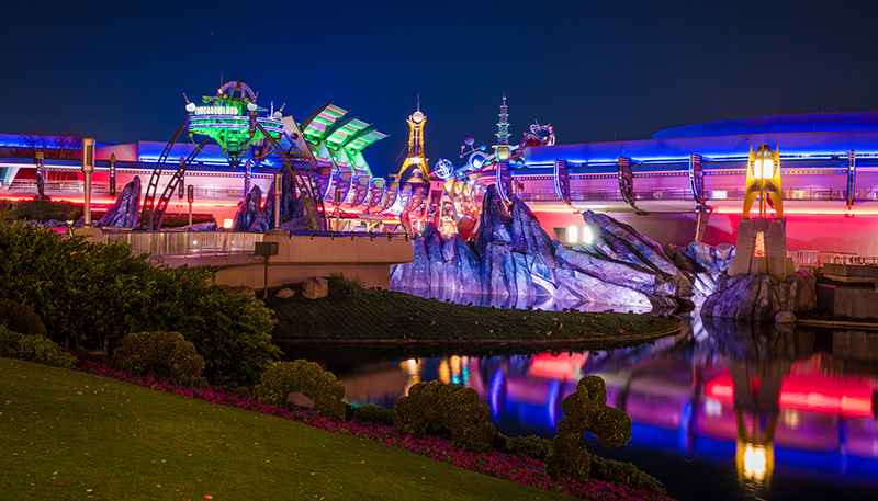
We see that in the WDW Tomorrowland until recently...considered to be "retro-futurism"

To me, this is considered retro, because it FEELS like familiar things from the 1940's and 50's...the neon lights, the Buck Rogers/ Flash Gordon aesthetic.
Question: If somehow the Imagineers created the above theme of Tomorrowland, and we didn't relate those to other things and created it as brand new, would it feel "futuristic" to us?
So I think pop culture has a lot to do with what we consider to be futuristic, and as such, also means that if it permeates in enough ways, even if it's color schemes, etc. Which also means that it can also quickly feel dated when it's widely adopted and people look for new ways to "feel" futuristic beyond that.
I know some people mistook this above Tomorrowland style with Steampunk which I vehemently disagreed with. It clearly isn't, even if it shares a few shapes. Discoveryland in Paris, at least in its original form, was much more Steampunk. I do believe a lot of that can come down to color schemes though, after thinking about it further. If our Tomorrowland at WDW replaced the neon with more normal lighting schemes and most of the yellows and blues and greens were replaced with brass and copper and silver color schemes, it could more easily pass for Steampunk.
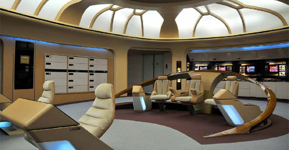
Aside from Disney, one of my other favorite things growing up with the aesthetic of Star Trek: The Next Generation.
Even though this show started in 1987, the bridge area still feels futuristic to me (clearly the original series didn't have the same longevity in style).
Again, I think the only things that define the era to me might be the beige colors, but generally in the 80's and 90's, most pop culture was much more bright colors and we didn't see this futuristic style expand everywhere. If so, it might feel more dated (though the haircuts and some of the outfits do definitely feel dated)

Just some thought experiments I wanted to share with you all in case you had some feedback
My theory is that futuristic architecture only works when it hasn't reached mainstream consciousness.
Example of a futuristic city background as seen in Horizons...(from ~40 years ago)

I always loved this background, and while some people can definitely say it feels of it's time, I don't think the style of those buildings have ever reached as much mainstream as other "futuristic" styling seen in other places.
Of course there are other things that can point to whether something feels futuristic. Using angles and types of building things which previously weren't possible...materials with new properties like color changing paint or multi-color lighting.
We see that in the WDW Tomorrowland until recently...considered to be "retro-futurism"

To me, this is considered retro, because it FEELS like familiar things from the 1940's and 50's...the neon lights, the Buck Rogers/ Flash Gordon aesthetic.
Question: If somehow the Imagineers created the above theme of Tomorrowland, and we didn't relate those to other things and created it as brand new, would it feel "futuristic" to us?
So I think pop culture has a lot to do with what we consider to be futuristic, and as such, also means that if it permeates in enough ways, even if it's color schemes, etc. Which also means that it can also quickly feel dated when it's widely adopted and people look for new ways to "feel" futuristic beyond that.
I know some people mistook this above Tomorrowland style with Steampunk which I vehemently disagreed with. It clearly isn't, even if it shares a few shapes. Discoveryland in Paris, at least in its original form, was much more Steampunk. I do believe a lot of that can come down to color schemes though, after thinking about it further. If our Tomorrowland at WDW replaced the neon with more normal lighting schemes and most of the yellows and blues and greens were replaced with brass and copper and silver color schemes, it could more easily pass for Steampunk.
Aside from Disney, one of my other favorite things growing up with the aesthetic of Star Trek: The Next Generation.
Even though this show started in 1987, the bridge area still feels futuristic to me (clearly the original series didn't have the same longevity in style).
Again, I think the only things that define the era to me might be the beige colors, but generally in the 80's and 90's, most pop culture was much more bright colors and we didn't see this futuristic style expand everywhere. If so, it might feel more dated (though the haircuts and some of the outfits do definitely feel dated)

Just some thought experiments I wanted to share with you all in case you had some feedback
