Cmdr_Crimson
Well-Known Member
One thing I do hope is....They kept that loop that plays in there still...

I was just looking at some pictures on Orlando Theme Park news page and what drew my attention was the Logo for Starbucks..
I thought a while back they said they weren't going to be showing the logo loud and proud and tried to keep it minimal. But the logo is right at the front entrance of the building..(And I also got a snicker that it also had a resemblance to the old pavilion logo's) But, I know it's the common logo for Starbucks.
I think that at Epcot, the logo showing "loud and proud" doesn't really matter. Epcot has always had corporate entities everywhere (Siemens is the most evident right now, their logo gets laser projected on Spaceship Earth nightly). Never thought about how the round minimalist logo of Starbucks resembles the old EPCOT Center logos, but you're right! I guess those ultra-minimalist and simple logos really were ahead of their time...if only they'd make a comeback.I was just looking at some pictures on Orlando Theme Park news page and what drew my attention was the Logo for Starbucks..
I thought a while back they said they weren't going to be showing the logo loud and proud and tried to keep it minimal. But the logo is right at the front entrance of the building..(And I also got a snicker that it also had a resemblance to the old pavilion logo's) But, I know it's the common logo for Starbucks.
I think it looks nice...certainly more 2013 futuristic. Now if only Club Cool could die a True Blood-esque death.
 place to rehydrate. Based on the 49 pages of responses for the link "Disney Refill Cups" I would think people would be happy the place still operates.
I was just looking at some pictures on Orlando Theme Park news page and what drew my attention was the Logo for Starbucks..
I thought a while back they said they weren't going to be showing the logo loud and proud and tried to keep it minimal. But the logo is right at the front entrance of the building..(And I also got a snicker that it also had a resemblance to the old pavilion logo's) But, I know it's the common logo for Starbucks.
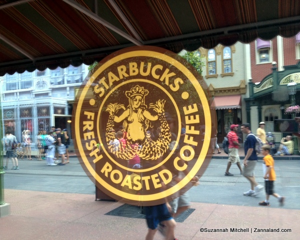
The Starbucks that's already in MK uses the OLD Starbuck's logo (which was considered a wee bit scandalous by people at one point because it's more "revealing). I liked that they'd decided to use to the older logo. These never photos use the most recent Starbuck's logo.
Here's the old logo:
Odyssey is way too big, and serves other roles. Fountain View Ice Cream really wasn't very good - just serving grocery store ice cream.I think this would've been better at Odyssey. A Bigger location and easier crowd control...
Register on WDWMAGIC. This sidebar will go away, and you'll see fewer ads.