EPCOT Aesthetics Then and Now: Discuss!

rsoxguy

Well-Known Member
I always find our perspective as WDW fans to be a bit of an unclassifiable quandary. If something isn’t changed, then the people at Disney are perceived as either lazy, cheap, or lacking in visionary talent. If something is changed, then the people at Disney are perceived as heartless vermin who dared to destroy a classic element that made the World great. I believe that Disney can only win with the casual fan who goes to the World perhaps two or three times within their human existence. The rest of us tend to over-analyze every move, down to the hedges and trash cans. EPCOT was a visionary beauty when it first opened, and it continues to evolve as an entertainment hub. We can not lament a loss forever if we are to proceed toward anything in life. To do so would forever tarnish any ability to enjoy the things that await every one of us as fans of WDW. Me? I tend to like both the past and present EPCOT, with a hint of criticism for both. What is that famous Marine slogan- ah yes, Seize The Day.
 

bgraham34

Well-Known Member
I really need to find my old home videos and look and see what the old Epcot was really like. As a youngster I was never a fan of World Showcase, I was fascinated by Horizons though.
 

Master Yoda

Pro Star Wars geek.
Premium Member
I always find our perspective as WDW fans to be a bit of an unclassifiable quandary. If something isn’t changed, then the people at Disney are perceived as either lazy, cheap, or lacking in visionary talent. If something is changed, then the people at Disney are perceived as heartless vermin who dared to destroy a classic element that made the World great. I believe that Disney can only win with the casual fan who goes to the World perhaps two or three times within their human existence. The rest of us tend to over-analyze every move, down to the hedges and trash cans. EPCOT was a visionary beauty when it first opened, and it continues to evolve as an entertainment hub. We can not lament a loss forever if we are to proceed toward anything in life. To do so would forever tarnish any ability to enjoy the things that await every one of us as fans of WDW. Me? I tend to like both the past and present EPCOT, with a hint of criticism for both. What is that famous Marine slogan- ah yes, Seize The Day.
I would tend to agree. The beauty of anything tends to erode when you dissect down to the atom like many of us are guilty of.
 

thewhitequeen

New Member
I don't see much of a difference either. While I really enjoyed Horizons, times change and they had to update. Test Track was certainly an improvement, as was the addition of Soarin. They really, really, really need to update the country pavillions though. Add some rides or something.
 

MansionGoer13z

Active Member
I vaguely remember the original aethetics of Epcot. But in comparison to what it is today. I think I prefer the original set up. I mean the fountain certainly looks way better than with the guard rail and stage with it. I also agree those blocky monoliths need to go. What are those things for anyway besides something to lean on? I also wish they would change the living Seas back to what it was. The infernal Nemo just drives me insane.
 

flavious27

Well-Known Member
Yes, but is it dated because you're bored with Star Trek or because it doesn't look believably futuristic? The reason I ask is because aside from Kirk and Spock I know almost nothing about Star Trek (to the point that I wouldn't recognize the bottom photo - looked like the original V series, to me). And if I saw that San Francisco image, I'd immediately think of the future.

I don't know, maybe it's generational.

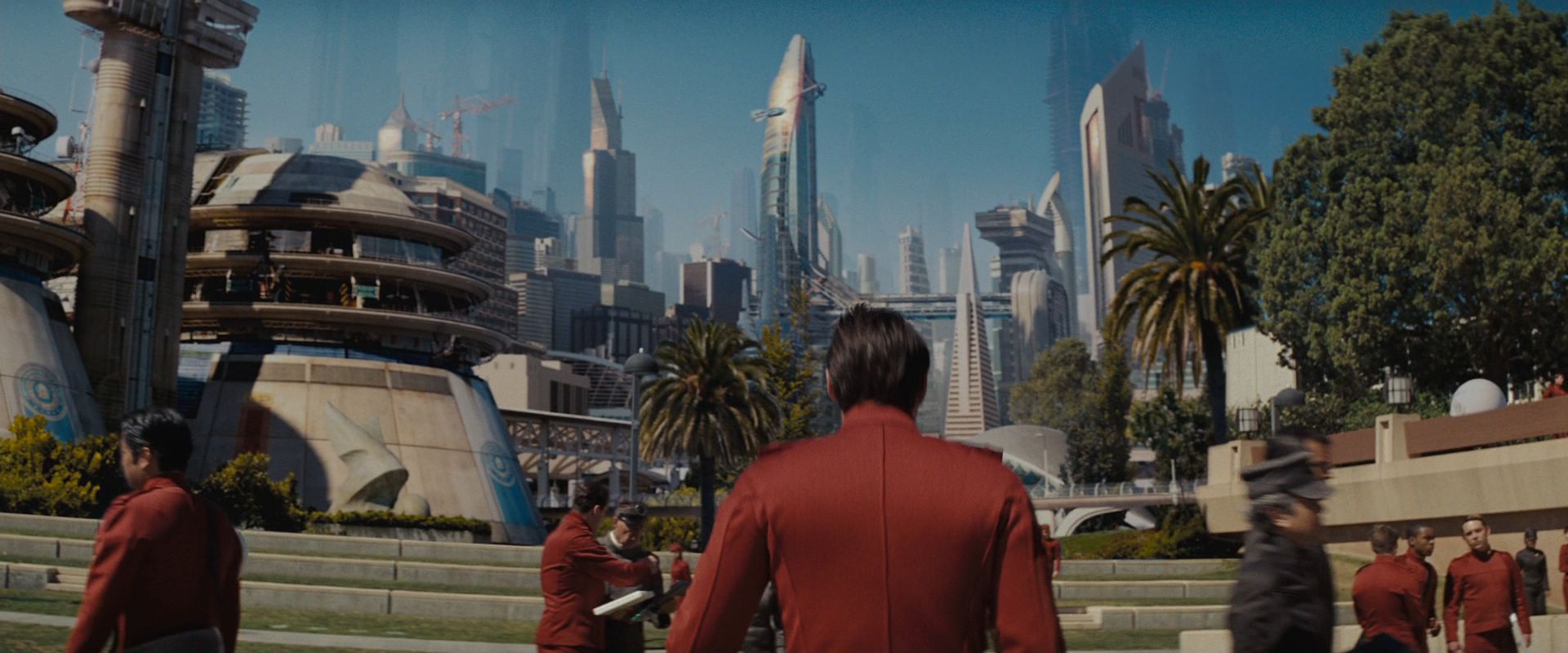
It looks dated because the star trek franchise has updated the look of the architecture shown. Case in point, this is what San Fran looks like in the latest movie:

Starfleet_Academy_alternate_universe_2258.jpg


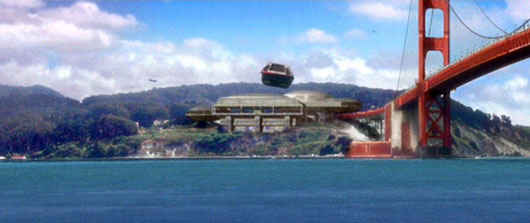
Contrast that to the look of the tram station during shatner's movies:

trek-1.jpg


The architecture that was shown in the last movie is what you expect from the sci-fi genre in the last decade +, it looks like dubai on steroids. There is a feeling of dystopia in the architecture, the buildings aren't all shimmering, smooth glass towers.

Star-Trek.jpg
 

flavious27

Well-Known Member
OK, adding things that turned out to be less appreciated after the fact (fountain stage, LaL tiles, etc.) I can see, but what exactly is the point of removing reflecting pools? Did the area seem a little too serene?

There's plussing gone wrong, and then there's...for lack of a better term...minusing.

And I agree that the original ethos looks fairly timeless. Clean architectural designs, understated tones, generous use of water and landscaping...if the future doesn't look like that, I'd rather not go personally. :)

I could not imagine that plaza having less walking room, it gets pretty crowded already.
 

jakeman

Well-Known Member
It looks dated because the star trek franchise has updated the look of the architecture shown. Case in point, this is what San Fran looks like in the latest movie:
Also, I think most fans of Star Trek would agree, it's the stories first and foremost that brings people back to Star Trek, not the visuals (although it would be silly to deny they have a big part).

That's the reason I have Star Trek II, VI, and First Contact on Blu-Ray (and the whole DS9 series) and not Insurrection (or a single episode of Voyager). It's not their vision of the future, rather the stories they tell in that vision.
 

flavious27

Well-Known Member
Also, I think most fans of Star Trek would agree, it's the stories first and foremost that brings people back to Star Trek, not the visuals (although it would be silly to deny they have a big part).

That's the reason I have Star Trek II, VI, and First Contact on Blu-Ray (and the whole DS9 series) and not Insurrection (or a single episode of Voyager). It's not their vision of the future, rather the stories they tell in that vision.

Well yeah the stories and plot is what kept trekkies watching and buying, but the style of the birdges, ships, sets, and architecure has to be believable or the story is effected. This is why a large sect of trekkers did not like the bridge of the last movie, asking if IKEA built it instead of real set designers.
 

tirian

Well-Known Member
Original Poster
I prefer the 80's design, however we should all remember that even if they had kept the minimal design it would still be different by now. It would not be dated if it had been plussed correctly to update the look.

I'd hate to see the original directional signs return; the separate squares for logos and titles are WAY to late-70s. But simple slabs look much more futuristic than the toybox aesthetic added in the 90s.

So yeah, timeless minimalism—like everything Apple designs now—always looks more contemporary than stacked crap.
 

The Empress Lilly

Well-Known Member
EPCOT 1983 looks less dated than later versions of Epcot. :lol:


Some of EPCOT has improved over the years, some things not. Without going over all of that, a few visual changes strike me as particularly poor choices:

- The fountain sculpture in front of SSE was an integral part of SSE. The view of the entrance plaza was as classical as the view down Main Street. I feel they've taken an essential element out.

Of course, quite apart from the fountain sculpture, the entire entrance plaza was destroyed to make way for a make-a-quick-buck scheme with all the happy aesthetics of a war memorial.

- I much prefer the quiet of the water in the plaza over the current visual clutter.

- Whether one prefers WoM or Test Track, the crass scaffolding that hides the beautiful sleek line of the show building is absolutely dreadful.

- The old logos are beautiful. They also give a sense of place, of purpose, of identity. Lower case Epcot misses all that, at least the latter two.
 

The Empress Lilly

Well-Known Member
I will say that if you look at the satellite picture the mess of tarps does look pretty impressive.

I always have imagined that getting approved in a meeting where they had a scale model to look down on and some concept art.

It just didn't quite pan out that way in real life.
I think you could be on to something here.

I noticed the same thing on Google Earth.
 

Figments Friend

Well-Known Member
Of course, quite apart from the fountain sculpture, the entire entrance plaza was destroyed to make way for a make-a-quick-buck scheme with all the happy aesthetics of a war memorial.

Wow..! This line of text perfectly sums up my attitude regarding this as well. Oh how i miss the original entranceway....
 

flavious27

Well-Known Member
I'd hate to see the original directional signs return; the separate squares for logos and titles are WAY to late-70s. But simple slabs look much more futuristic than the toybox aesthetic added in the 90s.

So yeah, timeless minimalism—like everything Apple designs now—always looks more contemporary than stacked crap.

Well the signs can't look too contemporary, or you just have a new version of the theming that was added in the 90's.

I think something simple like this sign would work. The shape of the sign would point guests to where the attractions are.

epcotsigns.png
 

Register on WDWMAGIC. This sidebar will go away, and you'll see fewer ads.

Back
Top Bottom