-
The new WDWMAGIC iOS app is here!
Stay up to date with the latest Disney news, photos, and discussions right from your iPhone. The app is free to download and gives you quick access to news articles, forums, photo galleries, park hours, weather and Lightning Lane pricing. Learn More -
Welcome to the WDWMAGIC.COM Forums!
Please take a look around, and feel free to sign up and join the community.
You are using an out of date browser. It may not display this or other websites correctly.
You should upgrade or use an alternative browser.
You should upgrade or use an alternative browser.
MK Does it look and feel like a forest?
- Thread starter EPCOTCenterLover
- Start date
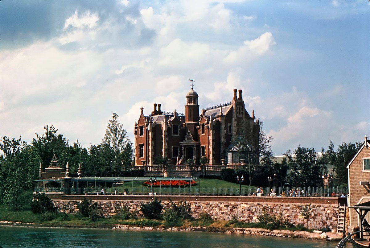
Actually the original idea behind the landscaping at the haunted mansion was a more polished french parterre garden...It is not necessarily immature landscape...it was planned to look stark... Later they changed their idea about the aesthetics and added the oak trees to the front lawn and additional plantings.... it was never intended to be sitting in a forested setting...So the comparison doesn't quite work...
But yes in time the trees in Fantasy Forest will grow...but I do not believe it will ever look like a forest....
In the original photo you can still see the show building. Regardless of the intent of the imagineers of what they wanted to do with the landscaping theme, the plants need time to grow. Will the NFL ever be confused with a forest, no of course not. Besides having the plants/trees develop, (and I'm not making excuses) you do also have to consider safety considerations such as fire truck and ambulance access, as well as maintenance vehicles/cranes access. Personally I don't have a problem with the way it was laid out.
COProgressFan
Well-Known Member
I really dislike the area right behind the carousel. It is a concrete wasteland with a silly piece of castle wall doing nothing out there. It would be very nice to have an island full of trees instead.
Yeah, I agree, the area from the carousel to the castle walls is just a vast concrete area. Before the re-do, there were some nice elevated planters there, but they were removed when the castle walls went up. I'm sure they were thinking about crowd flow, but its just too wide open.
disney4life2008
Well-Known Member
Nope - honestly, it is not really themed to me. If it wasnt for the music I wouldnt know it was fantasyland.
hpyhnt 1000
Well-Known Member
Give it about 10 or 15 years and some parts may start to develop a bit of a tree canopy (around Enchanted Tales with Belle for instance) but the area is never going to really look like a "forest." The absurdly wide paths will ensure that.
Besides, we all know how much the folks in charge of MK landscaping hate big trees. Just as the canopy starts to mature they will probably rip them out for shrubs instead.
Agree completely. While the new planters around Pinocchio Village House are very welcome, there's just way too much dead space behind the Carousel.
Besides, we all know how much the folks in charge of MK landscaping hate big trees. Just as the canopy starts to mature they will probably rip them out for shrubs instead.
Yeah, I agree, the area from the carousel to the castle walls is just a vast concrete area. Before the re-do, there were some nice elevated planters there, but they were removed when the castle walls went up. I'm sure they were thinking about crowd flow, but its just too wide open.
Agree completely. While the new planters around Pinocchio Village House are very welcome, there's just way too much dead space behind the Carousel.
Cmdr_Crimson
Well-Known Member
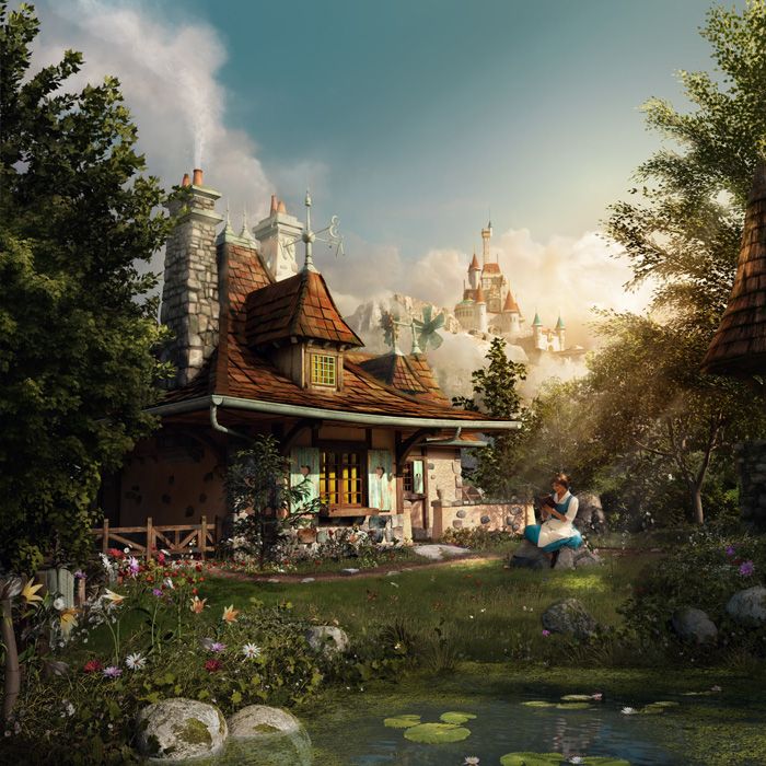
I think it's due partially to the concept art...Looks more woodsy..


jdmdisney99
Well-Known Member
This image in particular was very misleading...I think it's due partially to the concept art...Looks more woodsy..


MerlinTheGoat
Well-Known Member
That art brings up another somewhat related issue, I was also expecting more water features in addition to a greater amount of trees (btw there's that fallen tree bridge pixiedustmaker was trying to convince everyone hadn't really been slashed from the budget but just hadn't been finished yet). I don't know if it was designed this way or switched off to save cash, but there was what appeared to be a dry stream out in front of the cottage when I visited last week. It almost looks like they intended a small creek there but ran out of time or money to install a water pump in there. There's a severe lack of the amount of streams of water seen in that art...
The art is also more consistent with how the cottage and surrounding areas looked like in the original movie (again plenty of trees and a small stream flowing out front)-

The art is also more consistent with how the cottage and surrounding areas looked like in the original movie (again plenty of trees and a small stream flowing out front)-

Last edited:
lazyboy97o
Well-Known Member
Did Disney ever publicly use the Fantasy Forest moniker? I am relatively sure that they did use that name before Seven Dwarfs Mine Train and Storybook Circus were announced; when the name switched to New Fantasyland.
Macca250
Well-Known Member
I distinctly remember them using it on the Parks blog and press releases, and although I wouldn't swear on it; I'd bet quite a lot of money on having read it on the official website and that flash-based interactive map/site they had at one point. Regardless, the expansion was meant to feature 'Enchanted Forest' and 'Storybook Cirus' as 'mini-lands' within the umbrella term of 'New Fantasyland I belive. Anyone can feel free to correct me, but 'forest' was definitely used.Did Disney ever publicly use the Fantasy Forest moniker? I am relatively sure that they did use that name before Seven Dwarfs Mine Train and Storybook Circus were announced; when the name switched to New Fantasyland.
danlb_2000
Premium Member
Did Disney ever publicly use the Fantasy Forest moniker? I am relatively sure that they did use that name before Seven Dwarfs Mine Train and Storybook Circus were announced; when the name switched to New Fantasyland.
https://disneyworld.disney.go.com/events-tours/magic-kingdom/new-fantasyland/
The New Fantasyland Expansion
The expansion presents more Disney characters and stories—in rich detail—in 2 new themed areas. Discover fun for the entire family in the following regions:
- Enchanted Forest
- Storybook Circus
dgp602
Well-Known Member
Not for anything, it's brand new.
For perspective the HM looked like this when opened. I think you need let things grow in order to make a fair criticism.

And now it's this
I think I might actually like the original HM presentation....
If they can build a jungle at DAK with smaller paths through it, there's no reason they shouldn't have been able to "forest" Fantasyland.
lazyboy97o
Well-Known Member
And that it, there are no smaller pas. That's why I said it was like a highway. Even with trees grown in, it'll be these massive paths that you exit for the experiences.If they can build a jungle at DAK with smaller paths through it, there's no reason they shouldn't have been able to "forest" Fantasyland.
George Lucas on a Bench
Well-Known Member
To me, it looks like huge open areas of concrete.
As for the Haunted Mansion comparison, it looked better before! Our beloved manor once loomed over the river. Very imposing. The foliage and giant tarp (version 1.0 under construction in the vintage photo) over the queue line destroy that effect. Also notice how in the old days, they kept to Walt Disney's original intent for the Mansion's exterior being taken care of on the outside. Everything is WRONG now.
As for the Haunted Mansion comparison, it looked better before! Our beloved manor once loomed over the river. Very imposing. The foliage and giant tarp (version 1.0 under construction in the vintage photo) over the queue line destroy that effect. Also notice how in the old days, they kept to Walt Disney's original intent for the Mansion's exterior being taken care of on the outside. Everything is WRONG now.
Magenta Panther
Well-Known Member
It doesn't look or feel much like a forest to me, personally. Don't get me wrong, the expansion is beautiful! There are a lot of trees and greenery around Belle's cottage, so maybe as they fill in it will look like a wooded area.
And yes, the walkways are nice and wide to accommodate all of the guests and strollers.
Agree, that area is very well-done overall. And the nature soundtrack is a nice touch.
tirian
Well-Known Member
True. It was easier to see how you were entering a crypt. Today's fully grown trees also destroy the forced perspective.To me, it looks like huge open areas of concrete.
As for the Haunted Mansion comparison, it looked better before! Our beloved manor once loomed over the river. Very imposing. The foliage and giant tarp (version 1.0 under construction in the vintage photo) over the queue line destroy that effect. Also notice how in the old days, they kept to Walt Disney's original intent for the Mansion's exterior being taken care of on the outside. Everything is WRONG now.
That concrete wasteland behind the carousel is ridiculous.
Sped2424
Well-Known Member
Funny you mention that, because the place for that water feature is actually there. It's just filled with rocks and other river plants with no actual water. The same thing is over at Maurice's cottage, there is an area for water features, but it's filled with rocks and nothing is turned on....I have no clue why.That art brings up another somewhat related issue, I was also expecting more water features in addition to a greater amount of trees (btw there's that fallen tree bridge pixiedustmaker was trying to convince everyone hadn't really been slashed from the budget but just hadn't been finished yet). I don't know if it was designed this way or switched off to save cash, but there was what appeared to be a dry stream out in front of the cottage when I visited last week. It almost looks like they intended a small creek there but ran out of time or money to install a water pump in there. There's a severe lack of the amount of streams of water seen in that art...
The art is also more consistent with how the cottage and surrounding areas looked like in the original movie (again plenty of trees and a small stream flowing out front)-

Tom Morrow
Well-Known Member
it doesn't look like a forest, but the whole area is very pretty and does feel very fantasy-like, at least, the area around 7DMT and Mermaid. The Storybook Circus side, to me, is what feels way too open and barren.
But the mansion being somewhat hidden in the trees is also creepy and foreboding. I think they could perhaps trim the trees a bit so the mansion looks larger, but definitely keep the show building hidden.As for the Haunted Mansion comparison, it looked better before! Our beloved manor once loomed over the river. Very imposing. The foliage and giant tarp (version 1.0 under construction in the vintage photo) over the queue line destroy that effect. Also notice how in the old days, they kept to Walt Disney's original intent for the Mansion's exterior being taken care of on the outside. Everything is WRONG now.
Register on WDWMAGIC. This sidebar will go away, and you'll see fewer ads.


