Do you think the Old Logo is returning?

WinnieBear

Member
Original Poster
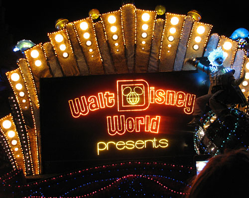
Now something i have noticed late last year and in the past year, Disney has been using this logo
image_wdwlogo1971_1.png

(Old WDW Logo 1971-1996)
a LOT on their merch this year, now it's easy to say that this is just retro merchandise. (After all their 45th anniversary was this year.) but we're talking about stuff like this.
2016-disney-world-year-shirt.jpeg
06_ParksBlog_2016Marathon_5K10KLARGE.jpg

Sorcere2016Autographbook.jpg

And there was also this from last year
P1080669-800x400.jpg

And their blog has the old mickey logo whenever there's a post related to WDW,
Untitled.png

All of this is not anniversary related at the slightest, so it'll be unusual for them to keep using their old logo unless it's anniversary related. So do you think Disney has plans to fully revive their old logo in the next few years, or am i just crazy?
 

brb1006

Well-Known Member
I have a good idea for bringing back the logo. Maybe if Disney finally stops using the Disney Parks brand for advertising both WDW and Disneyland. They might finally bring back the original logo for the resort but with a more updated and modern look. Walt Disney World should do this to celebrate the park's 50th Anniversary outside of using the old logo for merchandising only these days. One of the last places you could spot the original logo might be one of the monorails,a few flag.

Spectromagic also kept the original Walt Disney World logo and remained unchanged for 19 years even when WDW started using it's new logo starting in the late 90's.
image_waltdisneyworldpresents1.jpg

Maybe they could redesign the entrance to the entire resort by giving it a big makeover and using the old logo but updated.
 

mightynine

Well-Known Member
It appears to be pretty random. A lot of stuff has the retro logo, but some stuff has the current logo.

The 2017 stuff is using the retro logo AND the version of the retro D shape with Sorcerer Mickey inside it on some items.
 

WinnieBear

Member
Original Poster
Nostalgia sells. It's just marketing.
I have a sweatshirt from 2014 with this logo on it, I think as @Kman101 said, it's just marketing.
It's still weird that they're using it a lot more then they used to. Like i said in the opening, it'll make a lot more sense to use the Old Logo if this was all Anniversary or Nostalgia related, but it's not. Most of the stuff I listed in the opening is all current. (Hell those items in the opening post are obivously not the only examples out there in recent years.) Like i said before, I Think Disney is up to something. I don't know what these plans are, but with the 50th Anniversary coming up in just 5 years, it's certainly possible. (But to be fair, on the other hand, it could just be marketing or it could just be Disney being a troll.)
 

RoysCabin

Well-Known Member
I'd be all for it - it's not just a matter of nostalgia, it's also allowing the different resorts and the different parks to have their own identities. Besides, the block "D" logo with the mouse-eared globe in it is just marketing gold. Last couple of trips I definitely did notice that it was popping up on more and more merchandise, so I hope the trend continues.

They definitely started using the older EPCOT font on more merchandise after the 30th anniversary. @ElvisMickey, while I doubt we'll get the spirit of the "Center" part back, you're right and they really might as well do it; most people still say "Center" when talking about it, anyway, why not just embrace it and figure out a simple way to integrate the concept? We can hope, I suppose.
 

ElvisMickey

Well-Known Member
I'd be all for it - it's not just a matter of nostalgia, it's also allowing the different resorts and the different parks to have their own identities. Besides, the block "D" logo with the mouse-eared globe in it is just marketing gold. Last couple of trips I definitely did notice that it was popping up on more and more merchandise, so I hope the trend continues.

They definitely started using the older EPCOT font on more merchandise after the 30th anniversary. @ElvisMickey, while I doubt we'll get the spirit of the "Center" part back, you're right and they really might as well do it; most people still say "Center" when talking about it, anyway, why not just embrace it and figure out a simple way to integrate the concept? We can hope, I suppose.

I'm at Epcot now and there's a lot of new merchandise with the old EPCOT Center lettering and logo. They've actually had it out for a few weeks now. Not that it means anything, but hopefully with all of the changes coming they'll switch back to it.
 

RSoxNo1

Well-Known Member
I'm at Epcot now and there's a lot of new merchandise with the old EPCOT Center lettering and logo. They've actually had it out for a few weeks now. Not that it means anything, but hopefully with all of the changes coming they'll switch back to it.
In recent years they've made a conscious effort to put out a lot more retro EPCOT Center stuff.
 

WinnieBear

Member
Original Poster
I'd be all for it - it's not just a matter of nostalgia, it's also allowing the different resorts and the different parks to have their own identities. Besides, the block "D" logo with the mouse-eared globe in it is just marketing gold. Last couple of trips I definitely did notice that it was popping up on more and more merchandise, so I hope the trend continues.

They definitely started using the older EPCOT font on more merchandise after the 30th anniversary. @ElvisMickey, while I doubt we'll get the spirit of the "Center" part back, you're right and they really might as well do it; most people still say "Center" when talking about it, anyway, why not just embrace it and figure out a simple way to integrate the concept? We can hope, I suppose.
I definitely agree regarding the Old WDW Logo. Now i didn't grew up with it (I was born in 1999.) but there's a massive unique charm to the old logo that the current logo doesn't have. It's big and bold, just like the resort itself. Yeah it's a bit on the outdated side, but i would rather take the outdated but charming logo over the more modern but bland logo that we have today.
 

brb1006

Well-Known Member
I definitely agree regarding the Old WDW Logo. Now i didn't grew up with it (I was born in 1999.) but there's a massive unique charm to the old logo that the current logo doesn't have. It's big and bold, just like the resort itself. Yeah it's a bit on the outdated side, but i would rather take the outdated but charming logo over the more modern but bland logo that we have today.
You took the words right out of my mouth
 

WinnieBear

Member
Original Poster
And then in 2015 this was the logo that was used on a lot of merchandise:
IMG_1747.jpg

It uses the same font as Disneyland/Magic Kingdom.
this logo was part of a specific line of merchandise though. (It was themed to a Storybook.)
and it was never used anywhere but that specific line of merchandise.
 

Register on WDWMAGIC. This sidebar will go away, and you'll see fewer ads.

Back
Top Bottom