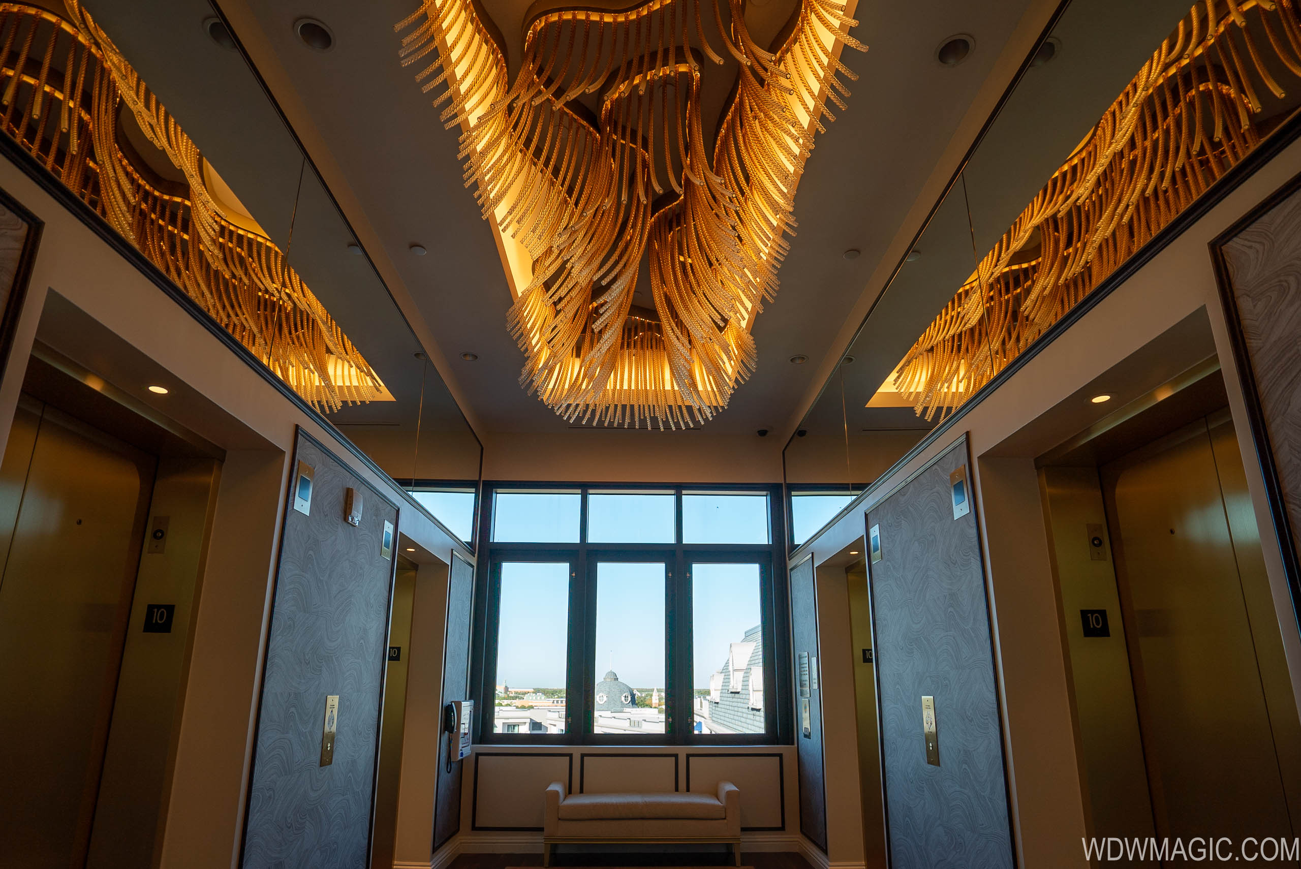
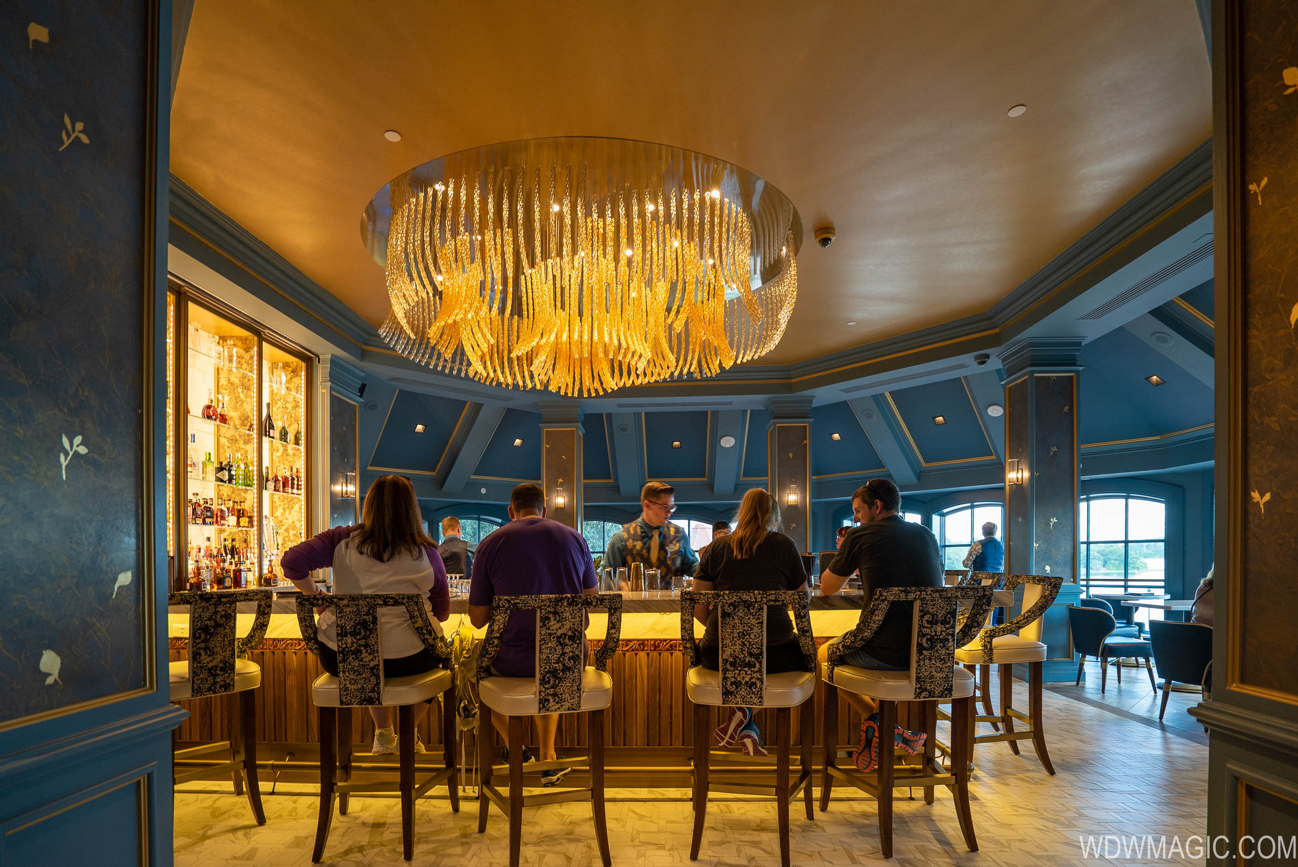
The rooftop access is via TopolinosIs the outdoor lounge on top of the building accessible to everyone or is it part of Topolino's?
-
Welcome to the WDWMAGIC.COM Forums!
Please take a look around, and feel free to sign up and join the community.
You are using an out of date browser. It may not display this or other websites correctly.
You should upgrade or use an alternative browser.
You should upgrade or use an alternative browser.
News Disney Riviera Resort announced
- Thread starter wdwmagic
- Start date
ToTBellHop
Well-Known Member
Everyone raves about the Four Seasons. This looks like it but it costs more for lesser service and you get the Skyliner. What’s not to love?
It's not as awful as the concept art as the concept art made it out to be, I just wish they themed the exterior more so it wouldn't look like a generic chain hotel.
No, no, the exterior is fine. You instantly know you're at a Disney Resort© when you arrive, because it's MAGICAL!!!
CJR
Well-Known Member
Is it me or am I not seeing a hot tub? That's a deal breaker for us. Otherwise, it all looks pretty nice. Here's hoping Reflections will have at least one or two.
[EDIT] Saw one in a picture on Google, so it looks like there is at least one. Not sure why Disney doesn't mention them with the other pool amenities.
[EDIT] Saw one in a picture on Google, so it looks like there is at least one. Not sure why Disney doesn't mention them with the other pool amenities.
Last edited:
ToTBellHop
Well-Known Member
Authentically Disney, Distinctly Marriott
ToTBellHop
Well-Known Member
Opening Ceremony
All I need to know is: was Bob there? Did he deem it applause-worthy.
So which place got the leftovers to make their lights? The Riviera or the Enchanted Rose?


Yeah, I see the hand of the designer who did the GF updates, too.
In these and other pictures posted, an over reliance on all the shades of blue paired with gold.
Below isn't very pleasant. The close zigzag pattern 'swims'. The chocolate brown trim would have been a good choice if so many bad pairings of colors weren't also chosen to try to go with it. The dark brown wood next to light red wood is awful. There's the dark bluish teal and a pop of clashing colors inexplicable in the seat padding.
And this below.... is hideous.
Little Green Men
Well-Known Member
!!!!

Disney Analyst
Well-Known Member
Yeah, I see the hand of the designer who did the GF updates, too.
In these and other pictures posted, an over reliance on all the shades of blue paired with gold.
Below isn't very pleasant. The close zigzag pattern 'swims'. The chocolate brown trim would have been a good choice if so many bad pairings of colors weren't also chosen to try to go with it. The dark brown wood next to light red wood is awful. There's the dark bluish teal and a pop of clashing colors inexplicable in the seat padding.
View attachment 434241
And this below.... is hideous.
View attachment 434244
I love that below photo. Wow.
carolina_yankee
Well-Known Member
Oh man... Something I would never have the opportunity to do, unless....
While a buy-in is pricey, you can rent points for one-time stays from a broker or the rental forums on a couple of popular sites for less than a deluxe stay. Just google “DVC Points Rental.” It’s still one of Disney’s pricier resorts but there are ways.
rkleinlein
Well-Known Member
Spot on. Little to no Riviera theming. So bland and boring. It doesn't look like they even tried.Authentically Disney, Distinctly Marriott
And the names "La Boutique" and "Le Petit Café." Really?
Has anyone on this design team ever been to the Riviera? Or how about the France pavilion in Epcot?
DisneyJayL
Well-Known Member
- In the Parks
- No
I have a friend that has points we could probably buy from. Still, it’s very pricey. I just don’t see the benefits of DVC, but that’s just me.While a buy-in is pricey, you can rent points for one-time stays from a broker or the rental forums on a couple of popular sites for less than a deluxe stay. Just google “DVC Points Rental.” It’s still one of Disney’s pricier resorts but there are ways.
ToTBellHop
Well-Known Member
They tried french toast and french fries for inspiration. Unfortunately both were from Burger King, thus the blandness.Spot on. Little to no Riviera theming. So bland and boring. It doesn't look like they even tried.
And the names "La Boutique" and "Le Petit Café." Really?
Has anyone on this design team ever been to the Riviera? Or how about the France pavilion in Epcot?
Creathir
Well-Known Member
Where DVC makes sense is if you go or intend to go on at least an annual basis, and do not wish to play the “save for the trip” game.I have a friend that has points we could probably buy from. Still, it’s very pricey. I just don’t see the benefits of DVC, but that’s just me.
It can be costly, but if you do indeed go annually, in the long run it can work out to be cheaper. You also can defer the cost somewhat by renting out your points and actually make money beyond the maintenance fees for a few years.
Math wise, it’s probably not the “smart” move, but neither is buying a new car, yet many of us like having that new car.
Yeah, I see the hand of the designer who did the GF updates, too.
In these and other pictures posted, an over reliance on all the shades of blue paired with gold.
Below isn't very pleasant. The close zigzag pattern 'swims'. The chocolate brown trim would have been a good choice if so many bad pairings of colors weren't also chosen to try to go with it. The dark brown wood next to light red wood is awful. There's the dark bluish teal and a pop of clashing colors inexplicable in the seat padding.
View attachment 434241
And this below.... is hideous.
View attachment 434244
Makes me think of a communal shower.I love that below photo. Wow.
Franklin47disneyguy
Well-Known Member
ABQ
Well-Known Member
Watched this last night and have to say, it's a pretty nice room. My 1 bedroom villa experiences are limited to Boardwalk and Boulder Ridge and this room is much nicer in terms of amenities. Tough to compare though, it being brand new and all.
Register on WDWMAGIC. This sidebar will go away, and you'll see fewer ads.
