Disney hotels are becomes less themed and more generic. Why?

Shouldigo12

Well-Known Member
I agree that not all of the room refurbishments have been bad. AKL's was definitely good.

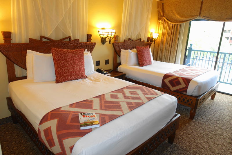
But take, for example, the Alligator Bayou section of POR. Here is the old room (ignore the themed pillows and bed runner, of course):


And here is the new room:


IMHO, the old room has consistent theming (and, although the video doesn't do them full justice, the "branch" beds really added to the theme), whereas now the more standard beds, more standard bathroom mirror, green corner trim (rather than "wood" colored), the cartoon image on the divider curtain (rather than the "stitched bags"), etc., just makes it look less like an aesthetically-consistent, immersive themed environment, and more like a basic hotel room that you would find elsewhere. (I do personally like the replacement of the carpets with the "wood" floors, though.)

I think this is the first room where I have to agree the new ones look too plain.
 

MisterPenguin

President of Animal Kingdom
Premium Member
I agree that not all of the room refurbishments have been bad. AKL's was definitely good.

But take, for example, the Alligator Bayou section of POR. Here is the old room (ignore the themed pillows and bed runner, of course):


And here is the new room:


IMHO, the old room has consistent theming (and, although the video doesn't do them full justice, the "branch" beds really added to the theme), whereas now the more standard beds, more standard bathroom mirror, green corner trim (rather than "wood" colored), the cartoon image on the divider curtain (rather than the "stitched bags"), etc., just makes it look less like an aesthetically-consistent, immersive themed environment, and more like a basic hotel room that you would find elsewhere. (I do personally like the replacement of the carpets with the "wood" floors, though.)


I don't see much of a difference. The headboards with the branch slats had to go. Open slatted headboards are a nightmare to lean against, to keep pillows contained, and to keep things from dropping behind the beds. You still have the fake plastic wood branches in the table in the room. Otherwise you still have the wood as crates, as slats around the AC, as paneling in the tub. And the paint job is a bit lighter.
 

Brad Bishop

Well-Known Member
I think cheaper to refurbish is the prime reason...

Easier to clean another...which is cheaper (laminate floors clean easier than carpets)

I think it also leaves more options open to outsource hotel operations - which is always a possibility to dump oodles of overhead costs if they want to in the future.

Realistically, people will pay premium prices anyway so why bother spending the extra money?
 

Marc Davis Fan

Well-Known Member
Original Poster
I don't see much of a difference. The headboards with the branch slats had to go. Open slatted headboards are a nightmare to lean against, to keep pillows contained, and to keep things from dropping behind the beds. You still have the fake plastic wood branches in the table in the room. Otherwise you still have the wood as crates, as slats around the AC, as paneling in the tub. And the paint job is a bit lighter.

Your glass-half-full attitude always makes me glad and more optimistic, @MisterPenguin. But in this case, in my very humble opinion, the "branches" were a really important part of tying together the aesthetic of the room (and they were actually quite realistic looking, IMO). They, along with the aesthetically/thematically consistent "branch"" mirrors, the wood-colored paneling, etc., made the room feel unique, custom-made, "imagineered." Now, IMHO, it's less aesthetically consistent, and looks a lot more like Disney just purchased the items rather than making a special effort to custom-make a themed environment.
 

Tomi-Rocket

Well-Known Member
Who is doing this?
2177B951-1AE8-4B2C-BB20-6FC9F182F3C1.jpeg
 

tomast

Well-Known Member
DSC_7108.JPG
Bed-Side-Disneys-Animal-Kingdom-Lodge-from-yourfirstvisit.net_1.jpg


I honestly can't fathom how anyone could prefer the first one. Visually, it looks like it probably smells like cigarettes and mold in there. The second one is modern and clean while still on-theme. The first one is a $59 per night roadside motel room, the second one is a $349 per night luxury resort room. And all that changed was the bedspread.
I think you are all going to hate me

But....
I agree, the first one smells like cigarettes and mold and cost $59 per night...
BUT
the second one also smells like mold and cost $79 per night.

I Think I love plain designs. I hate that carpet, and all that curtains overthere and that bed design. The padded looks okay,

(I am saying this and love the refurbished Pop century resort bedrooms)
 

tomast

Well-Known Member
WRT sprawl: WDW has to go up. There's little space left to sprawl. Most of the green space left is designated as conservation, or is in a flood plain, or is dedicated to 'green' space recreation, such as golf courses. Now, can WDW just ignore their plans, buy out conservation off-sets, and pipe in a million tons of sand to build up the swampland? Sure, but, building towers is easier and more efficient. Not to mention that a sprawling resort needs internal busing or multiple bus stops and that's so annoying for guests (or, speaking for myself, it's annoying).

WRT theming: Resort theming is mostly about the architecture. The Grand Floridian is themed to... an architectural style. And that's it. Then there is decorative theming that the values do: Giant IP stutues, bed frames that resemble boats or racing cars. I would agree that the concept art for the new towers are bland. Not as bland as BLT, tho. Their facades should have had more panache.


BLT... Mmm... BLT ... mm... bacon letucce and tomatoes... Maybe I should check your Big List of Abbreviations the last abbreviation i check was MILF and found something really unexpected! :p
 

Register on WDWMAGIC. This sidebar will go away, and you'll see fewer ads.

Back
Top Bottom