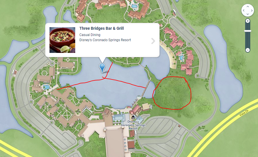
They also need to update their map...
-
Welcome to the WDWMAGIC.COM Forums!
Please take a look around, and feel free to sign up and join the community.
You are using an out of date browser. It may not display this or other websites correctly.
You should upgrade or use an alternative browser.
You should upgrade or use an alternative browser.
News Coronado Springs Expansion - Gran Destino Tower
- Thread starter P_Radden
- Start date
Little mermaid and Nemo character dining under the sea!
WDWtraveler
Well-Known Member
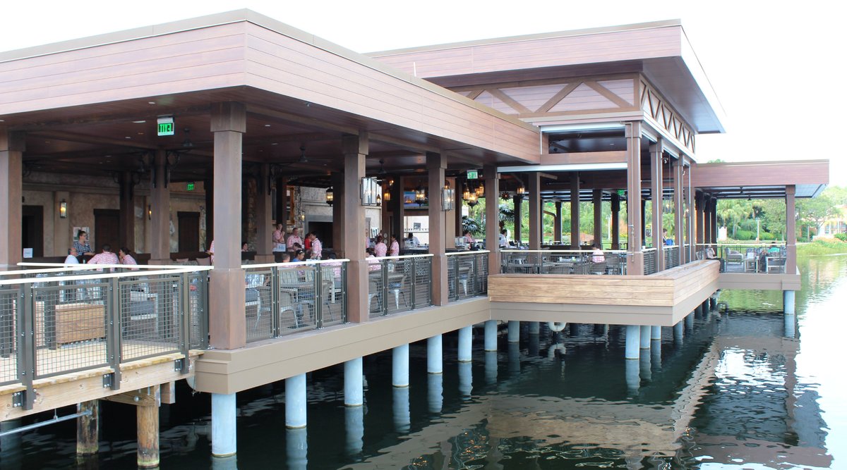
Photo update as of Friday, May 31, 2019. The bar and grille built over the lake was training staff today. I would not be surprised if it opened this weekend, but can't confirm that.
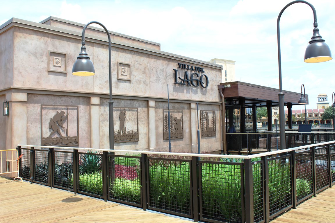
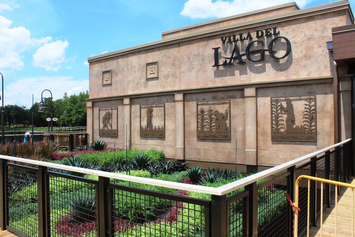
The plantings at the restaurant entrance are all plastic. The wind sculptures are missing now, but the mounting rods are still in place.
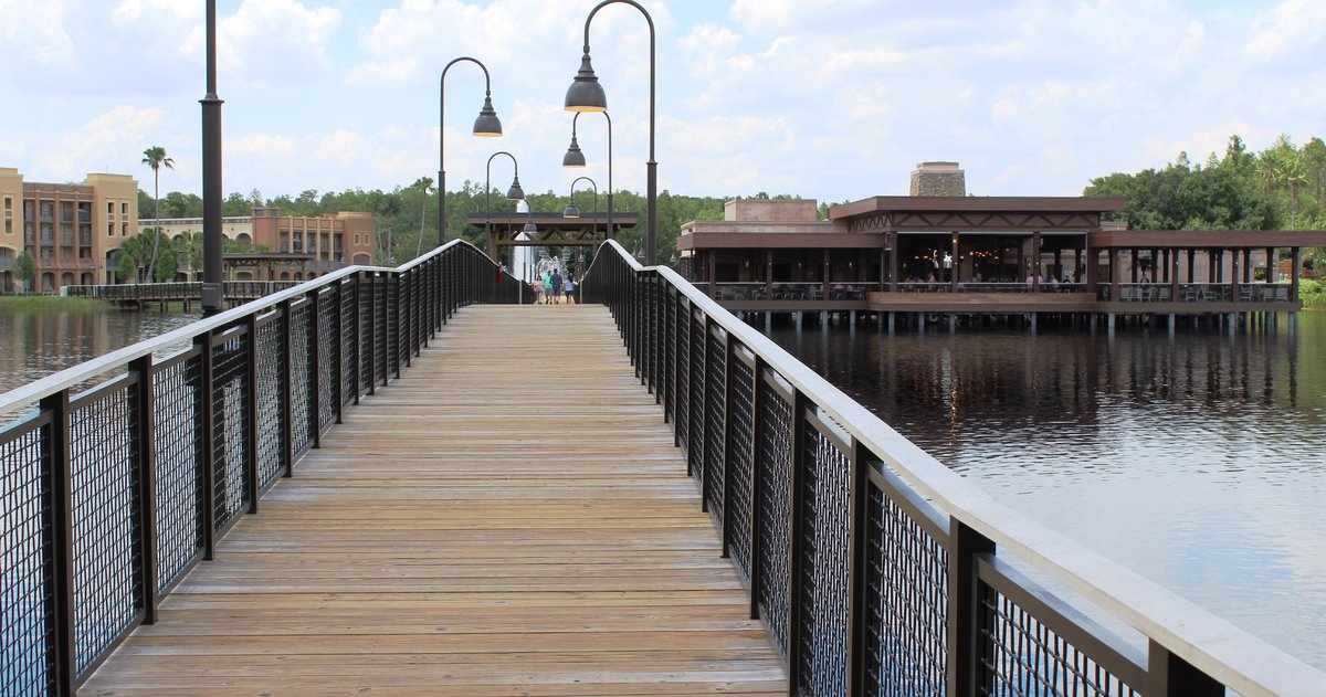
The longest bridge to the restaurant.
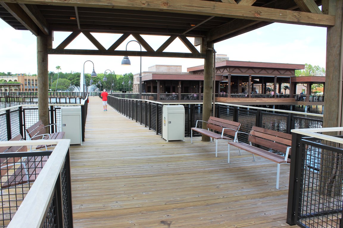
Two of the bridges have these seating areas, which will be a comfortable area to relax and take in the views around the lake.
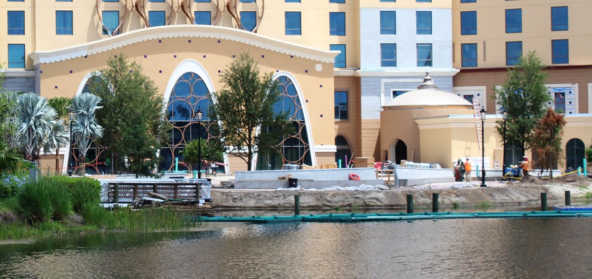
The "temporary" bridge that connected the resort has been removed. To get to the Cabanas, one must use the lake bridges now. The existing short bridge to the feature pool is currently closed while landscaping in front of the new tower and connecting pavement is installed.
The plantings at the restaurant entrance are all plastic. The wind sculptures are missing now, but the mounting rods are still in place.
The longest bridge to the restaurant.
Two of the bridges have these seating areas, which will be a comfortable area to relax and take in the views around the lake.
The "temporary" bridge that connected the resort has been removed. To get to the Cabanas, one must use the lake bridges now. The existing short bridge to the feature pool is currently closed while landscaping in front of the new tower and connecting pavement is installed.
castlecake2.0
Well-Known Member
I check in on Monday and I’m really hoping it’s open!
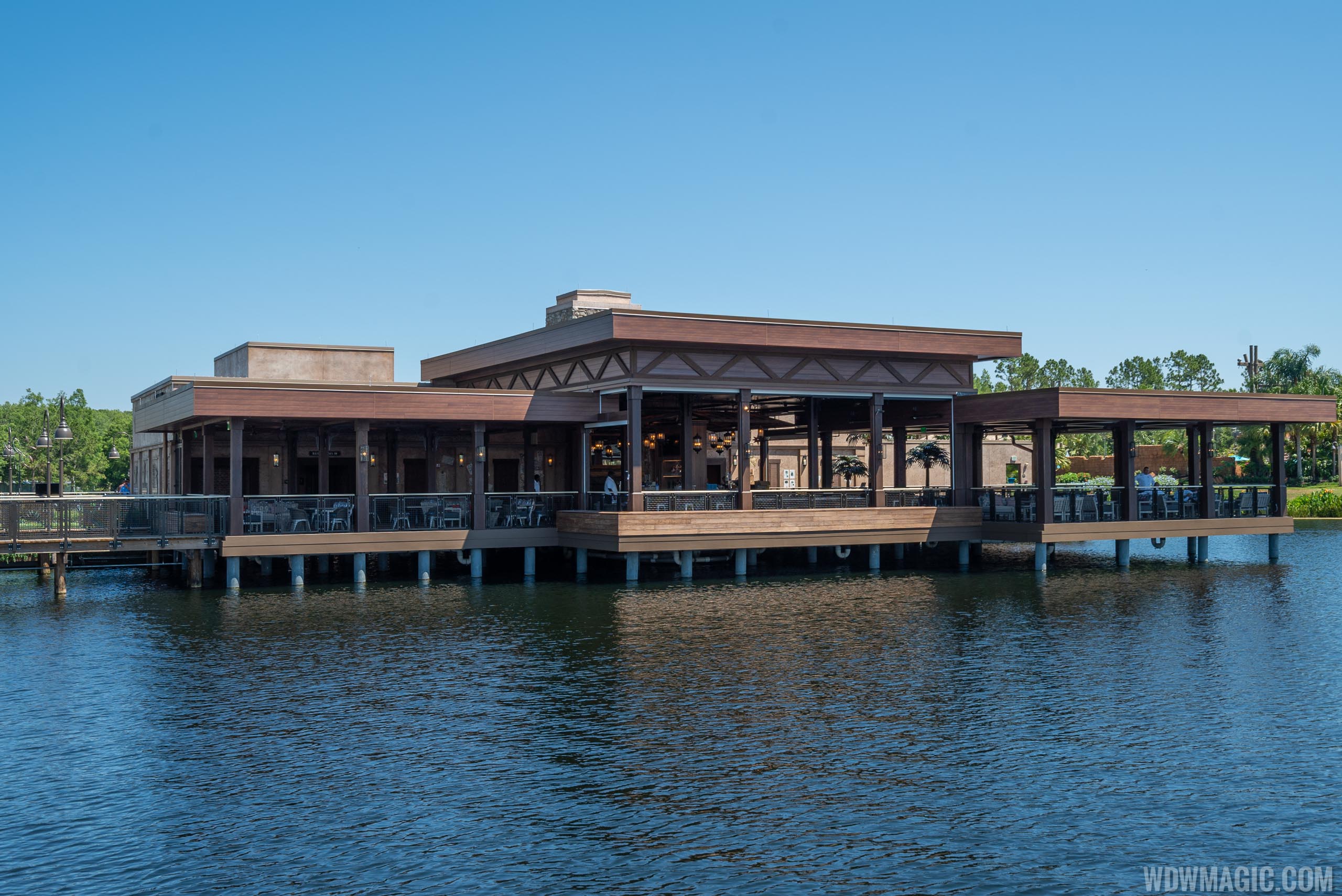
VIDEO - Walk-through of the new Three Bridges and Villa del Lago at Disney's Coronado Springs Resort

Three Bridges Bar and Grill News
The new waterside restaurant is expected to open this summer on the lake at Disney's Coronado Springs Resort.
www.wdwmagic.com
DABIGCHEEZ
Well-Known Member
Well the video looks shows the awesome additions at the resort... well except for that eyesore( the Tower).
Sir_Cliff
Well-Known Member
For me, this all seems to be coming together quite nicely. The new restaurant and walkways look like good additions, and the tower blends well with the rest of the resort. I wish they had of found a way to make it Southwest/Mexico themed as well, but aesthetically I don't think it looks particularly out of place nor overpowering from what we've seen so far.Well the video looks shows the awesome additions at the resort... well except for that eyesore( the Tower).
I've only stayed at Coronado Springs once, but on balance it looks to me that all of these developments are elevating the resort at least a little.
Last edited:
Gabe1
Ivory Tower Squabble EST 2011. WINDMILL SURVIVOR
While IMO one of the formerly most dysfunctional resorts Disney ever created, these new Bridges will finally bring both harmony and functionality to the resort that was always beautiful but challenging to any guests not staying and paying for a preferred building. I hope the dining changes fix the also dysfunction of later years.
Time will tell. It has always been a beautiful resort but lacking in basic services afforded to value resorts. Odd turn for the last
Of the moderate resorts when Disney should have had their own learning curve with many moderates under their belt. I look forward to our next stay in the future to see how the improvements actually impact stays vs previous mediocre experiences.
voodoo321
Well-Known Member
You could plop that restaurant down an any suburban outdoor mall/outlet complex and it wouldn't draw a second glance. I'll give it a few points for being out on the lake but Disney should and can do better than this.
This, the new tower, Disney Springs, Riviera, Old Port Royale, Reflections, etc. are all going for the modern and familiar. I don't know if that's comforting to the average Disney vacationer but that's not the reason I've chosen to visit over the years. It's all bland, boring and lifeless. This remodel and expansion of Coronado Springs has ripped out all the charm that this resort once had. But yet they still pack 'em in. What do I know?
This, the new tower, Disney Springs, Riviera, Old Port Royale, Reflections, etc. are all going for the modern and familiar. I don't know if that's comforting to the average Disney vacationer but that's not the reason I've chosen to visit over the years. It's all bland, boring and lifeless. This remodel and expansion of Coronado Springs has ripped out all the charm that this resort once had. But yet they still pack 'em in. What do I know?
cosmicgirl
Well-Known Member
The restaurant is opening now, Passport to the Parks just went live:
MickeyLuv'r
Well-Known Member
You could plop that restaurant down an any suburban outdoor mall/outlet complex and it wouldn't draw a second glance. I'll give it a few points for being out on the lake but Disney should and can do better than this.
This, the new tower, Disney Springs, Riviera, Old Port Royale, Reflections, etc. are all going for the modern and familiar.
I dunno, I like aspects of the new Disney Springs.
Blaze is a basic inexpensive pizza place, but it beats the socks off the tomato cookies WDW used to serve.
I accept WDW will have merchandise, much of it overpriced, but at least some of the new themed stuff they sell in DS is interesting! WDW merchandise stagnated far too long. It was about time they tried something different.
The new art shops are fun to explore. But then maybe we are odd, we've always enjoyed the art shops of WDW (and Universal.) I don't mean the stuff that's obviously made by Disney, I mean the actual art. I fully support the idea of WDW and Universal helping artists sell art.
I'm willing to give the new eatery a go. The resort needed some sprucing. Maybe they could have done better, but I think they also could have done worse. I dunno, I think character meals have kind of lost their appeal. I want a place with good food. theming is fun, but only if the food is good.
HoldenC
Well-Known Member
Anyone who says Disney Springs is bland has zero taste and should not be taken seriously 
 Its one of the best things that's happened non park wise at WDW in this decade. Likewise thede new additions to the hotel look amazing, cannot wait to stay there! Luckily I am getting a raise on August, so bring it on!! #hatersgonnahate
voodoo321
Well-Known Member
Good for you if you like the direction that they are taking with all the new resort builds. I wish I had your taste in design because it doesn't make me happy and I don't enjoy being unhappy. Disney Springs may be detailed and all shiny, new and hip but it lacks character. There is no heart in it. What does it represent? Looks just like many upscale So Cal shopping centers to me. It may look "nice" but I'm not drawn into whatever world it is attempting to create. I don't see creativity, personality or just plain "fun" when I look at it.
It doesn't feel like the Disney I used to know and fell in love with. But I don't get much of that type feeling driving around the property anymore. I guess that is on account of my lack of taste.
It doesn't feel like the Disney I used to know and fell in love with. But I don't get much of that type feeling driving around the property anymore. I guess that is on account of my lack of taste.
Jon81uk
Well-Known Member
Two of the bridges have these seating areas, which will be a comfortable area to relax and take in the views around the lake.

Would have been nice if some benches faced out towards the view of the lake instead of just towards the bench opposite you.
eliza61nyc
Well-Known Member
I have got to get to you guys malls, evidently the new crepeteria in France looks like a mall, now this looks like its from your mall.You could plop that restaurant down an any suburban outdoor mall/outlet complex and it wouldn't draw a second glance. I'll give it a few points for being out on the lake but Disney should and can do better than this.
This, the new tower, Disney Springs, Riviera, Old Port Royale, Reflections, etc. are all going for the modern and familiar. I don't know if that's comforting to the average Disney vacationer but that's not the reason I've chosen to visit over the years. It's all bland, boring and lifeless. This remodel and expansion of Coronado Springs has ripped out all the charm that this resort once had. But yet they still pack 'em in. What do I know?
Malls near me have TGiFs and olive Gardens. This looks nothing like a chain place.
I love the floor, from the video and definitely don't see a watermist fireplace.
Cocktail list sounded tasty.
Last edited:
Register on WDWMAGIC. This sidebar will go away, and you'll see fewer ads.
