Rose&Crown
Well-Known Member
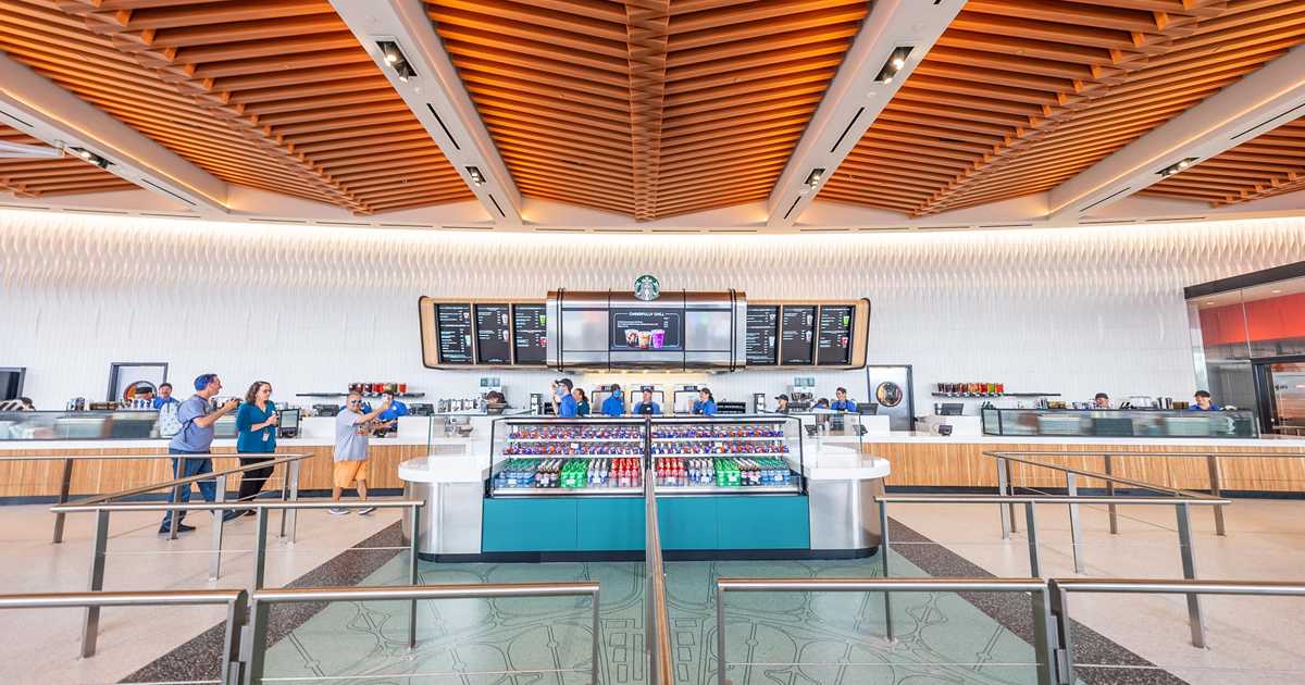
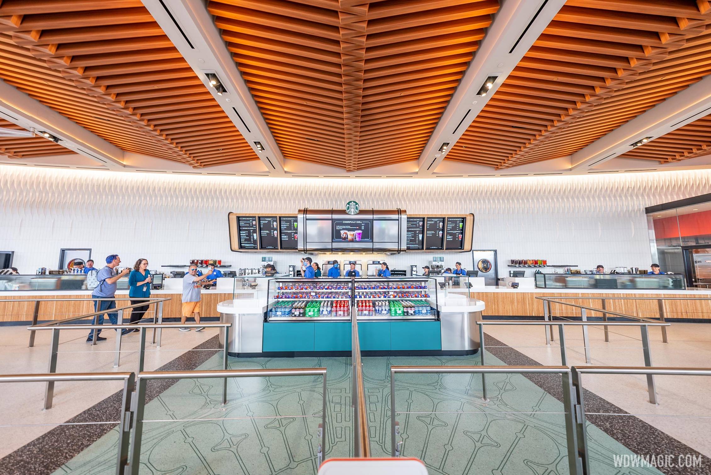
Looks like Disney trying to be that cool tech company with a fancy cafe. Not a fan of the look at all.
Oh, Look! Neon! It's all better. I LOVE this place now!
But there aren’t any neon lightning bolts!Oh, Look! Neon! It's all better. I LOVE this place now!
I never could figure out what -- exactly -- was going on there. Maybe you have to be at just the right angle to see the lightning bolts?But there aren’t any neon lightning bolts!
Thats all I could think of as well.. and I bet this place is so noisy you cant have a conversation.The term that springs to mind is "institutional."
I’m not really sure what people want. This area is supposed to be the functional hub of a world’s fair centered on the visionary architectural statement of Spaceship Earth. Clean and modern is the right vibe. People also seem to be unable to articulate what would make this more distinctively EPCOT aside from exposing their preferences for 90s color schemes and pining for talking trash receptacles.
I thought this was a McDonalds at first glance. YIKES!
I didn’t know that the 1960’s were back in vogue.Inside Connections Cafe


Same. Many aspects of Epcot's entrance reminded me of our local Burger King before the remodel, quite dated and I don't miss it.I get the opposite feeling...but everyone can like what they like. Personal preference for sure.
Register on WDWMAGIC. This sidebar will go away, and you'll see fewer ads.
