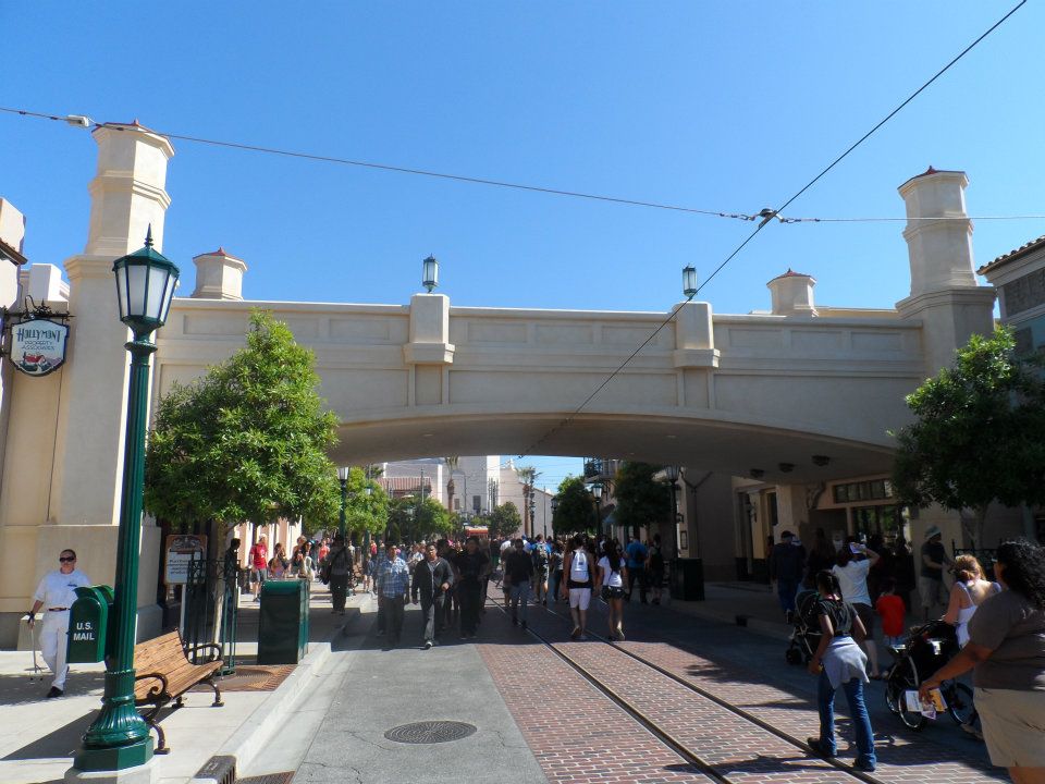
Buena Vista Street (2012)

BryceM

Well-Known Member
I think Buena Vista Street looks like one of the best entrances to a theme park. I love it. It's up there with Port of Entry at Islands of Adventure and, of course, Main Street U.S.A..

And I'm probably in the minority, but I liked how the bridge looked before the re-paint.
 

Cosmic Commando

Well-Known Member
I think the bridge looked nice then and it still looks good. Kinda funny that they felt the need to repaint it barely six months after opening, though. It kinda reminds me of when Cinderella Castle was repainted a while ago with the more pinkish brownish white... they said it would help bring out some of the detail. I wonder if the idea was similar here?

Edit: The Parks Blog had a post recently that (unwittingly) showed the two different color schemes of the castle. The Robin Hood characters are in front of the current castle and the Three Little Pigs picture is in front of the old castle.
 

croboy82

Well-Known Member
I prefered the older painting of the bridge cause this one is a bit too bright but it looks really nice at night so I'm kinda liking it :)
 

Californian Elitist

Well-Known Member
The Hyperion Bridge is now back to it's original color scheme. Looks like they got the hint when fans talked about how the new color wasn't historically accurate.

03-04-13-IMG_2439.jpg


http://micechat.com/23059-dapper-dans-sing-boy-bands/
 

TP2000

Well-Known Member
wait what?! Disney actually listened to their fans immediate response?! You must be joking.

It appears that what they actually did was a multi-stage paint process to bring the shade of the structure up by several degrees, with a reddish undertone to give it depth. Previously, the entire bridge was all one shade of very light beige. Everything on the bridge was sun-bleached beige; pediments, towers, trim, everything all the same shade.

Buena Vista Street Bridge, 2012 - You can have it any color you want as long as it's light beige.
525901_3795754583748_1436452041_n.jpg

http://www.sasakitime.com/2012/06/buena-vista-street-history-hyperion.html

Now this bridge is subtly two-toned, with the red undertones on the flat panels giving it more depth. It also sets off nicely against the other light colored buildings around it, and no longer matches the Carthay Circle Theater beyond. (Thus, it no longer competes with the Carthay architecturally since it's no longer an identical color)

What we saw was that purposeful multi-stage painting project taking place overnights in an operating theme park. The bridge looks great now, and no longer blends blandly with the surrounding streetscape. It now has depth, and an undertone of distressed color and patina. It looks great!
 

WED99

Well-Known Member
It appears that what they actually did was a multi-stage paint process to bring the shade of the structure up by several degrees, with a reddish undertone to give it depth. Previously, the entire bridge was all one shade of very light beige. Everything on the bridge was sun-bleached beige; pediments, towers, trim, everything all the same shade.

Buena Vista Street Bridge, 2012 - You can have it any color you want as long as it's light beige.
525901_3795754583748_1436452041_n.jpg

http://www.sasakitime.com/2012/06/buena-vista-street-history-hyperion.html

Now this bridge is subtly two-toned, with the red undertones on the flat panels giving it more depth. It also sets off nicely against the other light colored buildings around it, and no longer matches the Carthay Circle Theater beyond. (Thus, it no longer competes with the Carthay architecturally since it's no longer an identical color)

What we saw was that purposeful multi-stage painting project taking place overnights in an operating theme park. The bridge looks great now, and no longer blends blandly with the surrounding streetscape. It now has depth, and an undertone of distressed color and patina. It looks great!
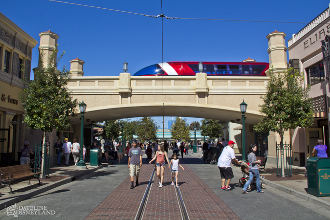
I did notice it looks a fair bit better now, I'm glad. Only the best for the best entrance in any Disney Park!
 

nemofinder22

Well-Known Member
Well it looks like the "if it's good enough for Six Flags" mentality is still alive at DCA when it comes to the BVS window displays.

The newest incarnation for Big Top Toys. Yes that is a cut out of Duffy!
i-DXJHZvh-M.jpg

http://mintcrocodile.smugmug.com/photos/i-DXJHZvh/0/O/i-DXJHZvh-O.jpg

i-gz2xxq7-M.jpg

http://mintcrocodile.smugmug.com/photos/i-gz2xxq7/0/O/i-gz2xxq7-O.jpg

Quality! :(
i-kBvWPSH-M.jpg

http://mintcrocodile.smugmug.com/photos/i-kBvWPSH/0/O/i-kBvWPSH-O.jpg

Photos by Mintcrocodile,
http://mintcrocodile.blogspot.com/2013/03/ugh-visiting-disneyland-resort-while.html

Here's the same window from June 2012.
i-f43jvBs-M.jpg

http://mintcrocodile.smugmug.com/photos/i-f43jvBs/0/O/i-f43jvBs-O.jpg

The original windows can all be seen here.
http://mintcrocodile.blogspot.com/2012/06/buena-vista-street-june-15-2012-disney.html
 

WED99

Well-Known Member
It's sad to see the window displays that helped create the environment so much be altered, but I can understand how it was necessary from a marketing standpoint.

Besides, I'm not going to break down in tears in the middle of BVS because they changed the windows :p
 

WED99

Well-Known Member
thanks for that! I don't really mind it, in fact it emphasizes the circus feel more.

Circuses are tacky but right?
 

Register on WDWMAGIC. This sidebar will go away, and you'll see fewer ads.

Back
Top Bottom