G00fyDad
Well-Known Member
Well, that will be the new festival area, they have moved to a portajohn look vs. table top building :0
Disneypalooza
Well, that will be the new festival area, they have moved to a portajohn look vs. table top building :0
In what part? If you're talking about the paint on the CommuniCore building, it's going to be all one color now. The blue-and-brown blocking is what's being painted over.Any idea why they are going with a paint scheme going from blues fading across to browns? Is that supposed to signify a different area or something or are they just trying to be artistic?
This part. The multi colored portions. It was always like that? I swear, for the life of me I cannot remember it like this. It has been a few years since we have gone but I seem to remember it being two different shades of blue and that was it.In what part? If you're talking about the paint on the CommuniCore building, it's going to be all one color now. The blue-and-brown blocking is what's being painted over.
Any idea why they are going with a paint scheme going from blues fading across to browns? Is that supposed to signify a different area or something or are they just trying to be artistic?
Yep, no more of this crap:In what part? If you're talking about the paint on the CommuniCore building, it's going to be all one color now. The blue-and-brown blocking is what's being painted over.
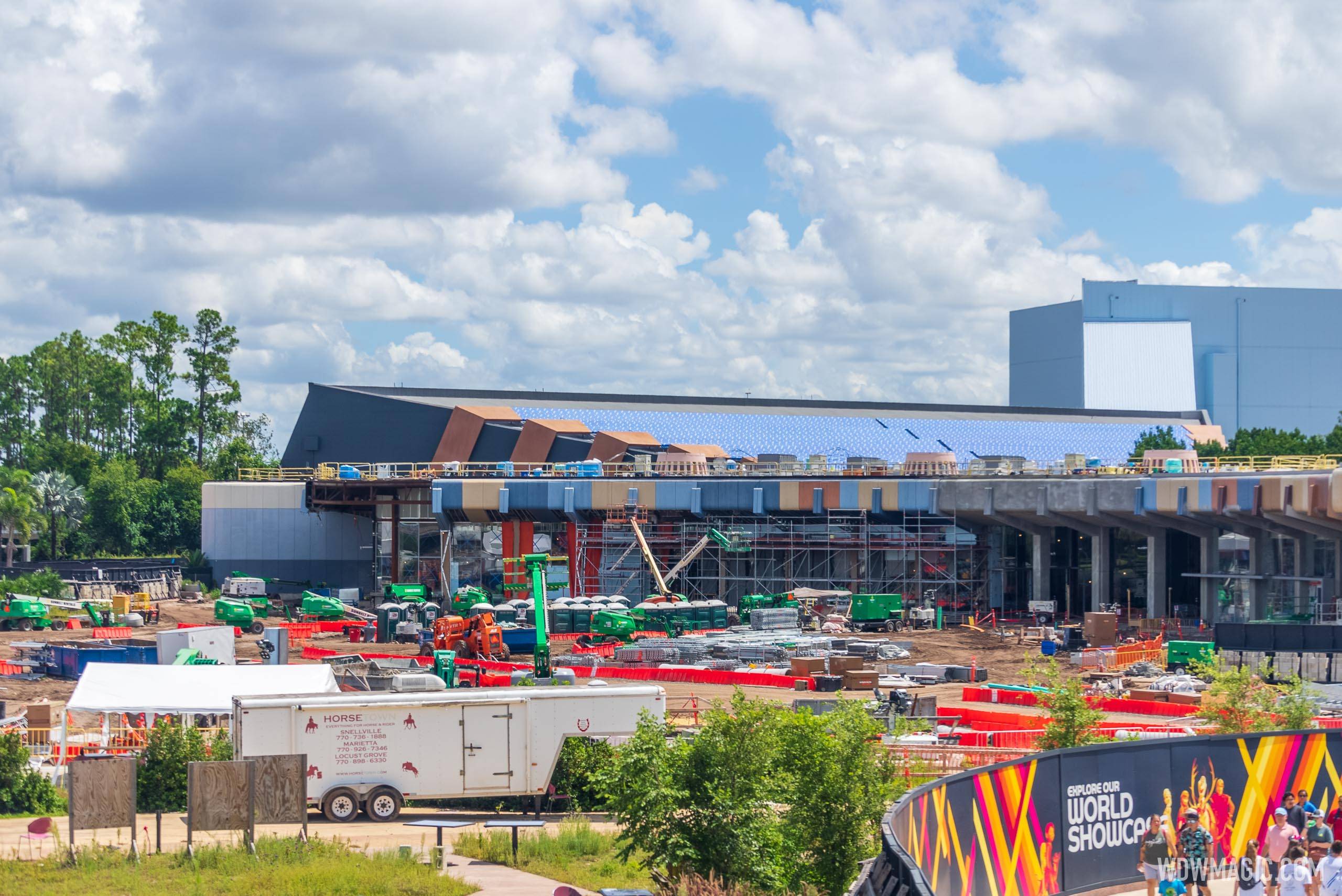
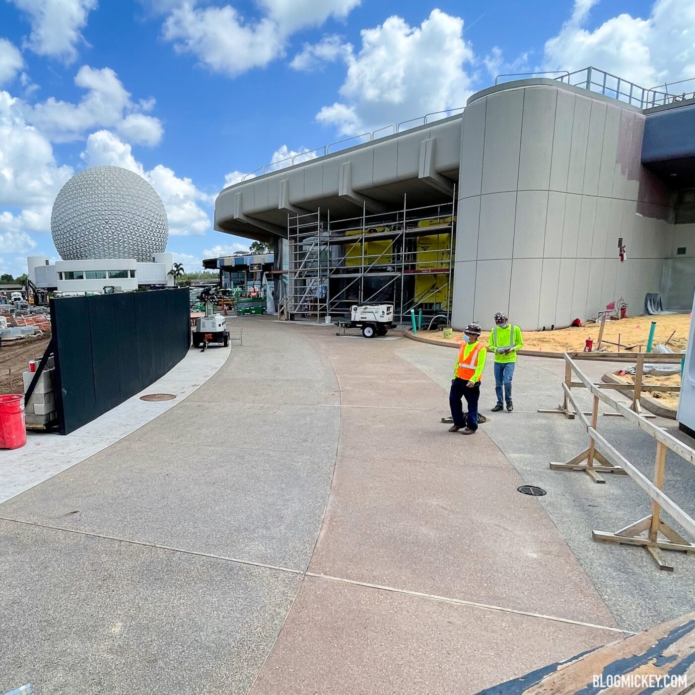
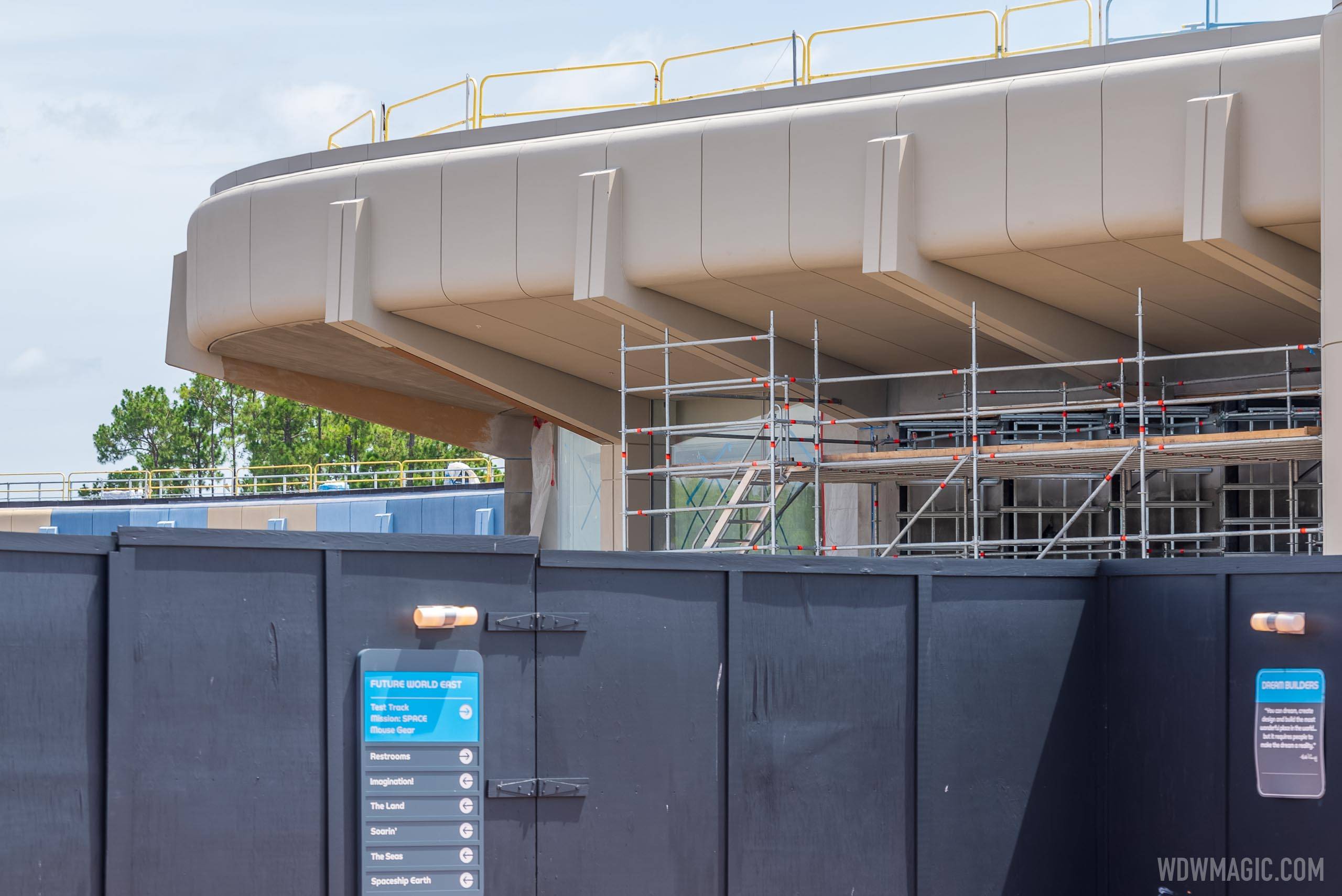
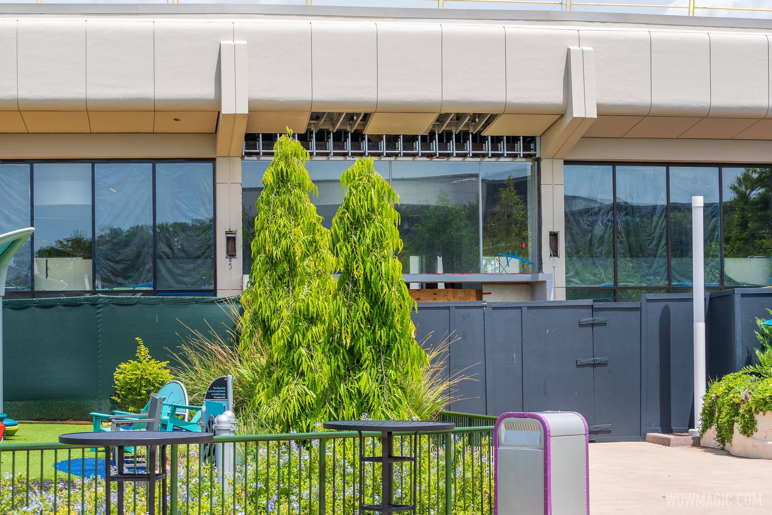
You mean the EPCOT re-envisioning is going back to something like it’s original color scheme?Yep, no more of this crap:

And more of this:


It's almost like the original teams that made the place knew how to make it look best. 35+ years later, WDI seems to have kinda figured it out.You mean the EPCOT re-envisioning is going back to something like it’s original color scheme?
It's almost like the original teams that made the place knew how to make it look best. 35+ years later, WDI seems to have kinda figured it out.
If only they could mirror this on the other side.Yep, no more of this crap:

And more of this:


Yes, but the parti of this part of World Celebrate is a circle, a shape famous for its asymmetry.If only they could mirror this on the other side.
Well, you're right there. I still laugh at how the bits they're getting right is really just reverting to the original design with slight tweaks to them. It says a lot about 80's WED vs 201X WDI.Looking at Epcot, I'd say WDI has not figured anything out. Or, at the absolute minimum, management doesn't have the foggiest clue.
Well, you're right there. I still laugh at how the bits they're getting right is really just reverting to the original design with slight tweaks to them. It says a lot about 80's WED vs 201X WDI.
It's not even an argument of "the 80's were better". The 90's overhauls really did mess things up.
Well, you're right there. I still laugh at how the bits they're getting right is really just reverting to the original design with slight tweaks to them. It says a lot about 80's WED vs 201X WDI.
It's not even an argument of "the 80's were better". The 90's overhauls really did mess things up.
While effusive praise is not warranted, the idea that the original Imagineers got everything right, that the new ones are just now realizing that, and that everything in between the original build and the reversion was a mistake is very much rooted in hindsight. We're simply at a fortuitous moment when a lot of styles popular at the time have come back into vogue and reversion happens to generally be the right decision from an aesthetic standpoint. There will come a time in the not-so-distant future when the gray of CommuniCore is once more seen as sad and tired and will be splashed over with a series of different hues, and that decision won't necessarily be wrong in the moment either. This is not to say that there aren't decisions I disagree with, just that it's easy to see why people are excited about the changes since they are probably less concerned with the history and more with how the updates mesh with current sensibilities.I find it fascinating how many people absolutely gush over some of what Disney has done in this park, yet are completely ignorant of the fact that what they are loving is, in fact, what the park used to look like. It's like independent thinking has gone out the window in favor of reading an Instagram post and accepting it as indisputable truth. Hmm... actually, that's what a wide swath of today's society does. You can see the results every day.
Few people in history understood the psychology of color as well as John Hench.It's almost like the original teams that made the place knew how to make it look best. 35+ years later, WDI seems to have kinda figured it out.
Here is a fly by from the monorail today
Register on WDWMAGIC. This sidebar will go away, and you'll see fewer ads.
