This discussion of the word-salad press release reminds me of the over-the-top description of the Harbor Blvd tram area when it first opened.
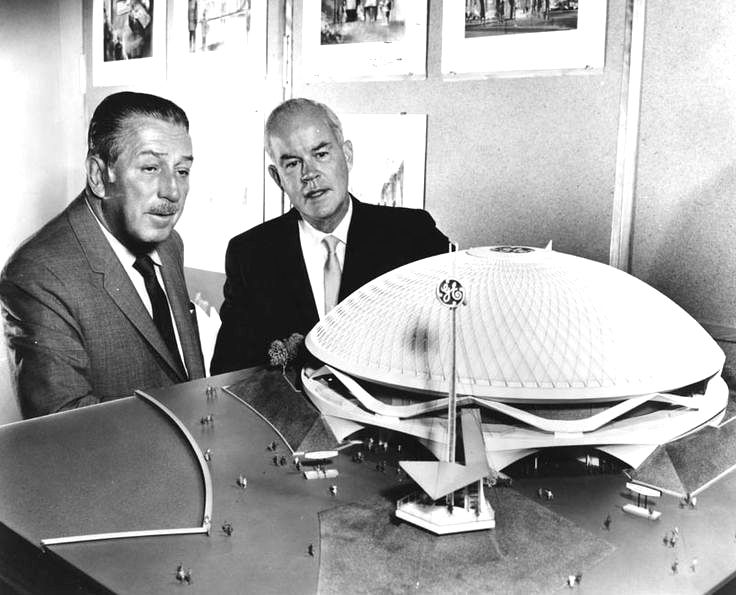
It was one of the first elements of the Disneyland Resort makeover project that would forever revolutionize the one little theme park into a true vacation destination, including a second theme park, shopping district, high-end hotel and spa, and extensive updates to the parking, landscaping, and general placemaking of the surrounding area. Disney brought in Martha Schwartz, a celebrity landscape from Boston, to design it, and the description had everybody excited to see it. As the first element of the new Resort to open (since it would allow the existing bus and tram infrastructure to be displaced), it generated a lot of early buzz:
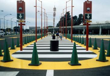
The Theme Park Entry Esplanade project is composed of three distinct areas: the Central Plaza Area, the East Tram Area or “Hyper-Highway”, and the West Tram Area. All three spaces are distinct in terms of character and function; however, they are conceived of as a series of spaces which, although different in expression, form a choreographed sequence of events. The three distinct spaces are organized in a linear fashion, inspired by gardens of the classical Baroque Period, where episodic events or spaces are joined through a linear progression of the pedestrian through the spaces. This journey, or pathway, links and brings coherence to the site. The use of geometry and its rhythm through the plantings and elements create a continuity which ties all parts of the design together.
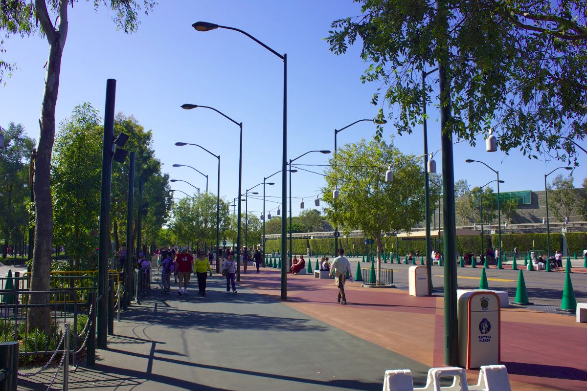
The “Hyper-Highway” concept was conceived as a tool to create clear boundaries between vehicular and pedestrian areas. Exaggeration and repetition of highway motifs, such as pedestrian crosswalks, traffic cones, and highway lights are used not only to help create clear and defined spaces, but also to create fantastical places. As a visitor turns into the environment of the “Hyper–Highway”, he or she will experience the world as a bright and more vivid place, as the visual language of the highway becomes bigger, bolder, and more colorful.
Shuttle buses from area hotels drop off and pick up passengers along linear traffic islands. These glorified traffic islands are marked by an insistent and oversized pattern of “cross–walk” to indicate clear, strong pedestrian access to the entry. Each traffic island is flanked by formal rows of highway lighting standards. The light standards have a metallic color finish. They glow a different color in each island. The brightly colored light provides not only a dazzling field of glowing colors at night, but also aids in way–finding and orientation.
The bollards, shaped as oversized traffic cones, painted green, allude to clipped topiaries in the European Garden Tradition. A single line of bollards winds through the entire East Esplanade on a five foot wide strip of bright yellow “detectable warning” tile. The tile provides the ultimate visual and tactile separation between pedestrians and vehicles.
Sounds pretty elaborate, huh? Well, here's what was built:
It feels just like Versailles, right?
For those who haven't been in the online Disney fan community long enough to remember when this opened, this area was mocked. Mercilessly. For many, many years. Martha Schwartz's name became a punchline for overhyped news and lackluster products.
And while it certainly has its quirks, the style of writing is actually consistent with how architects speak to about their work. This wasn't empty fluff dreamed up for a press release to the public, it was done in earnest; in fact, the text is still on Martha Schwartz Partners' website to this very day as a brag-worthy example of their work. And ultimately, the description clearly reflects the design intent, even if the end result was more utilitarian and less whimsical than implied.
Disneyland East Esplanade, Anaheim, CA, USA

msp.world
The entire area was repainted in the late 00's to make the color scheme less garish, but somehow also made it more mediocre. Instead of being wacky and whimsical with a clear vision, now it's just ugly and awkward. It isn't as harsh on the eyes (particularly at night, with the removal of the color-coded lights), but now it lacks a cohesive vision for why things are the way they are. Instead of having guiding principals that make wayfinding easier (like the color-coded drop-off locations), it's all just sort of an inoffensive blob of earth tones and frustrating small signage sprinkled over vast expanses of pavement. But at least the trees have grown in and there are more shade structures now!
In many ways, the fate of this area parallel's how WDI's work has evolved over the years: they're less bold and more risk-averse than ever, yet somehow the end result is a muddled mess that just doesn't quite work as well as it should. Instead of trying to make a bold statement or make something that's flawlessly functional, we get things that are just-okay enough to be largely ignored and forgotten.


")


