-
Welcome to the WDWMAGIC.COM Forums!
Please take a look around, and feel free to sign up and join the community.
You are using an out of date browser. It may not display this or other websites correctly.
You should upgrade or use an alternative browser.
You should upgrade or use an alternative browser.
Alice in Wonderland updates
- Thread starter Californian Elitist
- Start date
Nland316
Well-Known Member
Shhhh! Maybe they'll forget!I'm loving the splash of color the orange cones give!
Actually I thought we'd see another themed railing by now but perhaps not???
RandomPrincess
Keep Moving Forward
I wonder if they widened the track so that they don't have to put back a rail.
flynnibus
Premium Member
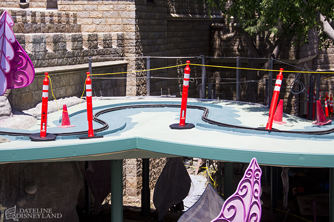
I think the biggest disappointment I have right now with the track as you see is it.. it's lost all the leaf effect.
Not the size as Castro whines.. but it's style/purpose! Before it was going leaf to leaf... now it looks like some patio coming off the castle and you go 'why is there some big patio here'?
Not the size as Castro whines.. but it's style/purpose! Before it was going leaf to leaf... now it looks like some patio coming off the castle and you go 'why is there some big patio here'?
Animaniac93-98
Well-Known Member
They should have just made it the second floor of the "castle", with some trees & shurbs for greenery and playing car guards for kinetics.
RandomPrincess
Keep Moving Forward
Here you can see they are repainting some sort of leaf design. We will have to wait and see how it looks when they are done.


flynnibus
Premium Member
Here you can see they are repainting some sort of leaf design. We will have to wait and see how it looks when they are done.

Painting will not change the issue of MASS and the shape of the platform. They have started installing a decorated railing too

It's lost the lightweight look of it. They should have gone and try to redecorate it in some other aspect like.. a voyage in the trees or something.
Here is a link to picture of the railing:
http://mintcrocodile.blogspot.com/2014/06/the-start-of-alice-in-wonderland-vine.html
http://mintcrocodile.blogspot.com/2014/06/the-start-of-alice-in-wonderland-vine.html
GiveMeTheMusic
Well-Known Member
Welp.
Decorative work on the platform (really, it's not even a vine anymore):

https://twitter.com/MintCrocodile/status/481930885457915904/photo/1

https://twitter.com/MintCrocodile/status/481930885457915904/photo/1
sponono88
Well-Known Member
I kinda like it. Sure, I wish they would have left the original alone but if they were forced to change it, then this doesn't look too bad. I'll wait to see the finished product once the walls are removed and the final railings come in.
I'm just glad they're finally doing something.. the cheap tarp/scaffold setup they had prior to this was pretty embarrassing.
I'm just glad they're finally doing something.. the cheap tarp/scaffold setup they had prior to this was pretty embarrassing.
I kinda like it. Sure, I wish they would have left the original alone but if they were forced to change it, then this doesn't look too bad. I'll wait to see the finished product once the walls are removed and the final railings come in.
I'm just glad they're finally doing something.. the cheap tarp/scaffold setup they had prior to this was pretty embarrassing.
Agreed, it doesn't look bad at all. I'll take a widened "vine" over those atrocious tarps any day.
JediMasterMatt
Well-Known Member
Agreed, it doesn't look bad at all. I'll take a widened "vine" over those atrocious tarps any day.
The tarps never were the real eyesore for me. It was the painted plywood that really screamed apathy to me.
Glad to see this refub winding down. Hopefully the goodies on the inside will be worth the wait.
The tarps never were the real eyesore for me. It was the painted plywood that really screamed apathy to me.
Glad to see this refub winding down. Hopefully the goodies on the inside will be worth the wait.
I bet Toad is really annoying to you then. It's all painted plywood, except the end.
gboiler1
Active Member
I bet Toad is really annoying to you then. It's all painted plywood, except the end.
I'm looking forward to Toad. Haven't ridden in years and my daughter will get to experience for the first time. Toad is such a throwback to dark rides all over the country at boardwalks and carnivals.
flynnibus
Premium Member
I bet Toad is really annoying to you then. It's all painted plywood, except the end.
except toad doesn't look like someone was trying to build their deck out of spare parts and pieces... that's what alice looked like
lazyboy97o
Well-Known Member
The obsession with self reference at work. It is more important that they left people know that they know that it used to be a vine than actually try to make it a vine.Decorative work on the platform (really, it's not even a vine anymore):

https://twitter.com/MintCrocodile/status/481930885457915904/photo/1
JediMasterMatt
Well-Known Member
except toad doesn't look like someone was trying to build their deck out of spare parts and pieces... that's what alice looked like
Toad is painted plywood but at least you can't see the texture. As Flynn said, it's like someone went and built the extended deck from whatever was on sale at Home Depot's odds and ends pile. Today on TLC's Trailer Park Treasures - Disney's new deck.
Register on WDWMAGIC. This sidebar will go away, and you'll see fewer ads.

