Parker in NYC
Well-Known Member
Very happy that the 90’s purple is going away. This is a good change.
 It's hot to feel the rush. To brush the dangerous.
Very happy that the 90’s purple is going away. This is a good change.
It's hot to feel the rush. To brush the dangerous.I'm gonna run right to, to the edge with you where we can both fall far in love

When I was young, I prayed for lightning (not McQueen).I'm gonna run right to, to the edge with you where we can both fall far in love
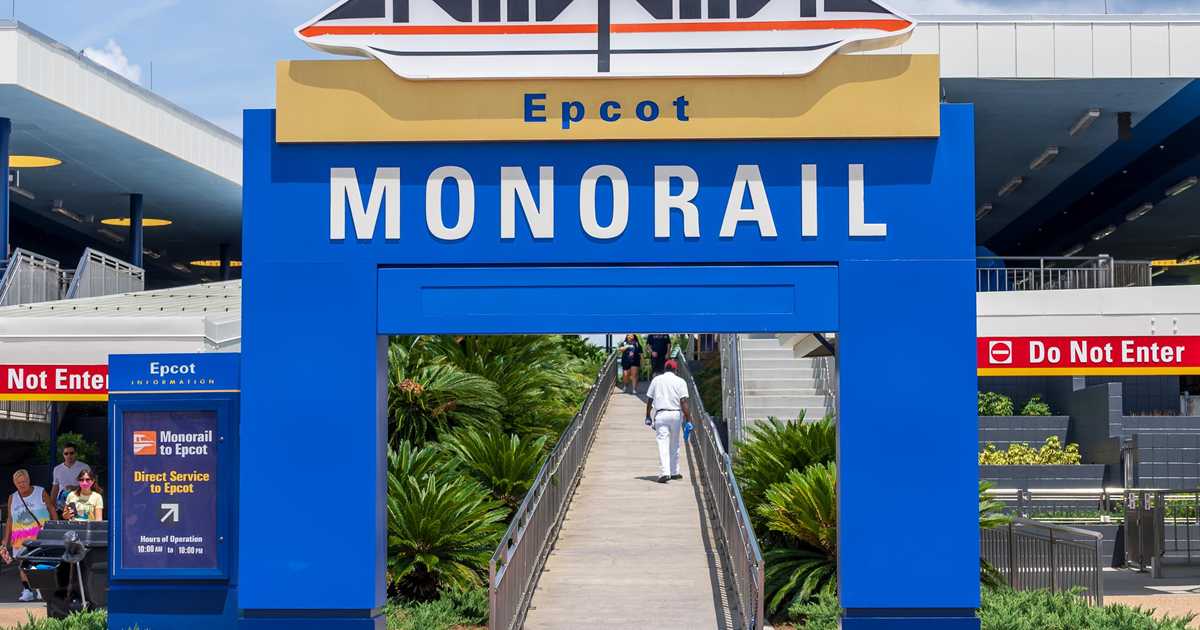
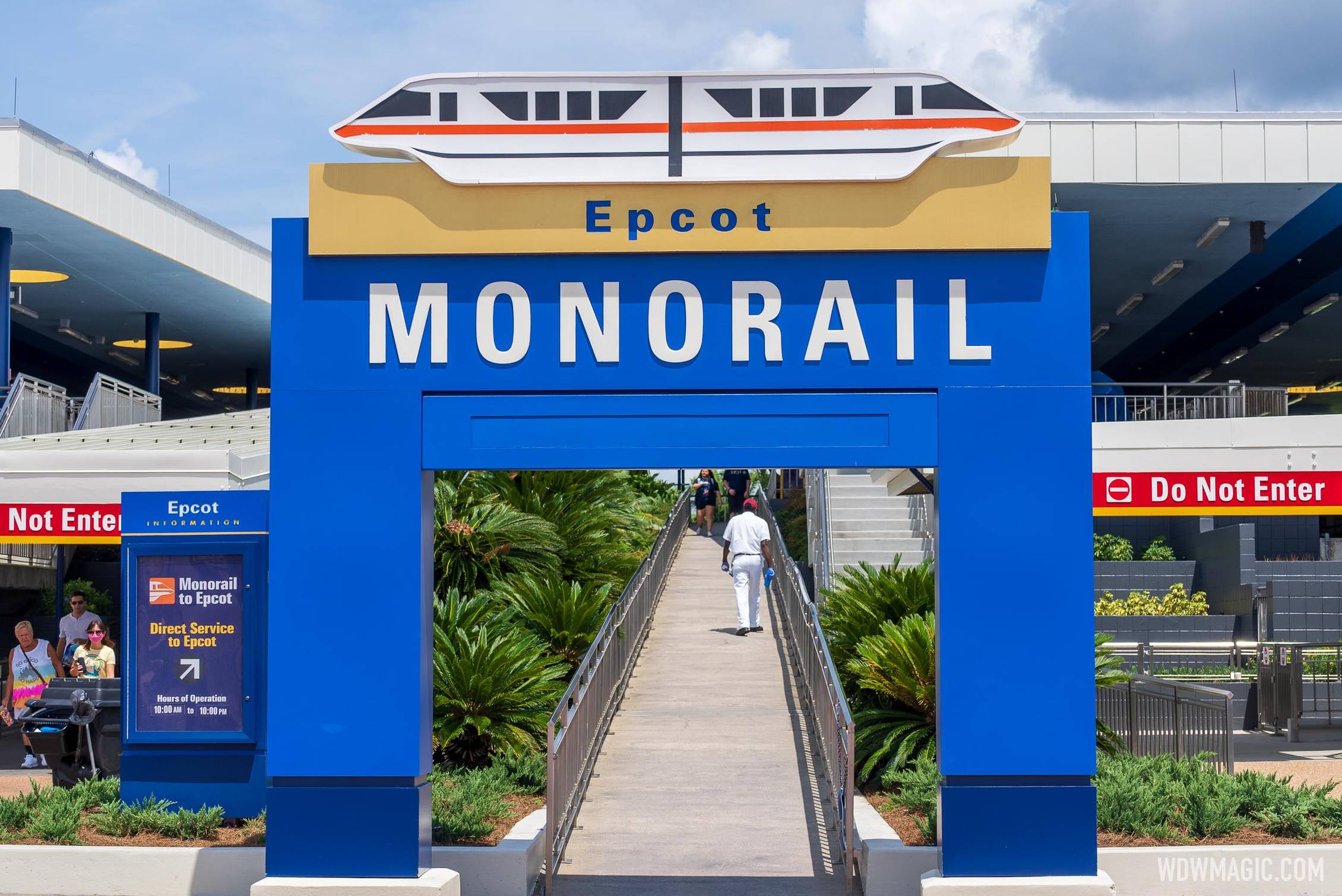
FWIW, I LOVE the road sign color combo…It’s so unlike the typical roadway signs, you REALLY know when you’re on property…but that’s just me.It definitely looks more grown up...which is a welcome change. Purple is my favorite color, but it's use on Disney signs and buses wasn't great (plus it leaned too red for my taste).
The fact that most of the lighting is still linear fluorescent tube lighting has always put me off. If the area got the facelift that say, Disney Springs got around their area with brick finishes, landscaping, etc I'd be much happier.They need to completely replace most of this. The architecture is dated and clunky. The TTC should be modern and sleek.
It’s in an interesting spot theming wise. Do you make it match Main Street? But it provides transport to other places too. Disney Springs look would be nice, and would compliment the ferry boats, but what about the monorails. I’m not sure what theme would work best here, seems like imagineers didn’t either so now we have 1970s transit hub.The fact that most of the lighting is still linear fluorescent tube lighting has always put me off. If the area got the facelift that say, Disney Springs got around their area with brick finishes, landscaping, etc I'd be much happier.
The TTC has always looked like a concrete wasteland and I don't see much hope seeing that they just expanded some of it and copied the design of the original look.
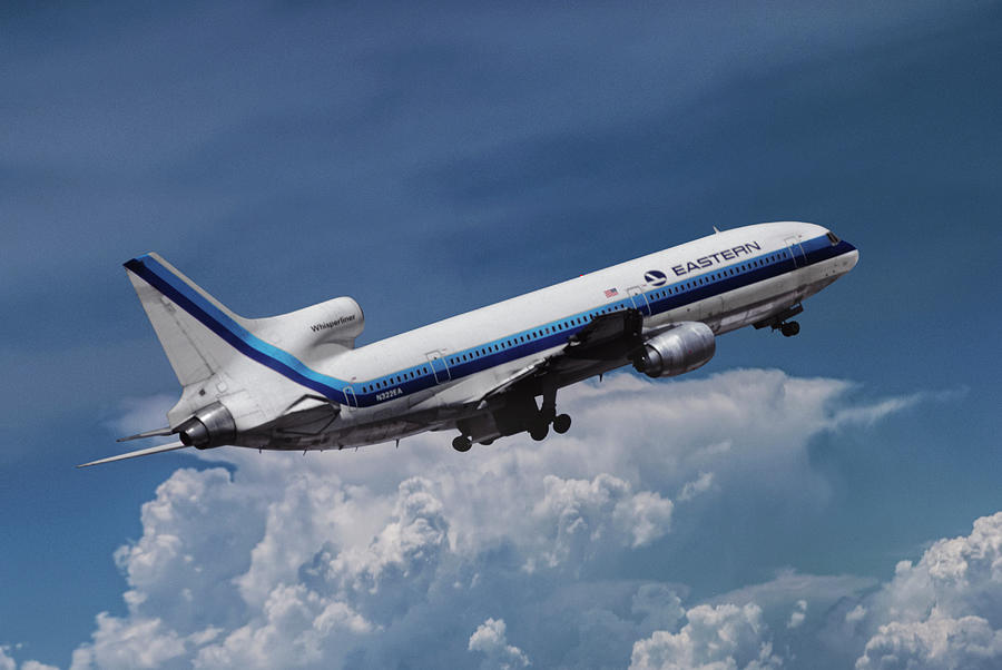
Anyone else old enough to get some Eastern Airlines vibes from those stripes?
View attachment 570184Eastern Whisperliner L-1011 by Erik Simonsen
Eastern Whisperliner L-1011 Photograph by Erik Simonsenpixels.com
And I had just gotten "If You Had Wings" out of my head, thanks...Anyone else old enough to get some Eastern Airlines vibes from those stripes?
View attachment 570184Eastern Whisperliner L-1011 by Erik Simonsen
Eastern Whisperliner L-1011 Photograph by Erik Simonsenpixels.com
 www.wdwmagic.com
It’s not that it needed fixed. It needed finished. It was never intended to stay gold on gold.That's crazy that this even had to be fixed. That gold on gold was a nightmare, especially for people with vacation brain.
Yes I should have made that point clear. It obviously wasn't complete. Odd that it was left that way for so long though.It’s not that it needed fixed. It needed finished. It was never intended to stay gold on gold.
I'd bet money the gold on gold was overspray. The letters are no longer cut out - the blue letters fit into the areas that were already there. What's horrifying is that it took this long to finish the signs.That's crazy that this even had to be fixed. That gold on gold was a nightmare, especially for people with vacation brain.
I don't remember what it looked line before. Does anyone have any pictures of it.
Thanks.News - Blue and gold color scheme arrives at the Transportation and Ticket Center
The new color looks so much better than the old in my opinion. What a nice glow-up. I dunno... I was never fond of the old purple either but I'm not sure this is any better - About the same for me but I think I just don't think much of the signage overall. Was this the original signage when...forums.wdwmagic.com
Register on WDWMAGIC. This sidebar will go away, and you'll see fewer ads.