I dunno... I was never fond of the old purple either but I'm not sure this is any better - About the same for me but I think I just don't think much of the signage overall. Was this the original signage when Epcot opened? I did a little googling but can't seem to find any others.The new color looks so much better than the old in my opinion. What a nice glow-up.
-
Welcome to the WDWMAGIC.COM Forums!
Please take a look around, and feel free to sign up and join the community.
You are using an out of date browser. It may not display this or other websites correctly.
You should upgrade or use an alternative browser.
You should upgrade or use an alternative browser.
News Blue and gold color scheme arrives at the Transportation and Ticket Center
- Thread starter wdwmagic
- Start date
Disney Analyst
Well-Known Member
They need to completely replace most of this. The architecture is dated and clunky. The TTC should be modern and sleek.
WondersOfLife
Blink, blink. Breathe, breathe. Day in, day out.
It looks great! Can’t wait to see it in person!I dunno... I was never fond of the old purple either but I'm not sure this is any better - About the same for me but I think I just don't think much of the signage overall. Was this the original signage when Epcot opened? I did a little googling but can't seem to find any others.
brb1006
Well-Known Member
Yeah, it's been long overdue for the TTC to get a modernized look.They need to completely replace most of this. The architecture is dated and clunky. The TTC should be modern and sleek.
The Great Gonzo
Well-Known Member
This has to be the unfinished look. Disney wouldn't leave it like this.
peter11435
Well-Known Member
It’s obviously unfinished. It’s laughable that some on here are unsure of thatThis has to be the unfinished look. Disney wouldn't leave it like this.
Tom Morrow
Well-Known Member
They need to completely replace most of this. The architecture is dated and clunky. The TTC should be modern and sleek.
Yeah. Paint jobs aren't enough. The TTC is the by far the ugliest spot in the entire resort and sets such a poor first impression for what is often the first park most people visit.
vikescaper
Well-Known Member
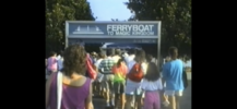
I was watching @marni1971’s transportation video and there is footage of the old ferry sign. I’m assuming the monorail signage at the TTC was the same.I'm serious though - are there any pics of the original signage? I don't think it started that way did it?
Attachments
I think I can safely say after seeing more than enough paint jobs of late that Disney was clearly inspired by the color scheme of:
WDWmagic.com

and

in that order!
and

in that order!
zarpman
Member
Not sure of the exact year, but the Transportation and Ticket Center colors were meant to match the Disney road signs when the "Disney Transport" brand was introduced (1989 I think, but I'm open for correction). That's also when the buses and trams moved from the orange and brown colors.
Now that the buses have moved on, it's time for the TTC to change as well. Unfortunately, it's going to take more than some character wraps to dress this area up. Maybe some classic topiaries? It doesn't need to be flashy; it just needs to not look dated.
Now that the buses have moved on, it's time for the TTC to change as well. Unfortunately, it's going to take more than some character wraps to dress this area up. Maybe some classic topiaries? It doesn't need to be flashy; it just needs to not look dated.
More blue and gold..
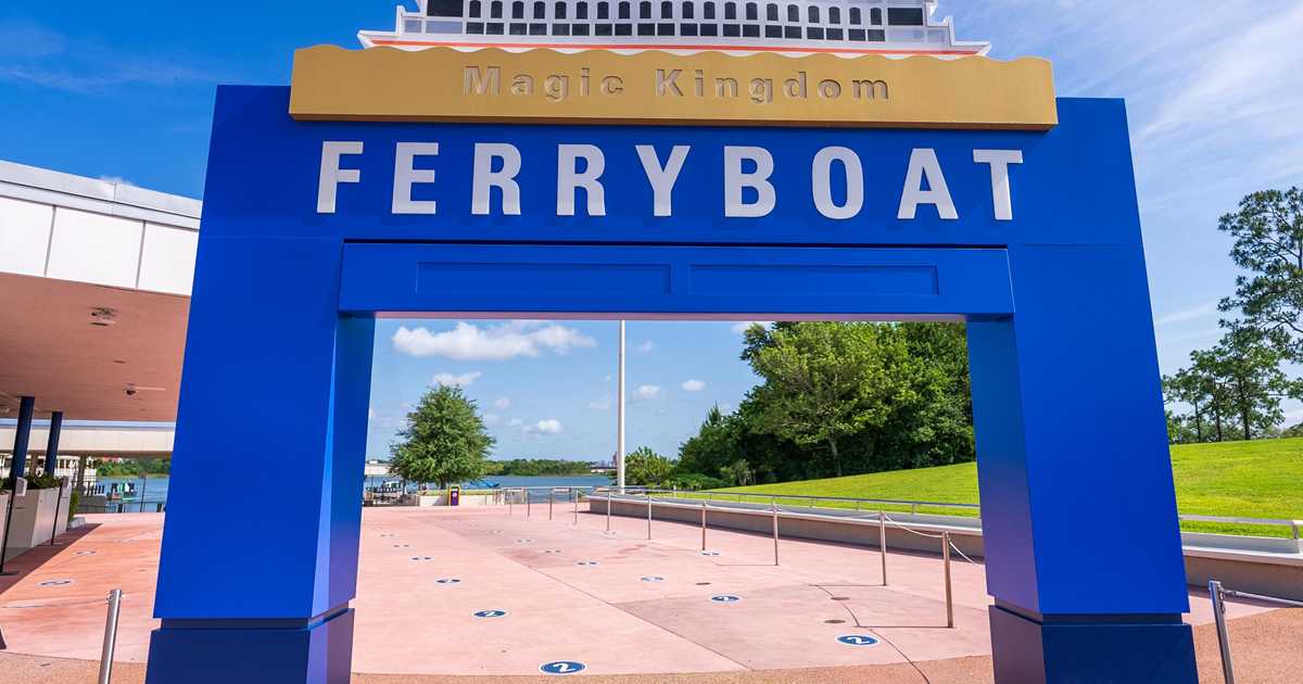
 www.wdwmagic.com
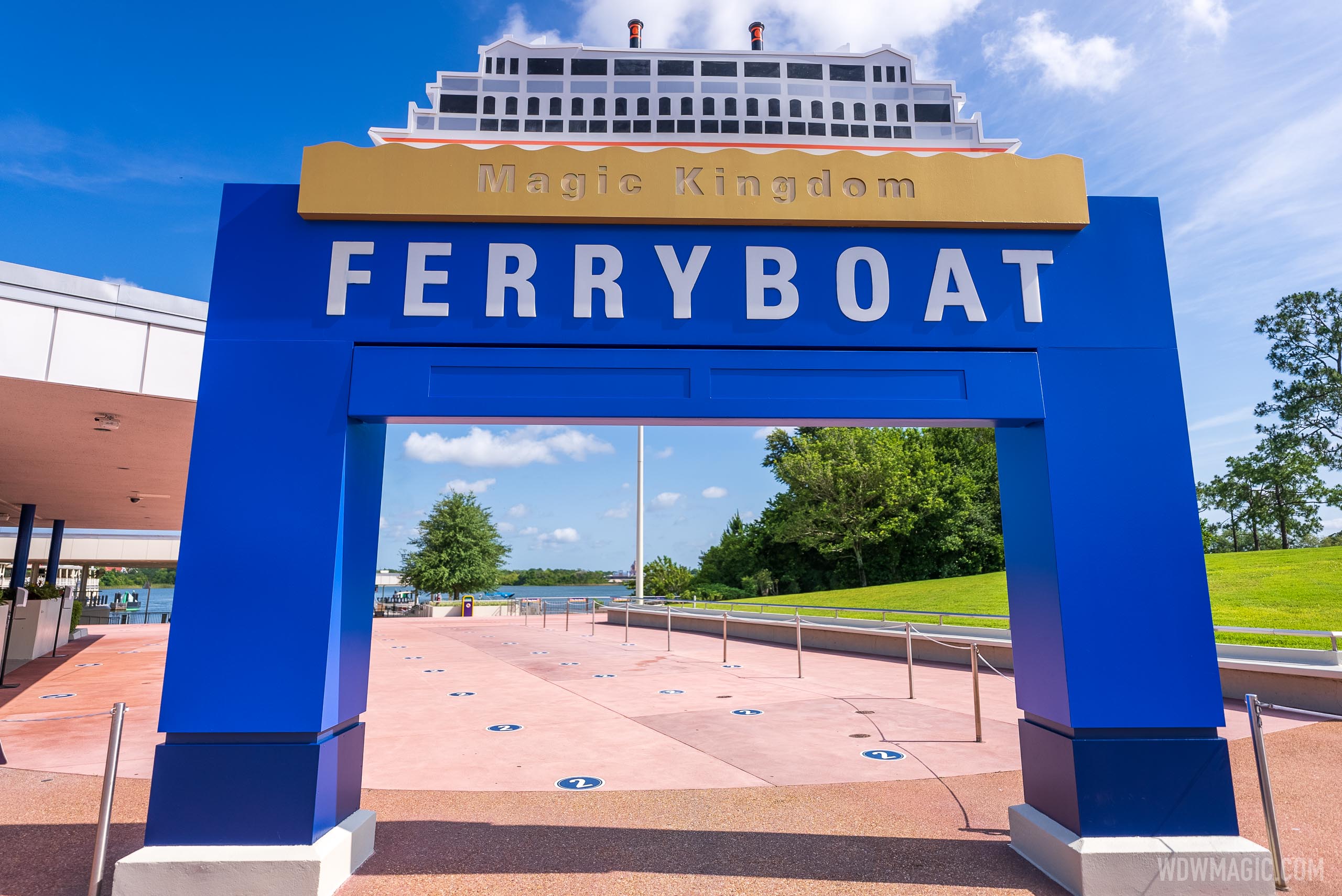

Transportation and Ticket Center new color scheme - May 3 2021
Transportation and Ticket Center new color scheme - May 3 2021

91JLovesDisney
Well-Known Member
Every time I see those signs (the old paint job) I think it makes Magic Kingdom look dated and cheap. As a guest, it's pretty much the first part of Disney you see, so it's gotta look nice. That's just my opinion. Glad they decided to repaint!
New color scheme coming to the Disney World Monorail station at the Transportation and Ticket Center
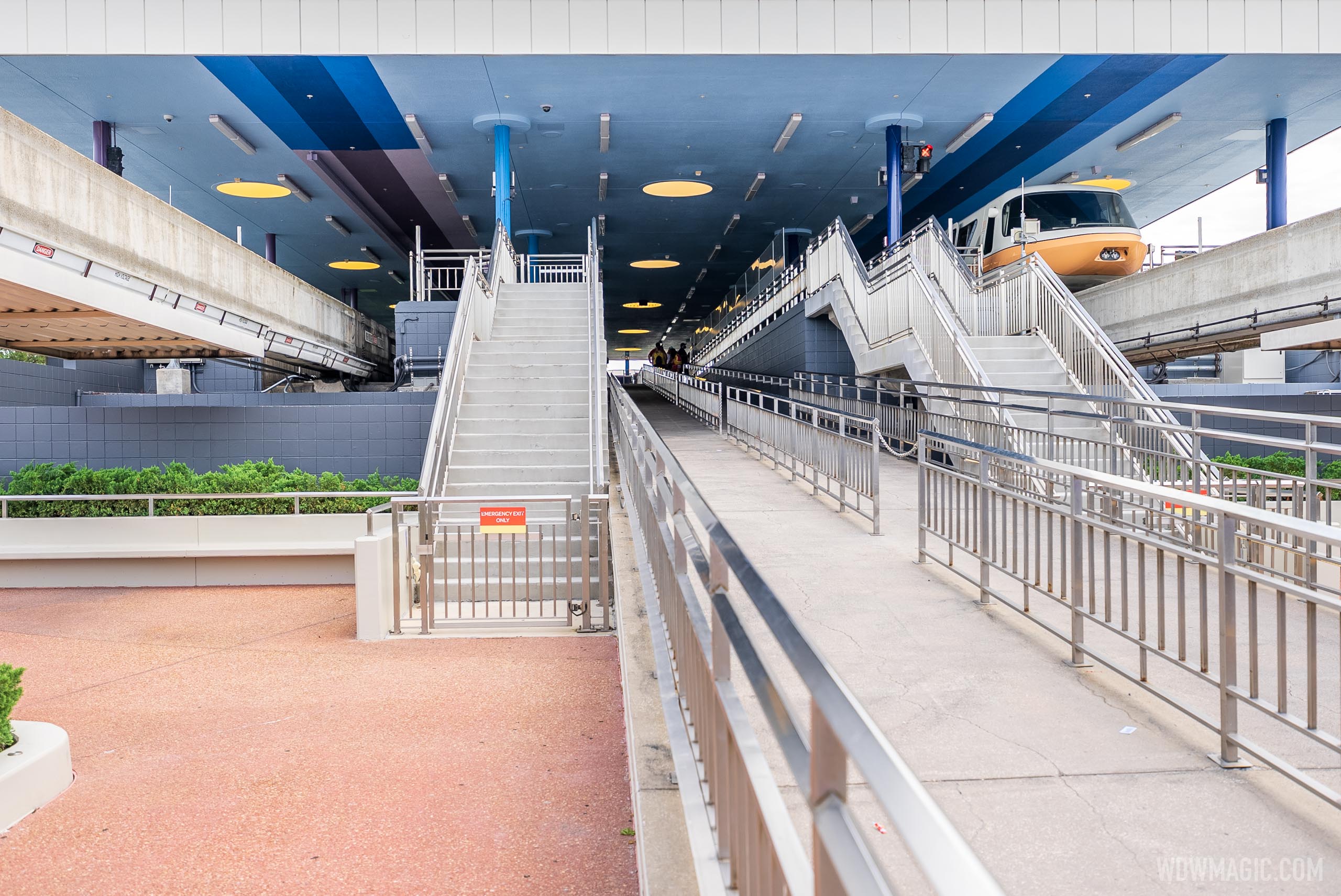
New color scheme coming to the Disney World Monorail station at the Transportation and Ticket Center
The new shades of blue are being added inside the monorail station.
As long as the station itself stays free of gold, I’m ok with this.
Epcot82Guy
Well-Known Member
I'm blue da-ba-dee-da-bu-dai....
Seriously, though - the new design is just fine. Nothing crazy. I agree the area could stand for a larger update - but it's nice to get a fresh coat of paint. The purple had nostalgia for me - but it was from a different decade, no doubt.
Seriously, though - the new design is just fine. Nothing crazy. I agree the area could stand for a larger update - but it's nice to get a fresh coat of paint. The purple had nostalgia for me - but it was from a different decade, no doubt.
Zummi Gummi
Pioneering the Universe Within!
Very happy that the 90’s purple is going away. This is a good change.
91JLovesDisney
Well-Known Member
I think it looks nice - nothing super exciting, but nice
castlecake2.0
Well-Known Member
TTC would look good with an EPCOT main entrance re do, but this is nice as well.
Register on WDWMAGIC. This sidebar will go away, and you'll see fewer ads.

