News Morocco Pavilion redevelopment

ImperfectPixie

Well-Known Member
Sorry, but you’re mistaken. Calligraphic Arabic would never look like this. The spacing is wrong and the letters, while neat, are inelegant. One wouldn’t expect such a text—on a wall, above a spice cart—to be written in a calligraphic style anyway, but rather in a script that resembles handwriting. What you see on the wall looks exactly as I have characterised it: like something written in Microsoft Word. It’s a fail.

ETA: The five samples of text in the image below give a better sense of what I’m talking about. The font they’ve used at Epcot is equivalent in effect to the top two samples: it is the unmistakable product of a computer. The three other samples (especially the one labelled “Arabic Typesetting”) are much closer in look to actual calligraphy (which, again, wouldn’t be the right look either for the spice cart).

Font-Samples.jpg
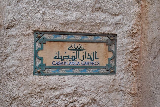
Having been a professional sign-writer for much of my adult life, there are different styles of painting used to achieve a typeset look (similar to Times or Garamond), and hand-written calligraphy or script. Calligraphy and scripts are generally produced using few brush-strokes, while Times and other typefaces require many more strokes per letter (and with a different style of brush) in order to accomplish the uniform thicknesses and serifs.

Typeface design for use on computers has improved by leaps and bounds (especially with the creation of Open Face Type, which can automatically add additional decoration to particular letters and letter combinations), but it will never really hold a candle to hand-designed and hand-painted lettering, IMO.
 

James Alucobond

Well-Known Member
Sorry, but you’re mistaken. Calligraphic Arabic would never look like this. The spacing is wrong and the letters, while neat, are inelegant. One wouldn’t expect such a text—on a wall, above a spice cart—to be written in a calligraphic style anyway, but rather in a script that resembles handwriting. What you see on the wall looks exactly as I have characterised it: like something written in Microsoft Word. It’s a fail.
Brush Script also looks like it's fabricated in Microsoft Word. The repetition and occasionally awkward spacing are apparent to native writers of cursive. My point is that, in spite of still being obviously fabricated, the strokes of the Arabic script in this signage are based on those that would actually be produced by a calligraphy brush. Times New Roman is not based on brush strokes. Its serifs are the result of visual artifacts that originated from chiseling the letters in stone. It's representative of a completely different medium.
 

LittleBuford

Well-Known Member
Brush Script also looks like it's fabricated in Microsoft Word. The repetition and occasionally awkward spacing are apparent to native writers of cursive. My point is that, in spite of still being obviously fabricated, the strokes of the Arabic script in this signage are based on those that would actually be produced by a calligraphy brush. Times New Roman is not based on brush strokes. Its serifs are the result of visual artifacts that originally resulted from chiseling the letters in stone. It's representative of a completely different medium.
Arabic calligraphy isn’t executed with a brush anyway, but with a pen (and traditionally a reed pen).

Arabic Times New Roman isn’t based on lettering chiselled into stone. Along with Arabic Arial and most other Arabic computer fonts, it is based on a calligraphic script called naskh, though, as I have indicated, it lacks the elegance of actual calligraphy.

I wouldn’t be posting so much on this if I didn’t know what I was talking about.
 
Last edited:

James Alucobond

Well-Known Member
Arabic calligraphy isn’t executed with a brush anyway, but with a pen (and traditionally a reed pen).
... But would be painted on a sign with a brush. My point is simply that the Arabic font in question emulates brush strokes, so comparing it to a Roman font that emulates a chisel isn't really 1:1. To the uninformed observer, one could feasibly be painted with quick brush strokes whereas the other would obviously never be the natural outcome of putting brush to surface.
I wouldn’t be posting so much on this if I didn’t know what I was talking about.
I certainly don't doubt that you know what you're talking about, and I'm actually not denying that a native writer could easily see that it's a font. Just pointing out that comparing it to Times New Roman is unfair. I actually think the font used for Le Chameau Bleu in your subsequent example is an appropriate comparison. It's obviously not the way someone would actually write in cursive and looks a bit stilted, but it could be created with a brush and might fool someone unfamiliar with alphabetical characters into thinking it had been done by hand.
 

LittleBuford

Well-Known Member
... But would be painted on a sign with a brush. My point is simply that the Arabic font in question emulates brush strokes, so comparing it to a Roman font that emulates a chisel isn't really 1:1.
I don’t agree. For most people, Times New Roman evokes traditional Western printing rather than the chiselled scripts from which it is ultimately descended. It looks formal, official, uninspired, and non-handwritten, and in these respects is directly comparable in effect to the script they’ve used at Epcot.

To the uninformed observer, one could feasibly be painted with quick brush strokes whereas the other would obviously never be the natural outcome of putting brush to surface.
Most uninformed observers can’t tell when Arabic is written backwards! That’s not the audience that Disney Imagineering should be content with satisfying. Visitors from Morocco, along with others familiar with Arabic and Arabic-derived scripts, would never look at that text and interpret it the way you’re describing. Far from passing for something that might have been painted with quick brushstrokes, it looks like what it is: a computer printout that’s been painstakingly copied onto a wall. I for one think Disney can and should do better.
 

nickys

Premium Member
I for one think Disney can and should do better.
This sums up the whole sorry saga perfectly.

I will give Disney credit for at least “correcting” the error when you pointed it out to them.

Unfortunately what they did seems to have been to take the Arabic script directly from your email and used that, rather than properly researched a) which word would have been better to use and b) how to write it correctly.
 

castlecake2.0

Well-Known Member
If we keep it up they’re just going to paint the wall white and be done with it. At the end of the day this is a land in a theme park. While they should respect the cultures they’re representing, I don’t think you’re going to find anyone from the represented countries that will be 100% satisfied with how their culture is showcased here.
 

James Alucobond

Well-Known Member
Most uninformed observers can’t tell when Arabic is written backwards! That’s not the audience that Disney Imagineering should be content with satisfying. Visitors from Morocco, along with others familiar with Arabic and Arabic-derived scripts, would never look at that text and interpret it the way you’re describing. Far from passing for something that might have been painted with quick brushstrokes, it looks like what it is: a computer printout that’s been painstakingly copied onto a wall. I for one think Disney can and should do better.
The text for Mahal Zrabi Tanja, Tangier Carpets, Souk-al-Magreb, Gifts of Morocco, and the various spice names on the cart (Cumin, Safran, etc.) all look like superimposed computer fonts to me as well, albeit with the paint distressed. The only reason this one stands out is because it's next to French text that looks more freeform, but the elements here were always a weird mix. Even in their initial incarnation, it seemed like the text was intended to look sloppy, but then someone went to the trouble of painting a drop shadow onto the Arabic text and neatly stenciling what looked like woodcut ornamentation around it.

I also don't disagree that they can and should do better, just that I don't think "more legible, but a font" is necessarily worse had they also modified the French text to be more uniform like other signage in the area and gotten their Moroccan diction exactly right. As I said, there are fonts everywhere throughout the market, so it's not immediately inconsistent with its surroundings. But I also didn't mean to take the discussion off on such an extended tangent. I honestly do agree with you that it's baffling they wouldn't do their research the first time (and especially the second time) around. It's just that as someone who works with fonts all the time, I felt it was slightly unfair to compare one that was designed with the organic thick-and-thin shapes of a calligraphy brush to one that has none of that; that's all. Sorry to derail things. I'll leave it at that.
 

LittleBuford

Well-Known Member
The text for Mahal Zrabi Tanja, Tangier Carpets, Souk-al-Magreb, Gifts of Morocco [. . .] all look like superimposed computer fonts to me as well
Absolutely, and I don’t much like them either, but at least they're not trying to present themselves as handwritten Arabic. Moreover, they are the names of actual businesses from which guests can buy things and as such are already breaking the fourth wall, so to speak. The spice cart, on the other hand, is a piece of fiction that is there solely for atmosphere; its theming should be impeccable, or at least more convincing than it is.

the various spice names on the cart (Cumin, Safran, etc.) all look like superimposed computer fonts to me as well
Yes, the issues I've noted apply to the spice cart as a whole. It just looks particularly obvious on the wall.

It's just that as someone who works with fonts all the time, I felt it was slightly unfair to compare one that was designed with the organic thick-and-thin shapes of a calligraphy brush to one that has none of that; that's all. Sorry to derail things. I'll leave it at that.
Again, the font doesn't appear organic to someone familiar with Arabic script. It looks the very opposite: computer-generated. We know for certain that that's what it is because of the initial formatting error.

Properly done Arabic calligraphy isn't organic either: the form and thickness of the penstrokes are meticulously determined and follow a set of well-established rules.

There's no need to apologise! I enjoy discussing the topic, if you couldn't tell. :)

I'll end with some images that show the sort of effort they've previously put into the Arabic signage. To be sure, such fancy specimens of calligraphy would look odd on a humble spice cart, but what a joy to see texts that have been individually designed by artistically informed human beings rather than typed up in Word!

tangerine-cafe.jpg


P7070096.jpg


o_1afhl3ggd19ct1ovl13hi11r4k5de.jpg
 

LittleBuford

Well-Known Member
If we keep it up they’re just going to paint the wall white and be done with it.
My hope is that they do indeed revert to how it looked the other day when @wdwmagic shared this picture:

Morocco_Full_42162.jpg


To my eyes at least, this textless version is in no way thematically lacking. If they can't get it right, they should just drop the inscriptions altogether. They are unnecessary and risk detracting from rather than enhancing the overall effect.

At the end of the day this is a land in a theme park. While they should respect the cultures they’re representing, I don’t think you’re going to find anyone from the represented countries that will be 100% satisfied with how their culture is showcased here.
No-one is expecting total authenticity. All of the pavilions at World Showcase are in their own way full of inaccurate and fanciful elements; as you say, it's a theme park. But that's not the basis on which I'm criticising the spice cart's signage, as I think I've made amply clear by now.
 
Last edited:

castlecake2.0

Well-Known Member
My hope is that they do indeed revert to how it looked the other day when @wdwmagic shared this picture:

Morocco_Full_42162.jpg


To my eyes at least, this textless version is in no way thematically lacking. If they can't get it right, they should just drop the inscriptions altogether. They are unnecessary and risk detracting from rather than enhancing the overall effect.


No-one is expecting total authenticity. All of the pavilions at World Showcase are in their own way full of inaccurate and fanciful elements; as you say, it's a theme park. But that's not the basis on which I'm criticising the spice cart's signage, as I think I've made amply clear by now.
Im just jealous that my pavilion is getting zero attention while imagineering waltzes around morocco adding bits and bobs everywhere lol
 

ImperfectPixie

Well-Known Member
The text for Mahal Zrabi Tanja, Tangier Carpets, Souk-al-Magreb, Gifts of Morocco, and the various spice names on the cart (Cumin, Safran, etc.) all look like superimposed computer fonts to me as well, albeit with the paint distressed. The only reason this one stands out is because it's next to French text that looks more freeform, but the elements here were always a weird mix. Even in their initial incarnation, it seemed like the text was intended to look sloppy, but then someone went to the trouble of painting a drop shadow onto the Arabic text and neatly stenciling what looked like woodcut ornamentation around it.

I also don't disagree that they can and should do better, just that I don't think "more legible, but a font" is necessarily worse had they also modified the French text to be more uniform like other signage in the area and gotten their Moroccan diction exactly right. As I said, there are fonts everywhere throughout the market, so it's not immediately inconsistent with its surroundings. But I also didn't mean to take the discussion off on such an extended tangent. I honestly do agree with you that it's baffling they wouldn't do their research the first time (and especially the second time) around. It's just that as someone who works with fonts all the time, I felt it was slightly unfair to compare one that was designed with the organic thick-and-thin shapes of a calligraphy brush to one that has none of that; that's all. Sorry to derail things. I'll leave it at that.
Don't get me started on Brush Script. HORRIBLE typeface.
 

LittleBuford

Well-Known Member
View attachment 560668
I’ve got a book full of things in this pavilion that needs fixed, but Morocco’s hogging all the imagineers lol. This was my home away from home for several years, but I’m in a different area now, but I still check in almost weekly ;)
On the subject of signs, why is there an apostrophe after the "O" here when the title of the Canadian national is simply "O Canada"?
 

ImperfectPixie

Well-Known Member
On the subject of signs, why is there an apostrophe after the "O" here when the title of the Canadian national is simply "O Canada"?
Likely a typo...the person designing/typesetting it probably mistook it for being similar to the "O" in "o'clock", not realizing that in the case of a clock, it's short for "of the clock".
 

Register on WDWMAGIC. This sidebar will go away, and you'll see fewer ads.

Back
Top Bottom