We likely have some discussion on this in the 50th thread, but I think it is deserving of its own thread at this point.

 www.wdwmagic.com
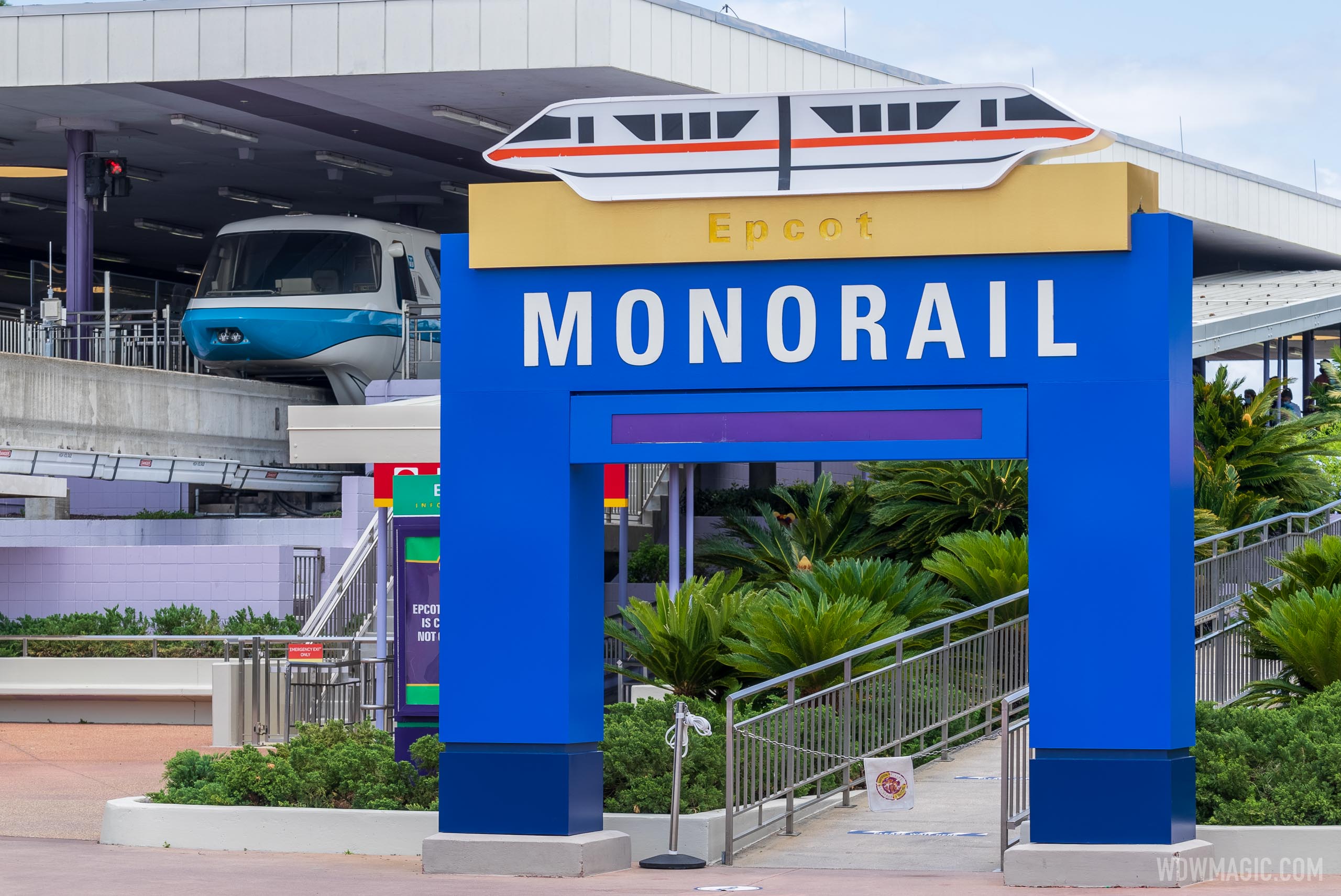
New Disney World 50th anniversary blue and gold color scheme moves into the Transportation and Ticket Center
Painting crews are very busy at Disney World right now as work begins on improving the TTC.
www.wdwmagic.com