DHS Big Reveal, New Logo

juniorthomas

Well-Known Member
This may sound like sacrilege, but do they really need this sign anymore? It would be like Magic Kingdom having a sign after Main Street saying "Magic Kingdom".

It would have been better if they just made it a sign for a new land. Monstropolis, Toontown, MickeyMouse10land, whatever.
That archway is a throwback reference to entry gates at Paramount and Universal. Another way to give the Hollywood look and feel, even if it doesn't welcome you to an active studio anymore.

368934
 

Po'Rich

Well-Known Member
I don't get how it can still be called "Studios". They should have just did a name change.
With no inside information and just based on the new logo, I think they are still working towards a name change. I could see them easily drop "studios" in the future and just call the park, Disney's Hollywood. Such a park would be a mixture of old Hollywood (which many of us would recognize as left-over components from the studio days) and new IP-based rides, such as what we're getting now.
 

tomast

Well-Known Member
Oh.. its another step in leaving the "Studio" part of the park on history books only.

In the old logo the "Studios" is the most important part. In the new one there is almost nothing left of the studios. Like in the park

Btw. The new logo looks twoo simple and the black ears of mickey gets mixed with the font color. I like more the old style more "Art deco" more timeless and the new one more like "fast fashion / instagram stlye"

368946
 

MisterPenguin

President of Animal Kingdom
Premium Member
Ya know, the old logo ain't that great either. It has three very strong and different fonts competing with one another. The font for "HOLLYWOOD" is just a bit too wacky. The dark tan drop shadow is inexplicable. And Mickey looks like a really bad 'shop job.

If we never had that old logo and it was being introduced today, it would be savaged worse then the new one.

That's not to justify the new one... It could certainly have been done better. But, it's not like we're losing something wonderful.

Now, if you want to get really savage, let's dissect a bunch of Epcot's old logos...
 

VJ

Well-Known Member
Now, if you want to get really savage, let's dissect a bunch of Epcot's old logos...
One way to get blacklisted on the WDW boards is to diss EPCOT Center... ;)

Honestly, I feel like the old DHS logo gets the whole "movie studio" (even if that's not the focus anymore, before someone points that out) feel across better than the new one. The logo for the park might not be a big deal in the grand scheme of things, sure, but those of us like @MrPromey and myself take it a bit more personally than people who don't really care about logos/graphic design (aka most people on this board).

That said, I've enjoyed this discussion! I don't get many opportunities to talk about graphic design, so this is fun for me.
 

britain

Well-Known Member
Ya know, the old logo ain't that great either. It has three very strong and different fonts competing with one another. The font for "HOLLYWOOD" is just a bit too wacky. The dark tan drop shadow is inexplicable. And Mickey looks like a really bad 'shop job.

If we never had that old logo and it was being introduced today, it would be savaged worse then the new one.

That's not to justify the new one... It could certainly have been done better. But, it's not like we're losing something wonderful.

Now, if you want to get really savage, let's dissect a bunch of Epcot's old logos...

As I said in my original critique, I think the design of the logo independent of context is a modest improvement over the last one. But its placement on the arch is lousy.
 

ᗩLᘿᑕ ֊ᗩζᗩᗰ

Hᴏᴜsᴇ ᴏʄ  Mᴀɢɪᴄ
Premium Member
I like it without the characters?View attachment 368944

This is markedly better. A simple change with greater impact. Less is usually more when it comes to logo design. Well, so long as it gets the point across. Not sure what the circles or colors signify but I do like it better compared to the framed characters. Why? Because this at least looks "playful" as opposed to being just very, very "corporate". I guess if I were to design a new logo I'd probably keep it simple like this, definitely improve the composition making "Disney's" larger and centering everything. Then... and if it's a requirement by "The Mouse" find a way to incorporate IP in a tasteful way... maybe as silhouettes.

That in itself could be a interesting concept: Daytime they're just colored circles. Nighttime those circles could feature (via projection?) the animated shadows of iconic park characters interacting with the logo.
 
Last edited:

wdisney9000

Truindenashendubapreser
Premium Member
Ya know, the old logo ain't that great either. It has three very strong and different fonts competing with one another. The font for "HOLLYWOOD" is just a bit too wacky. The dark tan drop shadow is inexplicable. And Mickey looks like a really bad 'shop job.

If we never had that old logo and it was being introduced today, it would be savaged worse then the new one.

That's not to justify the new one... It could certainly have been done better. But, it's not like we're losing something wonderful.

Now, if you want to get really savage, let's dissect a bunch of Epcot's old logos...
Tu quoque fallacies are a weak rebuttal.
 

Tony the Tigger

Well-Known Member
Oh.. its another step in leaving the "Studio" part of the park on history books only.

In the old logo the "Studios" is the most important part. In the new one there is almost nothing left of the studios. Like in the park

Btw. The new logo looks twoo simple and the black ears of mickey gets mixed with the font color. I like more the old style more "Art deco" more timeless and the new one more like "fast fashion / instagram stlye"

View attachment 368946

Why should they emphasize non-existent studios?

For your personal nostalgia and "feels?"

Because it's misleading for everyone else. That's what the park was, not what it is, not where it's going. A new logo made sense. (The one you pictured even has (gasp!) a character in the 'O' - will it make you feel better if someone tells you the new one is a nod to that? Was that awful because it contained IP?

This board has lost all perspective.

The trend in new/modern logos is clean, simple, not too busy. Amazon. eBay. UPS. (Yes, I know they're not theme parks.)

Again: the new logo is all of those things, and demonstrates the three main areas of focus for at least the near future: classic Disney (Mickey) Pixar (Toy Story) and Star Wars (BB8.) These correctly represent the park. They also - yes - indirectly push sales of merch. That is what the company is supposed to do. IP is not bad. Disney would not exist without IP, period. The movies not only inspired but paid for the parks, not the other way around. Nobody goes to Disney World the first time to see It's A Small World or Carousel of Progress. They go to see Mickey Mouse, Winnie The Pooh, The Little Mermaid, and the Lion King. And in the process, they discover Haunted Mansion, and other non-IP specific attractions. That's great. No need to bash either side. Neither is better than the other. Neither is more intellectually stimulating. Neither is high class opera.

Before anybody tells me I don't care or I'm not that into it, that's baloney. Not only did I take two years of basic Commercial Art (including packaging design, logo design, etc.) but I own my own business, and my own logo has evolved over 20 years, it has become more streamlined and lost some of it's original "flash" in favor of a more straightforward, easy to read/get presentation. In addition, I sometimes use different versions of the logo for t-shirts vs. for signage vs. for ads, etc.

Sometimes it's just good as part of a refresh or reset, as HS is clearly doing. It signifies a clean slate. In this case, it's going to match the parking lot signs and other things throughout the parks. That makes sense. It makes artistic sense. It makes business sense. There is no "nostalgia sense."

I hear a lot of "it's awful" without anything specific other than, "omg IP!" and it looks simple. There's nothing wrong with simple. Simple can be simply professional. And some of the suggestions presented as superior are simply not.

Some of you will just destroy anything and everything for no good reason.

I can't tell you how much it means when a customer tells me they've loved my business for x number of years. It means I've made something like the similar businesses I used to frequent that I loved. But none of them have any business critiquing my logo, old or new. Neither do I have any business critiquing Disney's as if they owed me something. I may comment on things I like or don't like, but they are not obligated to make something I like vs. what somebody else likes or vs. what the decision maker in the company wants to use.

Like it or don't like it. Don't make it out to be some kind of epic fail or "they don't care" or any other BS like that. That's messed up.

/rant.
 

tomast

Well-Known Member
Why should they emphasize non-existent studios?

For your personal nostalgia and "feels?"

I have no problem with removing the studio part. As much as I enjoy it, it is time to let it go. My point was just remark that. The old logo has mickey on the StudiO "o" and the new one has the characters on the Holywood "O".

But what I regret is using those clean logos. You might feel its "trendy" but to stay trendy you need to keep updating the logos. What I mean is that making something following a style will never be out of "fashion" while making something "Trendy" will.
DHS has lots of influence in an "Art deco" style, while the new logo does not fit correctly with the enviroment.

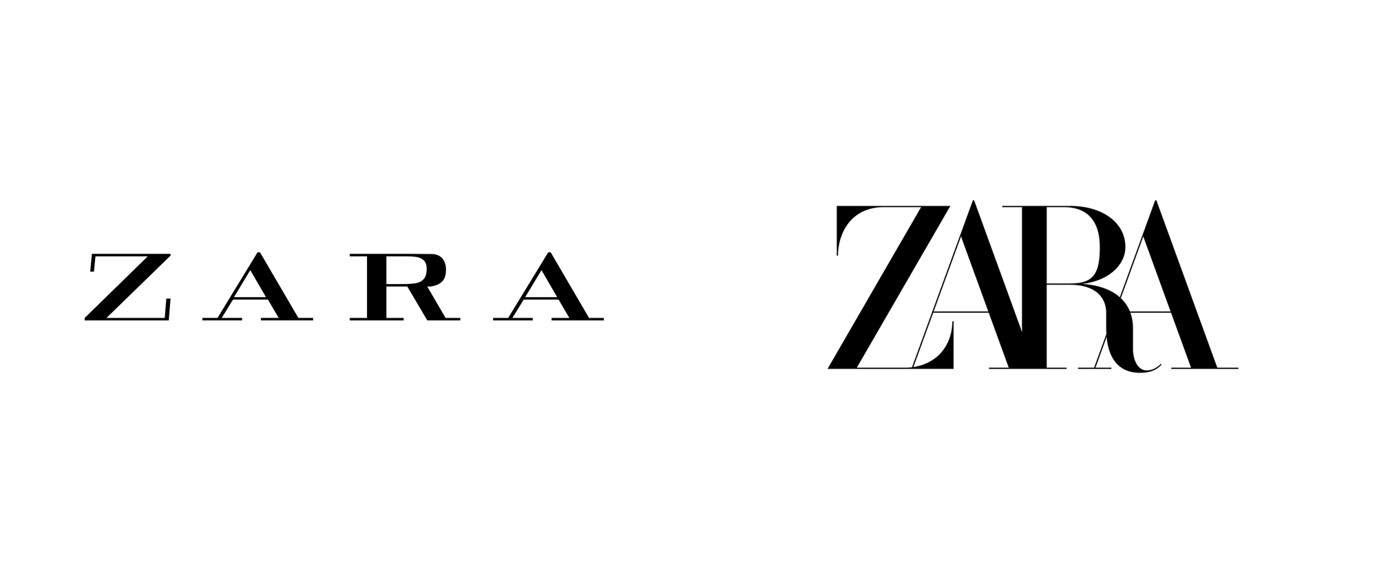
And by the way everyday more and more companys are returning to their original logos leaving the "cleans" ones as they do not represent the brand. An example of this might be "Avon" cosmetics, "Zara" clothing, etc. they are moving into a trend that is getting old and lack of personality.

fb_avon.jpg

zara_2019_logo_before_after.png
 

Register on WDWMAGIC. This sidebar will go away, and you'll see fewer ads.

Back
Top Bottom