I'm creating this thread for fellow Imagineers in the forum to post examples of their work, with a caveat.
You MUST describe the:
a) Process you went through to create it
b) The tools you used
c) Any tips or links to instructional videos for said tools
Think of this as a place where you can share and discuss graphic design, video design, the tools used to create it, and any tips you may have for others. The overall idea is that we not only get to show off a bit, but also get to help others learn to do things differently. After all, part of Imagination is learning how to express your ideas and share them with others!
I'll start.
I use Paint.NET as a graphics editor. For several reasons.
1) It's free
2) It's powerful (has filters, layers, etc.)
3) It's free
4) It's got a large community that supports it and has instructions on how to do all sorts of cool things here.
http://forums.getpaint.net/
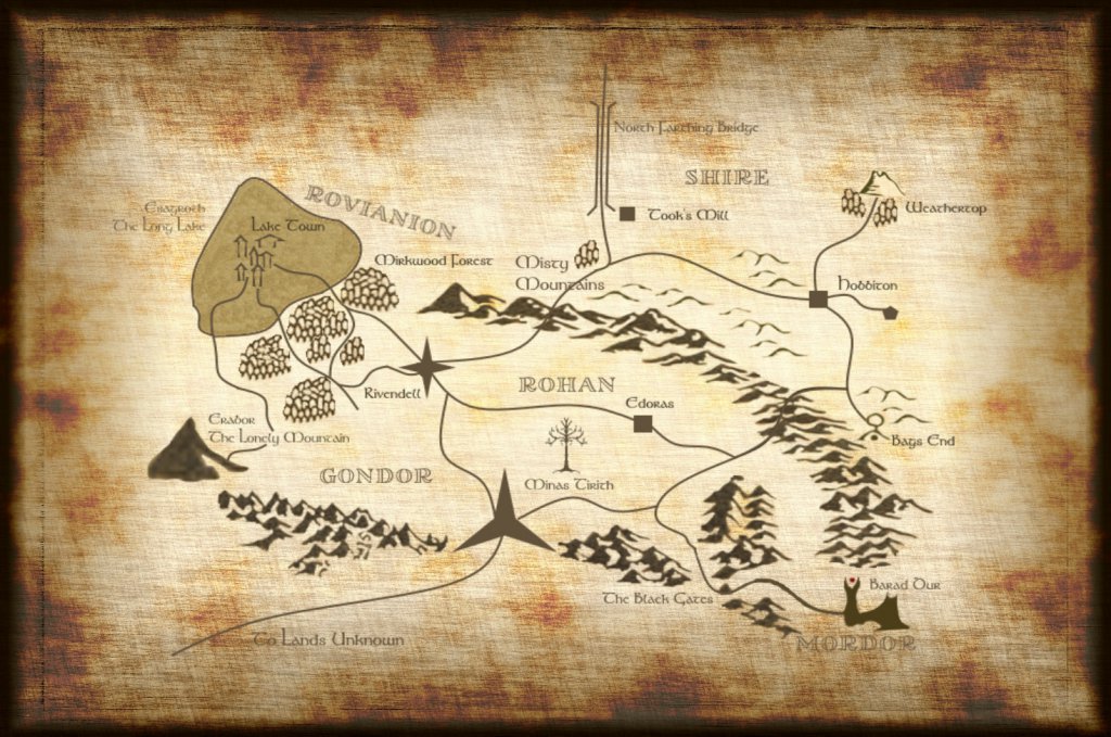
Here's an example of a map for a competition that was done in Paint.NET

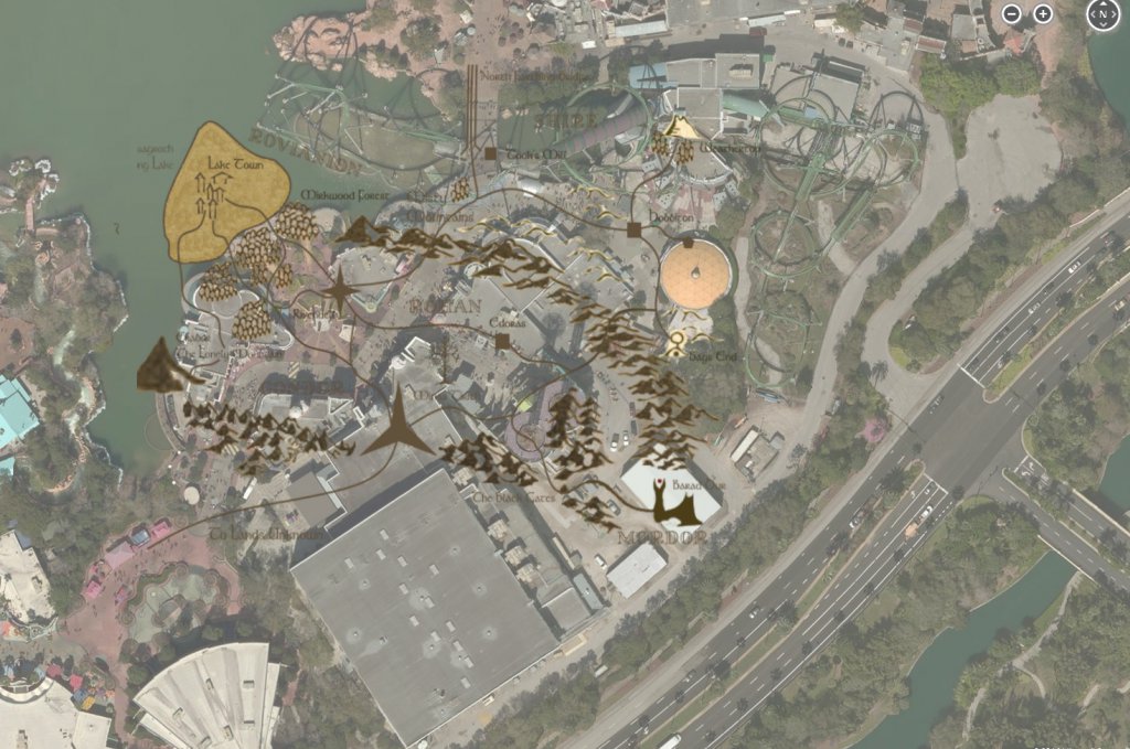
This was done with several layers. First, the far background layer is the actual layout of the area (Superhero Island at Universal Studios Florida) that was being redone.
Here's what it looks like without the Parchment layer, and the map layer set to a partial transparency to allow the drawn portions of the map to stand out.

The layers are in this order.
1) Bing Maps screenshot, using <CTRL PRINT SCR> and trimmed / cropped to suit my needs and placed as the bottom layer
2) Parchment background obtained from a google images search, touched up, and resized to fit my needs
3) Rovianion
4) Shire
5) Rohan and Gondor
6) Mordor
This allowed me to seamlessly integrate the areas, while also drawing them separately (over separate days) and still keep them in line with the real world map by removing the parchment layer.
The roads were hand drawn and shaped using the line tool.
The lake was filled in by doing a copy / paste of a small selection of the "sea" from a Tolkein map found with a google image search. Then cutting and pasting randomly to fill the area (if you look closely, you'll see what I did).
The lonely mountain map was taken off of a Tolkein map from the Hobbit (again found through google image search), opened up in another tab in Paint.NET, zoomed in and snipped it, then enlarged it to scale with my map.
The mountains and trees were obtained in a similar manner. For all of these, I had to make them transparent, so they didn't have a white blotch over the parchment, and that was done, by hand, using the eraser tool.
For the forests, I randomly pasted a section of the trees over and over again, and then erased any overlaps by hand with the eraser tool.
Also, I used very specific colors. I wrote them down (the RGB values) in Notepad and stored it, so when I would go to work on the map, I knew what my exact colors were.
You'll also notice the custom fonts. Those came from here:
http://tolkiengateway.net/wiki/Fonts
And the actual font was Tolkein.
This is downloadable as a TrueType Font (ttf), and is easily installed on a windows machine (not sure about a mac, though I'd imagine it's easy there, too). All you do is download the font, extract the zip file, right click on the ttf file and choose "Install". Then, it will show up in all your programs that access the windows font library.
The names of the regions were taken off of a Tolkein Map and rotated as needed.
So, there ya go! Feel free to ask questions of each other, this is a discussion, not a lecture thread, and join in with your own examples, tips and ideas!
You MUST describe the:
a) Process you went through to create it
b) The tools you used
c) Any tips or links to instructional videos for said tools
Think of this as a place where you can share and discuss graphic design, video design, the tools used to create it, and any tips you may have for others. The overall idea is that we not only get to show off a bit, but also get to help others learn to do things differently. After all, part of Imagination is learning how to express your ideas and share them with others!
I'll start.
I use Paint.NET as a graphics editor. For several reasons.
1) It's free
2) It's powerful (has filters, layers, etc.)
3) It's free
4) It's got a large community that supports it and has instructions on how to do all sorts of cool things here.
http://forums.getpaint.net/
Here's an example of a map for a competition that was done in Paint.NET
This was done with several layers. First, the far background layer is the actual layout of the area (Superhero Island at Universal Studios Florida) that was being redone.
Here's what it looks like without the Parchment layer, and the map layer set to a partial transparency to allow the drawn portions of the map to stand out.
The layers are in this order.
1) Bing Maps screenshot, using <CTRL PRINT SCR> and trimmed / cropped to suit my needs and placed as the bottom layer
2) Parchment background obtained from a google images search, touched up, and resized to fit my needs
3) Rovianion
4) Shire
5) Rohan and Gondor
6) Mordor
This allowed me to seamlessly integrate the areas, while also drawing them separately (over separate days) and still keep them in line with the real world map by removing the parchment layer.
The roads were hand drawn and shaped using the line tool.
The lake was filled in by doing a copy / paste of a small selection of the "sea" from a Tolkein map found with a google image search. Then cutting and pasting randomly to fill the area (if you look closely, you'll see what I did).
The lonely mountain map was taken off of a Tolkein map from the Hobbit (again found through google image search), opened up in another tab in Paint.NET, zoomed in and snipped it, then enlarged it to scale with my map.
The mountains and trees were obtained in a similar manner. For all of these, I had to make them transparent, so they didn't have a white blotch over the parchment, and that was done, by hand, using the eraser tool.
For the forests, I randomly pasted a section of the trees over and over again, and then erased any overlaps by hand with the eraser tool.
Also, I used very specific colors. I wrote them down (the RGB values) in Notepad and stored it, so when I would go to work on the map, I knew what my exact colors were.
You'll also notice the custom fonts. Those came from here:
http://tolkiengateway.net/wiki/Fonts
And the actual font was Tolkein.
This is downloadable as a TrueType Font (ttf), and is easily installed on a windows machine (not sure about a mac, though I'd imagine it's easy there, too). All you do is download the font, extract the zip file, right click on the ttf file and choose "Install". Then, it will show up in all your programs that access the windows font library.
The names of the regions were taken off of a Tolkein Map and rotated as needed.
So, there ya go! Feel free to ask questions of each other, this is a discussion, not a lecture thread, and join in with your own examples, tips and ideas!
Last edited:


