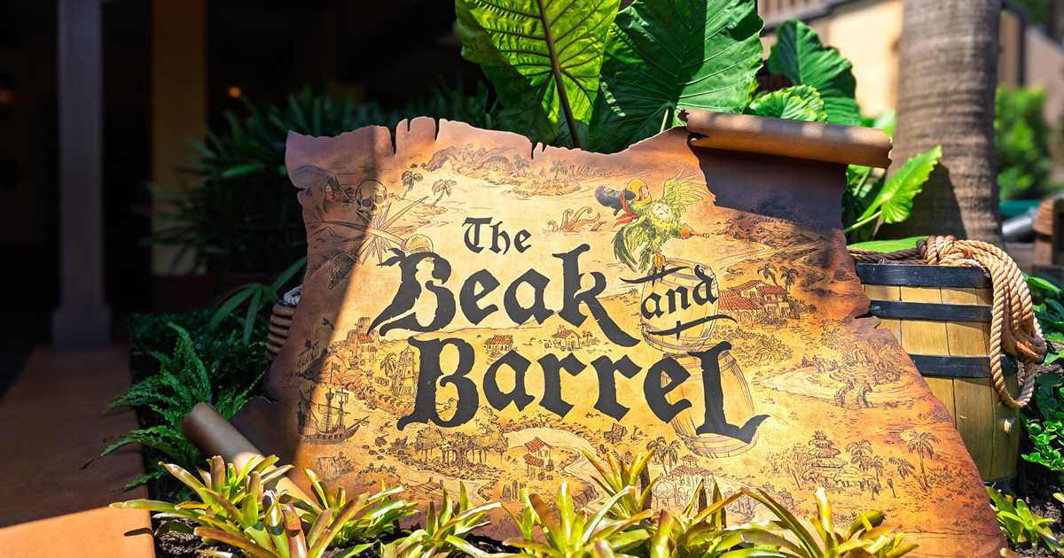
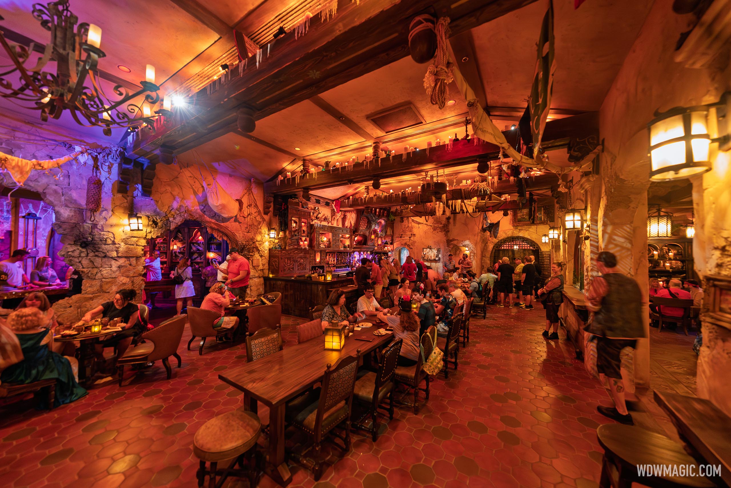
MK New Beak and Barrel - Pirates of the Caribbean-themed lounge

wdwmagic

Administrator
Moderator
Premium Member
Original Poster

Tour of The Beak and Barrel​


The-Beak-and-Barrel_Full_61968.jpg


The-Beak-and-Barrel_Full_61978.jpg


The-Beak-and-Barrel_Full_61988.jpg


The-Beak-and-Barrel_Full_61973.jpg


The-Beak-and-Barrel_Full_62000.jpg


The-Beak-and-Barrel_Full_61971.jpg


The-Beak-and-Barrel_Full_61974.jpg


The-Beak-and-Barrel_Full_61979.jpg


The-Beak-and-Barrel_Full_61982.jpg


The-Beak-and-Barrel_Full_61980.jpg


The-Beak-and-Barrel_Full_61989.jpg


The-Beak-and-Barrel_Full_61972.jpg


The-Beak-and-Barrel_Full_61984.jpg


The-Beak-and-Barrel_Full_61991.jpg


More at https://www.wdwmagic.com/dining/the...ery/28aug2025-tour-of-the-beak-and-barrel.htm
 

Andrew C

You know what's funny?
I like it overall. Looks cool. Could have been made to look a bit "grimier" but not the end of the world. I hate that you need reservations, but that is how it is these days...
 

DrStarlander

Well-Known Member
It's that everything is clearly digitally produced when it obviously shouldn't be if you're trying to be even remotely authentic. For instance, this "woodcut" doesn't actually look like a woodcut; it imitates overlarge grainwise gouges only as a decorative background element and then ignores that completely throughout the rest of the illustration, which thereafter adopts the line quality of pencil art.
View attachment 879919
And for things that are supposed to look handwritten, they never bother to actually hand-write anything. They just download the nearest free "handwritten" font, which always looks terrible because of the obviously machine-generated recurring swashes, most evident in the minuscule y and g below, though extremely obvious throughout due to the general repetition of the content.
View attachment 879921
I have a lot of qualms about the authenticity of graphic design and graphic art direction in Disney Parks. In my mind, if you are in that role at Imagineering, you should be an absolute geek -- not just about historic design and illustration styles, but the materials, mediums, methods, and historic technologies involved. A great person for that job is not just a technically productive designer with good taste and a sharp portfolio, but someone who loves history and research and is obsessive about "getting it right." You know the people building LARPing costumes as a hobby and who geek out about the authenticity of every detail -- the right kind of button or stitching technique or color of fabric dye for the time period? Those kind of people.

I was recently at the Swiss Museum for Paper, Writing and Printing in Basel, Switzerland. It's the kind of place you can see the tools, equipment, techniques, and materials used in printing and book-binding going back to medieval times. It's a hands-on place, you can make paper and print things yourself using old presses. And the docents will patiently explain everything. The graphic designers from Imagineering should be spending time there, or at other places like that.
unnamed-5.jpg


Having said that, Disney recently installed a banner in front of The Golden Horseshoe at Disneyland that blew me away. From afar, it's surprisingly authentic as a hand-painted late-1800s banner; I couldn't believe the simplicity and restraint. Nothing extra: no unnecessary borders, shadows, embellishments. And to top things off, a closer look reveals it's not just a solid opaque "paint" in the letters, rather it has a variegated look when the sun shines through, as if it was hand-painted (and maybe it was?!), so the coverage/density is appropriately inconsistent. Did the designer research what types of brushes were used by sign painters in the Old West, and when a squirrel brush would've been used vs. a hog bristle brush? You know, geek out? Maybe so! Anyway, bravo Disney! More of this please.
GqiWqrMboAAjcBh.jpeg

GH-sign.png
 
Last edited:

Nland316

Well-Known Member
It's that everything is clearly digitally produced when it obviously shouldn't be if you're trying to be even remotely authentic. For instance, this "woodcut" doesn't actually look like a woodcut; it imitates overlarge grainwise gouges only as a decorative background element and then ignores that completely throughout the rest of the illustration, which thereafter adopts the line quality of pencil art.
View attachment 879919
And for things that are supposed to look handwritten, they never bother to actually hand-write anything. They just download the nearest free "handwritten" font, which always looks terrible because of the obviously machine-generated recurring swashes, most evident in the minuscule y and g below, though extremely obvious throughout due to the general repetition of the content.
View attachment 879921
I understand what you mean, but I’m afraid this is more or less the “norm” in modern themed entertainment. It’s not exclusively a Disney thing. I’d argue it’s more of a stylistic thing throughout the entire industry.. Some examples are just better than others. Not even purely stylistic choice, but more for ease of production if any signs need a replacement, multiple rounds of feedback per design, etc then a Photoshop / Illustrator file is available.

It doesn’t personally bother me much or detract from any themed spaces, but I do think there could be a better effort to blend at time.
 

James Alucobond

Well-Known Member
I understand what you mean, but I’m afraid this is more or less the “norm” in modern themed entertainment. It’s not exclusively a Disney thing. I’d argue it’s more of a stylistic thing throughout the entire industry.
I would argue that this was and should continue to be something that sets Disney apart. It’s also not that difficult or space-consuming to have some traditional printmaking supplies available to at least partially simulate a letterpress.

That said, I will concede that it’s probably just generally less noticeable as a “problem” to anyone under 30 because almost all print and signage they’ve seen was digitally produced.
 

Figments Friend

Well-Known Member

Fantastic….these photos of the place make it look fantastic.

I have to admit, I am rather excited to try it out in a few weeks.
🤓

Looking at this set of pictures, I am noting this venue seems to have far more seating then Oga’s Cantina…which can only be seen as a plus.
Loving a lot of the details, and the lighting.

This really does look like a nice addition.
Looking forward to trying the menu offerings.


-
 

Figments Friend

Well-Known Member
Watching the above clip, I am surprised Disney’s internal ‘Censorship Committee’ has overlooked the lyrics to the classic ‘Yo Ho A Pirates Life For Me’ song.

The line ‘..we kidnap and ravage and don’t give a hoot….’?
Um, yeah…do these people even know what they are singing about and what that line refers too?
😮

-
 

MisterPenguin

President of Animal Kingdom
Premium Member
Watching the above clip, I am surprised Disney’s internal ‘Censorship Committee’ has overlooked the lyrics to the classic ‘Yo Ho A Pirates Life For Me’ song.

The line ‘..we kidnap and ravage and don’t give a hoot….’?
Um, yeah…do these people even know what they are singing about and what that line refers too?
😮

-
That's awful. It is just morally obscene to use 'h**t' in mixed company.
 

Ayla

Well-Known Member
I have a lot of qualms about the authenticity of graphic design and graphic art direction in Disney Parks. In my mind, if you are in that role at Imagineering, you should be an absolute geek -- not just about historic design and illustration styles, but the materials, mediums, methods, and historic technologies involved. A great person for that job is not just a technically productive designer with good taste and a sharp portfolio, but someone who loves history and research and is obsessive about "getting it right." You know the people building LARPing costumes as a hobby and who geek out about the authenticity of every detail -- the right kind of button or stitching technique or color of fabric dye for the time period? Those kind of people.

I was recently at the Swiss Museum for Paper, Writing and Printing in Basel, Switzerland. It's the kind of place you can see the tools, equipment, techniques, and materials used in printing and book-binding going back to medieval times. It's a hands-on place, you can make paper and print things yourself using old presses. And the docents will patiently explain everything. The graphic designers from Imagineering should be spending time there, or at other places like that.
View attachment 880041

Having said that, Disney recently installed a banner in front of The Golden Horseshoe at Disneyland that blew me away. From afar, it's surprisingly authentic as a hand-painted late-1800s banner; I couldn't believe the simplicity and restraint. Nothing extra: no unnecessary borders, shadows, embellishments. And to top things off, a closer look reveals it's not just a solid opaque "paint" in the letters, rather it has a variegated look when the sun shines through, as if it was hand-painted (and maybe it was?!), so the coverage/density is appropriately inconsistent. Did the designer research what types of brushes were used by sign painters in the Old West, and when a squirrel brush would've been used vs. a hog bristle brush? You know, geek out? Maybe so! Anyway, bravo Disney! More of this please.
View attachment 880047
View attachment 880049
Side note ~ Basel was one of my favorite cities we visited while in Europe. :)
 

BrianLo

Well-Known Member
Where is the pop culture reflection of this shift? The TV shows or movies with child-friendly bars? I think of bars on TV, I think of Always Sunny, Simpsons, Family Guy - all inappropriate places for children, something addressed in the shows. Now, those are all older shows, so maybe there’s a wave of programs or films I’ve missed that depict child-friendly bars.

I do still think you are a bit stuck in the dive bar mentality. This isn’t a classic sitcom dive bar. It’s a themed lounge. Brew pubs and lounges are increasingly what are child friendly. Not cocktail bars or dive bars.

As for a media example, most millennials grew up on Harry Potter and that normalized the kids being in bars and pubs at 11. There’s even low alcohol content in butter beer and firewhisky is just whisky. Another more relevant 90’s adjacent franchise to this would be One Piece (pirates) and has the 17yo characters in bars and taverns.

This venue isn’t actively encouraging kids to drink. It’s fun pretend with probably low alcohol content premixed drinks for parents. They don’t even serve beer.
 

Register on WDWMAGIC. This sidebar will go away, and you'll see fewer ads.

Back
Top Bottom