I just asked my 24 year old daughter what color the MK castle is right now. She said salmon.I’m talking is not ought. Ought is political, is is descriptive. Do I think Disney is going to use various shades of pink to increase marketshare with boys? No, I highly doubt it. Should they? Again, those types of conversations aren’t really allowed here.
At any rate, with the style of EU looming large at the moment, I can see the castle returning to a look that is a bit more in line with medieval castles, which tended to be natural shades.
-
The new WDWMAGIC iOS app is here!
Stay up to date with the latest Disney news, photos, and discussions right from your iPhone. The app is free to download and gives you quick access to news articles, forums, photo galleries, park hours, weather and Lightning Lane pricing. Learn More -
Welcome to the WDWMAGIC.COM Forums!
Please take a look around, and feel free to sign up and join the community.
You are using an out of date browser. It may not display this or other websites correctly.
You should upgrade or use an alternative browser.
You should upgrade or use an alternative browser.
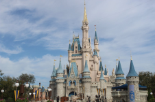
Is Cinderella Castle Ever Going Back to White and Blue?
- Thread starter Ice Gator
- Start date
This is the correct answer.At this point Disney is making the majority of their decisions entirely based on the possibility of increasing incoming money. If someone could show that a change of color scheme to the Castle would make guests spend more or increase ticket sales then it would happen. Using available funding for a paint job isn't a priority.
DisneyHead123
Well-Known Member
Ok cool. If you like the castle as is not trying to rain on your parade btw. I just like trying my hand at reading the tea leaves to see what I can successfully predict. I’d say relatively good odds the castle gets repainted in the next five years… but like I said, the new look has grown on me as it’s faded and gotten more muted.I just asked my 24 year old daughter what color the MK castle is right now. She said salmon.
StarWarsGirl
Well-Known Member
- In the Parks
- No
It has kind of grown on me. I think it looks a bit better against clouds (which let's face it, it's Florida; there's a lot of clouds).
I was looking through my photos...apparently I didn't take many photos of the old color scheme on a cloudy day. I have this one. It still looks nice, but looks way better on a sunny day.

Here's another one more at a distance. The blue stands out, but the grey blends in with the sky to a degree.

Whereas on a clear day, the grey pops, but then the blue almost blends in and doesn't pop.

Now we have the new color scheme. The brighter blues really pop against the clouds, and the rosy color is still vibrant and visible.

At the same time, the blue doesn't blend in with the sky on a sunny day. New blue is still popping and the rose color pops against the sky.

You can also pick the castle out very easily at a distance.

So yeah, I wasn't a fan at first, but now I like it. Closer to brown may have also addressed the color issues against the sky as there are also brown castles in Europe, but they're going for fantasy, not reality.
I was looking through my photos...apparently I didn't take many photos of the old color scheme on a cloudy day. I have this one. It still looks nice, but looks way better on a sunny day.
Here's another one more at a distance. The blue stands out, but the grey blends in with the sky to a degree.
Whereas on a clear day, the grey pops, but then the blue almost blends in and doesn't pop.
Now we have the new color scheme. The brighter blues really pop against the clouds, and the rosy color is still vibrant and visible.
At the same time, the blue doesn't blend in with the sky on a sunny day. New blue is still popping and the rose color pops against the sky.
You can also pick the castle out very easily at a distance.
So yeah, I wasn't a fan at first, but now I like it. Closer to brown may have also addressed the color issues against the sky as there are also brown castles in Europe, but they're going for fantasy, not reality.
Attachments
DisneyHead123
Well-Known Member
All good points… I’ll always be attached to the look of the castle the way it was when I started going back to Disney with my nephew, after not visiting for maybe 17 years. The new color scheme has kind of grown on me though.It has kind of grown on me. I think it looks a bit better against clouds (which let's face it, it's Florida; there's a lot of clouds).
I was looking through my photos...apparently I didn't take many photos of the old color scheme on a cloudy day. I have this one. It still looks nice, but looks way better on a sunny day.
View attachment 853299
Here's another one more at a distance. The blue stands out, but the grey blends in with the sky to a degree.
View attachment 853303
Whereas on a clear day, the grey pops, but then the blue almost blends in and doesn't pop.
View attachment 853301
Now we have the new color scheme. The brighter blues really pop against the clouds, and the rosy color is still vibrant and visible.
View attachment 853298
At the same time, the blue doesn't blend in with the sky on a sunny day. New blue is still popping and the rose color pops against the sky.
View attachment 853302
You can also pick the castle out very easily at a distance.
View attachment 853306
So yeah, I wasn't a fan at first, but now I like it. Closer to brown may have also addressed the color issues against the sky as there are also brown castles in Europe, but they're going for fantasy, not reality.
Figments Friend
Well-Known Member
With all the current trends with the projection effects, I do not see the Castle being returned to the lighter tones anytime soon.
The lighter hues will cause the projections to appear too ‘hard edged’ and blindingly bright, which will cause visual interference with the presentation.
I personally would love to see Cinderella Castle return to its former color palette, but I just don’t see this happening due to the projection issues.
-
jloucks
Well-Known Member
In the 80's I got to wear pink shirts and that was perfectly normal. White pants too. I miss the 80's.Pink is associated with female dress and fashion in US culture, within the past century at least.
That much is a matter of history. I’m not getting into the way things “should be” (that would be political), just describing the way they are when describing potential Disney marketing strategies.
DisneyHead123
Well-Known Member
In the 80's I got to wear pink shirts and that was perfectly normal. White pants too. I miss the 80's.
Getting a bit off topic but Google tells me that before pink was associated with femininity, it was associated with wealth. The “preppy pink” look seems a bit like a throwback to that association.
jloucks
Well-Known Member
"Preppy" reminded me of "Yuppie" ...that's a word I have not heard in so many years. Thank you for that happy little flashback.Getting a bit off topic but Google tells me that before pink was associated with femininity, it was associated with wealth. The “preppy pink” look seems a bit like a throwback to that association.

Last edited:
JIMINYCR
Well-Known Member
Everyone has their own likes and dislikes for color schemes and the Castle is no exception. Just people watch and you can see all kinds of color combinations of what clothing they are willing to match up with.
My all time fave was the Golden makeover which I thought brought out the royalty accents. Having the extra golden characters placed around made it even more interesting. The pepto color was my all time unliked.
The only people who will be accepting of any color would be the color blind individuals who don’t know what they are missing no matter what colors are made over.
JoeCamel
Well-Known Member
Rose gold as we have been told ad nauesaiumGetting a bit off topic but Google tells me that before pink was associated with femininity, it was associated with wealth. The “preppy pink” look seems a bit like a throwback to that association.
thanks, i think this is the main reason. for years (before the change) the bags you’d get from the gift shops featured a castle similar to WDW’s but with a paint scheme like DL’s. they’re used on both coasts, so i think they switched it to make the “commercial” castle real. not saying it’s good or bad- i prefer the original scheme, but the faded pink/salmon works for now.I think the OP hit it: from a branding standpoint, for goor or for bad, it works to use the same color scheme on all of the castles so they can brand it as Walt Disney Worlds and talk about all parks at once.
Chef idea Mickey`=
Well-Known Member
Those colors as much as I liked seen on this castle to compare are plushes better on Sleeping Beauty castles whether it's Paris, Anaheim or Hong Kong prior to the change.As a Disneyland guy. The castle doesn't look that out of place to me.
Disneyland's castle has the same color scheme.
Of course this is Cinderella's castle and not Sleeping Beauty's Florida castle so maybe it shouldn't have the same color scheme.
Chef idea Mickey`=
Well-Known Member
I would love to see how Cinderella Castle would look in silver and white. Even an art drawing is non existent.Lol, yeah, it feels over the top to me. Classic castle colors (grey, white, sandstone) are, well, classic in my opinion.
Chef idea Mickey`=
Well-Known Member
Is Sleeping Beauty Castle in Anaheim and Paris pink?Because if it's not pink, girls won't know it's for them, right?
StarWarsGirl
Well-Known Member
- In the Parks
- No
Yes...Is Sleeping Beauty Castle in Anaheim and Paris pink?
(I have never been to the one in Paris, but I happen to know it is in fact pink. The one in Tokyo is identical to Florida's castle, but I believe it still has the original color scheme)
Chef idea Mickey`=
Well-Known Member
Then I wonder if Cinderella castle would look great in it as well instead of salmon.Yes...
Yeah the 50th was representing "earidescent" but now without the 50th Decor would you rather salmon or pink or something else.
StarWarsGirl
Well-Known Member
- In the Parks
- No
I think of all the things WDW should copy from DL, anything to do with how the castle looks is not on the list...Then I wonder if Cinderella castle would look great in it as well instead of salmon.
Yeah the 50th was representing "earidescent" but now without the 50th Decor would you rather salmon or pink or something else.
(sorry DL people...

 )
)Register on WDWMAGIC. This sidebar will go away, and you'll see fewer ads.