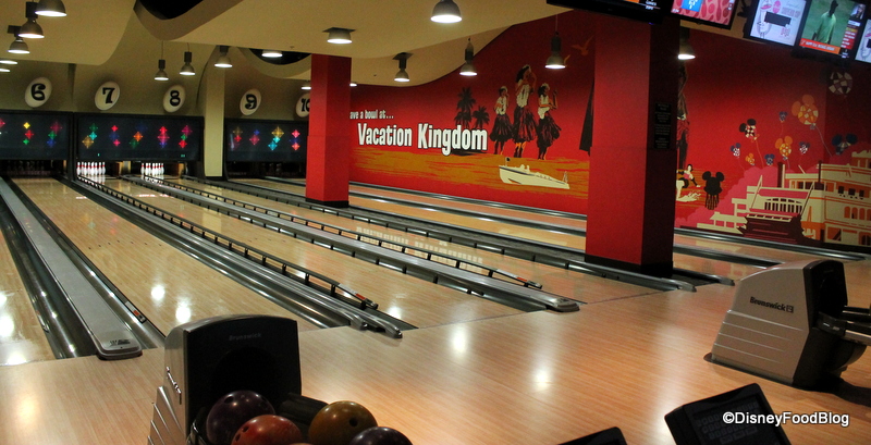
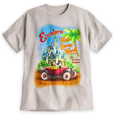
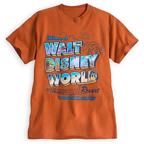
I was just thinking about the whole YOMD campaign, along with how many people confuse walt disney world and or the magic kingdom as "the happiest place on earth", as far as I know the official, but no longer used slogan for walt disney world continues to be "The Vacation Kingdom of the World", just like the official logo is sometimes seen but rarely used.
Doesn't this give WDW a nice identity? I mean Disneyland continues to use its old english Font, and actually on recent pictoral trip reports I;m noticing that they (Disneyland) have revived 50% of the original Disneyland logo. Which is sleeping beauty castle within the Disneyland "D", now only showing the stylized image of sleeping beauty castle in a circle.
Is it wrong to revive the actual 1970s Walt Disney World font and bring back the global mickey face in the oversized D, along with "the vacation kingdom of the world" in the future?
WDW is a vacation kingdom, it exists in itself and not just in the magic kingdom and is a great uplifting slogan especially since WDW is a true resort destination!
I just feel that after the 25th anniversary the "walt disney" font and simple type face "world" is quite bland and gives no identity to WDW.
Just my two cents...wondering what others think. :wave:


