msteel
Well-Known Member
Shoutout to Lagoon’s Spider in Utah!
Hmm. Don't remember that ride being there. It must be new in the last...um...30 years or so.
Shoutout to Lagoon’s Spider in Utah!
Bad ride is bad whether it has IP (Nemo) or not (Superstar). And Nemo is a bad ride. It is a book report ride that gets the book all wrong. The Nemo ride is to Nemo as what the current Figment ride is to Figment: an unenjoyable disaster.
It's no wonder that both rides are so often a walk-on.
How do you compare them to voyage of the little mermaid? I think both are better then voyage, but of course that’s not saying much.
Voyage is just as bad. The interactive screens in the queue are too high for children... on a children's ride. And they're useless now that there isn't a long queue (because no one want to go on the ride again), so, everyone just walks past them.
The story of the book report is highly condensed into no real narrative that you can follow unless you're already familiar with the movie... but let's get a lot of annoying Scuttle in there to not really fill in the blanks.
Too many people excuse the poor use of AAs just because there's the one decent AA of Ariel dancing. In that scene, you have fish on sticks rotating back and forth and even more plastic unarticulated ones just glued to the wall. It's a Small World has more life and movement and joy than that scene, which is heartbreaking for fans of the movie and fans of dark rides.
For me, the tunnel changes were the most confusing part about the Nemo overlay. Why block the great views just to project cartoon turtles onto plywood? Of course we know the clamshells don’t rotate like a true omnimover, but the top and side tunnel windows could have remained. It made less sense than ripping out the Hydrolators (which I miss too).They certainly did. The entire EAC projection corridor used to have windows on both sides of and above the ride path.
It was renovated during the time WDI was replacing AAs and props with projections, and most of the DL sub props were left over from the previous submarine voyage.I wonder why the Nemo ride didn’t use more of the views into the aquarium... I’m thinking of the underwater props they used in the subs in California.
The only "wow" moment is seeing the characters projected over the glass, and even that's underutilized.
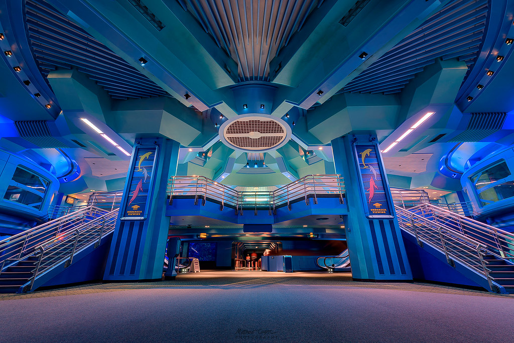
I missed this comment before I said the same thing. I agree, orange and gray would look really clean!I still want more colors then 5 shades of blue. It makes it looks so boring inside. Some orange and gray would add a bit to it. At least the new signs have orange logos to break up the color...just slightly.
I mean...I'm just reminiscing about the original style but it really made it feel like you were in some kind of technological marvel:I missed this comment before I said the same thing. I agree, orange and gray would look really clean!


The whole Nemo overlay to the SeaCabs was a missed opportunity. Instead of spending 5 minutes looking for Nemo, we should have had 5 minutes of Edu-tainment. Imagine Mr Ray (and the rest of the Nemo gang) giving us fun facts about "the seas" and the importance of protecting them. That whole section of the pavilion, in it's current state, is just fluff, no substance.
They should have kept that orange and white color scheme, syncs with Nemo perfectly.I mean...I'm just reminiscing about the original style but it really made it feel like you were in some kind of technological marvel:

vs

All of the blues are just so boring. Everything just looks flat (and even dreary in person) now whereas before the paint added depth to the flat surfaces (am I making any sense?). I get that they want to make it "fun" looking but surely you can do better then buying all shades of blue.
Voyage is just as bad. The interactive screens in the queue are too high for children... on a children's ride. And they're useless now that there isn't a long queue (because no one want to go on the ride again), so, everyone just walks past them.
The story of the book report is highly condensed into no real narrative that you can follow unless you're already familiar with the movie... but let's get a lot of annoying Scuttle in there to not really fill in the blanks.
Too many people excuse the poor use of AAs just because there's the one decent AA of Ariel dancing. In that scene, you have fish on sticks rotating back and forth and even more plastic unarticulated ones just glued to the wall. It's a Small World has more life and movement and joy than that scene, which is heartbreaking for fans of the movie and fans of dark rides.
I don't under the Mermaid hate when Peter Pan is a much worse attraction.The AAs (or lack thereof) in Voyage are atrocious. The whole thing looks incredibly cheap; it's an embarrassment to Disney. That movie deserves much better.
I still think it's a better ride than Nemo, but that's mainly because it has more space to build something like the Under the Sea scene and Nemo was constrained by trying to shove it into a space that was never intended for anything more than views into the aquarium. The Under the Sea scene still looks cheap (the fish on sticks, as you mentioned... ugh), but at least it's more visually impressive from size/space alone.
I would love to see Voyage completely rebuilt from scratch into something worthy of Disney. They could shut down and rework Winnie the Pooh while they're at it.
I can't compare it to Imagination because I haven't been on that ride since like 2004 or something. I know it's very bad, but I can't bring myself to go into that once incredible pavilion again just to view a rotting corpse.
As a passholder who visits on a practically weekly basis, this is not true. Journey of the Little Mermaid (bc remember Voyage is at DHS) tends to gather quite the crowd on a daily basis reaching 60 minutes again on a weekly basis. Every time I've gone through the queue all sorts of people interact with the screens... just not in the right way. Instead of pointing at the crabs to take away items, they just wave at them. Some of you fans need to stop acting like your opinion dictates what the general public enjoys/does.And they're useless now that there isn't a long queue (because no one want to go on the ride again), so, everyone just walks past them.
As a passholder who visits on a practically weekly basis, this is not true. Journey of the Little Mermaid (bc remember Voyage is at DHS) tends to gather quite the crowd on a daily basis reaching 60 minutes again on a weekly basis. Every time I've gone through the queue all sorts of people interact with the screens... just not in the right way. Instead of pointing at the crabs to take away items, they just wave at them. Some of you fans need to stop acting like your opinion dictates what the general public enjoys/does.
I don't under the Mermaid hate when Peter Pan is a much worse attraction.
Register on WDWMAGIC. This sidebar will go away, and you'll see fewer ads.
