Then and Now - WDW Comparison Photos

WDWtraveler

Well-Known Member
Original Poster
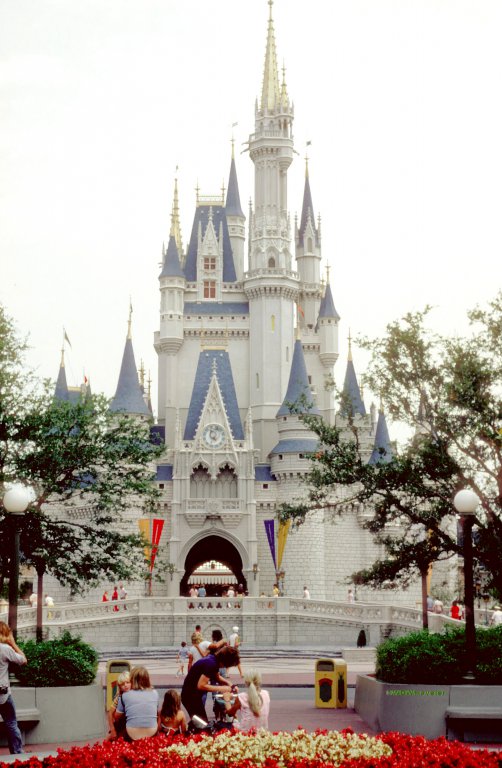
Twenty-eighth photo pair. Then: May 1974. The front of Cinderella Castle was an open courtyard with no stage, just ramps on either side of the courtyard. The hub area in front of the castle had large planter boxes with large trees, and benches. The smaller planter box in the center didn't have the Disney and Mickey statue back then.
025 May 1974.jpg


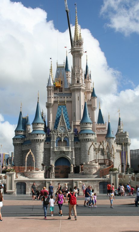
Now: August 2016. Forty-two years later, the castle forecourt area is smaller as a large performance stage is now present. The hub has been reworked to provide more standing room between the planter boxes. In the below view, the hub statue of Disney and Mickey is behind the photographer.
29 Aug 2016.JPG
 

SorcererMC

Well-Known Member
I think the 1974 photo is more attractive, because I like the greenery, flowers, and seating areas in front of the castle. Gives it more of a relaxed, "park" atmosphere. As for the castle turret colors, I like both versions.
Yes, the 1974 photo is more charming and retains the perspective. It's kind of depressing to me seeing the stark differences between the two pictures. I don't think I have anything good to say about the second photo, although I think Cinderella Castle is a nice backdrop for stage shows. Does anyone know when the stage was installed?

Edit: It looks like the front stage area was expanded by ~2003 (with the forecourt expansion with ramps, etc in 2015).
 
Last edited:

OliveMcFly

Well-Known Member
Twenty-eighth photo pair. Then: May 1974. The front of Cinderella Castle was an open courtyard with no stage, just ramps on either side of the courtyard. The hub area in front of the castle had large planter boxes with large trees, and benches. The smaller planter box in the center didn't have the Disney and Mickey statue back then.

View attachment 165031

Now: August 2016. Forty-two years later, the castle forecourt area is smaller as a large performance stage is now present. The hub has been reworked to provide more standing room between the planter boxes. In the below view, the hub statue of Disney and Mickey is behind the photographer.

View attachment 165033
I LOVE the castle without the stage!
 

Minnie1976

Well-Known Member
Twenty-eighth photo pair. Then: May 1974. The front of Cinderella Castle was an open courtyard with no stage, just ramps on either side of the courtyard. The hub area in front of the castle had large planter boxes with large trees, and benches. The smaller planter box in the center didn't have the Disney and Mickey statue back then.

View attachment 165031

Now: August 2016. Forty-two years later, the castle forecourt area is smaller as a large performance stage is now present. The hub has been reworked to provide more standing room between the planter boxes. In the below view, the hub statue of Disney and Mickey is behind the photographer.
View attachment 165033
The castle is much pretty without the stage. Also the castle wasn't closed off at certain times so you couldn't walk through it and enjoy the mosaics.
 

Brad Bishop

Well-Known Member
It's one of my biggest gripes with the MK: They made the castle and hub into an amphitheater. It wasn't supposed to be that.

Now:
- The path through the castle is blocked off a good bit of the time
- The hub is no longer a nice little park at the end of Main St
- The hub is no longer a "curtain" between Main St. and other lands (Fantasyland)
- The hub is constantly busy with shows.

If you want the castle as a backdrop, the way they did it in Paris seemed to be a good idea: Put the amphitheater off to the side. Still, I think the castles look better standing on their own instead of being part of an obvious amphitheater
 

WDWtraveler

Well-Known Member
Original Poster
Twenty-ninth photo pair. Then: September 2009. The west side of the Pinocchio Village Haus restaurant.
For @SorcererMC: I don't have any photos of this specific building from the 1970s/1980s, but there is a brown roof on another Fantasyland building in photo pair 27 (posted August 25, 2016) on page 19 in this thread.

IMG_0378 Sept 2009.JPG


Now: August 2016. The obvious difference is the addition of the tree and planter box with outdoor courtyard seating. The roof on the center section of the restaurant has also been replaced with multi-colored shingles.

29 Aug 2016.JPG
 
Last edited:

NutsForFlorida

Well-Known Member

Goofyernmost

Well-Known Member
Gosh I almost can't imagine those trees being so small once. Nearly makes me wish they had done some thinning at some point, just enough to get some peeks of the castle through the "forest" there.


1973= 3 children: 2 in the 10-13 range and 1 in the 5-7 range. All as noted walking.
2015= 5 (or 6) children: 2 (or 3) in the 0-3 range all in strollers, 2 more in a double stroller (1 in the 4-6 range and 1 in the 7-8 range), and 1 in the 8-12 range walking.

No hypothesis can be made from this data.
Of course there can be. Even if there were no children in the "then" picture it could be said that there were no strollers and now there are a bunch. You just have to use your tunnel vision.
 

Goofyernmost

Well-Known Member
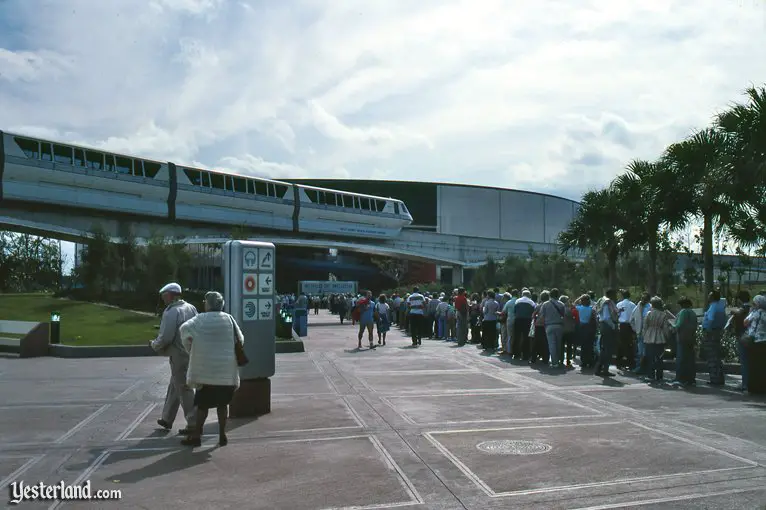
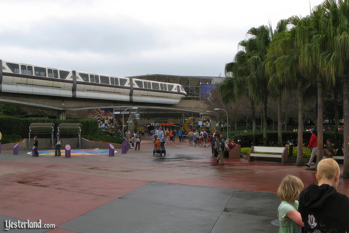
1983 - World of Motion
fwthennow1_generalmotors1983ww.jpg

2011 - Test Track
fwthennow1_generalmotors2011ww.jpg


Photos from Future World Then and Now Part 1 - Yesterland. com

1983 - manhole covers....2011 - no manhole cover at all. thanks a lot obama

seriously though, this is too cool. makes me really miss the old iconography they had for different pavilions
I'm about to make your day... Look to the lower right to that little girl in the green dress. What do you suppose that round thing is growing out of her back? Just sayin'.
 

WDWtraveler

Well-Known Member
Original Poster
Thirtieth photo pairing. This is an update from my August 13, 2015 posting. Additional photos to be posted soon.

Then: August 1978. The original entrance bridge to Tomorrowland at the Magic Kingdom.

005 Aug 1978.jpg


Later: August 2015. The updated Tomorrowland entrance.
IMG_5882.JPG


Now: Nov 2016. The current Tomorrowland entrance with newly painted rocks and revised landscaping.

2 nov 2016.JPG
 

MinnieM123

Premium Member
Thank you for your latest comparison of photos.

There's quite a different feeling from the older photo, versus the newer one. Somehow, the simplicity of the 1978 version, without the extra foliage, purple painted rocks, etc., looks actually more futuristic to me. And I like how the boat gently glides into the photo, providing yet another focal point of interest in the picture.

The newer version also captures my attention. The darker colors and a more filled in area, sets off a completely different vibe from the 1978 version. Not sure if I like it as much as the older photo, but it does have some interesting focal points. I haven't seen it in person yet, so I'll hold off my final thoughts until I do (might not get to WDW until the spring).
 

The Empress Lilly

Well-Known Member
I appreciate the effort they are currently putting in. The rocks do not necessarily look better, but they do look more futuristic, more distinct from all the other rockwork that's popped up all over WDW. Rocks, the one and only design instrument of nomagineers.

I do like the new landscaping. Although the second picture landscaping does go better with the alien spaceport theme. More lush, exotic, weird. Opting for a new design scheme was wrong, not following through on it.

Having said that, there will never be an excuse for that act of barbary that saw those splendid fountains removed. Tomorrowland, for all current efforts, remains but an ill-fitting sci-fantasy toontown overlay over a superb mid-century modern design scheme.
 

Doug Means

Well-Known Member
Thirtieth photo pairing. This is an update from my August 13, 2015 posting. Additional photos to be posted soon.

Then: August 1978. The original entrance bridge to Tomorrowland at the Magic Kingdom.

View attachment 174159

Later: August 2015. The updated Tomorrowland entrance.
View attachment 174160

Now: Nov 2016. The current Tomorrowland entrance with newly painted rocks and revised landscaping.

View attachment 174161
great pics. i really like the original look. there was a boat ride in the water there? never road that, wish i had!
 

Goofyernmost

Well-Known Member
I appreciate the effort they are currently putting in. The rocks do not necessarily look better, but they do look more futuristic, more distinct from all the other rockwork that's popped up all over WDW. Rocks, the one and only design instrument of nomagineers.

I do like the new landscaping. Although the second picture landscaping does go better with the alien spaceport theme. More lush, exotic, weird. Opting for a new design scheme was wrong, not following through on it.

Having said that, there will never be an excuse for that act of barbary that saw those splendid fountains removed. Tomorrowland, for all current efforts, remains but an ill-fitting sci-fantasy toontown overlay over a superb mid-century modern design scheme.
I believe that the "excuse" was that the water was raising havoc with the structure. Water spray when it was windy spraying water on passing guests as well as forcing unwanted water to the buildings and trim and parts of the People Mover. At least that is my understanding of it. It wasn't just because the didn't want to have it. It cost a lot of money to redesign the structure to have what we have now. It wasn't like the cheapest way out completely.
 

Raineman

Well-Known Member
I believe that the "excuse" was that the water was raising havoc with the structure. Water spray when it was windy spraying water on passing guests as well as forcing unwanted water to the buildings and trim and parts of the People Mover. At least that is my understanding of it. It wasn't just because the didn't want to have it. It cost a lot of money to redesign the structure to have what we have now. It wasn't like the cheapest way out completely.
If you look at the pic from 1978, you can see some black markings on the side of the left tower, which I assume was mold or mildew. With that fine spray constantly drifting around the towers, plus the humid Florida weather, it would have been a constant fight to keep the mold level controlled and the towers looking clean, which would cost time and money.
 

The Empress Lilly

Well-Known Member
Surely mold and water spray can be cleaned? The way it can from the million other fountains and waterfalls in WDW, including the one just at the next bridge underneath the Tomorrowland Terrace.

Tomorrowland-waterfall-cosmic-rays-magic-kingdom-walt-disney-world.jpg


Vintage TL had waterfalls at the entrances, a waterfall at the Skyway, trees. In the distance, the large pond and waterfalls and lush vegetation of 20k. It humanised all that concrete.

Modern MK has twice as many guests, has replaced attractions with restrooms (the skyway stations in both TL and FL), cut trees and replaced its water features from the hauntingly beautiful mature modern architecture fountains for a toddler Splash & Pee area.
 

Register on WDWMAGIC. This sidebar will go away, and you'll see fewer ads.

Back
Top Bottom