The Sorcerer's Apprentice Season 4: Homecoming Edition

AceAstro

Well-Known Member
Thanks to Team Verde for having the courage to submit first! And thank you to @FireMountain and @Poe Dameron for providing some individual feedback for the team from an outside perspective!

After all teams have submitted I will post my reviews. As will Red and tcool, and the rest of the guest reviewers - so thank you and see ya soon!
Will we have your reviews tonight (no pressure on that, just making sure I understand correctly :))? How long will it be between the due date and when we know who's going to the Haunted Boardroom?

(I am excited and extremely nervous!!!)
 

spacemt354

Chili's
Original Poster
Will we have your reviews tonight (no pressure on that, just making sure I understand correctly :))? How long will it be between the due date and when we know who's going to the Haunted Boardroom?
Yes I will do my best to get them up as soon as I can after the projects are done. Waiting around for feedback is torture as a player so I will try to not do that now lol Nevertheless I also want to make sure they are not rushed so there's a trade off, but they will be up tonight.

Tomorrow will be all feedback (a little respite for players) so that everyone to get their reviews in, followed by the results, and who is going where.
(I am excited and extremely nervous!!!)
The Sorcerer's Apprentice must be back!;)
 

WowFactor

Well-Known Member
:: WowFactor's Team Verde Review - Stanza 1 ::
Magnifique! L'équipe verte a apporté l'étincelle manquante à Disneyland Paris
It's amazing how the team managed to get me inside the new Fantasyland, the division of areas was very well thought out. I also noted the care they had in choosing IPs that connect with the European public (I loved having an area reserved for the Hunchback, IMO a darker IP that could contrast with the other surrounding areas). I just missed a list in the introduction with all the new restaurants, shops and attractions that helps you to get on track. I would definitely have fun at each of these new rides, and would certainly repeat Toad several times (what a great idea). Superbe!

Booking a trip to Paris 2020 on 3, 2, 1...
 
Last edited:

mickeyfan5534

Well-Known Member
logo6.JPG

Stanza 1: Pines of Paris
A Team Castle Production


As part of this extensive and grand update of Fantasyland, the expansion will be released in three phases, much like Walt Disney Studios

Phase 1: Fantasmic, the Woods, Dark Ride updates, and Fantasyland Placemaking - 2021
Phase 2: Mary Poppins' Jolly Holiday, Les Contes des Feés de Belle, Cinderella, and Fantasyport placemaking - 2022
Phase 3: Fantasyport completion - 2024
 
Last edited:

AceAstro

Well-Known Member
To: Spacemt354, MonorailRed, tcool123
From: Team Brava
Date: March 28, 2018
Subject: Re: 30th Anniversary Expansion

For your consideration, enclosed below is the press release concerning Team Brava's Proposal for the Fantasyland Expansion of Disneyland Paris. Upon further review and examination, it has been determined that this expansion will help take the Disneyland Paris Resort to the next level.

For more details visit the proposal site: http://voxeltech.net/fantasyland/fantasyland.html

Thank you,
Team Brava


press_release-png.272942
 

spacemt354

Chili's
Original Poster
Stanza I Reviews (Part 1)
spacemt354

logo7.JPG

This project out of the three teams is probably the toughest to review for a variety of reasons. At the very beginning this team seemed a little bit like Kylo Ren; unbalanced, but by the end was the most ready team out of the 3, posting first and way ahead of the due date. Will that strategy pay off? We shall see!

The initial rough beginning I do think was simply a case of getting used to team dynamics in the first project. There are legends of the forum such as RMichael21, IDInstitute, and TheOriginalTiki on this team, combined with prospering newcomers like Skipper2, and budding veterans of competitions such as Magic Feather and DisneyManOne. Perhaps it takes a project or two in order to get used to everyone's skill sets and styles.

Comparatively, the other teams conversed with each other immediately out of the gate in their Resort PMs, whereas this team was a bit more quiet. I think that quiet conversation transitioned into the start of the brainstorming, which suffered from the opposite characteristic of Team Castle. Whereas Castle gelled off the bat and began by throwing everything up against the wall with no hesitation, there were some incredible, and I sincerely mean, incredible ideas tossed out in the opening few replies on the first day of brainstorming for Team Verde that were never mentioned again.

There was a proposal for non-IP attractions (risky but a ton of potential if done right). There were mentions of a Marc Davis style King Arthur attraction (umm...yes please?:D) There was mention of taking advantage of the Paris snowfall. Furthermore, Black Cauldron was another risky but effective suggestion especially given DLP's more mature themes...this would have been interesting to see. There were mentioned of removing small world (another risk, but it's not unrealistic given it is being moved in Tokyo)

These ideas all surfaced within the first few replies, and then were never utilized again, which I think in some instances that initial hesitation on risky ideas led to what feels like a mix of safe Fantasyland IPs with one relatively risky one combined into one expansion pad plot in the final project.

So my advice for this team is simple...no idea is a bad idea in the development phase! I feel like actively brainstorming even oddball ideas will not only net more conversation with this team, but could lead to deeper relations on the team, using everyone's unique talents to their advantage, which ultimately could net more incredible projects going forward.

Speaking of projects - let's talk about this New Fantasyland

Before jumping into the attractions I just want to give a special round of applause to the incredible renderings done by @Skipper2. This is truly one of the highlights of the project for me as it makes the project 'feel real' throughout. I love it when projects can accomplish that feeling of realism so all the credit in the world for these images of the expansion area including individual attraction layouts and vehicle designs.

- The 'New Fantasyland' banner to start off the project was brilliant! IDI did that, a very smart move. especially given when you have the realistic Sketch-Up concept art - use it to your creative advantage and you did just that!

- Intro Paragraphs I'm concerned about all of this opening up in the summer of 2020. I wish you 'phased' it out. Two massive E-Tickets along with D-Tickets and C-Tickets along with restaurants and shops...all within the same area. Other than that it was nicely written.
- I love the use of empty space to create Princess Gardens! Awesome job taking throwaway space and giving it a purpose.

- Cherry Tree Lane Iffy on removing Toad Hall for this. Side-note, the map at the top says Toad's Restaurant (I'm assuming this is a typo, but should have been caught for the final post:oops:) I'm not sure I see a reason for it other than to include Mary Poppins, and especially when you are seemingly tearing down the Toad Hall facade, only to build it again on grander scale across the street for the Mr. Toad attraction. Also essentially changing out a British menu, for another British menu as described. That being said, I do like the three distinct areas - reminds me of the Skipper Canteen in that regard! (in a good way)

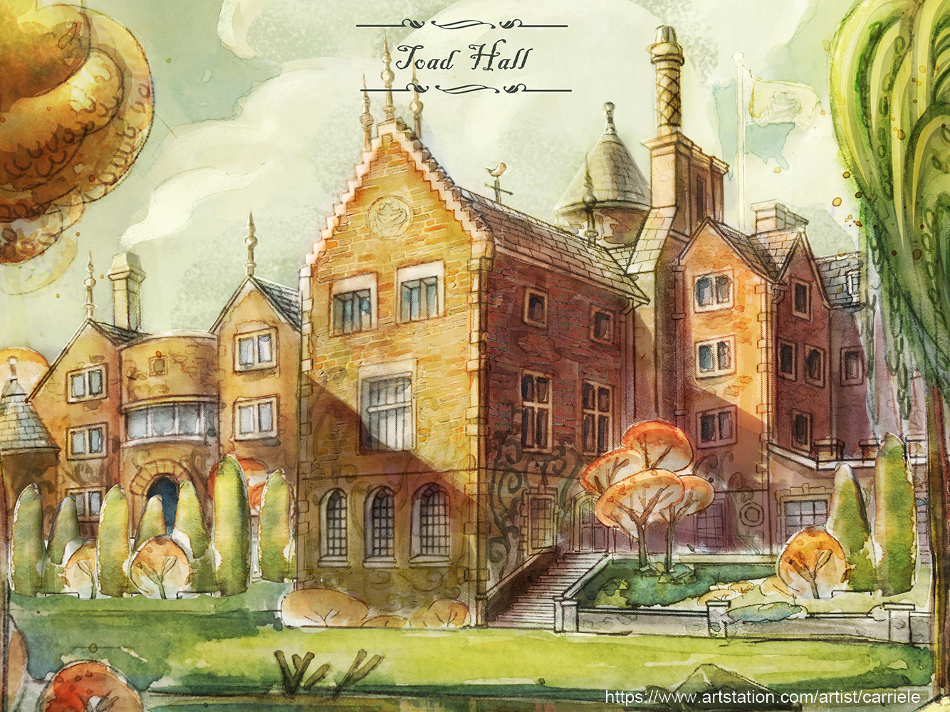
- Mr Toad's Wild Ride Love the attraction itself, not entirely sold on its location. Though to be fair, I don't think it utilized effective reference photos to elaborate on the text descriptions. To a novice reading this for the first time, I see the art of essentially the quaint Toad Hall restaurant duplicated multiple times to explain a 'larger than life facade', with the description stating it's a 4 story tall singular show building with lift hills and all sorts of stuff inside, which doesn't coincide with the Sketch-Up. And the only reason why I'm not confused...is because I found this reference photo in the team PM, which makes a bit more clear what the exterior will be. (this should have been included in the project)
carrie-le-toad-hall-big.jpg

Location wise I think this is still a bit tall and dominant now of a quaint Fantasyland, however the easy response to that critique will be posting a picture of the Matterhorn so touche before that even happens. :p

- Alice in Wonderland Perhaps it's just my admiration for David Bowie, but I wish this had 'Labyrinth' still in the title. Alice in Wonderland is just the title of the film, it has no unique quality to it in my view. Nevertheless, I adore the use of the maze as the queue - what an inventive idea! A way to use an old property in a unique fashion, love that! As for the attraction itself, similar in some points to Disneyland's however unique in its own way. Nice work there.
------------
*A side-note, thank you for including transitions in-between the areas. A subtle, yet effective way for the reader to feel like you are guiding me through the land, rather than me reading simply an outline. Great job!
------------
- Winnie l'ourson et le Lieu Inonde Ah, yellow font, my eyes!o_O If you're going for a Yellow font then make a quick custom logo with Yellow font. Yellow on the forum doesn't show up. Also slight nitpick, the description for the attraction says this is in a 'forest themed section' yet it's clearly in a village. I only bring this up because the 'village' will be a talking point later on. As an individual attraction, this and Hunchback might be my two favorites. Winnie the Pooh as a flume ride, despite the concept art circulating, I think you did an excellent job of differentiating it from the previous design, incorporating unique transitions and giving it a heck of a capacity at 3000 guests per hour.

Very detailed description, but I could have used a reference photo or 2 in the attraction. The gift shop/bakery has 3 photos while the actual ride has no on-ride photos aside from the sketch-up (which are fantastic) but it is a ton of description not broken up with visuals.

Also -1 point for not having the Heffalumps say "back back over the falls!" (kidding);) Lastly, the gift shop is very nice (and unique) for a Winnie the Pooh area stylizing it more towards its UK roots rather than a woods feel.

*This next part is going to be a nitpick, however I think this is something to definitely learn from and improve on for next time.

It's at this point in the presentation where it feels more slapped together than it should. Made by different people more than by a 'team'. This paragraph was written days ago along with the project, but feels very out place in context.
With headliner attractions based off of The Hunchback of Notre Dame and Winnie the Pooh, and D-ticket attractions coming for Beauty and the Beast and The Adventures of Ichabod and Mr. Toad, Team Verde discussed creating two C-ticket attractions that would round out the expansion. Alice in Wonderland and Tangled perfectly fit this bill. For the Tangled attraction, a scale and story similar to Frozen Ever After at Epcot was decided. The attraction would be a slow-moving, classic Fantasyland attraction with a plot after the film's conclusion, building onto the world's canon.
Based on the previous descriptions, it seems like Toad was an E-Ticket (at least E-Ticket level cost based on the elaborate exterior), so now Pooh is an E, and Hunchback (an attraction the reader has not been properly introduced to yet), is now being mentioned as an E-Ticket. For future projects, the person who assembles the final project, should double check for unnecessary content like this, and just take it out:)

- Tangled: A Royal Celebration I think this is a delightful touch as a C-Ticket and the Snuggly Duckling as a Be Our Guest style restaurant is pretty neat! Very well articulated throughout (as RMichael21 always does). I also find it funny that two teams decided on a Tangled C-Ticket -- lol great minds think alike!

- Le Conte Enchanteur de la Belle et la Bete All around great attraction and surrounding area with the Tavern (as a Trader Sam's type location) and Library. Yes, this area might be a bit derivative of the Magic Kingdom's New Fantasyland, however the write-up using the French language throughout was delightful to read. I am concerned based on the reference photo that the ride is only seating 1 guest per vehicle. I'm sure that is not the case, but it should have been clarified.

- Le Grand Charivari de Quasimodo This will be mentioned in another Team's review as well that I understand the difficulties of presenting these types of projects in a linear fashion. However think of these projects as a Battling Lineup in baseball...which is also a linear order. Your best 'hitters' tend to be towards the top of the lineup, not at the bottom. This is an incredible E-Ticket attraction, and as such, should be ranked as such so that the reader is most engaged once I come to it. Because I think Hunchback is an inspired choice for an attraction. While one could point to the risky aspect of it being a 22 year old IP with only a show in MGM to account for it, Beauty and the Beast was a 21 year old IP at the time it entered New Fantasyland in 2012, with only a show at MGM/DHS beforehand - so there! :p

-----
All in all I wish more of that type of discussion and reasoning will happen in the future with this team. As I said in the opening, some way out the box concepts were provided early on and then just never used again. And the project ended up being a slight glimpse of that unique darker tone with Hunchback, surrounded by a mix of European villages all packed together with little room for more elaborate transitions from a UK architectural style, to a German setting, to the French cottages, and then 1400s Paris.

You mentioned how the meet and greets in the Princess Gardens would not disrupt the beauty and landscape of DLP, but then take away the Casey Jr/Canal landscape and replace it with an expansive European village. I'm kind of mixed on that creative choice and how expensive of a choice that would end up being all things considered. I would have preferred to see more of a 'forest' setting or some sort of natural landscape extension beyond the station or wherever you ended up expanding. Nevertheless, there is no denying that this is a fantastic proposal and this team will only get better from here on out!

----------------------------------------------------
Team Castle is up next

Team Brava is on deck
 
Last edited:

spacemt354

Chili's
Original Poster
Stanza I Reviews (Part 2)
spacemt354

logo6.JPG
Off the bat this team was very well balanced with the amount of teamwork and general enthusiasm. This was shown by the creative idea to have all your avatars be castle themed! While some members definitely took a lot of the responsibility in the first round, and should be commended for their efforts, each of you brought something to the table for the final project write-up and I noticed several side conversations throughout the brainstorming process of how to 'plus' it, try new things, etc. That type of positive mindset is truly what makes this game special and hopefully that type of style continues to foster on this team as the game continues.

In terms of the presentation format, a Google Doc is a great way to organize things as a team, however if the goal was to be unique, I don't think it's accomplishing any more than what a forum thread would do. As a reader, I still have to scroll through the project in a linear fashion, and I actually think the font choice made the (!) punctuation very hard to read, and seeing something that is 50+ pages is beyond impressive but, I do think that is a bit intimidating just sit down and read if one was casually browsing through imagineering projects.

Building off of that notion, you all had so many ideas that it seems like everything plus the kitchen sink was thrown into the project, ballooning the budget up to almost $2 Billion for an expansion to an already existing land within a park. The effort to go way above and beyond and pull out a budget guideline from years ago deserves all the praise in the world. That was something completely unexpected (and trend setting as once you posted that in the Workshop thread other teams started discussing it as well). Nevertheless, I won't get into the individual attraction numbers as I mentioned to you all I wouldn't, but the overall budget is something that can be compared to previous expansions like the DCA 2007-2012 project, which was estimated a little over $1 Billion...for an entire park refurb!

For the future, my suggestion would be to toss all ideas out during the brainstorming phase, balloon anything you want, like you did...but then as a team, come together and decide what is most important, what flows together the best, and so on, for the final project.

In addition, if going with a linear presentation style such as this where the reader is scrolling down through the project -- put what is most important at the top (Objectives, Map, etc) so that there is a natural progression one can follow. Despite that, I love the table of contents, it makes the project feel like a thesis paper; very professional. But as a reader I can't visualize the additions/refurbs because the map is all the way at the bottom of the project. That should be one of the first things the reader sees in my opinion to orient them before jumping into text descriptions.

Speaking of the descriptions, let's go through the project!

- Ok, while a small detail, the idea of a team photo to start off was funny and unique. I appreciate small details like that and it's eye-catching immediately given how out of left field it is.
- The Hub renovation and Fantasmic. I thought this was a brilliant out of the box move and something unique to this project. The Fantasmic show as a whole was great, though I could have used s'more English translations s'il vous plaît. Also...perhaps this is just me, but the Ariel reference photo seems to be in a bit of a...'paint me like one of your French girls, Jack' position. :hilarious: I have no further comment on that, anything else will get me in trouble.

- The Dark Ride Updates. In terms of brainstorming you were actually the first team to realize that this project could be more than just an 'expansion' and could also include refurbishments. And good call - nice write up on the Pinocchio attraction.

- Mary Poppins Jolly Holiday The positives of this one being I think Cherry Tree Lane brings a lot of synergy to the area, transitioning from Peter Pan, to Toad, to Mary Poppins, and then to the Woods area and beyond - very fluid. The attraction itself was also smart to utilize the animated portions of the film. Also a 1,500 guest hourly capacity is a solid number, that may bump it up from a C to D-Ticket, though tickets are subjective. My hesitation to this though doesn't arise until we get later into the review, so sit tight.

- New Train Station/Mickey M&G I'll make this one simple - it's wonderful. A great usage and re-theme of the station to tie in with the surrounding area. Mickey as a conductor is a very unique M&G option.

- Winnie the Pooh and Tigger Too Again, this is really great. A whip ride brings a different flair to the land, another kid-friendly attraction, and something that fits with the UK theme that has been established through the Pan refurb, Toad, Mary Poppins, Paddington Station, and now the 'Woods'.

- A Brave New Frontier Scotland woods is a fantastic transition from the more traditional London facades, towards woodsy exteriors, and now finally to Celtic forest locations. I will say the ride is very well written and detailed, though the name reminds me of the dystopian novel Brave New World - not sure if that's what you want in Fantasyland:p Really appreciate the effort that went into hand-drawing the queue area - a very realistic depiction! However, this is the 2nd 'horse-riding' attraction in this project. Different systems and everything yes, but given the high volume of attractions in this project, the uniqueness of Mary Poppins (the lesser 'ticket' of the two) I feel is offset, rendering it now kinda feeling tacked on rather than an integral aspect to the project. To end on a positive note, I thought as a quick service the Mead Hall was unique and something original to exit the attraction through.
---------------------------
*Okay, so for future projects, this is something to me that has to be mentioned. To the reader, I've read 20+ pages of content, and as a reader, I'm getting tired. And I'm expecting stuff to wrap up soon. You've added a Hub transformation, refurbed C/D ticket dark rides, added synergy to the UK/Celtic areas, and a new restaurant, shop, and a refurbed M&G. To then continue to scroll and find that you're basically only halfway through the project, and some of the next components are very detailed, it could have been better organized.

Either include the most detailed pieces in the beginning, or weight the detail based on importance (ie E-Tickets have the most, then D, C, etc) Now seeing a C-Ticket 5 pages long, this isn't a commentary on saying that any of these upcoming components are bad, it's just -- you should consider that people are going to be reading this and when assimilating the project, try think from their perspective as a reader. What keeps a reader's interest? What needs the most detail and what doesn't? Good things to consider going forward.

- Rapunzel's Tangled Tale Tangential from the feedback about, on an individual basis, the Rapunzel attraction might be my favorite 'attraction' along with the adjacent QSR in the bunch. No discount to any of the others, but the great map outline, the fluidity of all the scenes...this truly feels like a classic Fantasyland dark ride, with great capacity on top of it. Though I kinda of wish the location was a bit further away from the UK mini-land. You all did such a great job building up that UK/Celtic area that now a Germanic story right across the path kinda feels out of place to me. Maybe a bridge transition traveling further east could have helped.

The Feast of Fools buffet, I can never say anything bad about something inspired by the Germany Biergarten:p However, with Snuggly Duckling and Mead Hall so close to one another I feel like either Mead Hall should have been the buffet and Feast of Fools cut, or Snuggly Duckling cut. Because again, now it goes back to my point how we were in the northern UK/Celtic forest, but across the way is a German forest and now abruptly we are in 1420s Paris with the Feast of Fools.

- Contes de Fees de Belle I'll be honest this one is an enigma to me. Is it a retheme of the Storybook Canals? Is it a 'plus of the canals?' Is it a new attraction entirely? It feels like combination of all three of these given the location, but it just kinda jumped into the description without giving any backstory. With regard to the expansion space, the rest required no backstory to what is happening because it was new, however Casey Jr. and the Canals existed, so some 'fyi' component should have been given to the reader. To top it off I'm just not that big of a fan of this one. It's very well written and thought out, however an E-Ticket using a variety of IPs from different time periods runs the risk of becoming 'Great Movie Rided' (yes I just made that up) meaning it will just stay as is until it becomes dated. I also think Fantasmic covered stories like Ariel and Aladdin, so I'm not sure why we need to revisit those again.

*checks page number progress*
*22 more pages to go*
12d2tz.jpg


- Fantasyport Whoever wrote the intro about Mary Blair and the contributions to Disney deserves a ton of praise. Why this wonderfully crafted piece is 40+ pages into the presentation I have no idea to be honest. The best aspects should be put on display not hidden in the back. With the level of detail that has gone into this area I can see why you were hesitant to cut it, but at the same time, cutting stuff down should have been decided much earlier on in the brainstorming. I believe not doing that is what led to these conundrums.

- Mickey Mouse Revue I really want to give this attraction props for its inventiveness, but honestly this whole mega-E-ticket conversion from Figment to now Mickey Mouse with Figment, is something I was concerned about. Honestly, if you kept the original design, but just said it was an expansion to Discoveryland -- I would be totally fine with it. However, you've taken away all of Discoveryland's expansion space with something that I feel is an entirely different land. If you have the Mickey M&G by the train, I'm not sure you need this attraction. And if you have this attraction, I'm not sure why you have the M&G of Mickey on the other side. It just feels repetitive, and I really don't like saying this because on its own this attraction is amazing, but within this behemoth of a project it doesn't stand out as much.

- La Beaute de Cendrillion Harking back to my Mary Poppins hesitations, not only were the horses in A Brave New Frontier a bit repetitive, this sub-land of Cinderella contains a dark ride at a C-Ticket level very similarly to Mary Poppins. If you wanted to include Cherry Tree Lane perhaps a M&G or some sort of Mary Poppins interactive adventure, and have the Cinderella sub-land be the main focus for an additional C-Ticket. But again this section feels very fleshed out and well-done. Nevetheless, the sheer scale and magnitude of this project makes these brilliant areas feel like afterthoughts, and I don't say that putting it down. I'm saying that because reading this on page 74 out of 84 doesn't have the same impact to the reader as it would on page 3 because I already read about several C-Tickets and female-led princess attractions.
--------

In summary, this was an amazingly ambitious project by a very talented group of excited and enthusiastic imagineers. So ambitious though you might want to scale it back a tad, and focus on a core goal for future projects because that will definitely come in handy. What I find ironic about that advice is for a few days in your google doc you had a section for overview with the question 'Do we need a basic overview of the project?' -- Yes..yes you do:p Because it will help you stay focused as a group on the prompt objectives and what you hope to achieve with your project as a whole. If you can master that, then dang, the other teams better watch out, because this was an incredible first outing for Team Castle!
----------------------------------------------------
Team Brava is up next
 
Last edited:

spacemt354

Chili's
Original Poster
Stanza I Reviews (Part 3)
spacemt354

logo8.JPG
Before beginning, this is the only team that made me have to exert effort to go back and find the team logo for the review. Curses to all of you! :p

Okay, where to begin...let's start with what I personally think was the best project manager of the challenge (not that it's a competition...well..no it is a competition, what am I saying) @AceAstro deserves a lot of credit for his ability to manage a team that could have easily delved into continuous organized chaos. There were flashes of that at the end, however - as a whole I think Ace's ability to come into a brand new game environment and be able to manage and delineate work to several titans of the imagineer forum on this team, should be commended.

And that leadership, translated into easily the most engaged and active team of the bunch. While page count is not everything, to me it is a relative indication of how much devotion and engagement a team has, and with 47 pages total in the PM, if you combine the other two teams PMs together, you still have some room left over.

However that fast-break style of brainstorming can lead to chaos near the end of the project. I think for future projects...this team needs to do a better job of making sure everyone is on the same page before moving forward. Because it led to, especially towards the end, conversations that I couldn't follow, and perhaps a bit of a rushed finale. All things considered though, as I was saying earlier, that fast-paced razzle dazzle brainstorming really is what The Sorcerer's Apprentice was founded on...it's what it's all about so it was a pleasure to see a team that engaged and working out a few kinks going forward, I believe this team could be destined for greatness.

However, are they destined for greatness in Stanza I? Let's find out:

- Why did you link the website to Disneyland Paris? Oh wait a minute...;) Seriously, this presentation off the bat already ranks up in my book on the Mount Rushmore of unique presentation styles. A perfect fit for what the project was asking for and just an incredible way to include a lot of moving parts without it being a linear presentation. Not that linear presentations are bad, just this is that 'wow factor' that makes me want to read more. Also love the press release...a unique way to introduce the project. While a small factor...the notion that you included euros for your price is noticed and commended.

- Thank you for using phases along with the french logo for 'Fantasyland Nouveau' as well as the tie in to the 30th Anniversary.

- Casey Jr becomes [RIDE NAME] among other components like this on the first page...this is due to the organized chaos at the end.

- The map is pure Fantasyland - visually and stylistically and I also appreciate the little blimps of content underneath the map -- makes it feel like a real map because on Disney Park maps you always see those little descriptions. Having them be numbers like on a park map would have been even cooler, but no points off.

Proceed for information

Okay I'm proceeded and seeing the same thing essentially I did on the previous page. I think it could have just hyperlinked from the map to the different areas, because as a reader I already know what content is in your phases I don't need to read it again.

- Fantasyland Anniversary Updates - okay updated Peter Pan queue and some ride effect, cool beans...I think the Snow White update was so small it's unnecessary, however I do like the note that Pinocchio has a long queue -- someone did research! Fantasyland Station was okay, kinda meh - only big thing was the tunnel to Fantasia Fields.

- Alice's Curious Pizza Love the Sketch-Up I feel like we will be having a concept art battle royale in the upcoming projects which I am looking forward to immensely. :D Actually this is a pretty unique option to design your own pizza with the 'wonderland' theme...never thought of that before, pretty cool.

- That's it for Phase 1? No rides?

- Mr Toad's Wild Ride "Manufacture : Walt Disney Imagineer" Yes, a singular imagineer designed this entire attraction:p, let's see how he/she did. Like the layout though it is a tad confusing to me because I don't know why there are random color lines throughout. Now I see...Each is a section of the ride, okay I wish 'Race Across the Countryside and Fair Grounds Journey Home both had depictions of what color (yellow or blue) they were. As an attraction though, can't get enough of Toad.

- Fantasia Fields Grr. You're making me be the grammar police off the bat. 'Their our experiences' Somewhere my former English Professor just had a stroke. I've said the same thing to multiple teams now...but when you have great content...show it off! Don't have incredible concept art randomly between reference photos. It was so good if I didn't know D Hindley drew it I would have assumed it was a reference photo (which is a compliment in its own right but as an imagineering creative enthusiast I want it on display.

But overall this might be one of my favorite additions to your 'New Fantasyland' -- it's naturalistic so it blends in with the incredible Disneyland Paris landscapes. It's slightly more mature (akin to the rest of DLP), and it's unique imagineering. While the IP of Fantasia has been done, I have not seen it done in this capacity before, and a special note to the 3D animation model of the Dance of the Flowers...wow! Dang impressive.

- 100 Acre Wood Nice intro (no typos either!) I will say at first I was a bit hesitant on the location of this. As mentioned to another team it feels as if Discoveryland is becoming an afterthought of a land...however...I do think this within 'Fantasyland' and now transitioning to small world, fits like a glove. In addition - an indoor area yes! Paris is not California or Florida...it snows! And is cold for months on end...so having an indoor climate controlled area is a welcome addition.

The Honey Hole, interesting choice for a name haha was not expecting that...I love the effort put into the menu art piece, as well as Bounce Along Forest (a Jumpin' Jellyfish type atraction) And Honeycomb Hollow for the aliteration, the attraction itself is ...okay to me, maybe could have used a rendering or something to better explain what it is.

Where Roo Plays...is that a question? :p Where does roo play...this reminds me of the Laughin' Place at the end of Splash, a nice touch though I think deserves a better name. Fort Roo or something. Pooh's Playhouse and Pooh Corner are also nice, but my favorite has to be Eeyore's Gloomy Goods -- this is so clever! It sells ponchos and umbrellas, in an indoor area, before going back out into the rain or snow...perfect.

- Sleeping Beauty's Coaster - Naming here is not the strong suit...however the content is! Holy cow from the artwork to the backstory, to the interior design of taking the Mine Train and making it as intended with more dark ride components, and all the analysis that went on in the PM to ensure that this fit into the area...this I applaud the effort. I also believe this would look amazing counter to Sleeping Beauty Castle -- which stands around 167 feet tall..I'm assuming from talks Maleficent's will stand around 100 ft -- however that detail should have been included because based on the concept art it looks a lot bigger than intended.

- Dreams of Fantasy - the nighttime show running in at 22 minutes...I do like this as an addition for the 30th anniversary. What I do think is something that should be noted, is that this was only added to the project during the organized chaos portion of the last 3 hours, yet looks like something that was completed a few days ago. The transitions between scenes were a bit predicable following the premise of the Fantasia films, however presented in a way that overall packs a nice punch, especially with the photoshop of the Mickey shaped fireworks with Mickey projected onto Sleeping Beauty Castle. Well done!

Daisy's Birthday I will be honest was...odd lol I understand it but is Dasiy a character that is worth building an entire show around? The oddity of it and risk is commended however with no reference photo and only a description to go off of this does feel tacked on at the end.

------
Overall, I think this team had a lot of positives, and really did strive to push the boundaries from day one of the PM to do something unique not only in the presentation but also with the content. Yet I still believe that this team has room for improvement...not necessarily in the 'pushing the boundaries' department, but not burning yourselves out. I think that can be accomplished easily by just having a project manager, or a consistent someone, keep the team on track nightly with the progress. You did that at times, but the last few days you didn't, and frankly it led to a lot of the grammar errors and sort of tacked on feeling to some of the aspects of the project. Nevertheless, Team Brava, Bravo!
----------------------------------------------------


Overall...an incredible first round of projects. In my book, the best round of imagineering the game has seen in a long, long time.

Congratulations to everyone again! :)It will be a close call.
 
Last edited:

MonorailRed

Applebees
Stanza I Reviews (Part 1)
MonorailRed

logo7.JPG

I’m not going to lie; I was incredibly concerned for this team when it was first starting out. :bookworm: Something about the team’s dynamic threw me into concern, with little talks in the Trader Sams Lounge pre-challenge. Later, when the project was in full swing, it seemed all of the legendary forum members knew what to do, and you guys went about your projects.:)

This team had some serious diamond in the rough concepts initially that I wish were talked about more in the PM. There were brilliant brainstorming ideas that came up that just seemed to be ignored, which was a little sad in my opinion.:bored: For example, the King Arthur attraction sounded amazing, :D and I really wish that came to fruition.

Teamwork kept building up, and I think your project came together quite nicely.

Getting into the project, I have to take the biggest advice I ever got from Joe Rhode into account on theme park design. “What is its purpose?” – :bookworm: What made this expansion important, and why Disneyland Paris needed this expansion. What was the story? Does the story integrate with it’s purpose?

The condensed expansion area reminded me more of Disneyland in California rather than Disneyland Paris. It’s tighter design seemed to focus less on the Baxter landscape of DLRP, and focus in more on attractions.

Paris’ Fantasyland is much more mature than Disneyland, and I feel like that element stayed true in your design. :D The Hunchback of Notre Dame attraction seemed phenomenal! The storytelling, the connection to Paris – absolutely wonderful. I think the movie has a deep connection with the French audience and I’m glad you used it. I do question the realism of the excess advanced AAs in the attraction. I love Navi River more than anyone, but know River Journey’s budget got cut for Navi’, :bored: I could sadly see this go in the same pattern for Topsy Turvey Adventure, realistically.

Unto Winnie the Pooh – I really want to say how creative this was in terms of design. Very smart using a previous ride system to give a unique twist on a classic. :cool: I do wonder though if the capacity would reach Frozen Ever After issues, and how popular this would be in the winter months of Paris. Overall, remarkably unique concept! Definitely a gem in this project.

I also enjoyed the Beauty and the Beast attraction, very wise including that in Paris. :) That being said, I enjoyed all your attractions in Paris. Tangled, Alice – all of them. However, I seem to wonder how the landscape connected deep into the storyline with DLRP. The expansion overall seemed like a “Let’s put as many IPs together in a European themed town in one spot’ - Type project than a storyline that intertwined with the DLRP mindset.

I loved all the attractions and elements of your proposal, but I didn’t enjoy how you portrayed them. It’s like putting Olympic gold medals in a dollar store frame.

Overall, you all have phenomenal talent on this lineup, SA Alumi, Skipper’s artwork, amazing storytellers from Visions Fantastic – it’s a great team.:D I urge Team Verde to truly think next project about the purpose of what their adding, and the overall cohesion of how it fits into that area. Disney Parks around the world all have their quirks and times in the sun – it’s what makes them special to work with. Keep in mind place, purpose, and story of the project next round, and Team Verde will be a serious force to be reckoned with!​


Stanza I Reviews (Part 2)
MonorailRed

logo6.JPG


First off, this team’s excitement and cooperation towards the project was absolutely amazing.:D It was so great to see everyone not only to be excited for the project – but to also to see that everyone did something a little different to add to the final project.

I like the team picture in from of the castle. #DLRPCastleSquad. :cool:

Presentation-wise, the google doc was a nice touch, though I do think that there wasn’t much difference between using that or the forum to convey your idea. :bookworm: I’m big into visuals, but I think some pictures, such as the ones for the Fantasmic! Project weren’t really needed. I wish there was a little less photos and more concept art from the team. I really enjoyed the map layouts, and more show scene art pieces would have brought the project to the next level.

Unlike space, I personally enjoyed the font choice.

I enjoyed the Tribute to Las Fallas near It’s a Small world. :) I thought it was a nice nod to Mary Blair. Winnie the Pooh and Tigger Too was a nice whip ride, I’m glad you included that as a nice break from giant attractions. A Brave New Frontier was an odd name choice, but overall a great attraction, definitely an unsung hero of the project.:cool:

There were SO many elements in this project. o_O Fantasyland Expansions usually have about a handful of total experiences, and maybe a few refurbishments. This project tossed in everything anyone could have possibly have thought of for a Fantasyland Expansion. With all the content, I felt like some projects in your proposal became more of an afterthought, while others were very dominant. It made some areas seem less purposeful than others, and more and more disconnected.

I’m really happy you all tried to budget, it’s always great to see that effort. However, that was a massive budget for an expansion. WDW’s Fantasyland was over $600 million. Pandora was $500 million. $1 Billion was the price for opening day at Animal Kingdom. :bookworm:

With those numbers in consideration - $2 Billion specifically in one expansion, for one land in Paris is a pretty hefty sum. :bored: If FantasyPort and Fantasia was another land in the park altogether, I would have been more accepting of the pricing. However, it seemed to be the “Star” of the budget and it seemed other areas were looked at less because of this. The "Star" of the giantly priced expansion, is on page 64/84 - it kind of hides the grand expansion piece in that aspect. :bookworm: I would've loved to see the main ingredient in the beginning or end to really pack a punch into your presentation.

Overall, I enjoyed the enthusiasm in Stanza One, but it seems like the brainstorming never got cut up to the point of making one expansion, and it made it seem like 2 different expansion projects in one proposal. My advice going forward would be to dream big, but not be afraid to cut what isn’t working with the overall storyline of what you’re working with. Ask what the purpose of the project is, and if it doesn’t fit in that mission statement, don’t be afraid to look at other avenues or put more detail into hit projects you have already been working on.

Stanza I Reviews (Part 3)
MonorailRed

logo8.JPG

I want to first applaud your presentation style this round. This truly brought back Sorcerer’s Apprentice Season 2 memories. There was this moment that year where I said to myself during a Stark Expo project from Team Air.

“….Did they just do that? :cyclops: – Yeah they did that.” :joyfull:

This project evoked that concept of selling a presentation right :cool:– and I think that’s half the battle. Selling your project is absolutely crucial in Apprentice, and I’m glad you stood true to that. The website and memo sold it.

I would like to take another moment to say AceAstro’s Project Management tacitics were great. Everyone had a job, and they worked on it. Everyone on this team has a purpose and a hand in the project.:)

I’d also like to take a moment to say D Hindley’s artwork was spectacular and brought the project together. Voxel’s hand in ride system animations helped make the project more and more realistic.

Opening in Phases was a wise choice – Great move. Indoor Fantasia attraction – Great move. :D Indoor Resturant – Great move. I really enjoyed how you kept in mind Paris’ logistics.

Though I have many great elements in this project I truly enjoyed, there are some that truly confused me. I have to ask myself the Joe Rhode advice of “What is its purpose?” and what did the elements mean for Fantasyland. :bookworm: That question left me with some conundrums with this project.

What was the purpose of the Hundred Acre wood near Discoveryland? :bored: I’m thinking it was to lighten up the Forest heading to It’s a Small World, but it left me guessing. Sleeping Beauty seemed like a condensed miniland to build off the castle, but it lacked cohesion with it’s European Princess counterparts being left within the castle courtyard.:bookworm: I could see the purpose of enclosing the canal boats and the pizza restaurant. I could see the purpose of Sleeping Beauty and Mr. Toads. However, I couldn’t see the purpose of putting It’s a Small World, Winnie the Pooh, and Sleeping Beauty near a steampunk Discoveryland. The new addition really lacked cohesion for me.

Overall, great work with addressing Paris’ needs, but certain elements left me confused with its purpose within the DLRP landscape. I would urge Team Brava to truly think of the purpose of each element, and how they blend together for a giant, cohesive story that intertwines with the area they are working with. :D You sold me on the presentation, the planning, and the artwork - but it seems the purpose of landscape storytelling took a backseat in this expansion.​
 

MA Screamin'

Well-Known Member
Team Verde and Team Brava, you guys hit it out of the park! Happy to see what we'll be up against for the subsequent Stanzas, while taking some notes and helping Team Castle see what we can better at next time. Space and Red, thank you for the insightful reviews, as I can tell you really thought deeply about our project and were considerate of all aspects of our presentation.

Best of luck to everyone as we venture out on our next adventure :)
 

spacemt354

Chili's
Original Poster
Thank you MA! :) And with that I would like to bring up a special announcement!

This round was so good, and mostly everyone on the teams were really active and engaged, in stunning fashion really for the first project. The only instance where I condone eliminations in a first round is if someone is non-existent on a team throughout with no reason as to why. To be honest, the plan after the results was to not force active members into a board room to plea against someone who was inactive. That to me is a waste of time, so up until yesterday the plan was to eliminate @ctxak98

However, he presented a compelling reason for his absence to his team and mentioned having more time going forward, so in the spirit of opportunity and second chances - this round is now non-elimination!

Yes, there is no Board Room for Stanza I -- everyone advances to Stanza II (woo!)

With that said -- the general schedule for today will be feedback from tcool123 as well as the individual team reviewers till roughly around 8PM EST - after such time the results/rankings will come in, followed closely by the Stanza II content and prompt, where hopefully some on the teams have time before heading to bed to let the next project objectives sink in.

Thanks again everyone!
 

Voxel

President of Progress City
Thank you MA! :) And with that I would like to bring up a special announcement!

This round was so good, and mostly everyone on the teams were really active and engaged, in stunning fashion really for the first project. The only instance where I condone eliminations in a first round is if someone is non-existent on a team throughout with no reason as to why. To be honest, the plan after the results was to not force active members into a board room to plea against someone who was inactive. That to me is a waste of time, so up until yesterday the plan was to eliminate @ctxak98

However, he presented a compelling reason for his absence to his team and mentioned having more time going forward, so in the spirit of opportunity and second chances - this round is now non-elimination!

Yes, there is no Board Room for Stanza I -- everyone advances to Stanza II (woo!)

With that said -- the general schedule for today will be feedback from tcool123 as well as the individual team reviewers till roughly around 8PM EST - after such time the results/rankings will come in, followed closely by the Stanza II content and prompt, where hopefully some on the teams have time before heading to bed to let the next project objectives sink in.

Thanks again everyone!
Random questions. Even though your not gonna give us the challenge now, can we have the Due date.. So I can make plans for the weekend :p
 

spacemt354

Chili's
Original Poster
Random questions. Even though your not gonna give us the challenge now, can we have the Due date.. So I can make plans for the weekend :p
Surely ;) - it'll be due Sunday April 8th at 11:59PM EST

Side-note I used PST as the last due date timezone because west coast people always get left out. And then I had confused questions asking when the project was due lol we tried west coast people...but it's back to EST :p
 

TheOriginalTiki

Well-Known Member
Thanks for all the feedback, I had a blast this round! It feels so good to be doing creative writing again. As for the early stages of this project...that's something that will definitely be chronicled on Team Verde's end on the podcast. We basically had one productive day right at the beginning followed by a day of hardcore scrambling haha. Yea, the King Arthur idea was something that just randomly popped in my head which I would have loved to do work on. It was frustrating to see it go by the wayside, but I don't think it would have fit with the team's overall vision for the expansion. All in all I can safely say the Hunchback attraction is one of my favorite things I've ever designed. Perhaps King Arthur will make a return in SYWTBAI Season 17. It does fit the "International" bill, after all. ;)
 
Last edited:

v_k

Active Member
Team Brava Review
Hi Team Brava! first of all, great job on this project! I loved the custom site, and kudos to whoever did the artwork. I will go through each component of your proposal and give my thoughts on each one, before giving my overall impressions.

Fantasyland updates - these are solid, nothing else to really say here
Alice Curious Pizza - when I first saw this, I thought it a bit odd, as pizza is not really something I'd associate with Alice. But you really sold me on the idea with the massive choice of toppings. I agree that DLP definitely needs of quality dining options. I'm also really glad you kept the hedge maze too.
Mr Toad's Wild Ride - I love Toad! This was a great update to the classic dark ride; I would never have thought to use Junkyard Jamboree, but it really works!
Fantasia Fields - I feel like there's not enough Fantasia in the parks, so I loved the idea of an entire mini-land. I liked how the canal boats, concert adventure and the restaurant tied in to each other. Speaking of the restaurant, this is another great dining option; I particularly like the different themed rooms.
100 Acre Wood - I love that you enclosed this mini-land; it gives a great feeling of intimacy and I can just imagine how different lighting and sound effects could be used to simulate different times of day. That being said, there was no one attraction that really 'wowed' me, although it seems like the kind of area where I would be content just to wander about.
Sleeping Beauty Mine Train - first of all this ride looks great; I imagine this would look amazing next to sleeping beauty castle. The name is a little baffling; mine trains are not something I would associate with Sleeping Beauty at all. That said, the ride through is great with plenty of amazing visuals, especially the final big drop through the thorns.
Dreams of Fantasy - Kudos to whoever did the write-up for this component; this sounds like a really beautiful show which makes the most of the castle with the projection mapping. Daisy's Birthday Bash sounds like a cute show; I could see something like this happening.

Overall, I really enjoyed reading this project. The custom website is fantastic, and the variety of offerings are great. I'm a little surprised you didn't include Beauty and the Beast and Cinderella, both being French fairy tales, but that might have resulted in princess overload, and you have a good mix already. There were a few typos here and there, but nothing to detract from the quality of the finished product. My favourite part was the Fantasia mini-land, but there was nothing I disliked about this proposal. Great work!
 
TEAM BRAVA REVIEW
Wow! When I followed the link I really did think that I had been redirected to the official website! Great presentation!
In terms of specifics, I really like a lot of the proposed ideas. I agree with @v_k for a ton of the proposed additions, so most of what I say below will just be in agreement! Here are some of my big takeaways:

- Fantasyland Updates: It is always a great idea to look at plussing existing attractions and keep them fresh while still remaining their iconic status. Good ideas!
- Alice's Curious Pizza: Like @v_k said above, at first I wasn't too sure about this one. I love the theming and idea to incorporate Alice, but the pizza part kind of threw me. I know it would work in the U.S., but I'm just not sure about European attitudes towards pizza. I know in Italy, at least, they do pizza vastly different than in the states and can be a bit more conservative with toppings. Overall, I think it could work but the local tastes need to be taken into account.
- Including Fantasia: I believe that Fantasia is largely ignored at Disney Parks, and it's a shame as it was one of Walt's favorite projects. Paris is such a great place to implement attractions and experiences based on this iconic/artistic film!
- 100 Acre Wood: Very neat idea! I love how it's not just one side attraction or character spot, but a whole themed mini land letting Guests step into that world! As @v_k mentioned, there aren't many "big ticket" attractions there, but there almost doesn't need to be if it is themed extraordinarily well with a lot of interactive elements (Kind of like Tom Sawyer Island).
- Sleeping Beauty Ride: Looks like a good way to add some coaster thrill to Fantasyland in a tasteful, well-themed way. The only thing is the mine cart connection. The ride system makes sense and could work, but the mine cart body doesn't seem to fit with Sleeping Beauty.

FINAL THOUGHTS:
I thought that the presentation was amazing! The main issue seems to be typos and editing errors, but the main ideas and proposals are overall very imaginative and well thought out!
 

Fox&Hound

Well-Known Member
Team Verde Project Review-Fox&Hound

Wow! Wow! Wow! Seriously impressive Team Verde!

Let’s start with what I love:

Toad Ride- this is genius. Toad meets Haunted Mansion! I like how you cleaned up the narrative and kept the ride set to Toad Hall giving the ride a sense of place. Ride vehicles, show scenes, and music are all inspired.

Beauty and the Beast ride- seems like a very fun experience!

Poppins Restaurant- clever idea- can you eat on the ceiling with Uncle Albert? :)

Hunchback- while I don’t think Hunchback is the most popular IP, I like the cohesion of the land and you sold me on this project!

Pooh- changing a classic ride to a water ride- genius. Love the progression.

Some things to consider:

Belle’s vehicle- I like the ride but the ride vehicle seems odd. Great movie tie-in but will a bench be added to accommodate more guests? If not, this could be a capacity nightmare. And why would the wood chooper be going on a rampge through the castle? With the axe attached it seems a bit odd. And if you add a bench or a double bench you would have to alter the design so much maybe another ride vehcicle should be considered.

Tangled- I looooove this movie but I think this project needs the most attention still (sorry- don’t hate me). So you can eat in the Snuggly Duckling and the ride starts there too? Is it one building or a separate one? I got confused somewhere....Also, while we all agree we don’t want to settle for book report rides, this ride seems like a bit of filler. Lots of random scenes with new characters (cook) and the payoff of seeing the lanterns (which would be incredible) seems to be the only part of the ride people may want to repeat. Would love if more characters we knew were added- Pascal, thugs, etc. I think people would miss the characters they know so well in this “continuation” ride.

Overall, I loved this entry and I think pooh and toad are two of the best project ideas I have ever seen! Oh and the princess Gardens is a great use of the space! Excellent work all!!!!!
 
Last edited:

tcool123

Well-Known Member
Verde's Verdict
Tcool's Reviews

DYg8BmlU8AE5TsS.jpg

First off I would to thank you for not only having the courage to post first, but also for participating in the competition! I'm going to be splitting my review into two parts the brainstorming/group dynamics, and the final product.

I'm not going to lie I was scared for the group. While the rest of the teams instantly clicked, and threw everything they had to the wall, this team was a bit slower. At times members would dispute over one particular attraction, but overall once @DisneyManOne came in everything began to settle. Thanks to not only your great project manager, but also your group bonding everything worked out fine.

Throughout your brainstorming various unique ideas had come up, and I was glad to see such ingenuity within the team. This brainstorming you all had is essential for making a team work as it gives you not only a map for the future, but also allowed for you all to come together. Now onto part two of your review the final result.

Overall I am fan of the way you had your expansion set up, and I feel that your final concept art meshes well with Old Fantasyland creating an extension of it. So while not only expanding Fantasyland your team also complimented it. However this does not mean your project is without any faults. The map itself is a nice touch, and in general is easy to follow. However the issue comes in with A - H. With no explanation for the markings, nor the meanings it left me with a few questions to placement. Also I'm having an issue locating Cherry Tree Lane, and its placement.

The Mr. Toad Ride sounds like it would be immensely fun, and a great way to bring in the character into the park. However my concern is the size of the building, and it sound like it is going to be immense, and may dwarf the rest of Fantasyland challenging the skyline for the area. The idea to incorporate the Cobra's Curse system is a clever one. For Alice I like how you play homage to the original labyrinth, but I will miss the teacups. While it is a minor thing it is a classic attraction that all parks have a variation of. At first the ride begins with an interesting idea, and seems like it could divert from being Alice from Disneyland. However it quickly subverts to this, and this creates one big issue. How can you see the Cheshire Cat guiding you if you are in the Cheshire Cat? Overall I do like this ride, and I think it is an interesting twist on a classic much like Toad.

Winnie the Pooh in my books is a homerun. It is fun, innovative, but also familiar. It is something that I'm sure will become a favourite throughout time. However the queue is quite frankly odd. You enter the queue through an oversize book in a village, and then you enter a library to just enter the same book again. I'm sure if this works as not only would the giant book would ruin the aesthetic of the village, but it may lead to confusion within guests. Love the gift shop though really has a cheerful atmosphere in my opinion.

Tangled in general is off, or to clarify aspects of it all. As I was reading I was loving the atmosphere and the planned streetmosphere. The gift shop was well done, and clever. However came the Tangled ride, and it just felt forced. It was oddly paced, and seemed to be just the tower and the lanterns. There is no real reason behind it nor a story to be told. Nor is there a resolution of the story that was set up as it seemed the riders get swept away, and Flynn Ryder essentially responds with "eh, they'll figure it out". While not saying it is what came across. The story felt forced, and I was hoping for a resolution. The restaurant tries to be Be Our Guest, but then there's also Cherry Tree Lane also doing the same thing. This for me is concerning as they would fight for attention from the fans, and if I remember correctly both would require reservations thus lacking any new quick service in this area.

For Beauty and the Beast once again fell into the same pattern. For example why is lumiere welcoming you into France if you're in France. Is seems a bit redundant, no? As for the pacing it was alright, but a head scratcher on why we leave the castle to start in the forest, and just return to the castle in a moment's notice. However besides this is was a good ride.

Lastly there is the Hunchback of Notre Dame. At times I felt that at certain portions the decisions were decided they had to be justified. However given the opening of the ride it was clear that stylistic deviations were going to be used given we were in a puppet show. By doing this it takes readers out of the element. Additionally the big trackless exploration scene fell flat for me. My main issue is there wasn't enough detail for the Frollo and Phoebus segment, and compared to the rest of the scene is just a disappointment. However whatever is a dissapoint are the Court of Miracles, Out There, and Hell's Fire scenes as they all sound lavish. Overall this ride was risky. The source material is dark, and different from much of Fantasyland. However an effort was done to establish that this is the adult area of Fantasyland. In fact I even liked how you reincorporated A Guy Like You into something worthwhile.

Overall this project was at one point a mess, but the team came together to form a project that for the most part flows well. Not only that but there was some fun rides. With my main and lingering concern is the feasibility of this project given the park has two years to bulldoze, and build essentially a literal whole new Fantasyland. With that said I do like your project, and think it complements what already exists.

Castle's Conclusion
Tcool's Reviews

DYg8BmiUQAEWYFq.jpg

Much like with Verde my review will be split into two.

From the start this team just clicked, and ever since then they have been on a roll. The entered and exited the brainstorming process of this challenge very quickly, and began handing out assignments in a flurry of Imagineering excitement. Overall the early stages had a few minor snags, but overall the team came together to really progress through this challenge. Now onto the submission itself!

84 Pages? Okay let me cozy then, and my reading music playing. ;):p

I haven't even read it yet, but I'm sure you aware that 84 pages is a bit large for most. With that said kudos for the table of content that sticks out from the left. Allows for navigation through this document. At times there are some grammatical and spelling errors, but we all make those errors. So while not optimal they do slip through even the best of double checking.

Fantasmic sounds like it will an issue with the crowds with the way the show is set up viewing may become limited due to the proximity guests must be for the two stages. Not only this, but wouldn't the stage obstruct the view of the fountains, and the castle itself during the show? Overall the show is nice, but I would have wished to see some of the newer properties instead of the same core Disney films. With that said there were two outliers Ratatouille and Hunchback. The inclusion for Ratatouille was odd given that it has its own land next door, but the inclusion and execution of Hunchback sounds brilliant.

I thought it was nice to see the classics get some love. However I don't follow the reasoning behind Pinocchio getting a full scene by scene, but the rest of the rides got either a blurb or a bullet point. I feel that there should be consistency throughout, and this ruined said ideas of consticinecy. With that said I do think that the refreshes are a nice touch, and should keep these rides popular for longer. While the new dark ride in Old Fantasyland, Mary Poppins, was a nice touch.

Now onto the first new subland, The Woods. I'm glad to finally see a map, and I wish there had been one earlier. The map allows me to visualize how everything will fit together, and I would've loved if this received its own tab within the table of contents. Now onto the land itself.

Within the land itself there seems to be no breathing room, and at points some thematic clashing between attraction concepts which comes into play. My issue lies upon the proximity of the Parisian Beauty and the Beast and Hunchback, Germanic Tangled, Scottish Brave, and the British Pooh. With the cramming of IP, and the likely sightlines created by the facades of the iconic locations an issue arises. You won't be transported to anywhere, and this is different from the Forest at Magic Kingdom. Within the Forest there is breathing room between Beauty and the Beast and The Little Mermaid. While the Seven Dwarfs is vaguely themed on the outside allowing for it blend in no matter the location. This is lost in the Woods in which everything has a set piece right after one another.

The best example is Tangled/Brave. You pass by a Germanic tower, and run into a Celtic castle, but you soon run into a Germanic themed tavern. However placement does not affect the quality of a ride. Just the cohesiveness of the Woods.

The Winnie the Pooh ride sounds like a fun addition, and is definitely something I would love to ride. It puts a fun twist on the current whip rides throughout the many parks. While the gift shop is a ice touch, and rminds me of th Barney gift shop at Universal.

Now onto Brave, and a lot has changed within the canon since the last time we were allowed glimpse. Apparently Fergus and Eleanor are now dead? This is of course the reason for Merida becoming a queen, or is it because she had been wed off to a suitor who needed a queen? This little detail causes some questions to pop up, and then bam dragons? Okay, sure...I guess. Look the triplets can talk now, and at this point I wished there was a time reference for when this takes place. And Merida has magic powers! And her mom, the queen, is alive! I have a whole lot of questions, and zero answers from the ride itself. Wait we get one in the restaurant with a backstory that I feel would've been great before the ride. All in all this didn't feel like the world of Brave to me, but rather something that could've worked on its own that was given a Brave theme.

However while the story was odd. The effects and the ride itself sound like they would be a great ride. This would be a huge win for Disney in terms of effects, thrills, and the ride itself. And I do apologize for ragging on the ride based on story, but that represents that you may need a backstory before the ride. The restaurant however was a good call, and I would love to go if just for the iconic pastries that the triplets were constantly stealing within the film.

Tangled I feel was well executed, and a fun ride which involves many interesting moments. While the Tavern was clever, and something that I absolutely loved.

Onto the Feast of Fools! Fun fact, all the castle parks have alcohol now. With Paris being the first? to roll it out. The restaurant itself is another home run, and is something I would love to experience. It's a fun use of the property, and definitely adds variety to the current landscape of dining at the resort.

Now we reach the ends of the Woods! Now I have a question. Does Belle's library contain literary classics such as Twilight, 50 Shades of Grey, and dystopian teen novel of choice? ;):p Overall the Beauty and the Beast is fun, and provides for pretty much every Disney movie not in Paris's Fantasyland yet a chance to shine. It does remind of Once Upon A Time at Tokyo Disneyland and Magic Kingdom, or the Crystal Grotto at Shanghai.

Now Dreamport! I like the Las Fallas walkthrough, and I think it's great. It'll allow for a quick getaway from the crowds allowing for a time to relax. While the Fantasia museum is beautiful, and something that will probably become a must do for everyone.

Mickey's Concert is interesting. I don't follow the reasoning behind Figment being here, but sure. I wish the first ride had more detail, but overall it is really ambitious. Overall the ride is ambitious, and good. While I'm not a fan of Figment hanging around, nor that Chernabog decided to speak I like it.

Overall the rest of Fantasy Port is good. Nothing to crazy, but it is fun. It compliments the area.

Lastly I love the concept of the budget, and something I have played around with in the past. However the budget for this expansion is a tad bit too large, but I do love the realism you were going for. At times some of your rides feel like they were forced on some themes. Figment onto Fantasia, Beauty and the Beast onto the five? films, and Brave onto the original story. It just seemed a bit odd to me.

Brava's Breview
Tcool's Reviews

DYg8BmjU0AA-Ayz.jpg

Eh, I tried with the title :hilarious:

Much like what other reviews this will be split into two. At first I was concerned if england and Vox would mix well with the newer players such as Ace and D Hindley. However any concerns were soon quelled by the way Ace took the helm of Project Manager, and he was on fire! Everyone on that team had a role, and the dynamic within the team made me really happy to see everyone work well together.

I loved the realism set up by the press release, and how the website is connected to the actual Disneyland Paris website. While the map is nicely done, and simple to navigate. However there on the website there was some errors such as [FANTASIA FLAT RIDE]. Lastly the three phases were a nice touch of realism that I felt was well appreciated.

The updates to the old rides were nice, understated, and generally improved Old Fantasyland. The small touches done to each of the rides I felt really revitalized them. Additionally the Alice restaurant was clever in its usage and theming. I especially love how parts of the labyrinth were reused to allow for guest seating.

The Mr. Toad was really innovative, and besides the grammar errors is definitely fun. It's an interesting twist on a classic, and is something I could see being popular not only for begin new ride, but a unique take on an old story and ride system. Also like how you strayed away from the main plot of the short film and book.

I absolutely love Fantasia Fields. It is a unique take on a typical Fantasyland land, and I feel that the way it was pulled off here really flows. The canal boat ride while simple is beautiful and enchanting. This ride represents that not everything in Fantasyland has to be over the top, but sometimes a calm and simple experience can be a good addition too. The big ride here is an interesting one as it incorporates typical dark ride elements, but also surprises such as the glass tube that allows for a vision of the outdoor Canal Boats. While the hybrid scenes of Dance of the Hours and Carnival of the Animals is smart, and save space while making it unique. However the usage of screens is a bit disheartening, but in general I liked this ride. The flat ride I thought was very creative, and I love the sample video that was made.

Unlike space and red I do not find an issue with the placement of the 100 Acre Woods, but rather like it. It's separate enough from the rest of the land be an indoor land, but still close enough to relate that fantasy element. Overall this land is a bit mixed bag. It has the perfect atmosphere, and has me quinely want to go in and tour the area. However I do wish there was more details for Honeycomb Hollow as the point of that ride? was unclear to me. Besides that I do like the rest of the 100 Acre Woods, and think that it is a fun distraction for the whole family.

Now onto the crown jewel of your expansion, Sleeping Beauty Mine Train. The name itself should have been workshopped a bit more along with the ride vehicles themselves. I also think that having three castles all next to each other is a bit redundant (Maleficent's, Stefan's, Sleeping Beauty). However I do think that this complements the beauty that is Disneyland Paris. It keeps the hill while getting rid of the hill (if that makes any sense) it's an interesting take for sure. I love how the backstory of the ride is shown, not told. I think it will be effective, and catches up riders to what has happened. As for the ride itself I think it is a great balance, and an improvement on the Seven Dwarfs. Overall I loved this ride, and I think it is a great addition to the park.

We made it to the last change, Dreams of Fantasy! Overall I love this show, and I think that it matches the park itself. Fantasia is an ambitious and beautiful film, and the park is also ambitious and beautiful. I especially love how you end in the Firebird Suite which I think was a wonderful move that highlights a beautiful scene from Fantasia.

Overall I felt that this was the most realistic project, and mirrors that of Magic Kingdom's New Fantasyland. The ideas presented throughout the proposal were familiar, but also fresh. These concepts would definitely fit within the park as the park itself is familiar, but also fresh. On a final note I love the concept art, and I hope to see more of it in the future!
 

Register on WDWMAGIC. This sidebar will go away, and you'll see fewer ads.

Back
Top Bottom