Stanza XIV Detailed Project Guide
This guideline is provided to offer additional insight and some creative tips to best organize and manage your project so you understand exactly what we are looking for, along with some context for why this is the final project.
Stanza XIV, designing a timeless E-Ticket attraction for your 'home' park - has always been tapped as the finale project since the game's inception back in January 2018. We even teased the finale through the first demo version of the Stereophonic Sounds, with some timeless attraction sounds mixed in. We have this as the finale because it allows you as an imagineer to incorporate many if not all of the skills and substance you've learned over the course of the entire season, and apply it to this one attraction.
The main question is - what defines an 'E-Ticket'? The best definition I can give to you is -- whatever you define it as.
As a brief history and origin of the 'E-Ticket'
Credit: Fastpass Facts
To further elicit how my own definition of E-Tickets is meaningless to this project, E-Tickets in 1971 at Walt Disney World, such as The Country Bear Jamboree and The Hall of Presidents, might not be considered E-Tickets if they were built today. But if you use the ability to time-travel back to 1971 at Walt Disney World, and want to create an audio-animatronic show as your E-Ticket, attractions like those clearly fit the bill. So in the end,
what you define as an 'E-Ticket' matters more than our definition. In today's world - it's subjective, and comes down to basically, what do you think are the coolest attractions that are must-do's at the Disney Parks? Justify your decision - and you're good.
Now that you've gathered your own definition of what an E-Ticket is, let's dive into some of the components for how to make an attraction timeless.
The Premise

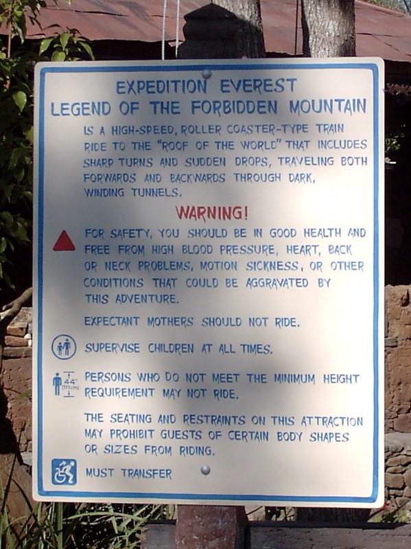
Before even jumping into the attraction write-up, everything starts with the story. The best advice I can give to know whether or not you have a strong story is - can you explain it in a few sentences, give those sentences to someone else, and have them understand it. While some attractions have complex backstories as you read more about them, most have very basic storylines, some even having vague pronounced plotlines where the guests can create their own story. Space Mountain doesn't have a finite story, it is a flight through outer space from the futuristic Starport 75, allowing you to fill in the blanks yourself as the guest. Some attractions have announced stories, such as Flight of Passage, which outlines exactly what, uh, you're doing, why, uh, you're there, and what, uh, your purpose is. And other attractions are 'mission' based, such as Dinosaur or Mission: SPACE, which tells you what your goal is and what you need to accomplish, with the attraction following this narrative throughout. Regardless of your premise - think of attempting to write the 1 sentence safety sign description for your attraction. What would it say? That's your general premise to branch off of.
As an aside, a perfectly acceptable and winnable option is to go back in time, and re-imagine an already timeless E-Ticket attraction in your own image. If you think you can do The Haunted Mansion or Pirates of the Caribbean better, now is your chance! My one caution with this option is, while you'll have a lot to work with at your disposal from imagery, to relative storylines, to music, and more, these attractions are timeless for a reason, so be wary of having this simply turn into a nostalgia project. Your attraction needs to one up the already timeless one, so this option, in our view, is definitely the most risky, yet possibly the most rewarding direction you can go.
Setting The Stage
Timeless Disney attractions all tend to have similar traits, and one of those is setting up the attraction before you even reach it. Whether it be hearing the dog howl from Liberty Square as you approach the Haunted Mansion. Or a looming 199 ft tall Tower of Terror hovering over the end of Sunset Boulevard. Or even something as simple as standing underneath the massive 180 ft geosphere of Spaceship Earth and noticing the faint aroma of the Rome Burning scene from the line as you pass by the massive communication mural. Each attraction has their own distinct way of setting up the story before you even enter the attraction. In Splash Mountain's case, seeing the tall Chickapin Hill from the distance as your round the Rivers of America, and hearing the screams and splashdown of the guests as they plummet down the waterfall, hypes the guests up to say "hey let's go ride that!" Make sure for your E-Ticket, regardless of the park and location you place it in, that you do a good job of 'setting its stage.' It's the...Prologue!
*And if it's a tall structure, consider how it would look from other areas of your resort
The Queue
After you've set the stage of the attraction, you've convinced the guests to ride it - and now they are walking through the queue. With an E-Ticket, you can make an educated guess that your attraction will be popular and you'll have long lines. So here's where you can give the guests further details to immerse them in the story you are trying to tell. In Expedition Everest, not a word is even spoken yet from traveling through the ambiance of Serka Zong, entering into the expedition post, seeing the Yeti museum and the props around it, you understand exactly what you're getting into. The Twilight Zone Tower of Terror is another example of a strong queue that guides the guests through overgrown plants and decaying facades with ominous 1930s Big Band music mysteriously playing in the background, before a Pre-Show TV tells the story.
Moreover, you have to understand the era in which you're designing your attraction. Tower of Terror when it opened in 1994 was one of the most detailed queues Disney had ever done, and it wasn't until the genesis of Fastpass in the late 1990s that elongated and detailed queue design became an integral part of the guest experience. So if you're designing an attraction in the 70s or 80s, your queue details might be more subtle on detail, but strong on immersion.
Think the dark Caribbean fort you enter, seeing skeleton Pirates playing chess in Pirates of the Caribbean, or the stretching room of The Haunted Mansion, or the Jungle Cruise Radio announcements and comical signs surrounding the switchback queue, that might not be on the level of a Tower or Everest, but certainly immerse the guests further into the attraction. The attraction begins way before stepping into the vehicle or show - a trait of all timeless Disney attractions. And we've done an entire Stanza on queue design - Stanza X offering opportunities to design a queue/pre-show, as well as other larger projects that also incorporated having to design queues.
Finally, beginning with the Queue, many if not all timeless E-Ticket attractions have
music loops and songs throughout the experience. When you say Haunted Mansion you think Grim Grinning Ghosts, when I think of WDW's Space Mountain, I think of the Star Tunnel Music, and if I think of Splash Mountain, I think Zip-A-Dee-Doo-Dah, and even Expedition Everest's Anadapur Area Loop. These songs and instrumental music loops, both in the queue and attraction, are an integral part of what makes these attractions timeless. So you should have some form of a music loop or loop(s) (exterior music, interior music, attraction music, etc) within your project.
The Attraction
The difficult tasks are out of the way, you've gotten your premise, your stage, and your queue - now is the 'payoff' for all that build-up. This is where you describe exactly what happens throughout your project. This may vary depending on what type of attraction you design. If you're doing a roller-coaster, think first about your presentation of this. It's hard for the reader to fully appreciate it if you're writing "you drop down, spin 180, do a loop" etc, where visual aids, RCT3, Planet Coaster, and more would be much more beneficial to you. For other types of attractions - how you write it will depend on your preferences. And for a show it would be more script based.
Either way, after 13 reviews so far if you haven't noticed we like visuals. Especially custom ones, and we don't care how good they are, just as long as you try to provide more aid to your readers than generic pictures or just text. So, I don't think I need to say any more on that haha. And that goes for every aspect of the project, but I'll get to that below.
Lastly, as mentioned, this is supposed to be the payoff. Payoff could mean many things, it doesn't mean that this write-up needs to be the length of a thesis paper, but it means that it should make the attraction feel complete. Short-changing this section, and the whole idea of this project kind of falls apart. Because this is where the timeless E-Tickets are born. When designing your attraction, think of your first experience riding a favorite attraction. Write it as if you're trying to replicate that level of awe and amazement. The ballroom scene of The Haunted Mansion, the town sequences of Pirates, the adrenaline of Indiana Jones Adventure, the family fun of Big Thunder Mountain Railroad, the first 'big kid' ride on Splash Mountain. These moments are why we define timeless attractions as such.
Miscellaneous Extras
The main focus should be on the Premise, Set-Up, Queue, and Attraction. Nevertheless, there are extras that can be sprinkled in throughout the project to enhance it and give it a more authentic feel. If you check any of your Hotel PMs - on the first post of all of them there are several links to free online drawing software, Disney history YouTube channels, podcasts, the equation for attraction capacity, and more at your disposal - feel free to use those to your creative advantage!
If your attraction ends with a gift-shop or restaurant, or if a restaurant is in your attraction, or some other crazy combination, feel free to elicit that information. You don't have to go into detail about it - unless it's an integral part of one of those four main focuses listed above.
Having a blueprint or some form of map for your area would help give it realism. As much as we joke about fire escapes, maintenance bays, and more - if you feel it pertanent to include those, as long as it doesn't bog down the attraction description in Statistics taking away from the core four items, then by all means it could only enhance your project.
A creative presentation doesn't have to be a custom website or something like that, especially for one attraction - however if it helps explain your narrative, and you have time, then by all means. That being said - a forum post with some creative touches to it, a strong foundation, visuals, and more - could win the Stanza if done right. So don't spend too much time on this when it could be spent on making sure your E-Ticket experience itself is top notch.


