The biggest eyesore in WDW

What is the biggest eyesore in WDW

  • Leave A Legacy in Epcot

    Votes: 49 31.2%
  • The nets around the Tree in AK

    Votes: 20 12.7%
  • The Sorcerer's Hat in HS

    Votes: 69 43.9%
  • The lack of trees/the new hub in the MK

    Votes: 11 7.0%
  • Something else

    Votes: 8 5.1%

  • Total voters
    157

Fox&Hound

Well-Known Member
I try to avoid going near the carnival, though I enjoy Dinosaur enough to make it a priority to make it over there. Extremely unfinished though Dinosaur is (and compared unfavorably to Indy), I do still enjoy it to some extent. And there are so few quality rides at Animal Kingdom besides the Safari. So I still am forced to at least partially see Dinorama. Any way you look at it, Dinorama is not only hideous but it is a massive waste of space that could and should have been used for something truly fantastic.

Sadly i don't hold out much hope for this area being rectified any time soon. At every turn they've avoided even removing the hat at DHS, which they know people hate and would cost next to nothing to take down. Even the simplest things are too much to ask for...

My hope is that if "The Good Dinosaur" does well in the box office it may persuade Disney to spend some money and revisit Dinoland in AK. I hate Chester& Hester's with a passion- I agree that it looks cheap and distasteful to an otherwise beautiful park. Why do dinosaurs have to be terrifying (Dinosaur) or silly and juvenile (the rest of the area)? Kids and adults would probably love to have a ride that visits the majesty of dinosaurs and even teaches cool facts- kind of like the Ellen Energy ride with dinosaurs but with better AA's. I also think the T-rex restaurant from DD would be awesome in this part of the park as well. Add a cool volcano attraction/ride too. Oh, and add that roaming dinosaur they used to have-Lucky?
 

NiarrNDisney

Well-Known Member
I voted for BAH! However comma I would also like to add the Dolphin's triangular structure which is very visible from all areas Epcot/WS and really takes away from the skylines of the countries!
 

FettFan

Well-Known Member
Really? Disney's Fantasia was released in 1940 right around the Hollywood era that was the original theme of DHS. The hat is also one of the most important Disney icons. Yet people want Mann's theatre which has very little to do with Disney. Now, if it were the Carthay Circle Theater where Snow White opened then there might be an argument. So people are against an era appropriate Disney icon. Amazing.

As I mentioned in your other thread, Carthay Circle is already represented at DHS.
3004668.jpg

It's the facade for "Once Upon a Time" gift shop on Sunset Boulevard, just before the entrance for Tower of Terror.

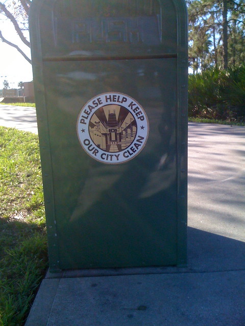
The Chinese Theater is the icon for the park because it's always been the icon for the park. Don't believe me? Take a look at the trash bins lining Hollywood Boulevard.
4644942453_a74a5179ce_z.jpg

It's an iconic "Old Hollywood" building that doesn't need to be blocked by the big blue turd anymore.


The fact that it exists at the end of Hollywood Boulevard is appropriate....given that the real Chinese Theater actually sits on[link=[url]https://www.google.com/?gws_rd=ssl#q=6925+hollywood+boulevard][/url] Hollywood Boulevard[/link].

It's right across the street from another famous theater, El Capitan....guess who owns El Capitan?
El-Capitan-Theatre.jpg

El Capitan was also built as a joint venture with Sid Graumann, the man behind the Chinese.


Also, I'm guessing with your staunch defense of the Big Blue Turd, you never had the opportunity to visit the park in its heyday. Because brother, it was AWESOME.
Disney-MGM-Studios-1989-19-M.jpg
 
Last edited:

Gabe1

Ivory Tower Squabble EST 2011. WINDMILL SURVIVOR
Tough question as there are a fair few choices to pick from, including the ones you mention as well as others. Of the ones in your list i'd probably have to say the Sorcerer's Hat. I really dislike the Leave a Legacy tombstones as well and also find them depressing and inappropriate, but at the very least the view of SSE is still reasonably unobstructed. They're unsightly but I can more effectively ignore them than a giant ugly hat which is in plain impossible to ignore sight, completely obscuring what was once a lovely centerpiece for the park.

But something i'd consider just as bad if not worse than anything on your list is Chester and Hester's Dinorama. The carnival area. It sticks out like a sore thumb and disgustingly interferes with the otherwise wonderful aesthetics of what i'd say is one of the most beautiful and well designed theme parks in the world. I love the idea of a Dinosaur related area at AK, or just a general area dedicated to prehistoric extinct species as a whole. But they completely screwed it up with that ugly carnival. That entire mess needs to be torn down and replaced with something actually good (i've expressed my wish for a multilayered indoors EPCOT-caliber boat ride through the history of prehistoric species).

The lack of trees at Main Street is a definite one. I was sorely reminded of this quite recently while watching some old home movies of mine from the early 90's and saw those lovely old trees with their twinkling lights. It's disgusting what they did to Main Street here. Hopefully this will be addressed at least to an extent with the hub work currently underway. Based on what we've seen from the 3D render video, it'll probably be an improvement over what's there now. Articos told me not long ago that there were plenty of new trees coming and they were even bringing back the twinkling lights. We'll see.

From the concept art for the Polynesian's new lobby, i've good reason to believe it will become the newest eyesore similar to the tree removal at Main Street. What with the centerpiece waterfall decoration being completely demolished and removed for empty space. Also, if there's STILL a huge amount of lightbulbs burned out on the Grand Floridian, you can include that as a (dis)honorable mention as well (there were still massive quantities out the last time I visited in early 2012, don't know if it's been addressed but it's high time they switch to LED if they're unwilling to address burned out lights).

What remains of old Fantasyland's facades is also starting to show its age and become somewhat of an eyesore. I was never a big fan of the tent facades in the first place, especially after visiting Disneyland Paris and seeing the brilliance of their Fantasyland. Magic Kingdom's Fantasyland at least worked better prior to '94 (before 20k Leagues left) when there was more consistency to the theme. But now that New Fantasyland has arrived there's a lot of thematic clashing occurring that needs addressing. The Peter Pan and Small World facades are nestled in between much more elaborately themed areas (shoved in between the lovely new Tangled area and Villagehaus flowing into New Fantasyland), it's a bit of an unsightly mishmash IMHO. Pooh at least got a new facade to better match the new surroundings. Hopefully Pan's upcoming queue work will lead to a new facade as well (though that still leaves Small World's facade, which will require more creative thought to address properly). I'm also unhappy they didn't replace the old and unsightly roof on the teacups, it looks like they were planning to replace it with a copy of Paris' lovely glass roof based on the old New Fantasyland concept art.

Very good post!
 

Gabe1

Ivory Tower Squabble EST 2011. WINDMILL SURVIVOR
As I mentioned in your other thread, Carthay Circle is already represented at DHS.
3004668.jpg

It's the facade for "Once Upon a Time" gift shop on Sunset Boulevard, just before the entrance for Tower of Terror.

The Chinese Theater is the icon for the park because it's always been the icon for the park. Don't believe me? Take a look at the trash bins lining Hollywood Boulevard.
4644942453_a74a5179ce_z.jpg

It's an iconic "Old Hollywood" building that doesn't need to be blocked by the big blue turd anymore.


The fact that it exists at the end of Hollywood Boulevard is appropriate....given that the real Chinese Theater actually sits on[link=[URL='https://www.google.com/?gws_rd=ssl#q=6925+hollywood+boulevard]']https://www.google.com/?gws_rd=ssl#q=6925 hollywood boulevard][/URL] Hollywood Boulevard[/link].

It's right across the street from another famous theater, El Capitan....guess who owns El Capitan?
El-Capitan-Theatre.jpg

El Capitan was also built as a joint venture with Sid Graumann, the man behind the Chinese.


Also, I'm guessing with your staunch defense of the Big Blue Turd, you never had the opportunity to visit the park in its heyday. Because brother, it was AWESOME.
Disney-MGM-Studios-1989-19-M.jpg

Oh I miss this view every time I enter the park.
Disney-MGM-Studios-1989-19-M.jpg


So much butchering of wonderful theming in all the parks. :(
 
Sometimes I'm on the fence about LaL. Sometimes when I see really good pictures of the area, I don't' mind them but when I'm actually there, I don't like it at all. I really think it only has value for those that bought spaces (and there's so much unused space). But I definitely think the Hat is highest on the list. I have no problem with the hat in theory or in general. What I don't like is that there's a pin shop under it and that it blocks what used to be a fantastic view of TGMR as pictured above. If they had put the hat in a location that didn't obscure such a good line of sight, I wouldn't have a problem with it.
 

Chef Mickey

Well-Known Member
The Leave a Legacy is pretty much the definition of a sell out. I'd like to see that nice and clear with more flowers and or short magnolia trees.
 

rct247

Well-Known Member
I picked the netting at DAK because of all the choices, that's the only one that wasn't planned and designed to be there.

That said, I think the biggest eyesore is in DHS. While the hat distracts from the Chinese theater, it has grown on me just enough to accept it, but still wish it was the other way. The bigger problem is the temporary stage that is up in front of the hat for the majority of the year now. That ugly stage now block the ugly hat which blocks a beautiful Chinese theater. Couldn't they have turned the area under the hat from a pin store into a stage at least.
 

MDactor1980

Well-Known Member
My vote went to the hat, but I actually "like" the hat. I think it's interesting to look at, and I like how it gives a theme to the park (I dig the WDW merchandise with the castle, the ball, the tree, the hat). The problem I have, and that most are stuck on, is the placement. I was looking at the layout of the park the other day while daydreaming about what I would change, and I think the hat should move to in front of the gates where the brooms sculpture is. This would restore the "old Hollywood" view on park entry, while keeping the hat around.
 

midwest_mice

Well-Known Member
I would have to say the older part of fantasyland facades. The striped tents are an eyesore compared to the great details in the New Fantasyland. I really like how Disneyland build great fronts to their rides in Fantasyland and got rid of the striped tents.
My second would be the big hat. As much as I like Fantasia and all, the hat has a place and meaning, but not in the middle of a great sight line of the Chinese Theatre.
 

Register on WDWMAGIC. This sidebar will go away, and you'll see fewer ads.

Back
Top Bottom