News Refurbishment coming soon to Disney's Polynesian Village Resort - Moana details to be included

UNCgolf

Well-Known Member
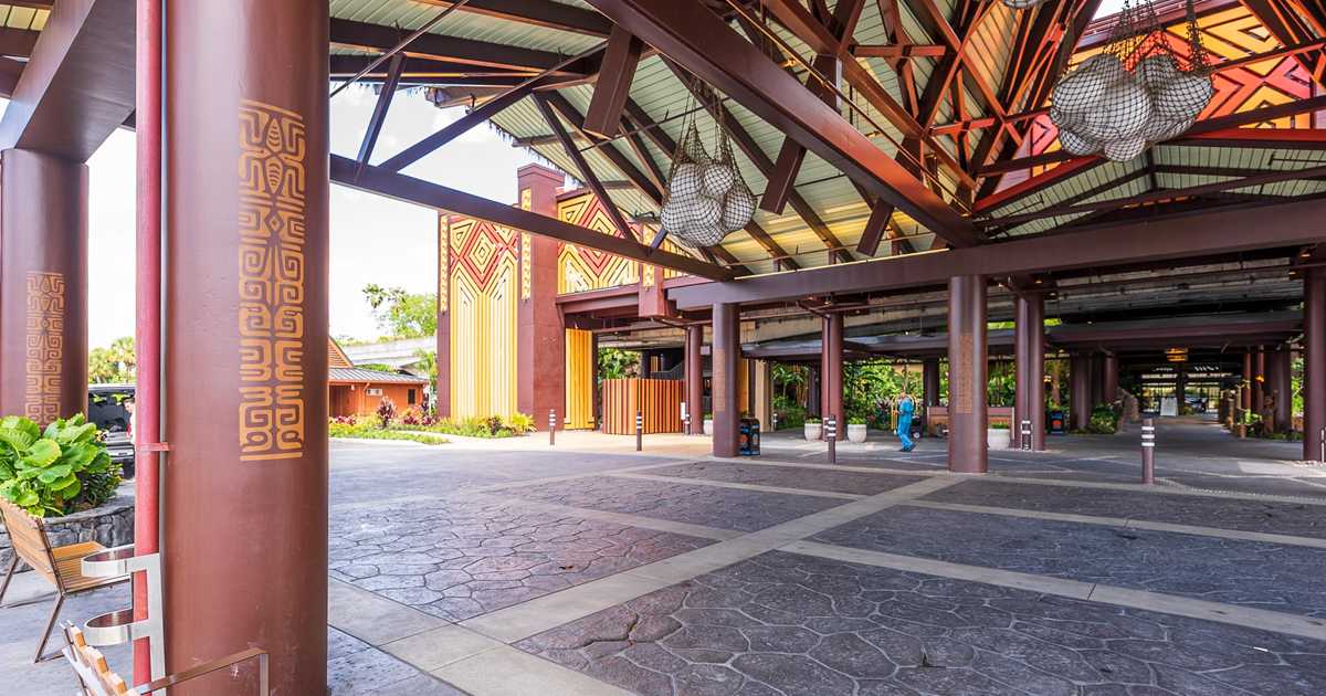
Here are those photos -


I guess that's better than nothing, but it's a far cry from the care and detail Disney used to put into their resorts. It's still a painted concrete (I assume) column with a bit extra on top. Nothing about it says "this is an expensive, upscale hotel"; if anything it's more like "this is a cheap hotel".
 
Last edited:

wdwmagic

Administrator
Moderator
Premium Member
Original Poster
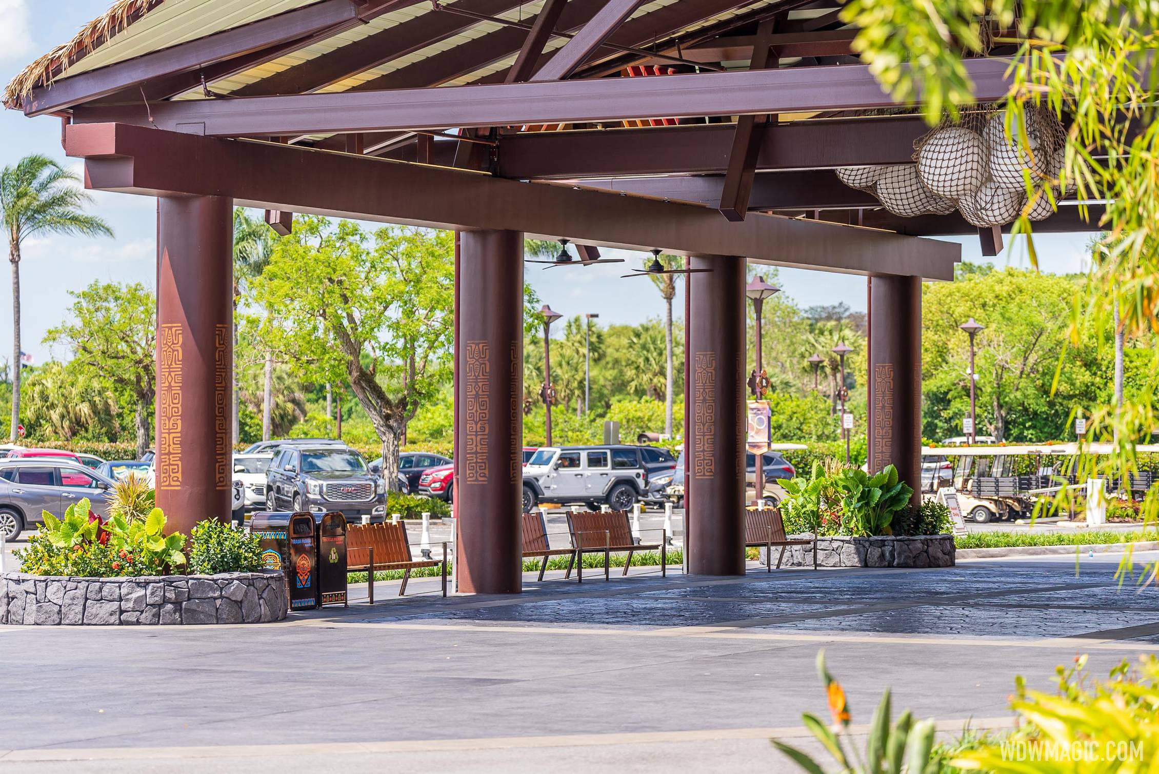
Here are some daytime pictures of the new graphics.


Disneys-Polynesian-Resort_Full_46934.jpg
 

MerlinTheGoat

Well-Known Member
Those stencils are so poorly done that i'm actually not even sure if I could call it an improvement over having them blank. Can't believe i'm saying that...

They'd at least look bare minimum ok if they had printed them out in the correct size that fills and wraps around the entire column. As the concept art showed-

polynesian-village-entrance-construction-arrival-11242020-03.jpg


^As you can see, they appear to be using the designs seen in this art. But someone failed to print them off in a proper large size. This was so easy to get to a tolerable state, and they just keep messing up such basic details. It's embarrassing.
 

UNCgolf

Well-Known Member
Hope that’s work in progress and that more will be added to cover the columns in their entirety. Otherwise, I kind of regret bringing up the ornament as it feels vaguely like I willed this to happen in a monkey’s paw fashion.

Completely covering the columns would certainly be an improvement from whatever this is, but I don't think it will help much overall since the underlying base is so bad.
 

MerlinTheGoat

Well-Known Member
Is this possibly a test.... on all columns... for some reason? See how it reads from various distances?
I'd like this to be "unfinished", but what they're doing doesn't really make any sense for getting a "read" on something. They just need to take measurements of the columns and print off a stencil wrap at the proper size. That will get it to a baseline of "acceptable" and an improvement over a blank surface, which isn't something I can actually say about the tiny stencil they went with.

Completely covering the columns would certainly be an improvement from whatever this is, but I don't think it will help much overall since the underlying base is so bad.
It would absolutely be an improvement at the very least over having either a blank surface or this hilariously scaled down stencil. Ideally they would have added sculpted depth and texture to get it looking more like actual carved wood. But this is Disney in perpetual penny pinching mode where even baseline acceptable is getting hard to come by.
 

James Alucobond

Well-Known Member
Completely covering the columns would certainly be an improvement from whatever this is, but I don't think it will help much overall since the underlying base is so bad.
I mean, agreed. At this point, my best case was that they would anchor various carved (or faux carved) panels to the columns, sealing edges and painting them the same base color as the columns so that requisite gaps for elements like the downspouts wouldn't be as obviously concrete, but that's making the best of a situation that really shouldn't have existed in the first place. But if this is what they're going to do, the execution is just insanely bad, and I hope to goodness this is only step one or something.

Also, I continue my daily burnt offerings to encourage the nylon net balloon lights to spontaneously combust.
 

TikibirdLand

Well-Known Member
Why are the columns so shiny? Does it really look like that in person? I'm filing the stencils under, "Better than Nothing". The nightly rate is way too high for that file folder.
 

Bocabear

Well-Known Member
They have the creative talent, staff and supplies to do this the right way...If I didn't know better I would say they were just punking everyone with the ridiculously undersized stencils... but seriously...The white plastic beachballs in a net, painted brown concrete and now this? Can they not follow their own concept art? If they columns had the large full wrap graphics at least it would have taken away from the lack of texture...
 

Register on WDWMAGIC. This sidebar will go away, and you'll see fewer ads.

Back
Top Bottom